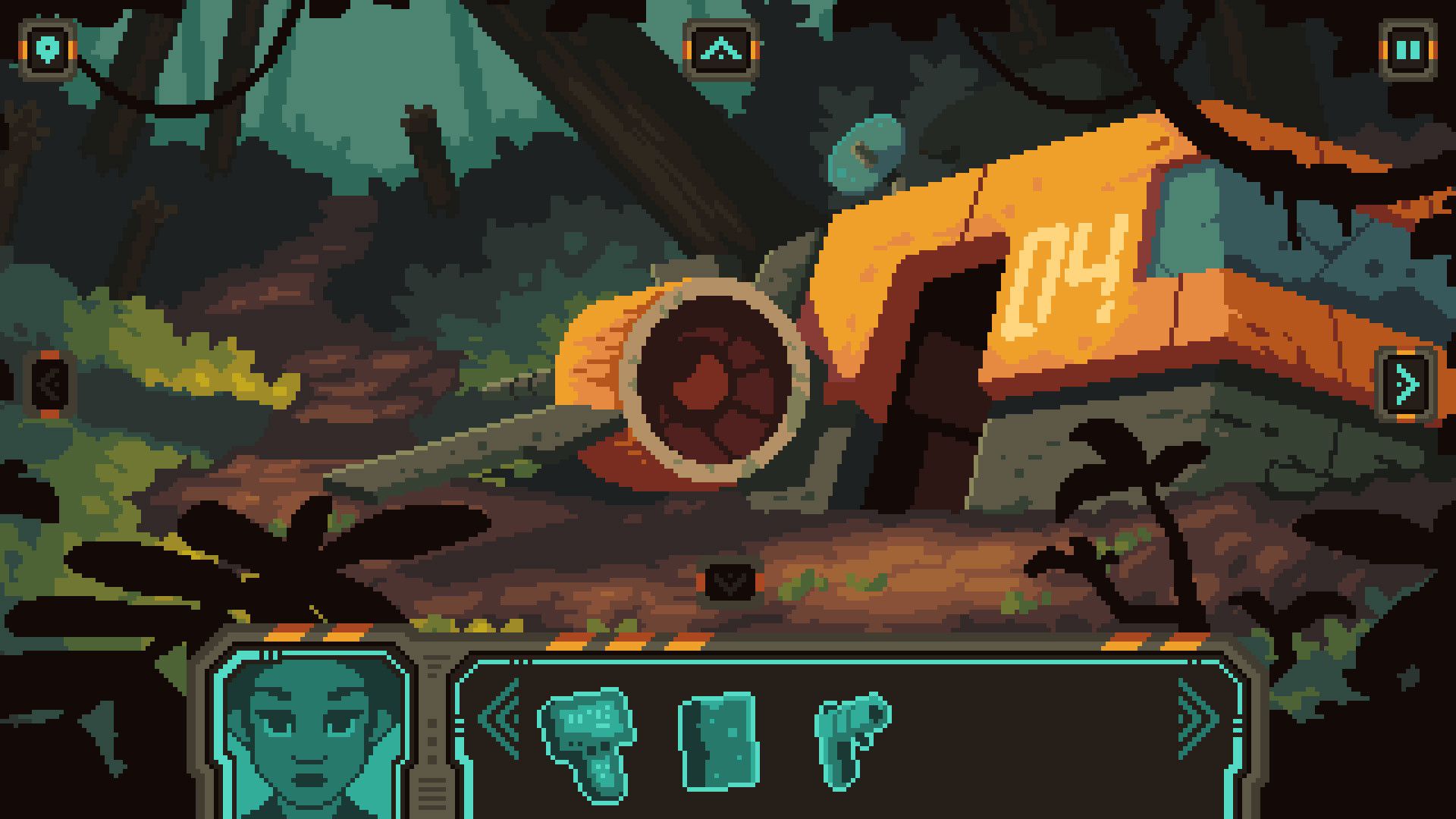
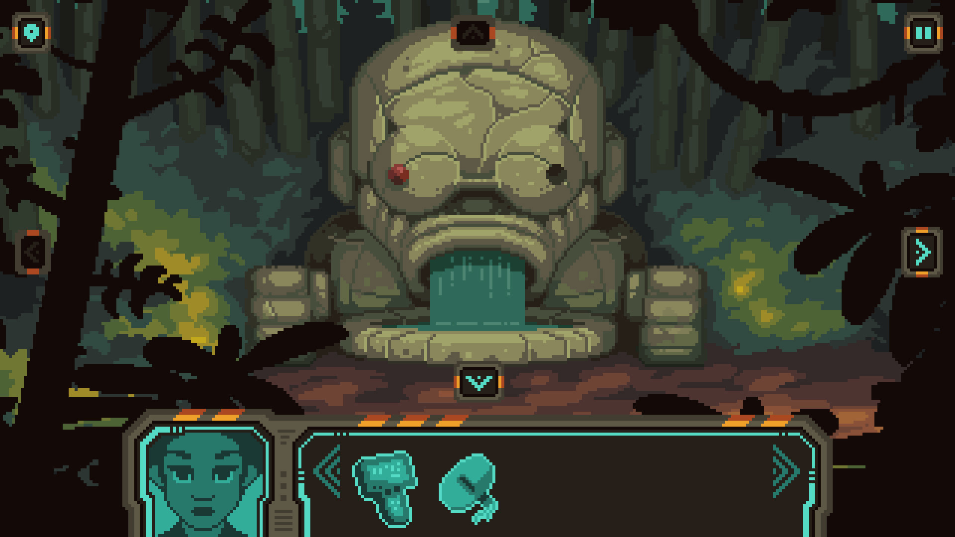
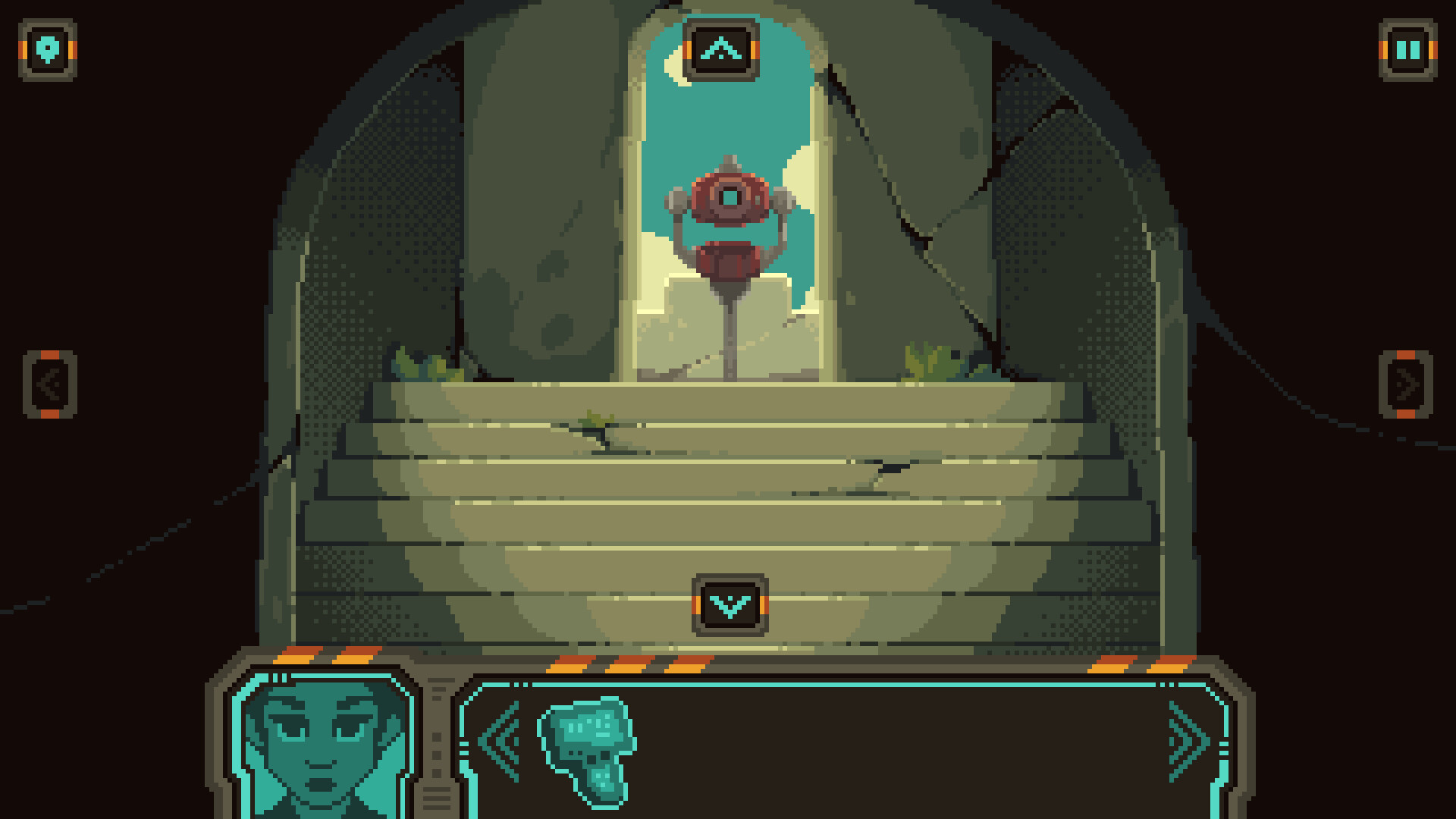
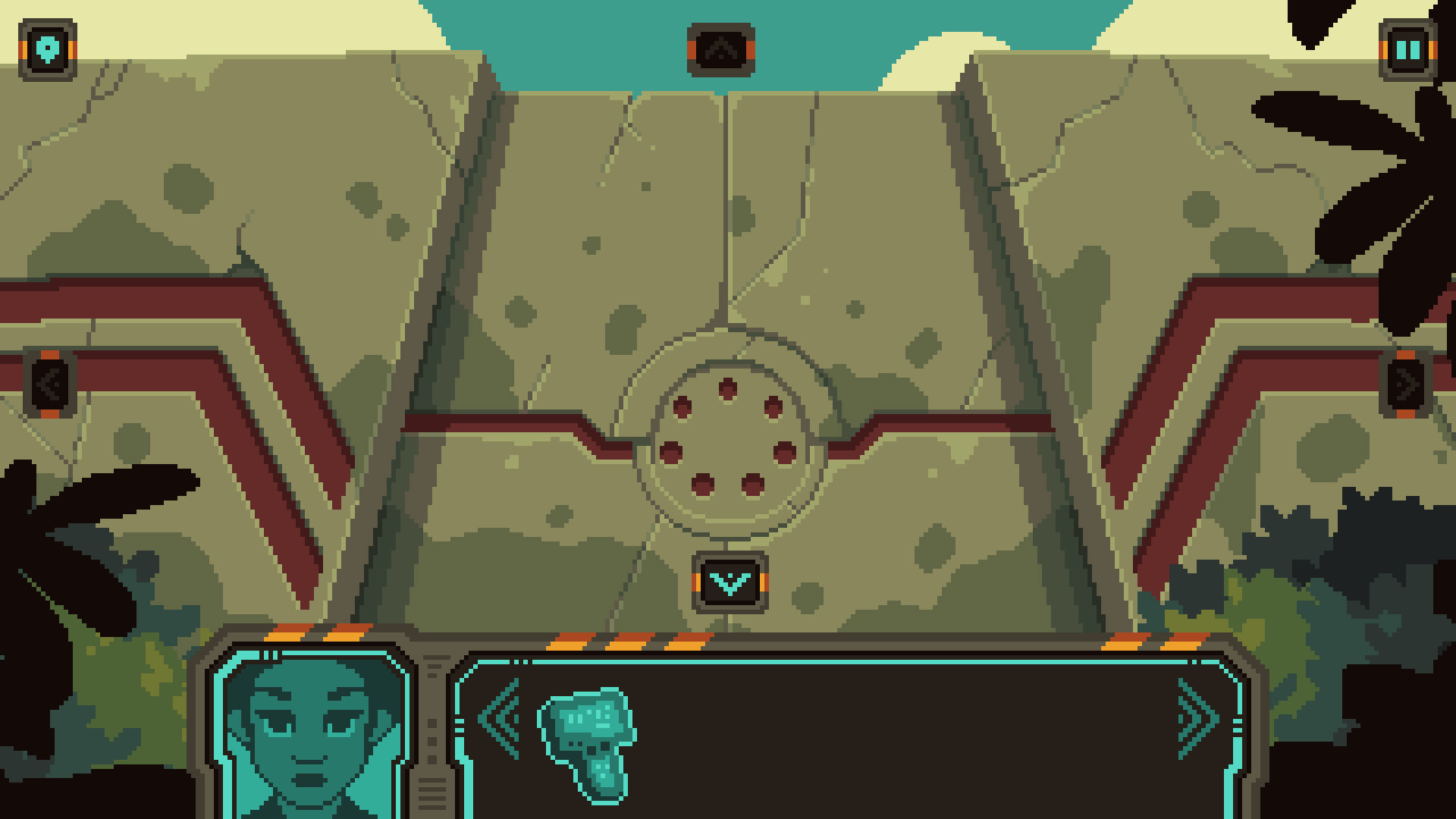
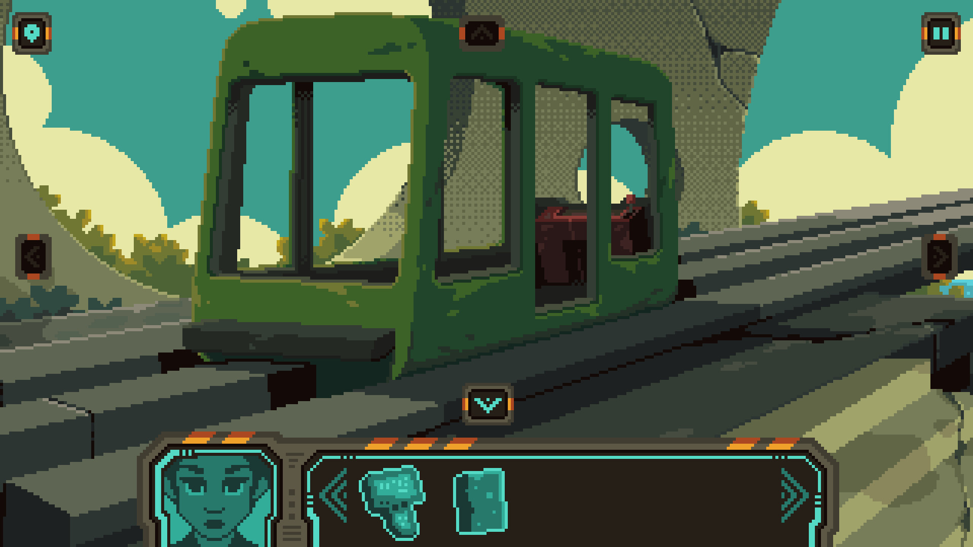
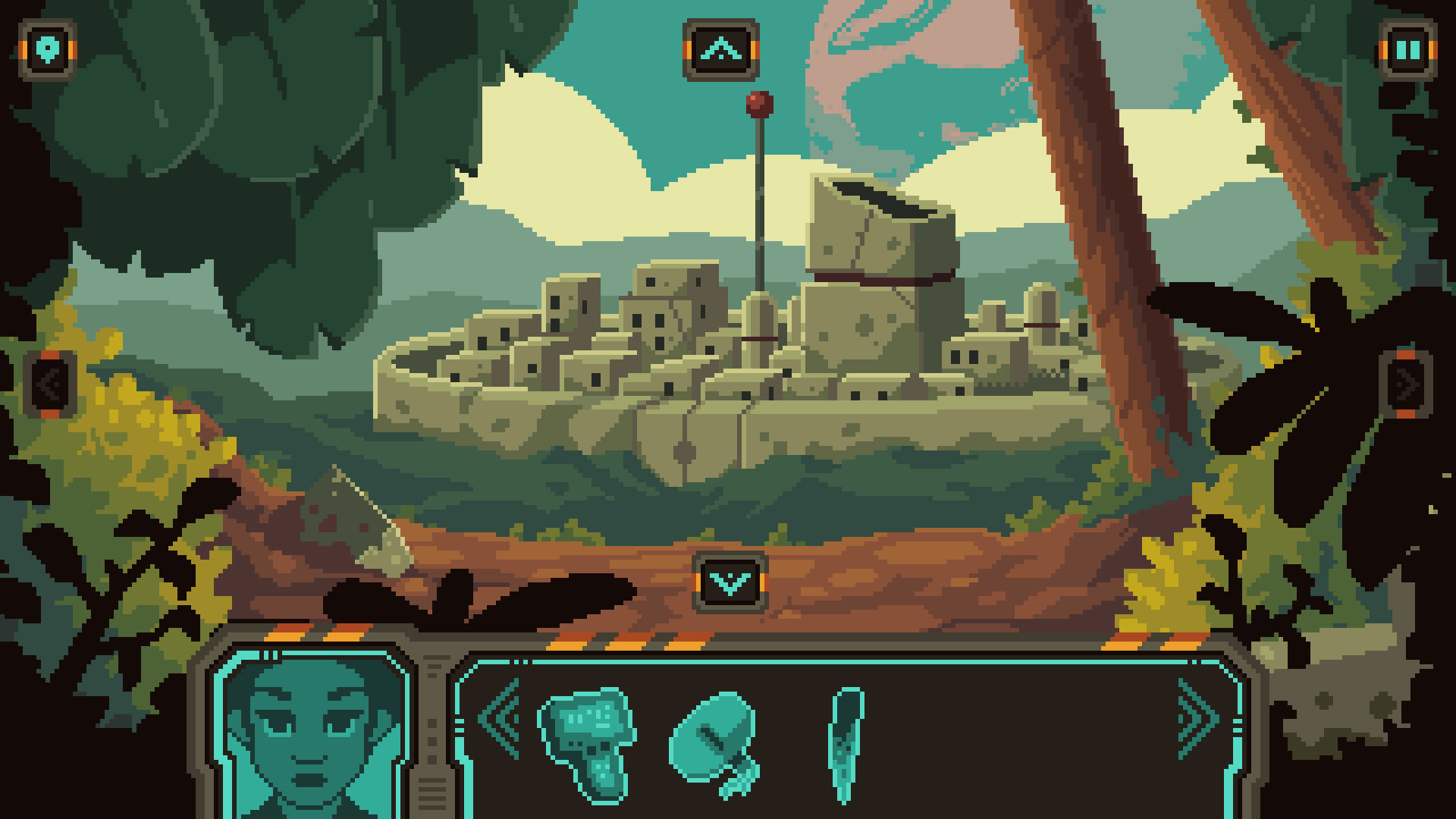
When a wormhole tears open space, an astronaut is sent to a distant planet. But where is she? Where are all the inhabitants of the planet? And how is she going to get back home? Solve the puzzle and piece together the mystery in a throw-back, retro-inspired, point and click adventure.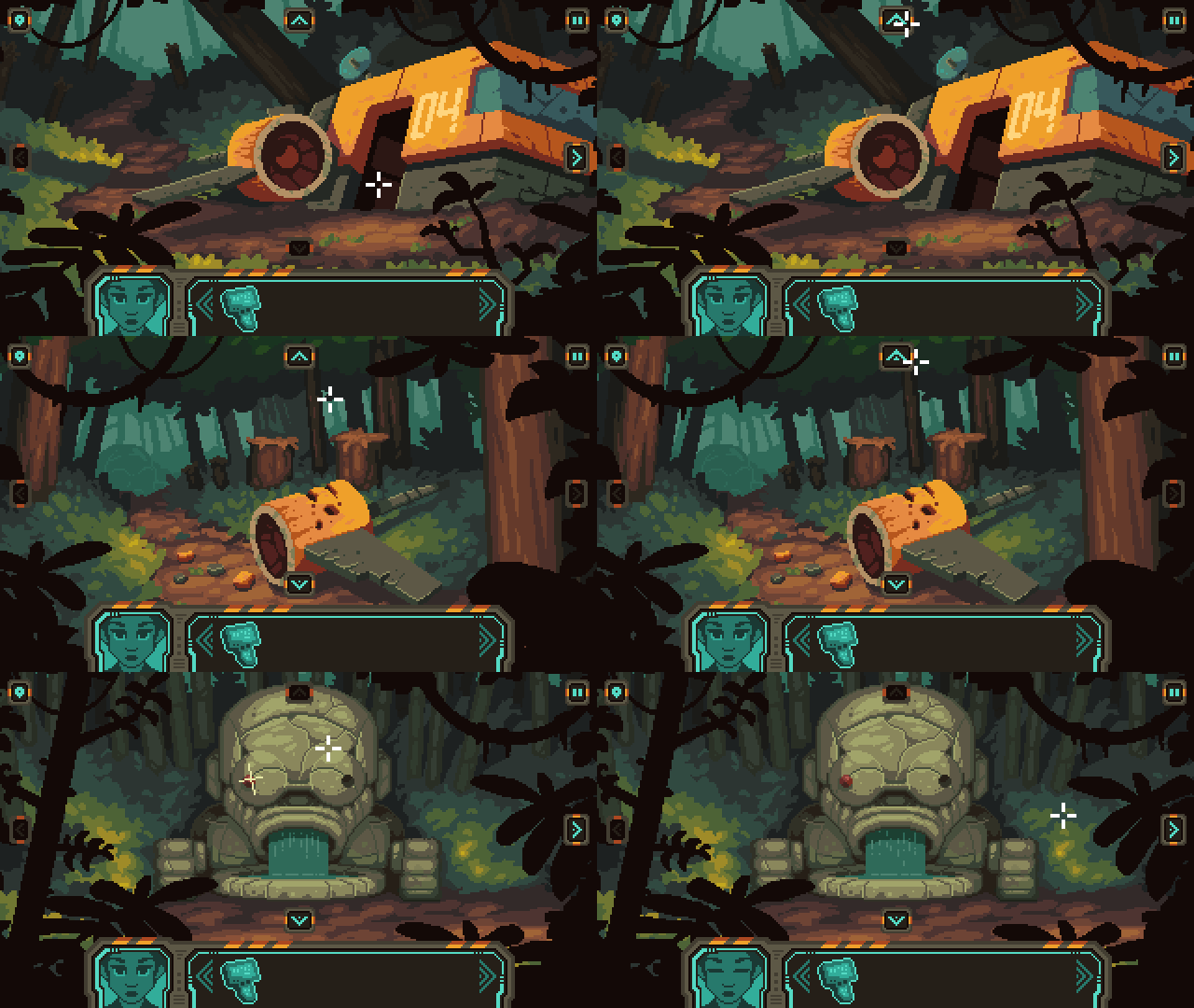
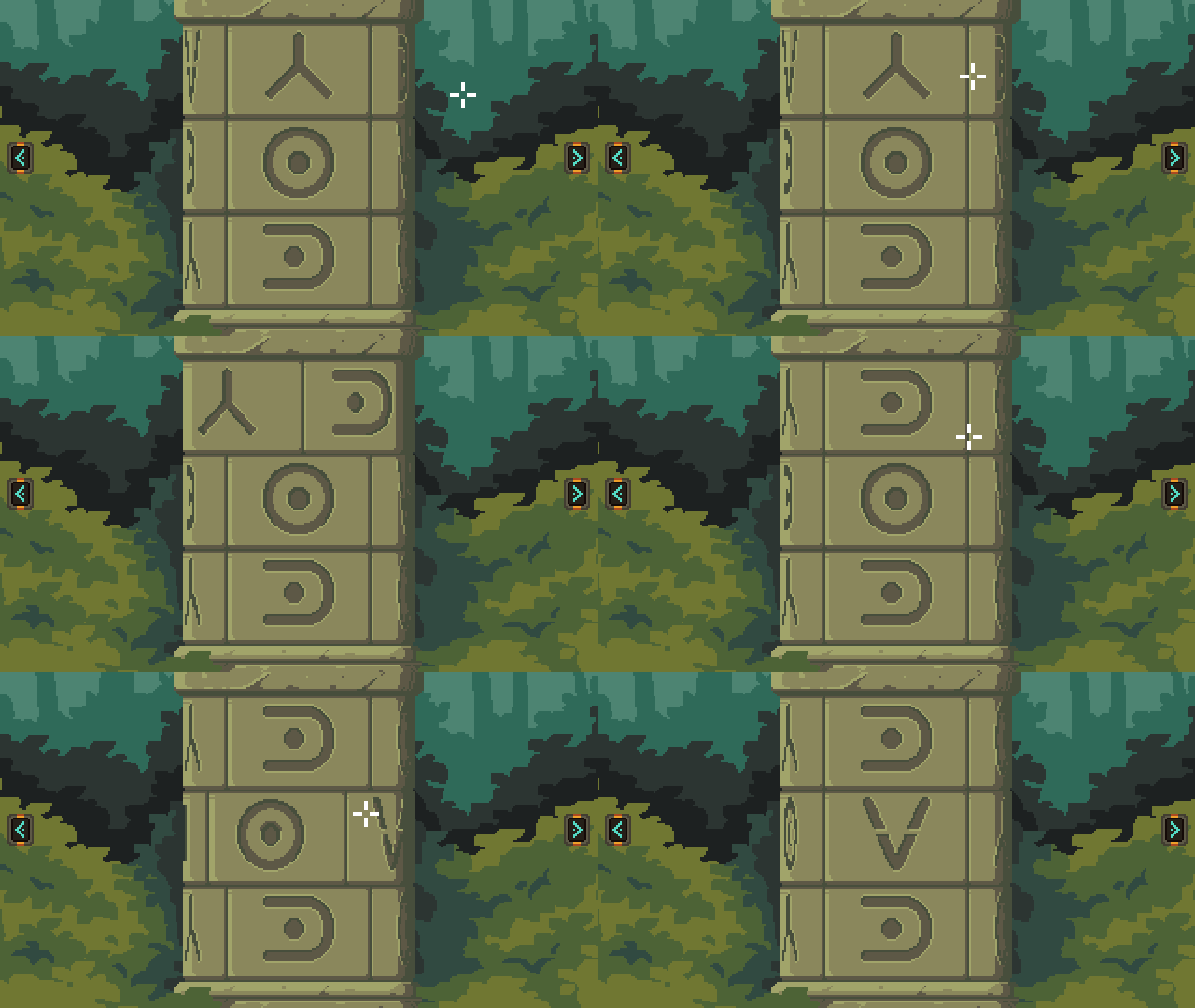
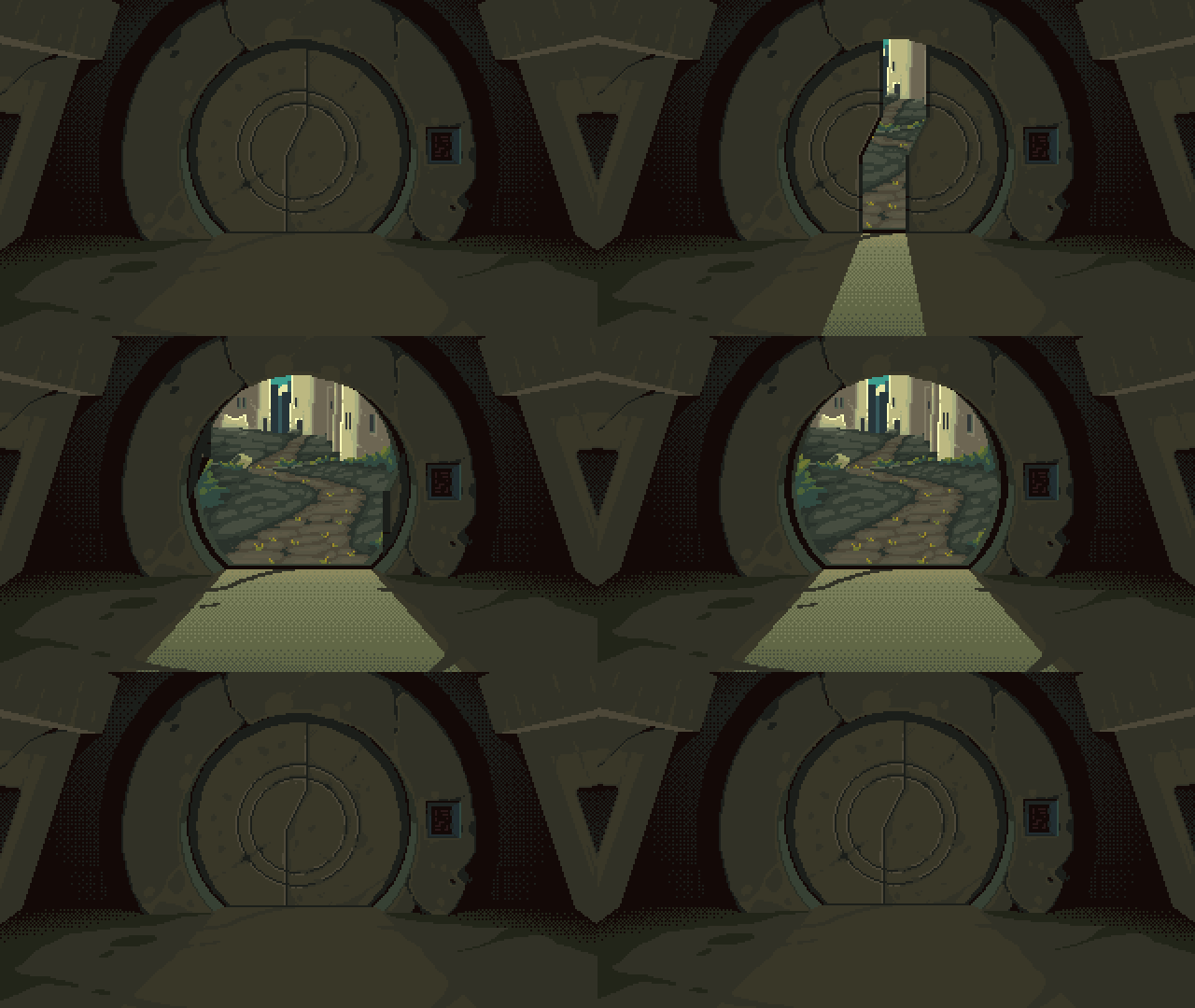
Unique Navigation & Amazing Scenes to Explore

Solve Puzzles


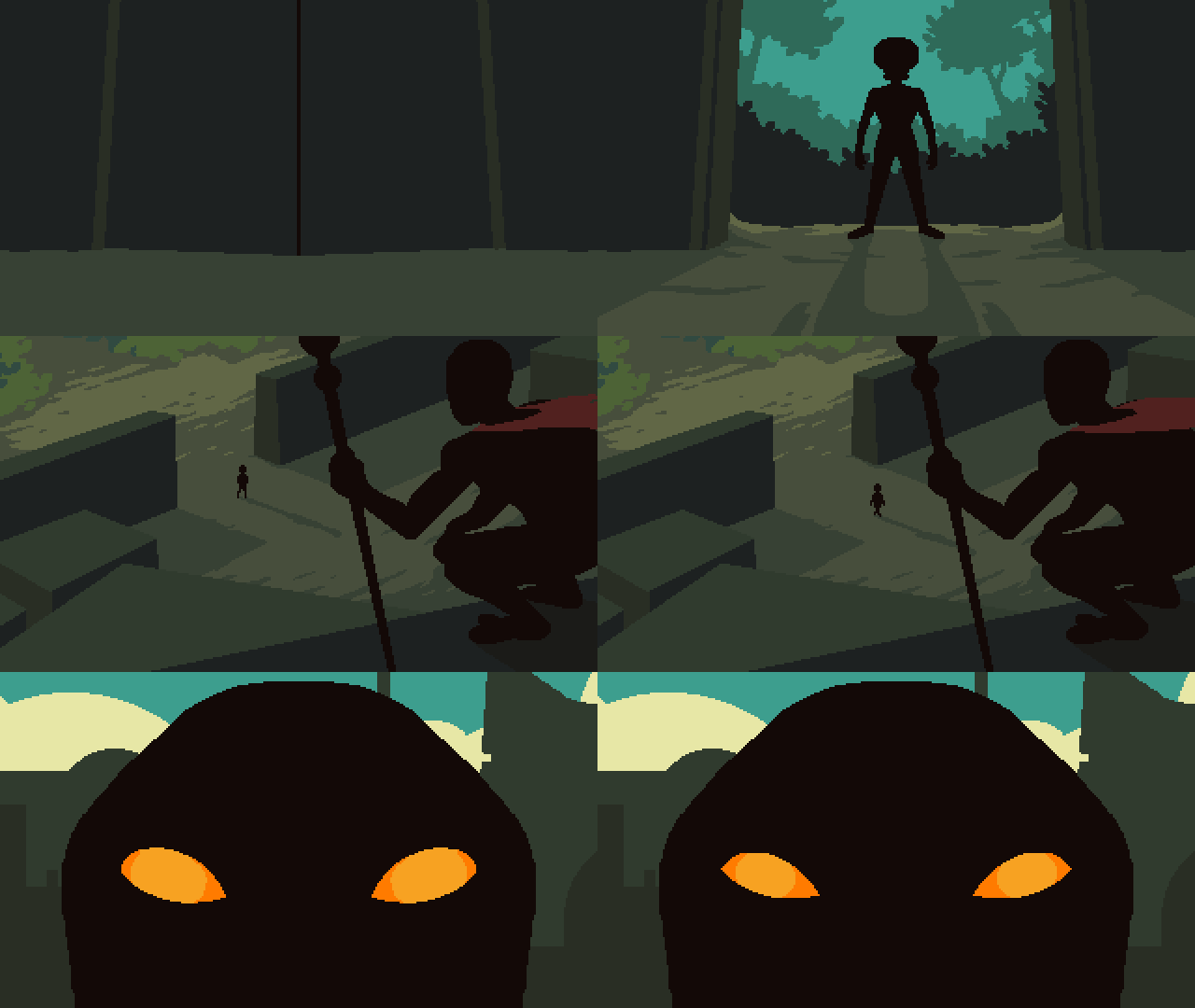
Chilling Cutscenes

Development Update - 2
Well, I'm working hard completing more backgrounds, animations, and puzzles for Act 3. I'm almost done with the artwork for that Act.

My plan is to complete the background artwork/animations for all 5 Acts, then go back through the game and add some additional puzzles and artwork where needed. It's always easier said than done, but my game design philosophy is this; no artwork is sacred. What does that mean?
You may have noticed that many modern adventure games leave you sitting on one or two backgrounds (or maybe a handful) for 30-40 minutes of gameplay. Just going back and forth between those few areas, and jamming them with head-scratching puzzles. I personally don't like this. This ends up feeling like an escape room game, which have their place in the entertainment world, but ultimately leave narrative by the wayside.

Instead, I like a greater sense of physical movement and exploration. When you played the demo to TAP, you likely noticed that you quickly move from one area to another; a puzzle on one screen opens a path on a another. Some backgrounds don't even have a puzzle or an item to pick up, but they are essential for communicating the space and feel of the overall area. That's something I enjoy and that's what I am including in TAP.

I believe there are something like 270 backgrounds (not including cutscenes) in TAP; each one unique. It's a lot of work, but it all contributes to an exciting adventure game experience.
Now, on to the main topic -- I'm reworking the UI. I wouldn't call this a "major" change, because I'm not altering the aesthetic of the UI, but the position of the UI elements and possibly, the fidelity of the UI. For context, here is how the UI currently appears in the game:

While I do like this, and while it technically "works", there are a few issues:


This fixes the issues described above:

So, what do you think? Personally, in my opinion, I like the pixel art UI with the HD font. Not only do I like the way it looks, but the font is so much easier to read. I feel that the HD UI really clashes with the overall retro/pixel-art aesthetic of the game.
But what's your opinion? I'm making this game for YOU to play it. Which UI would you prefer to interact with?
I look forward to hearing your feedback. Thanks again for following the development, and don't forget to tell you friends about The Abandoned Planet!
All the best,
Jeremy Fryc dexterstardust.com
Hello everyone!
Welcome back for another development update for TAP. I'm happy to report that things are coming along nicely. First of all; where am I at with the game?
Game Progress
Well, I'm working hard completing more backgrounds, animations, and puzzles for Act 3. I'm almost done with the artwork for that Act.

My plan is to complete the background artwork/animations for all 5 Acts, then go back through the game and add some additional puzzles and artwork where needed. It's always easier said than done, but my game design philosophy is this; no artwork is sacred. What does that mean?
You may have noticed that many modern adventure games leave you sitting on one or two backgrounds (or maybe a handful) for 30-40 minutes of gameplay. Just going back and forth between those few areas, and jamming them with head-scratching puzzles. I personally don't like this. This ends up feeling like an escape room game, which have their place in the entertainment world, but ultimately leave narrative by the wayside.

Instead, I like a greater sense of physical movement and exploration. When you played the demo to TAP, you likely noticed that you quickly move from one area to another; a puzzle on one screen opens a path on a another. Some backgrounds don't even have a puzzle or an item to pick up, but they are essential for communicating the space and feel of the overall area. That's something I enjoy and that's what I am including in TAP.

I believe there are something like 270 backgrounds (not including cutscenes) in TAP; each one unique. It's a lot of work, but it all contributes to an exciting adventure game experience.
UI Changes
Now, on to the main topic -- I'm reworking the UI. I wouldn't call this a "major" change, because I'm not altering the aesthetic of the UI, but the position of the UI elements and possibly, the fidelity of the UI. For context, here is how the UI currently appears in the game:

While I do like this, and while it technically "works", there are a few issues:
- The portrait/inventory take up a lot of permanent space on the bottom.
- For those who wish to click the arrows on screen (as opposed to using the WASD or arrow keys, which is what I prefer to do), the arrow buttons are far apart on the screen. This means that the player has to constantly move their cursor across the entire screen to navigate.
- The pixel art font is no good for localization
- The pixel art font is terrible for accessibility


This fixes the issues described above:
- The portrait is now on the left side and the inventory opens on a button click, thus freeing up that space on the bottom.
- The arrow buttons are all located on the right side, making it easier to click on them (if that's your preferred method of interaction).
- The use of an HD font is perfect for localization.
- The HD font is perfect for accessibility.

So, what do you think? Personally, in my opinion, I like the pixel art UI with the HD font. Not only do I like the way it looks, but the font is so much easier to read. I feel that the HD UI really clashes with the overall retro/pixel-art aesthetic of the game.
But what's your opinion? I'm making this game for YOU to play it. Which UI would you prefer to interact with?
I look forward to hearing your feedback. Thanks again for following the development, and don't forget to tell you friends about The Abandoned Planet!
All the best,
Jeremy Fryc dexterstardust.com
[ 2023-01-05 17:19:56 CET ] [Original Post]
Minimum Setup
- OS: ?Memory: 4 GB RAMStorage: 1 GB available space
- Memory: 4 GB RAMStorage: 1 GB available space
- Storage: 1 GB available space
Recommended Setup
- OS: ?Memory: 16 GB RAMStorage: 1 GB available space
- Storage: 1 GB available space
GAMEBILLET
[ 6370 ]
FANATICAL
[ 5870 ]
GAMERSGATE
[ 1265 ]
MacGameStore
[ 1943 ]
INDIEGALA
[ 986 ]
FANATICAL BUNDLES
GMG BUNDLES
HUMBLE BUNDLES
INDIEGALA BUNDLES
by buying games/dlcs from affiliate links you are supporting tuxDB
