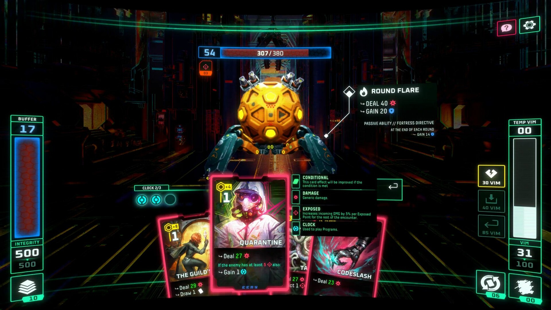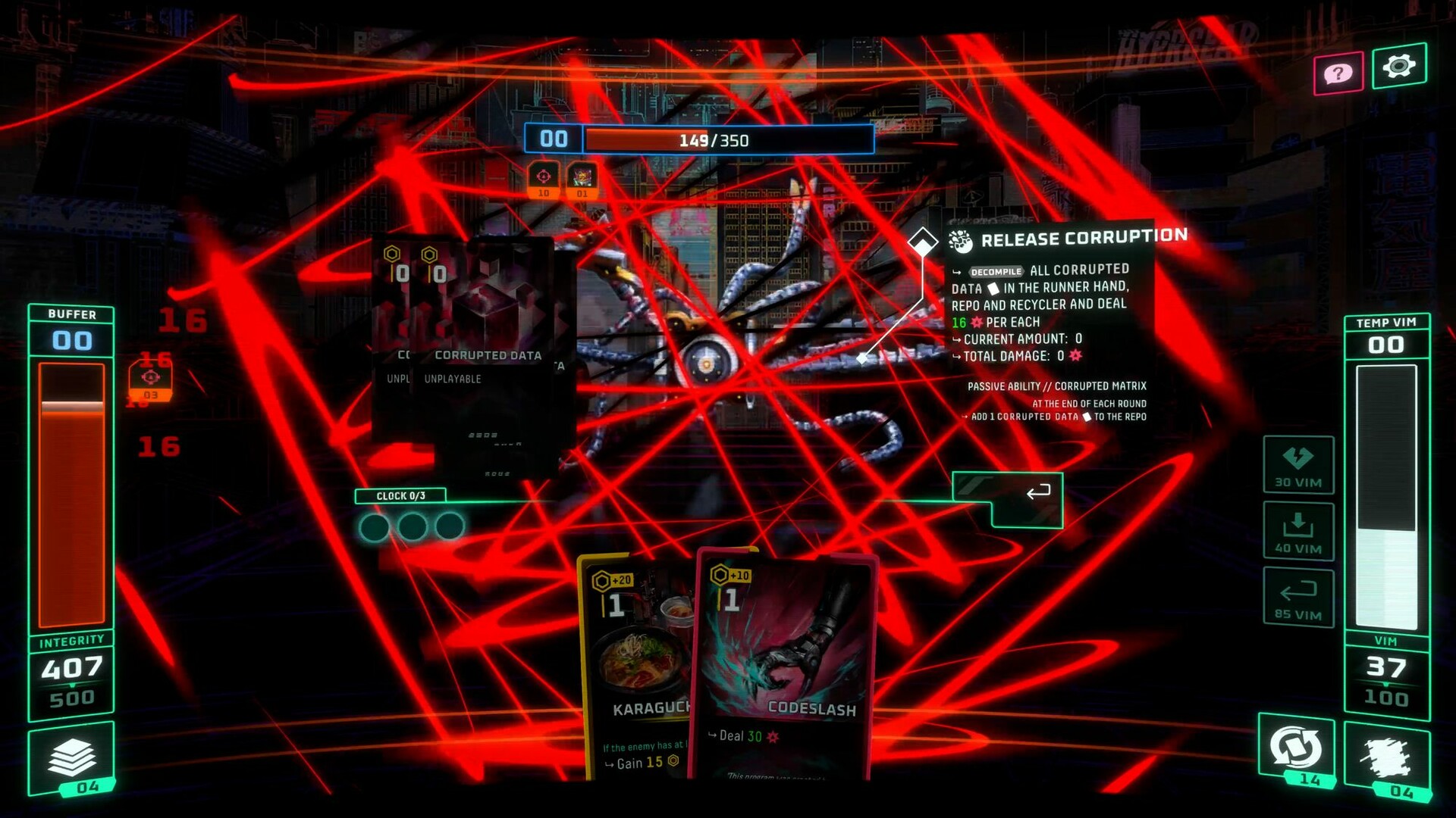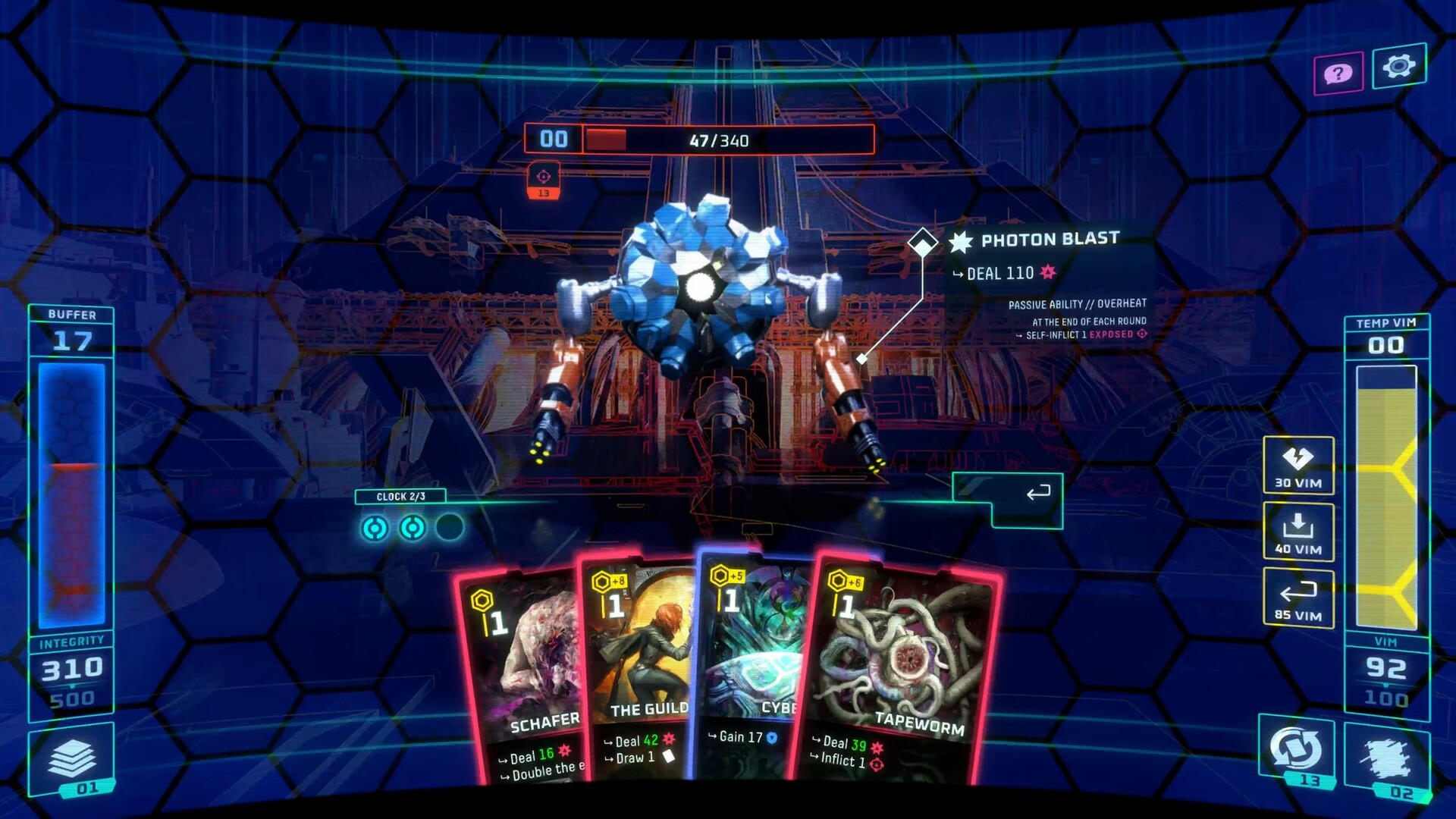

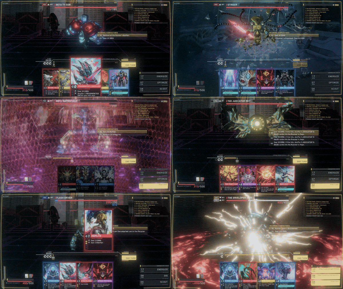
Ever wondered what the love child of a Roguelike Deckbuilder and a Tabletop Boardgame would look like? Here’s the answer: Into The Grid features action-packed card battles and deeply tactical map exploration with resource management.


We designed a unique dual-resource system where each card is played for its effect while simultaneously generating Virtual Memory (VIM), which allows the player to take advantage of even the most suboptimal hands. Use your VIM to activate your Commands during battle and obliterate your enemies’ defenses!


Exploit the Commands - powerful unlockable skills that can be the difference between victory and defeat. Choose them wisely, sync them with your deck, and strategically deploy them for knockout wins.

The Grid is the infinite digital landscape where information lives. Full of riches and dangers, it’s a place where only the sharpest minds can thrive. Experience a layer of depth never seen before in the genre; consider every move as if it were your last because it might be. Fight or flee? Visit this area now or later? Cash in a reward immediately, or hold on to it for an even bigger payoff? The choice is yours, as well as the punishment and the profit.

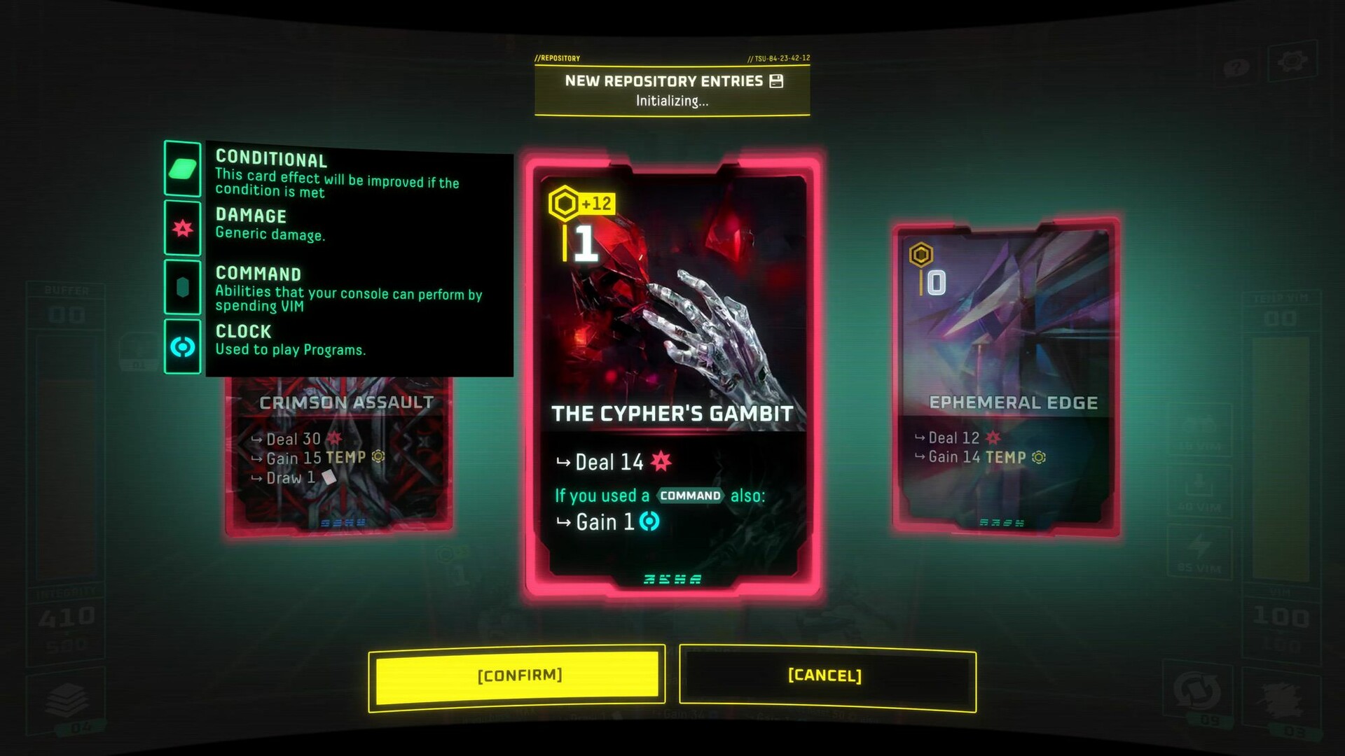
The Repo is your arsenal, and its program cards, your weapons. Get new Programs as you explore, and scrap your least effective ones to upgrade your best ones. Look out for unique combinations and unlock the ultimate power.

As a hacker, your Console is an extension of your mind and body. Customize it to match your playstyle by unlocking hardware mods and perks. The more you hone your skills, the more options you’ll discover!

Into The Grid includes five distinct characters, each with its own story arc, gameplay mechanics, art, and much more.

Development Updates - June 2024

1Playtest Round: UI Redesign (Sep)*
2Playtest Round: Map Exploration (Sep)*
3Demo Launch (Oct-Nov)
4Steam Next Fest (Feb 2025)
5Early Access Release (Feb-Mar 2025)
62nd Character Release: The Maker (TBD)[/h5]
Events 1 & 2 may occur simultaneously or separately; this is yet to be determined.

[h5]This years Latin American Games Showcase was part of the Summer Game Fests official schedule. It was the biggest edition to date, co-broadcasted, and covered by all the main gaming media outlets.
We premiered our latest trailer during the show with a 2-minute deep-dive segment. This brought the game a ton of attention, and we saw a fantastic boost in our wishlist count, which injected us with renewed energy!
You can see the segment below [/h5]

[h5]As part of our work for the new trailer, we also decided to update our main game art. We believe the new image aligns better with how the game will look in its new iteration once we release the UI redesign update. Considering the full game will have 5 distinct characters, we decided to create a yet-undefined character for the main art instead of tying it to Ursa, our first character.
Below you can see part of the process of creating the new capsule, done by our extremely talented artist Joi.[/h5]


[h5]We are very proud to show you the new designs for the Combat and Decks screens! Lets compare them and go over some details about the team's decisions.[/h5]


*The new image is missing the background + enemy, dont worry, they will be there.
[h5]
We dropped the helmet effect. It wasnt adding that much to the immersion we were looking for and was generating visual artifacts, motion-illness, readability, and resolution issues. We decided to re-focus on our early ideas of retro-futuristic interfaces, brightness saturation, and grain filters.

We decided to go a lot more minimalistic regarding health and VIM bars. We also ditched the status effects icons in exchange for abbreviated and color-coded words to add to the terminal/console style.


We noticed that we were not giving enough spotlight to one of our most unique mechanics, the VIM and Commands system. By making it look so similar to the Integrity bar and putting the commands as small icons, they usually got overlooked.
Now, the VIM is a central piece of the UI (quite literally!), and the Commands now have a unique design with different states and animations depending on the context.


From dragging and dropping issues to the fact that it didnt quite feel hackery enough, we decided to change the card fan to a straight display of the Runners hand of cards. We believe the new look aligns better with the overall linework of the UI and the responsiveness has been improved considerably.


We received a lot of feedback asking for a way to keep track of what happened during the enemys turn, a Battle Log of sorts. Well, we had that in the plans for quite some time, and now we believe we nailed the way to make it work.
We created a Terminal that will not only let you know what happened and show a historical log of actions but also contextual information about many other things happening during combat. It also allows us to trigger immersive and flavorful text fragments to add to the overall experience.
You will be able to trigger actions and discover Easter eggs and secrets directly by prompting the terminal. On top of all that, it also looks sleek and retro AF!


We made changes to how we show the enemys intention during your turn. Now, youll see a step-by-step breakdown of what the enemy will do during its turn.[/h5]


[h5]
The console is your best friend in The Grid, and as such, it will try to show you as much useful information as it can. Keeping that in mind, we added a new widget to the deck view that lets you quickly check the distribution of card types within the deck. This is essential when planning the turn sequencing and trying to foresee upcoming draws.

It also shows information about keywords on the currently selected/hovered card.


We made big improvements to how selecting and highlighting cards in the different deck views work. We also reworked how tooltips are shown on screens where the side widget is not used.
 [/h5]
[/h5]

The redesign also covers the map screens, which we will be revealing soon in a separate post. What we can spoil for now is that it will not be a hexagonal grid!
Mechanically it will work as described in our previous article .

[h5]As a studio, we are proud to implement user research and playtest methodologies to support decisions that can make our games their best possible versions.
Many of the decisions detailed above come from watching and surveying players, and we want to thank all of you who participated from the bottom of our hearts.
Knowing that there are people out there playing and devoting time to expressing their opinions about our game is a feeling that we cant even describe, and it means the world to us!
During these tests, we received more than 300 survey replies from over 3000 unique players; we interviewed and reviewed recorded playthroughs of dozens of people, and more than 100 new members joined our Discord to chat with us live and share their thoughts.
Its our commitment to keep working this way and to make you all part of this journey of creating the best game possible.
All these new things we mentioned in this update will be up for you all to test soon ;)[/h5]

[h5]In case you dont know, every week, we release a new piece of lore about the universe where the game takes place.
Its one of the many ways in which we show the passion were putting into this project and how we envision something much bigger than just a game.
We already have 20 entries you can read on our website , split between The Runners , The Corporations , and Into The Grids Short Stories .
Go give them a look; we think you will love them![/h5]

[h5]This covers pretty much everything thats going on (at least what we can show!) behind the scenes.
As always, dont forget to join our Discord to chat live with the team and other fellow Runners!

See you in The Grid!
[/h5]

[h5]Hello Runners!
Its been some time since our last update and a lot has happened. Let's take a moment to review the news.
Lets go![/h5]

[h5]Based on our latest estimations, we adjusted some of our date ranges. The most relevant points are:
- New playtests happening around September.
- The demo releasing between October and November.
- The Early Access launch happening in Q1 2025, after Februarys Steam Next Fest.

1Playtest Round: UI Redesign (Sep)*
2Playtest Round: Map Exploration (Sep)*
3Demo Launch (Oct-Nov)
4Steam Next Fest (Feb 2025)
5Early Access Release (Feb-Mar 2025)
62nd Character Release: The Maker (TBD)[/h5]
Events 1 & 2 may occur simultaneously or separately; this is yet to be determined.

[h5]This years Latin American Games Showcase was part of the Summer Game Fests official schedule. It was the biggest edition to date, co-broadcasted, and covered by all the main gaming media outlets.
We premiered our latest trailer during the show with a 2-minute deep-dive segment. This brought the game a ton of attention, and we saw a fantastic boost in our wishlist count, which injected us with renewed energy!
You can see the segment below [/h5]

[h5]As part of our work for the new trailer, we also decided to update our main game art. We believe the new image aligns better with how the game will look in its new iteration once we release the UI redesign update. Considering the full game will have 5 distinct characters, we decided to create a yet-undefined character for the main art instead of tying it to Ursa, our first character.
Below you can see part of the process of creating the new capsule, done by our extremely talented artist Joi.[/h5]


[h5]We are very proud to show you the new designs for the Combat and Decks screens! Lets compare them and go over some details about the team's decisions.[/h5]


*The new image is missing the background + enemy, dont worry, they will be there.
[h5]

We dropped the helmet effect. It wasnt adding that much to the immersion we were looking for and was generating visual artifacts, motion-illness, readability, and resolution issues. We decided to re-focus on our early ideas of retro-futuristic interfaces, brightness saturation, and grain filters.

We decided to go a lot more minimalistic regarding health and VIM bars. We also ditched the status effects icons in exchange for abbreviated and color-coded words to add to the terminal/console style.


We noticed that we were not giving enough spotlight to one of our most unique mechanics, the VIM and Commands system. By making it look so similar to the Integrity bar and putting the commands as small icons, they usually got overlooked.
Now, the VIM is a central piece of the UI (quite literally!), and the Commands now have a unique design with different states and animations depending on the context.


From dragging and dropping issues to the fact that it didnt quite feel hackery enough, we decided to change the card fan to a straight display of the Runners hand of cards. We believe the new look aligns better with the overall linework of the UI and the responsiveness has been improved considerably.


We received a lot of feedback asking for a way to keep track of what happened during the enemys turn, a Battle Log of sorts. Well, we had that in the plans for quite some time, and now we believe we nailed the way to make it work.
We created a Terminal that will not only let you know what happened and show a historical log of actions but also contextual information about many other things happening during combat. It also allows us to trigger immersive and flavorful text fragments to add to the overall experience.
You will be able to trigger actions and discover Easter eggs and secrets directly by prompting the terminal. On top of all that, it also looks sleek and retro AF!


We made changes to how we show the enemys intention during your turn. Now, youll see a step-by-step breakdown of what the enemy will do during its turn.[/h5]


[h5]

The console is your best friend in The Grid, and as such, it will try to show you as much useful information as it can. Keeping that in mind, we added a new widget to the deck view that lets you quickly check the distribution of card types within the deck. This is essential when planning the turn sequencing and trying to foresee upcoming draws.

It also shows information about keywords on the currently selected/hovered card.


We made big improvements to how selecting and highlighting cards in the different deck views work. We also reworked how tooltips are shown on screens where the side widget is not used.
 [/h5]
[/h5]
The redesign also covers the map screens, which we will be revealing soon in a separate post. What we can spoil for now is that it will not be a hexagonal grid!
Mechanically it will work as described in our previous article .

[h5]As a studio, we are proud to implement user research and playtest methodologies to support decisions that can make our games their best possible versions.
Many of the decisions detailed above come from watching and surveying players, and we want to thank all of you who participated from the bottom of our hearts.
Knowing that there are people out there playing and devoting time to expressing their opinions about our game is a feeling that we cant even describe, and it means the world to us!
During these tests, we received more than 300 survey replies from over 3000 unique players; we interviewed and reviewed recorded playthroughs of dozens of people, and more than 100 new members joined our Discord to chat with us live and share their thoughts.
Its our commitment to keep working this way and to make you all part of this journey of creating the best game possible.
All these new things we mentioned in this update will be up for you all to test soon ;)[/h5]

[h5]In case you dont know, every week, we release a new piece of lore about the universe where the game takes place.
Its one of the many ways in which we show the passion were putting into this project and how we envision something much bigger than just a game.
We already have 20 entries you can read on our website , split between The Runners , The Corporations , and Into The Grids Short Stories .
Go give them a look; we think you will love them![/h5]

[h5]This covers pretty much everything thats going on (at least what we can show!) behind the scenes.
As always, dont forget to join our Discord to chat live with the team and other fellow Runners!

See you in The Grid!
[/h5]
[ 2024-06-24 12:51:55 CET ] [Original Post]
Minimum Setup
- OS: Ubuntu 14.04 LTS
- Processor: 2.0 GhzMemory: 2 GB RAM
- Memory: 2 GB RAM
- Graphics: 1Gb Video Memory. capable of OpenGL 3.0+ support (2.1 with ARB extensions acceptable)
- Storage: 1 GB available space
GAMEBILLET
[ 6375 ]
FANATICAL
[ 5746 ]
GAMERSGATE
[ 1265 ]
MacGameStore
[ 1943 ]
INDIEGALA
[ 986 ]
FANATICAL BUNDLES
GMG BUNDLES
HUMBLE BUNDLES
INDIEGALA BUNDLES
by buying games/dlcs from affiliate links you are supporting tuxDB
