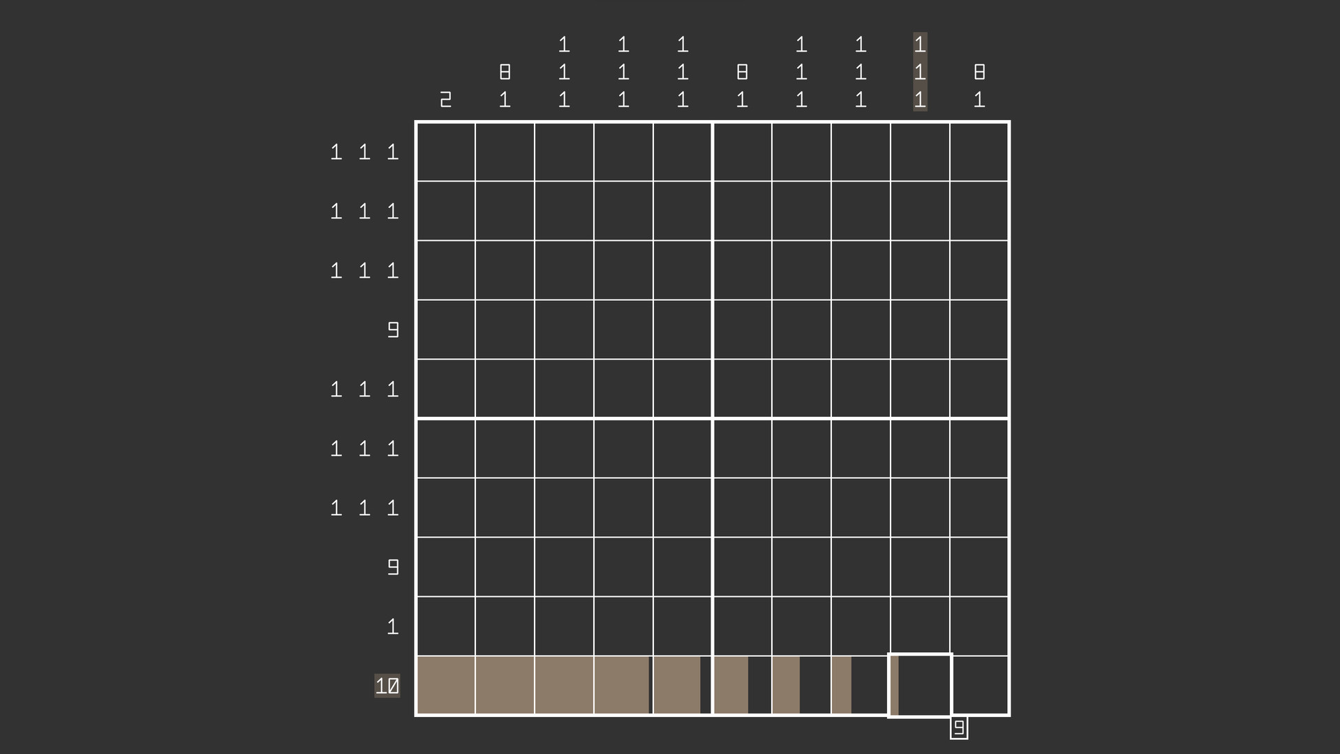
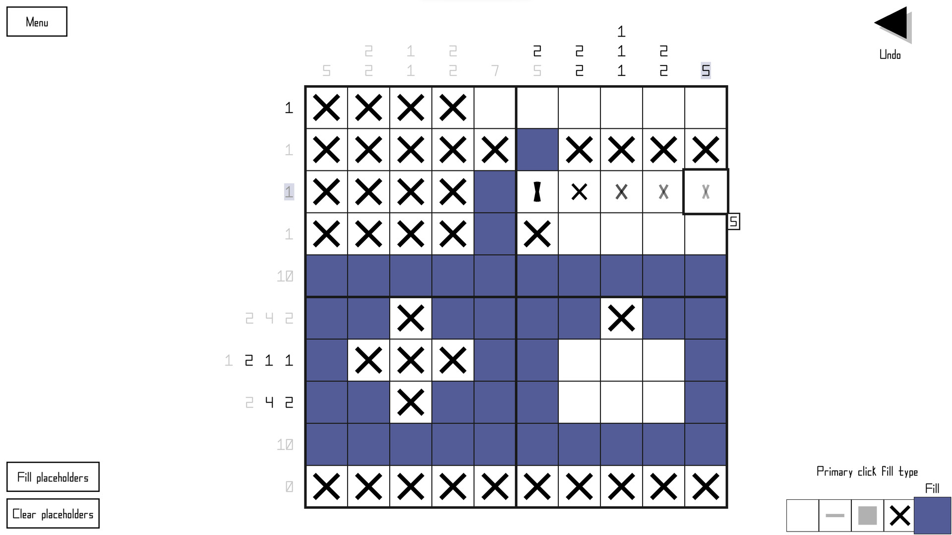
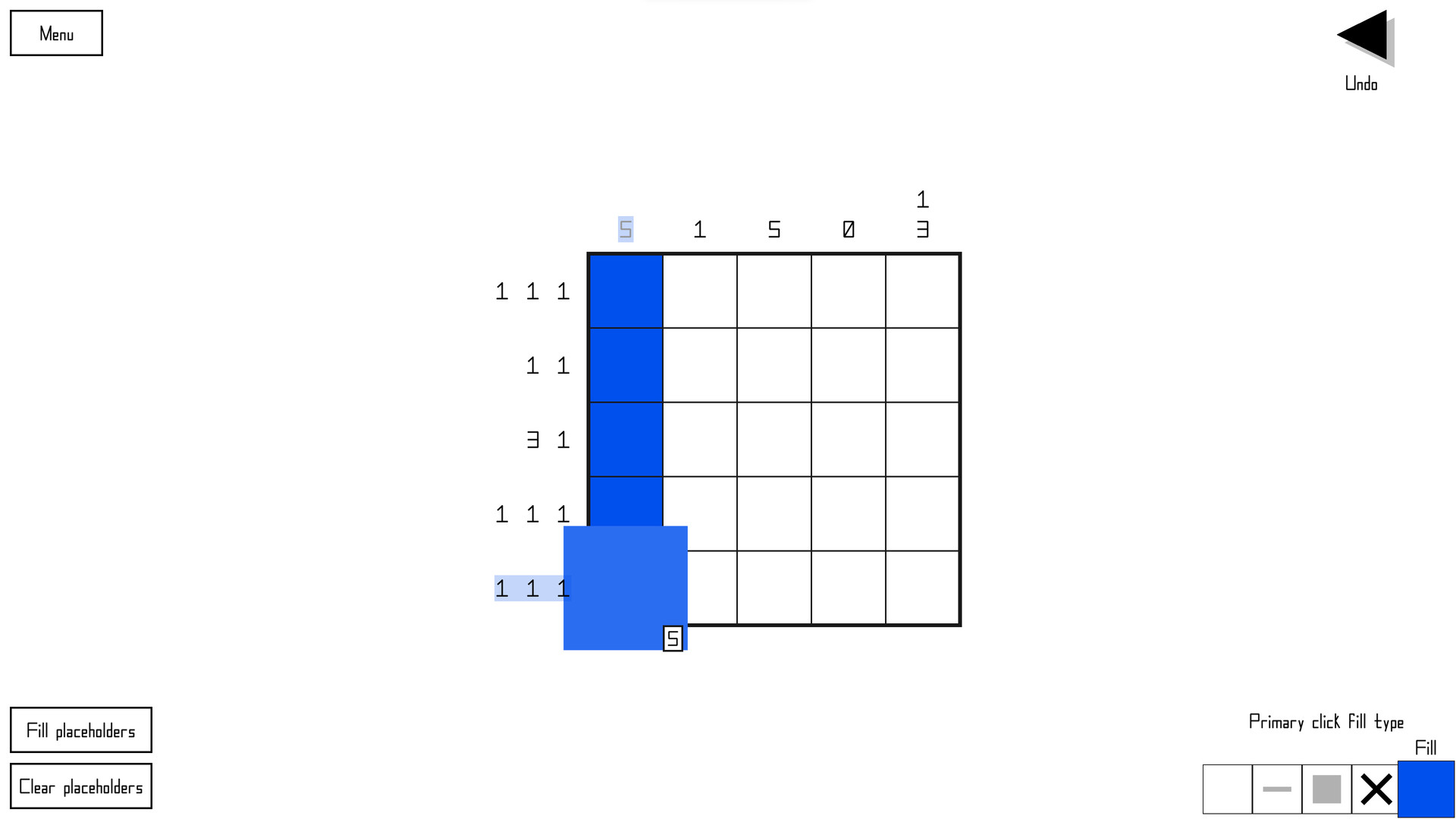
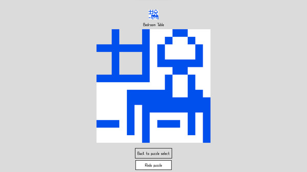
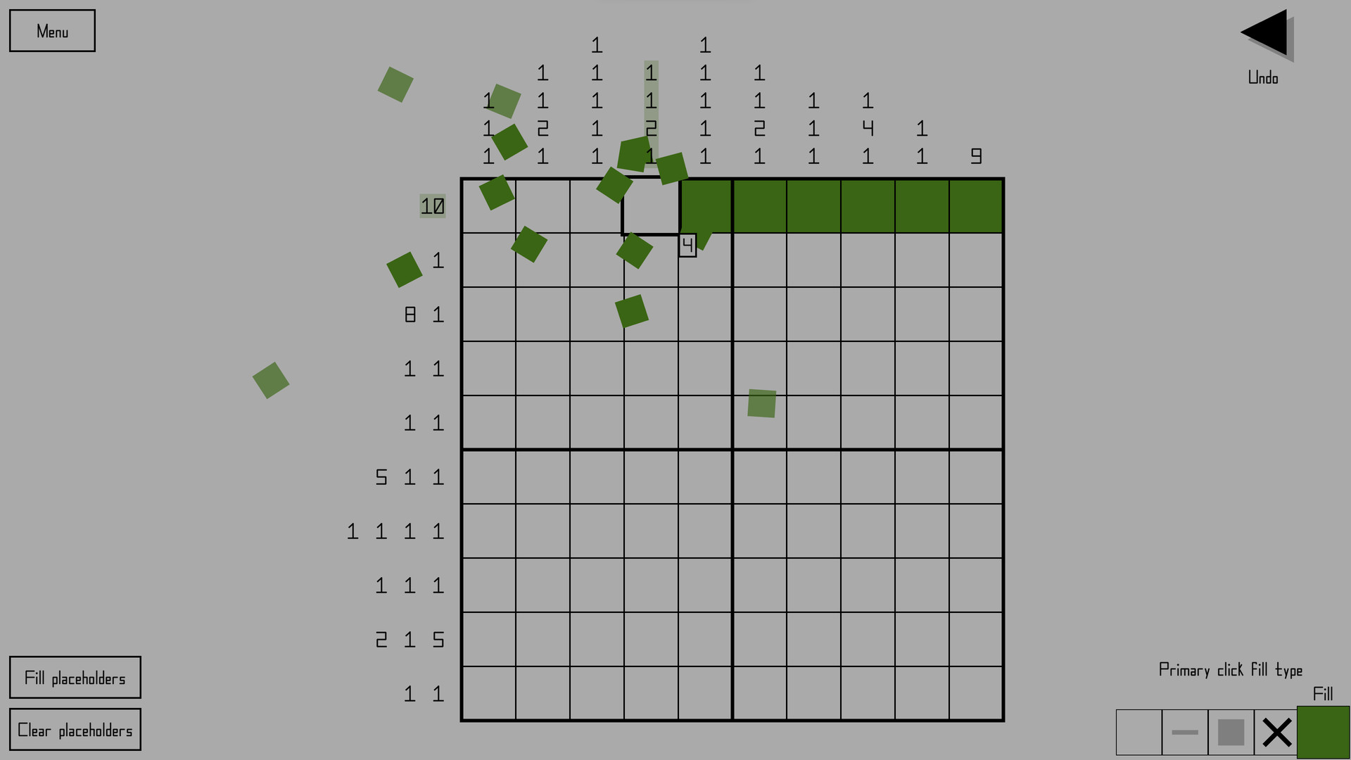
Each row and column of a nonogram has one or more number hints attached to it, and each number represents a contiguous group of filled in pixels. Using these hints, you can figure out which squares should be filled in and which ones should be blank, and thus fill in the puzzle one step at a time until it forms a complete image.
Features
- 200 hand-made nonograms to solve, ranging in size from 5 by 5 to 25 by 25 (plus 100 abstract puzzles, for a total of 300)
- Play randomly generated puzzles for endless gameplay
- Solve puzzles in any order
- Unlimited undo and redo
- Optional warning for when the puzzle is filled incorrectly
- Automatic mid-puzzle progress saving
- Tutorials and step-by-step puzzle solution examples
- Mouse, keyboard, and controller support
- Highly customizable
- Light, grey, and dark preset themes
- Selectable main color for each preset theme
- Custom theme editor
- Numerous gameplay and appearance options
- Full control remapping
- Supports up to 8K resolutions, as well as ultra-wide aspect ratios
- Arbitrarily high refresh rate support (240+)
- Chill electronic soundtrack
- Puzzle creation and sharing (via Workshop, clipboard, and file exporting)
Nonozle's color theme system and theme editor have been totally reworked.
Prior to this update, the game had three built-in themes and a hard limit of five custom themes that couldn't be renamed or shared. With 3.02.00, themes are now like puzzle packs: you can rename them, sign and export them, and add as many as you want.*
The five existing custom themes will be imported into the new system on first startup. But the theme you had selected as your current theme prior to 3.02.00 will not be recalled because the method of saving and recalling which theme is the current one has been changed.
Twelve new included themes
This update includes twelve new built-in themes. Click below to see previews of them.
[expand type=details]
Forest Green

Deep Sea Blue

Purple

Ice Blue

Orange

Light Blue

Computer Terminal

Green-blue

Rose


Black and White

White and Black

[/expand]
Additionally, the three original built-in themes (Light, Grey, and Dark) are still included but have been somewhat reworked.
Primary color differences
Prior to this update, you could choose from multiple different primary colors for the built-in themes Light, Grey, and Dark. But because of how the theme system has been reimagined, this is no longer the case. Each theme has just one primary color associated with it, and directly changing the primary color of a built-in theme is not possible. You can copy the theme to create your own version of it and thus change the primary color that way, but you would also likely want to change a few of the other colors that are often related to the primary color, such as the puzzle select button background and hint highlight colors, because those are now settable color types of their own instead of directly using and modifying the primary color. So the process is a bit more involved now.
Theme select
Instead of using a MultiOptionSelector to choose the current theme, there's a new screen (with a layout like that of the user puzzle pack lists) where you can scroll through the list of themes. From here you can pick the current theme, create a new theme or copy an existing theme, edit your own themes, and delete themes (except built-in ones). The items in the list use their respective theme's color instead of the current theme's colors as a quick preview, and all colors in the theme are shown in a row of color swatches.

Theme editor
The theme editor has been completely reworked. Instead of showing a list of the colors, color types are accessed by using a drop list. A preview of how the current theme looks is shown, and the screen being shown in the preview automatically changes to make sure that the currently selected color type is visible. You can see in real time how every color looks as you change it.

The color selector has been changed; instead of simply putting the red channel on the slider, the green channel on the x axis, and the blue channel on the y axis, the selector is now based on hue (slider), saturation (y axis), and value (x axis). This change makes finding and picking colors much more intuitive. Additionally, the granularity has been greatly increased, with 256 units along the x and y axis instead of 25, and 360 units along the hue slider, giving much more precise control over the colors you can pick. Because of this, directional movement with gamepad or keyboard on the color picker now has acceleration added to it.
The ability to copy and paste colors remains as before, including the ability to do so between themes.
Sharing themes
Custom themes can be exported and shared by directly sending the theme file (.THM) to someone else, who can then drop the theme into their Documents/Nonozle User Themes folder to have access to the theme in-game. Despite originally planning on it, I decided not to include Workshop theme sharing. I don't think the game's Workshop sees enough use for the extra effort to be worth it. But I'm willing to consider changing my mind if, like, more than one person requests it in the Steam forum. No promises though.
New color types, new color assignments
Several new color types have been added, and the colors of several elements in the game have been reassigned to different color types. The list of color types has also been reordered. Click below to learn more.
[expand type=details]
New color types
- "Button and credits background", which buttons and the credits screen now use as their background color instead of just using the "Background" type
- "Dots" color type, which page dots now use instead of the "Text" type they used before
- "Hint highlight" color type, which hint highlights now use instead of simply using the primary color with a lower opacity
[list] - Removed "Hint highlight opacity" as an option and concept in themes
Renamed color types
- Dropped "color" from the end of all color types
- "Main color" to "Primary"
- "Faded text color" to "Faded hint" to reflect its new singular purpose
- "Highlighted hint fade color" to "Faded hint (highlighted)"
- "Arrow and X button color" to "Arrow, X button, slider handle" to reflect its new use
- "Input color" to "Highlighted text" to reflect its varied uses
- "Five-line alt. color 1" to "Five-line alternate 1"
- "Five-line alt. color 2" to "Five-line alternate 2"
Color type reassignments
- The puzzle select button checkmark now uses "Primary" instead of "Puzzle title text"
- The slider UI element now uses "Border" for the bar and "Arrow, X button, slider handle" for the handle instead of using hard-coded grey colors that didn't change with the theme
- The outline around actionable row/column hints now uses "Text" instead of "Faded hint" for greater visibility
- The background color behind UI elements in the main menu now uses "Puzzle grid background" instead of "Background"
- "A game by HopefulToad" and the version number text now use the primary color instead of "Text"
- The icon box on the title screen now uses "Puzzle grid" instead of "Border", which is how it should have been in the first place
- The toggle square on toggle buttons now uses "Text" instead of "Primary" for maximum visibility regardless of the theme ("Text" will always be highly visible against "Button background" in a usable theme, but "Primary" might not be)
[list] - Additionally, the toggle no longer specifically changes color when it's disabled (other than the overall fade applied to the entire button)
[/expand]
New UI element: DropList
I created a new UI element specifically for the new theme editor: the DropList. Like the MultiOptionSelector (button with arrows on either side), its purpose is to pick one particular option among several. But instead of having to scroll through the options one at a time without being able to see them all at once, the DropList does exactly what it sounds like. When you click it, a drop-down (or up) list appears showing all the options at once, and you can then pick one.

Many of the options that used to be contained within MultiOptionSelectors are now in DropLists. Click below to see the list.
[expand type=details]
Square overwrite behavior
Border/outline color
Window mode
Horizontal resolution
Vertical resolution
Font
Filling animation
Removing animation
Puzzle solved animation
Title/menu track
[/expand]
The ones that have been left as MultiOptionSelectors are either because there's only two options for the setting or because the options are sequential in nature.
Puzzle layout changes
I reworked puzzle grid sizing and placement. Again. This should be the last time, though. The method of determining how to best fill up the screen space with the grid has been improved and greatly simplified. Specifics are somewhat out of scope for these patch notes, but if you're curious, drop a thread on the forum asking about it and I'll do my best to explain.
The "Puzzle incorrect" warning label's location has been moved to directly below the "Menu" button instead of directly below the puzzle grid, freeing up more vertical space for the puzzle.
A new setting has been added that changes the placement of the puzzle grid on the screen. The setting can be found at Settings > Puzzle > Puzzle appearance > Puzzle centering style. There are three options.
The first, Grid, tries to place the puzzle grid itself as much in the center of the screen as it can, ignoring hints except to the extent that it won't allow the hints to be offscreen or overlap other elements.
The second, Hints and grid, considers both hints and the grid as one whole to be centered as much as possible. Imagine a rectangle drawn around and encompassing all the hints plus the grid. This rectangle is what is centered (as much as it can be). This is the type of centering the game did prior to adding options.
The third, Golden mean, places the grid at a point exactly between the two other options as a sort of compromise. I've found that, to my eye, this one looks the best, and it is the default now.
The puzzle editor grid's positioning and placement has similarly been simplified and improved. It is now always centered horizontally, whereas before this update it could sometimes be horizontally off-center at some aspect ratios or resolutions. The above-mentioned option doesn't affect it as there are no hints to display in the editor.
Bug fixes
Click below for the list:
[expand type=details]
- Fixed rumble bugs
[list] - Fixed UI-movement type rumble occurring in puzzle pack selection, pack editor, and virtual keyboard screens even when it was toggled off.
- Removed an extra rumble on puzzle restart that shouldn't have been there
- Added back in the big rumble on puzzle solve which was mistakenly missing
[/expand]
During initial load, the game occasionally gets stuck waiting for a Workshop query to finish that never does. There's not much I can do about that on my end, unfortunately. However, this update adds code to time out the query if it takes too long; that way the game can finish loading instead of being stuck. But when that happens, some of the Workshop items will have failed to load, so the game shows a notification warning you about happened and recommending you restart the game to properly load the Workshop items.
Other miscellaneous changes
- "Extra 2," another puzzle track disabled by default, has been added into the game. It was a track I composed at the same time as the others but didn't initially include with the game.
- The game now remembers the most recent puzzle you had selected within a puzzle select scenario in-between sessions. For instance, if puzzle B-45 was the last selected puzzle in the original puzzle pack at the time you close the game, when you start the game again and go to the original puzzle pack, it will start with that puzzle selected still. The only exception to this is with puzzle packs by other users due to their dynamic nature. They will instead automatically navigate to the earliest as-yet-unsolved puzzle.
- The UI of the puzzle validation screen has been simplified. Instead of two separate buttons ("Skip solve animation" and "OK") where only one would be enabled at a time, there's now just one button that changes its text and function as neededit starts as "Skip solve animation" and changes to "OK" once you click it or once the animation has played out. Also, the back input now skips the solve animation and exits the validation screen, allowing you to intuitively mash either the select button or the back button when you're impatiently repeatedly tweaking a puzzle trying to get it to be solvable.
- A certain puzzle in the original puzzle pack has been renamed to "Ice Pops" because the prior name is actually trademarked and I'm scrupulous.
[list] - Once the DLC comes out, "Ice Pops" will have the honor of being the only puzzle title to be used twice among any of the puzzles I've published, though the two puzzles are not identical.
[hr][/hr]
DLC puzzles out soon!
I had 100 new puzzles I was planning to release in a DLC pack to coincide with this update. Unfortunately, it didn't occur to me that the DLC page would have to be reviewed by Valve before it could be made public, so it'll have to wait a bit.
[hr][/hr]
*Admittedly, I haven't tested how well the game handles having a thousand themes, but why would you want that many anyway?
Minimum Setup
- OS: Tested on Linux Mint 21.1 Cinnamon; should work on other distros too
- Processor: 64-bit processorMemory: 2 GB RAM
- Memory: 2 GB RAM
- Graphics: Integrated graphics works fine. For high resolution (8K). high frame rate (240 fps). and/or multi-sampling. a discrete GPU may be necessary.
- Storage: 137 MB available spaceAdditional Notes: The minimum resolution supported is 800 by 480. A 720p or higher monitor is recommended.
[ 6416 ]
[ 5771 ]
[ 1967 ]
[ 2356 ]
[ 713 ]
[ 1040 ]
[ 32813 ]
[ 859 ]
