What is SokoSolitaire?
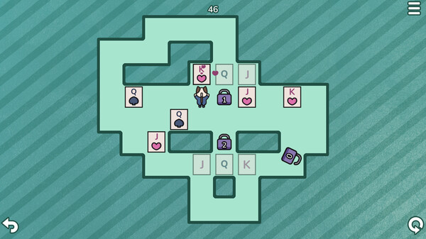
SokoSolitaire is a unique game combining the block-pushing Sokoban formula with Solitaire elements. Use your wits to navigate each level by pushing cards to their destination while stacking or flipping them along the way if necessary.
Push the cards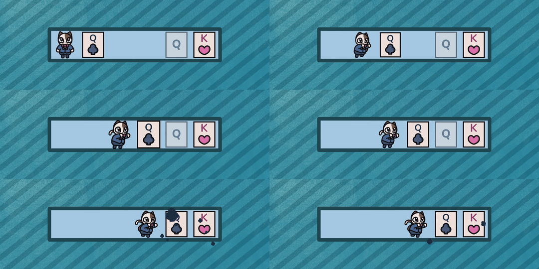
The goal of each level is to push all the cards to their destination.
Inspired by Solitaire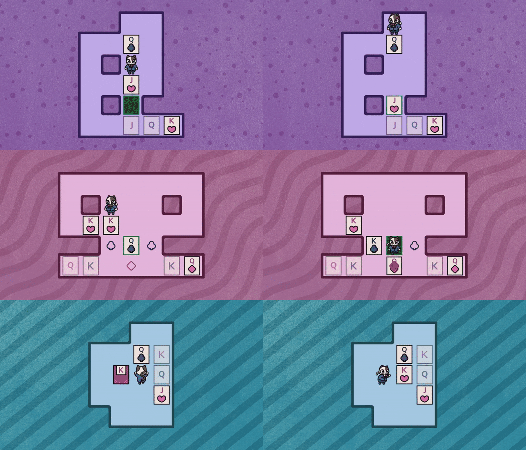
Overcome unique Solitaire inspired elements unseen in other puzzle games.
Stack your cards, flip them around, change their suit and more!

SokoSolitaire is a unique game combining the block-pushing Sokoban formula with Solitaire elements. Use your wits to navigate each level by pushing cards to their destination while stacking or flipping them along the way if necessary.
Push the cards

The goal of each level is to push all the cards to their destination.
Inspired by Solitaire

Overcome unique Solitaire inspired elements unseen in other puzzle games.
Stack your cards, flip them around, change their suit and more!

- 60 handcrafted levels
- Infinite undos
- Don't like a level you are playing? Skip it!
- Innovative and fresh combination of Sokoban and Solitaire.
- Colorblind mode - Trichromatic, Dichromatic and Monochromatic options.
Devlog 2#

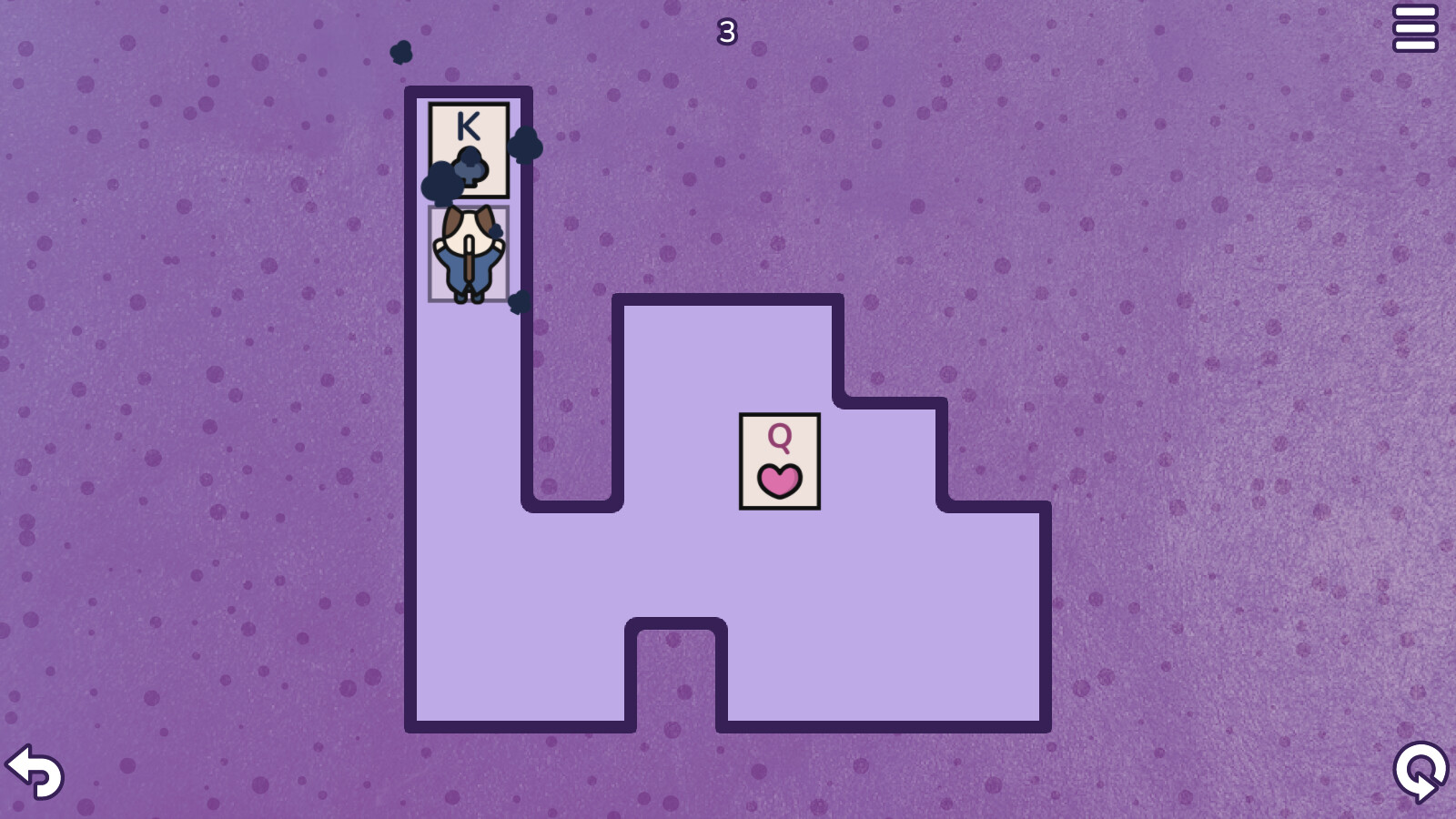
Here's what SokoSolitaire was originally supposed to look like. It's serviceable for sure and clean enough. You can easily see what is what and where it is in relation to other things. Clarity is a must for puzzle games. However, having Julieta on board for SokoChess spoiled me. I want my games to look better these days. I learned a lot by making 5 games but art is just something I cannot get a grasp of no matter what I try.

This is one of the concept arts I made, I was playing with the idea of changing color palette of the background and the main character's suit as you progress through the game.
Funnily enough the images above show off the more polished and better style I came up with, here's an image of what I was trying at first. No matter what I tried it just looked awful.

I seem to be better (although not good) at more abstract art styles, art that represents things rather than looking like them exactly. Going back to Sokobos, it's mostly just lines with spaces between them and a dominant black background, but I actually made it work. Funnily enough this made a lot of people compare the game to Baba Is You before release.

While working on SokoSolitaire, thinking all the art will be done by me, I felt very uneasy. I knew that the game's art is going to hurt the game, thankfully, I got lucky.
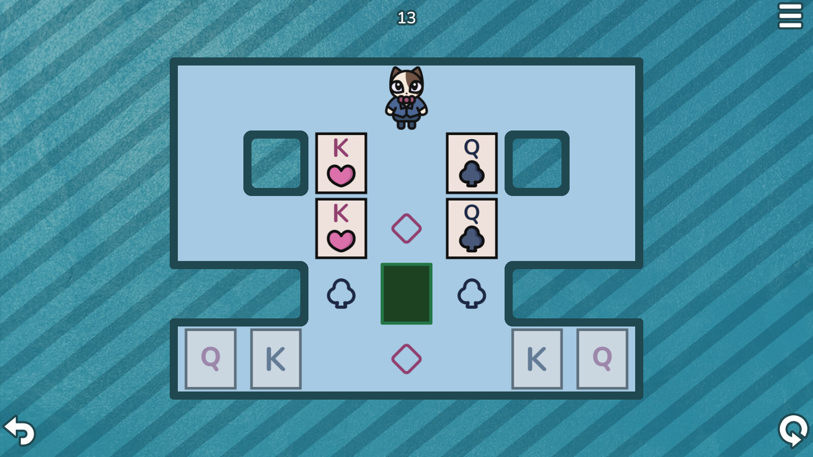
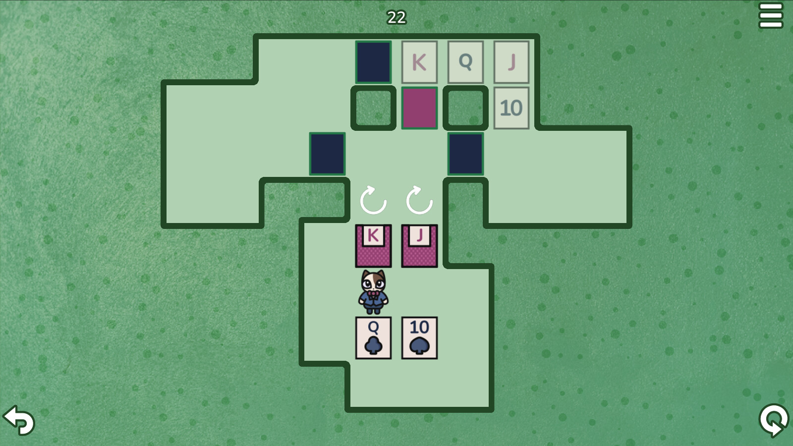
Very quickly I realized we will have to change the game's native resolution. Originally SokoSolitaire was designed for 1280x720 with each cell on the grid being 48x48. However, non-pixel art needs to be bigger due to its more complicated composition and things such as anti-aliasing or outlines. After some experimenting on my part, I decided to increase the native resolution to 1600x900 and each cell was increased to 72x72. This was not done for SokoChess because the levels in it aren't as large as in SokoSolitaire.

It took us a while to make things look like what you see on the image above. We were struggling with the size of the cards for example. How big should they be? They shouldn't be too large so things don't look too noisy when many cards are close to each other, but they should be large enough so they are easily readable, remember, clarity matters. We also had to worry about their scale compared to our protagonist Mr. Cat! Another issue was finding the right outline thickness or as we on the internet say - THICCness.
What is great about Pixel art is that pixels are precise, there's no anti-aliasing and if you zoom in, the pixels just become larger and everything looks fine. However, in SokoSolitaire Mr. Cat art was exported into 72x72 resolution. Normally it looks fine, but if you zoom in, it becomes blurry as you can see the anti-alliasing artefacts and as a result it looks ugly and makes the whole game feel unpolished.
I had no idea what causes this as this was never an issue for me before. Googling didn't help, maybe because it's such an obvious thing to other people nobody ever asks about it, maybe I wrote the question wrong or maybe it's because Google is mostly useless now because it's filled with ads these days. Perhaps it's a combination of all of the previously mentioned reasons.
So I reached out to a friend of mine who has been an artist for over a decade, he knows so much about art of all kinds; traditional, digital, miniature painting, if you can name it, he has done it. I don't know what Mipmaps are exactly nor how they work, I just know they were the key to solving this issue.
Here's how we fixed it. We exported the images as 576x576 instead of 72x72. When I was importing them to Godot I used the Mipmaps setting (which does something magical I quite don't understand) and then the sprite is down scaled to 0.125 size so it fits flawlessly into the 72x72 cell. Thanks to this if you zoom in, it's not blurry! You can see which image is originally 72x72 and which 576x576 on the image below.

For example, I'd like to include different images for Mr. Cat based on what he is doing. I want different graphics for just moving or moving while pushing. I think it would be neat to include some short, cute animation when you beat a level. I am also thinking of animating the background, nothing too flashy and distracting, maybe parts of the background can slowly move, stretch or something similar along those lines.
Sometimes we also come back to an existing art and then remake it. For example, Mr. Cat now has more cat-like eyes and we also made his outlines thinner so you can see more of his suit! Of course, we will be also adding a tail.

All kind of ideas come and go as you develop a game, so we'll see what more we change and put in.

Thanks for making it this far! Let us know in the comments how you like SokoSolitaire's look so far. Is there anything you think we should add?
Today I'll talk about what the game looked like before Julieta jumped on board as an artist, what it looks like now and what I'd like to improve before the release!
5 games later and I am still awful at art
If you're familiar with my game Sokobos, you might disagree with this statement, but with Sokobos I got lucky. I made an appealing and stylish art style that was manageable even for me, however it took many attempts, consultation with friends and luck to come up with it.
Here's what SokoSolitaire was originally supposed to look like. It's serviceable for sure and clean enough. You can easily see what is what and where it is in relation to other things. Clarity is a must for puzzle games. However, having Julieta on board for SokoChess spoiled me. I want my games to look better these days. I learned a lot by making 5 games but art is just something I cannot get a grasp of no matter what I try.

This is one of the concept arts I made, I was playing with the idea of changing color palette of the background and the main character's suit as you progress through the game.
Funnily enough the images above show off the more polished and better style I came up with, here's an image of what I was trying at first. No matter what I tried it just looked awful.

I seem to be better (although not good) at more abstract art styles, art that represents things rather than looking like them exactly. Going back to Sokobos, it's mostly just lines with spaces between them and a dominant black background, but I actually made it work. Funnily enough this made a lot of people compare the game to Baba Is You before release.

The truth about judging a book by its cover
After releasing 5 games on Steam, each having banner and game art of various quality from awful to good, I can confirm that people do indeed judge books and games by their cover. This reflects in impressions resulting in more store page visits, wishlists and even sales. You may know that my goal for 2023 is to become a full time game developer, so as much as I enjoy and love (not I love pizza kind of love, but actually love love) making games, I have to worry about things such as if people will want to buy the game and how much money it will make as a result.While working on SokoSolitaire, thinking all the art will be done by me, I felt very uneasy. I knew that the game's art is going to hurt the game, thankfully, I got lucky.
Julieta saves the day!
You may not be familiar with Julieta, but if you saw SokoChess or SokoSolitaire before, you know her art. Thankfully for me and SokoSolitaire, she ended up having time to design and make the art for it.Very quickly I realized we will have to change the game's native resolution. Originally SokoSolitaire was designed for 1280x720 with each cell on the grid being 48x48. However, non-pixel art needs to be bigger due to its more complicated composition and things such as anti-aliasing or outlines. After some experimenting on my part, I decided to increase the native resolution to 1600x900 and each cell was increased to 72x72. This was not done for SokoChess because the levels in it aren't as large as in SokoSolitaire.

It took us a while to make things look like what you see on the image above. We were struggling with the size of the cards for example. How big should they be? They shouldn't be too large so things don't look too noisy when many cards are close to each other, but they should be large enough so they are easily readable, remember, clarity matters. We also had to worry about their scale compared to our protagonist Mr. Cat! Another issue was finding the right outline thickness or as we on the internet say - THICCness.
Great, now let's change all the graphics again
Due to the increased resolution from 1280x720 to 1600x900, we ended up having a lot of empty space in smaller levels, so much that it actually ended up being distracting. I thought I'd solve it just like in Sokobos by zooming the camera in, well, that shed light on a whole new issue.What is great about Pixel art is that pixels are precise, there's no anti-aliasing and if you zoom in, the pixels just become larger and everything looks fine. However, in SokoSolitaire Mr. Cat art was exported into 72x72 resolution. Normally it looks fine, but if you zoom in, it becomes blurry as you can see the anti-alliasing artefacts and as a result it looks ugly and makes the whole game feel unpolished.
I had no idea what causes this as this was never an issue for me before. Googling didn't help, maybe because it's such an obvious thing to other people nobody ever asks about it, maybe I wrote the question wrong or maybe it's because Google is mostly useless now because it's filled with ads these days. Perhaps it's a combination of all of the previously mentioned reasons.
So I reached out to a friend of mine who has been an artist for over a decade, he knows so much about art of all kinds; traditional, digital, miniature painting, if you can name it, he has done it. I don't know what Mipmaps are exactly nor how they work, I just know they were the key to solving this issue.
Here's how we fixed it. We exported the images as 576x576 instead of 72x72. When I was importing them to Godot I used the Mipmaps setting (which does something magical I quite don't understand) and then the sprite is down scaled to 0.125 size so it fits flawlessly into the 72x72 cell. Thanks to this if you zoom in, it's not blurry! You can see which image is originally 72x72 and which 576x576 on the image below.

What's next
I'm happy with how SokoSolitaire is looking right now, Julieta did a great job and the game looks even better than SokoChess. Personally, I'd like to add few more touches.For example, I'd like to include different images for Mr. Cat based on what he is doing. I want different graphics for just moving or moving while pushing. I think it would be neat to include some short, cute animation when you beat a level. I am also thinking of animating the background, nothing too flashy and distracting, maybe parts of the background can slowly move, stretch or something similar along those lines.
Sometimes we also come back to an existing art and then remake it. For example, Mr. Cat now has more cat-like eyes and we also made his outlines thinner so you can see more of his suit! Of course, we will be also adding a tail.

All kind of ideas come and go as you develop a game, so we'll see what more we change and put in.
Farewell, for now
So that's where we are as of right now. Before I say good bye, I'd like to leave you with a final version of the banner art, we just couldn't help ourselves and we had to add Mr. Cat on it!
Thanks for making it this far! Let us know in the comments how you like SokoSolitaire's look so far. Is there anything you think we should add?
[ 2023-04-07 15:40:54 CET ] [Original Post]
Minimum Setup
- OS: Any distribution
- Processor: Requires a 64-bit processor and operating system
- Graphics: Support for OpenGL 3.3
Recommended Setup
- OS: Any distribution
- Processor: Requires a 64-bit processor and operating system
- Graphics: Support for OpenGL 3.3
GAMEBILLET
[ 6425 ]
FANATICAL
[ 5899 ]
GAMERSGATE
[ 1587 ]
MacGameStore
[ 2438 ]
INDIEGALA
[ 482 ]
FANATICAL BUNDLES
GMG BUNDLES
HUMBLE BUNDLES
INDIEGALA BUNDLES
by buying games/dlcs from affiliate links you are supporting tuxDB
