Nightmares - all children see them sometimes. But what if in provincial Russia there are kids so harsh they can defeat the vile creatures from dreams?
Three simple Slavic kids - Boris, Dora and Joseph - turned out to be daredevils. Why them of all? It’s unclear, because in real life they have only three things in common. These children were born in the region of the Kursk magnetic anomaly, always obeyed their parents and they did not eat pork.
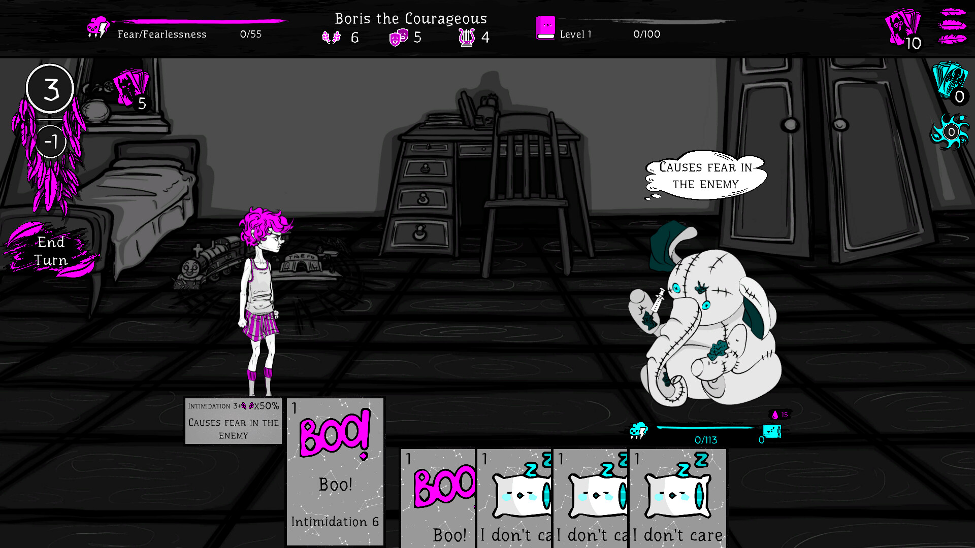
3) Collect a deck of cards to strengthen the child, to make enemies whine instead of him/her;
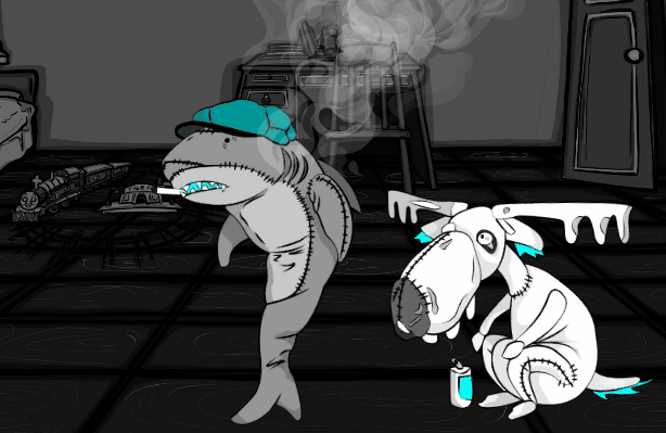
4) Defeating monsters (there will be many, many monsters) including such dangerous ones as the Beer-drinking elk and the Smoker shark;
5) Make important game decisions - do something or do nothing.
2) Quirky-looking hand-drawn graphics. Just whenever, whenever;
3) Leveling the hero’s characteristics that affect the strength of the cards;
4) Jokes (at least attempt at jokes);
Three simple Slavic kids - Boris, Dora and Joseph - turned out to be daredevils. Why them of all? It’s unclear, because in real life they have only three things in common. These children were born in the region of the Kursk magnetic anomaly, always obeyed their parents and they did not eat pork.
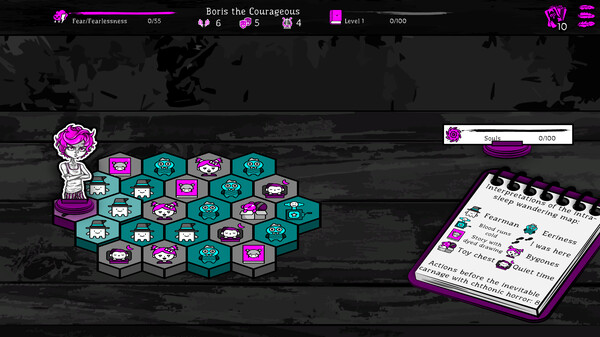
In this card roguelike you can do the same as in every other:
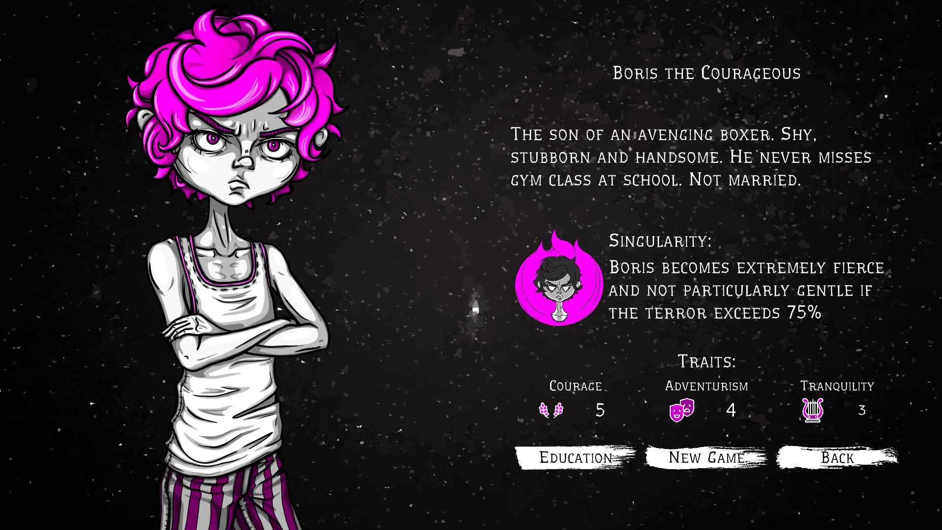
1) Play as one of three characters with different characteristics:- Boris the Brave. The boy's greatest dream is following his father’s example and become a boxer, but for now, monsters of his dreams are the only defeated opponents;
- Dora the Adventurer. Dora likes to talk, repeating the same phrases. She wants to become a traveler. In the meantime, she finds adventures only in her head;
- Calm Joseph. He enjoys playing the ukulele and being smart, but no one cares. Joseph plans to distribute political propaganda in order to putting garbage in people’s heads, but the only current listeners are the corpses of the murdered enemies in dreams.
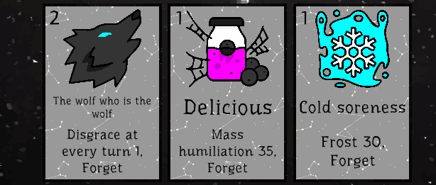
3) Collect a deck of cards to strengthen the child, to make enemies whine instead of him/her;
4) Defeating monsters (there will be many, many monsters) including such dangerous ones as the Beer-drinking elk and the Smoker shark;
5) Make important game decisions - do something or do nothing.
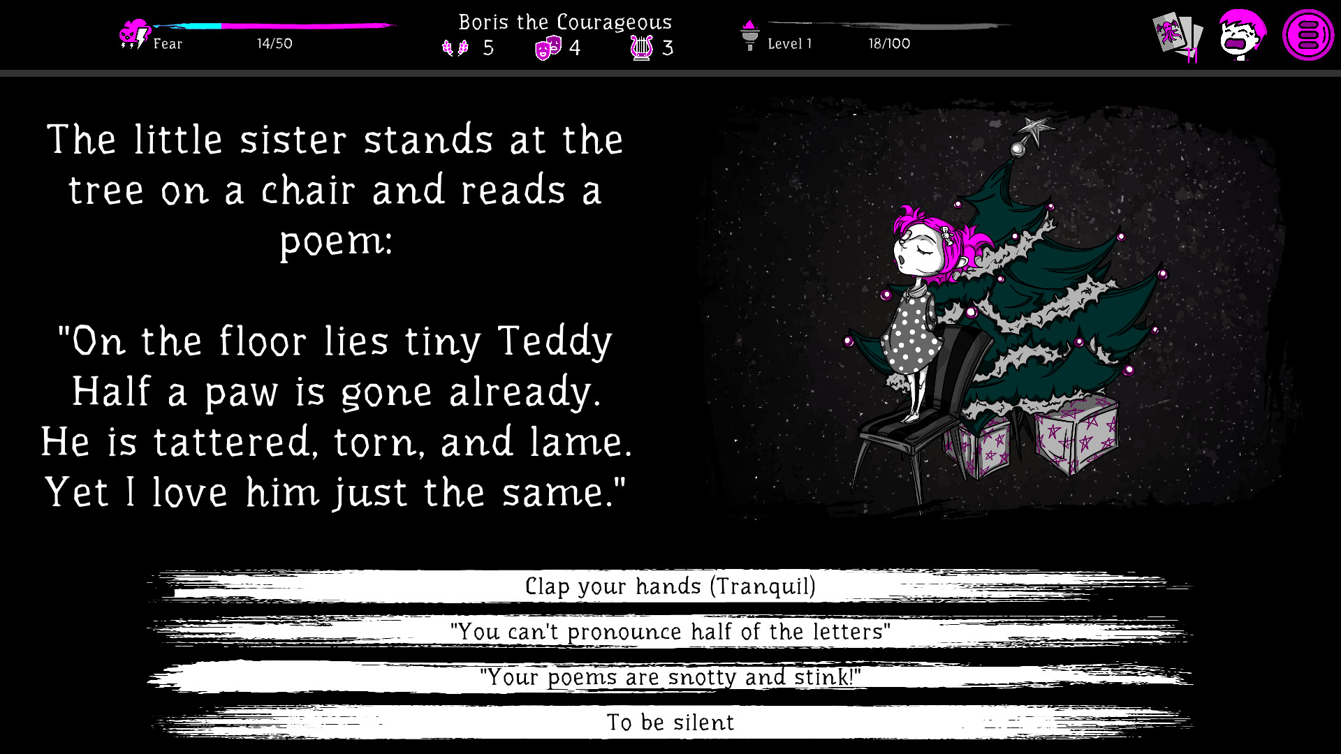
Also you can find something that, perhaps, is not present in other roguelikes:
1) Manga series that change the character's mechanics (not always for the better), for the great sin of humanity - calling them comics;2) Quirky-looking hand-drawn graphics. Just whenever, whenever;
3) Leveling the hero’s characteristics that affect the strength of the cards;
4) Jokes (at least attempt at jokes);
The best way to support game development is add it to Wishlist.
Dev blog #2 The main character Boris or "How to do everything ten times."
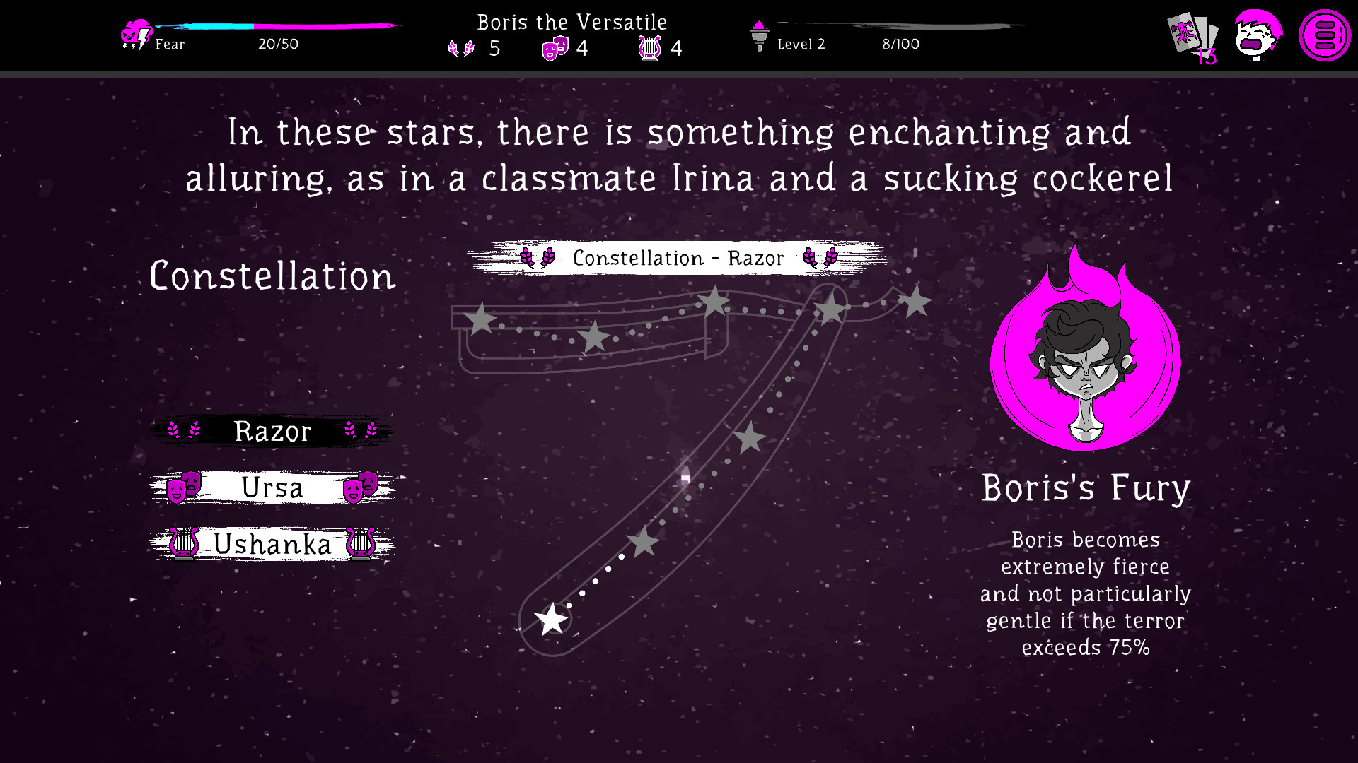
Also, the introduced magenta and cyan colors have become anchored to objects in order to clearly separate characters and different types of cards.
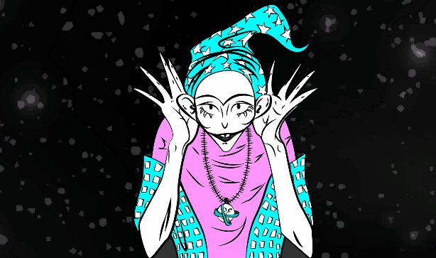
The further the development went, the further the idea developed: instead of banal monsters and ghosts, preference was given to toys, fairy tales and other things that surrounded children. The idea came up to ridicule the society of adults, making the enemies vicious and unprepossessing (lame, anxious, drinking, using drugs, suffering from obesity). Against this background, Boris, who was originally drawn with the proportions of illustrations from old Soviet books, became as alien as possible to the general play style, and a completely new Boris 2.0 appeared. More angry and furious. Skinny, sinewy, but strong as snail teeth.
 |  |
| Boris | Inspiration for Boris |
First idea of play style: more dark to the dark god.
The original idea was to make the game completely black and white. A kind of hybrid of Soviet magazines and drawings by John Kenn Mortensen. But huge problems arose with the interface - the visibility of descriptions, indicators, icons. It all merged together. |  |
| One of John Kenn Mortensen's drawings | Sketch of the first monster for the game |
The emergence of color, Boris on the style.
With different colors, the hero and enemies have become more contrasting, and the interface elements are more noticeable. Two complementary colors were chosen - magenta and cyan. They came to the developer's mind from the clips of the artists of the Trap genre, which he was actively looking at that moment in his life. |  |
Boris | Lil Peep is the most popular member of the Trap genre |
Vector or I dont want to make animation for 5 years.
And here, for some inexplicable reason, the drawing became annoying, which, moreover, put sticks in the wheels regarding animation, since working with raster graphics is quite difficult, editing, splitting into layers and deformation took a lot of time. The preference has gone to the direction of vector graphics.\Also, the introduced magenta and cyan colors have become anchored to objects in order to clearly separate characters and different types of cards.
 |  |
| Boris | One of the backgrounds of that time, which will not be in the game (copied from a painting by Salvador Dali) |
The idea of a child's sleep. Boris is final.
The further the development went, the further the idea developed: instead of banal monsters and ghosts, preference was given to toys, fairy tales and other things that surrounded children. The idea came up to ridicule the society of adults, making the enemies vicious and unprepossessing (lame, anxious, drinking, using drugs, suffering from obesity). Against this background, Boris, who was originally drawn with the proportions of illustrations from old Soviet books, became as alien as possible to the general play style, and a completely new Boris 2.0 appeared. More angry and furious. Skinny, sinewy, but strong as snail teeth.
 |  |
Boris 2.0 in red | Mouse |
[ 2022-05-16 09:12:09 CET ] [Original Post]
GAMEBILLET
[ 6381 ]
FANATICAL
[ 5873 ]
GAMERSGATE
[ 750 ]
MacGameStore
[ 1993 ]
INDIEGALA
[ 878 ]
FANATICAL BUNDLES

Time left:
356102 days, 8 hours, 26 minutes
Time left:
356102 days, 8 hours, 26 minutes
Time left:
6 days, 16 hours, 26 minutes

Time left:
34 days, 16 hours, 26 minutes

Time left:
37 days, 16 hours, 26 minutes

Time left:
38 days, 16 hours, 26 minutes
GMG BUNDLES
Time left:
12 days, 2 hours, 26 minutes
HUMBLE BUNDLES
Time left:
0 days, 10 hours, 26 minutes
Time left:
7 days, 10 hours, 26 minutes
Time left:
13 days, 10 hours, 26 minutes
Time left:
14 days, 10 hours, 26 minutes
Time left:
19 days, 10 hours, 26 minutes
Time left:
25 days, 10 hours, 26 minutes
INDIEGALA BUNDLES
Time left:
4 days, 23 hours, 41 minutes
Time left:
9 days, 16 hours, 27 minutes
Time left:
11 days, 15 hours, 27 minutes
Time left:
16 days, 22 hours, 37 minutes
by buying games/dlcs from affiliate links you are supporting tuxDB


