
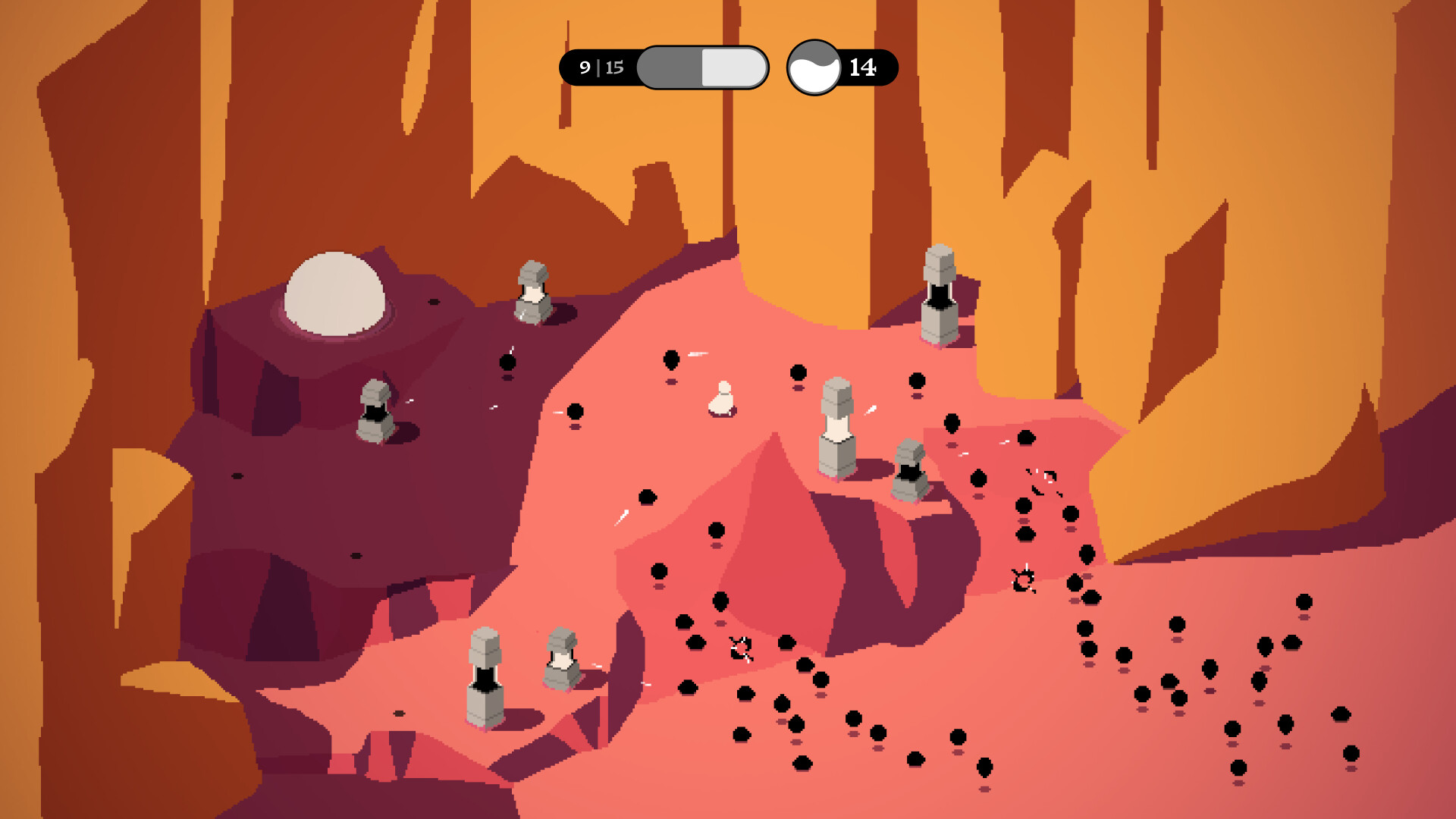
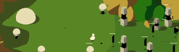
As with most tower defense games, enemies in Rift Riff come in waves and you summon various towers to stop them from reaching and destroying your basecamp.

So what's the deal with the rifts? Rifts in spacetime fling you from one atmospheric world to another. While you summon towers and extract energy from each world to create a rift to bring you home (hopefully, probably, maybe) its inhabitants spawn to sabotage your escape.

Features
- The whole game with updates and everything (?)
- Some amount of levels (??)
- Multiple hours of gameplay (?!?)
- Many many towers and enemies (?!???!)
- Upgrades, Skill Trees, Challenges, Modifiers, Replayability... we have no idea either!
- If it wasn't clear enough: we don't know precisely (yet) what'll be in the game. We'll announce things as we go right here on Steam, so uhhh... wishlist and find out?!
Made by…
Rift Riff is being made by game designer Adriaan de Jongh (best known for the indie hit Hidden Folks), graphic designer Sim Kaart, and music composer and sound designer Matthijs Koster. Rift Riff is made using the open source game engine Godot.🕹️ Partial Controller Support
🎮 Full Controller Support
- [0 B]
Hey! We gave the UI some love. We decided it should live in hi res space instead of pixel land, because we want to be able to use normal fonts (legibility of pixel fonts is meehh) and 'cause it ended up actually looking better!

We redesigned the icons that represent the towers to be more intuitive.

Costs are now shown in numbers instead of dots.. which was somewhat impractical.

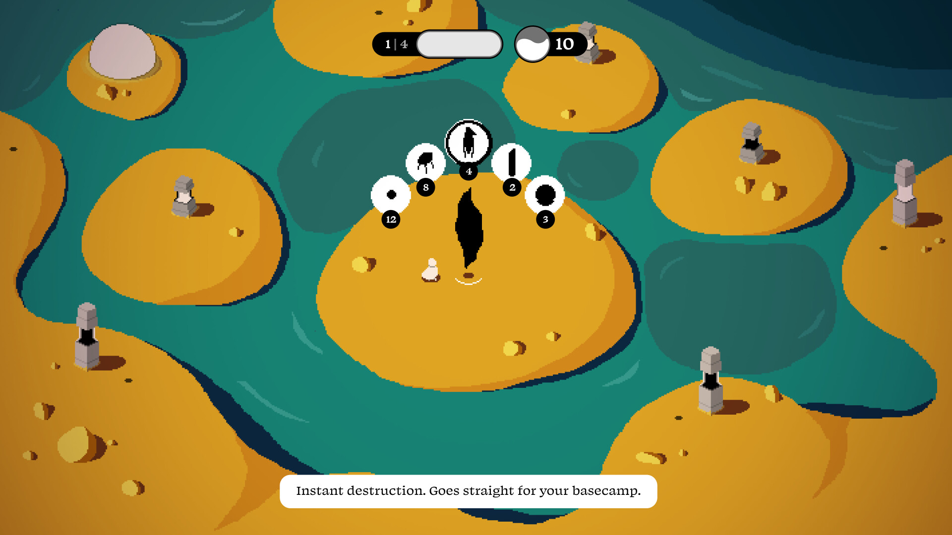
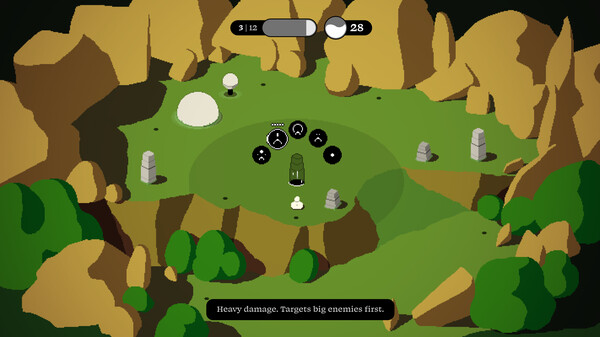
We added a 'spawn point inspector' so that you can now make informed decisions.

And the upgrade icons got a small overhaul after the feedback we've received on the previous ones.

We also simplified the HUD. Left is an icon indicating what's going in the world (here, it show enemies are currently spawning) the number in the middle is the amount of resources coming your way, and the number to the right is the amount of resources currently available.

Next up is making an over-world/level selector with the ability to configure your experience (i.e. choose tower setup, challenges, unlock things, et cetera).
Bye!
Minimum Setup
- OS: Linux distribution released after 2016
- Processor: x86_32 CPU with SSE2 instructions. x86_64 CPU. ARMv7 or ARMv8 CPUMemory: 4 GB RAM
- Memory: 4 GB RAM
- Graphics: Integrated graphics with full Vulkan 1.0 support
- Storage: 300 MB available space
Recommended Setup
- OS: Linux distribution released after 2020
- Processor: x86_32 CPU with SSE2 instructions. x86_64 CPU. ARMv7 or ARMv8 CPUMemory: 8 GB RAM
- Graphics: Dedicated graphics with full Vulkan 1.2 support
- Storage: 300 MB available space
[ 6365 ]
[ 6407 ]
[ 3185 ]
[ 2507 ]
[ 1655 ]
[ 1040 ]


[ 32822 ]


[ 882 ]
[ 45587 ]
[ 6040 ]

Time left:
356091 days, 15 hours, 39 minutes

Time left:
356091 days, 15 hours, 39 minutes

Time left:
23 days, 23 hours, 39 minutes

Time left:
26 days, 23 hours, 39 minutes

Time left:
27 days, 23 hours, 39 minutes

Time left:
49 days, 15 hours, 38 minutes

Time left:
29 days, 23 hours, 39 minutes

Time left:
1 days, 9 hours, 39 minutes
Time left:
2 days, 17 hours, 39 minutes
Time left:
3 days, 17 hours, 39 minutes
Time left:
8 days, 17 hours, 39 minutes
Time left:
10 days, 17 hours, 39 minutes
Time left:
14 days, 17 hours, 39 minutes
Time left:
15 days, 17 hours, 39 minutes
Time left:
15 days, 17 hours, 39 minutes
Time left:
17 days, 17 hours, 39 minutes

Time left:
1 days, 4 hours, 40 minutes

Time left:
3 days, 4 hours, 40 minutes
Time left:
6 days, 5 hours, 50 minutes

Time left:
15 days, 2 hours, 41 minutes


