
The Spatials are back on a new adventure!
The Spatials: Galactology is The Spatials reimagined as a deeper, more rewarding simulation game. With mod support and active pause, Galactology adds new items and structures to build, trade routes to exploit, planets with many new variables, sophisticated AI, civilizations that actually attack your station -- and unique gameplay systems behind every object and room.
Key Features
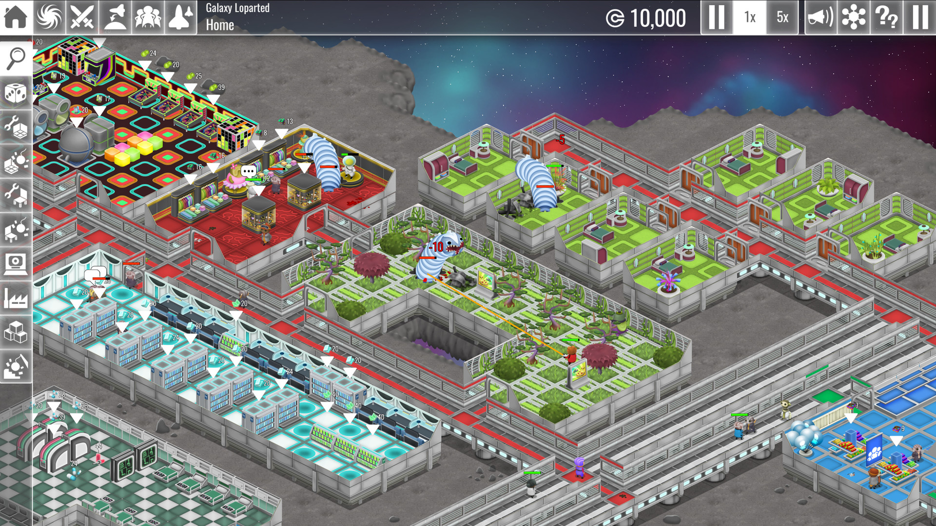
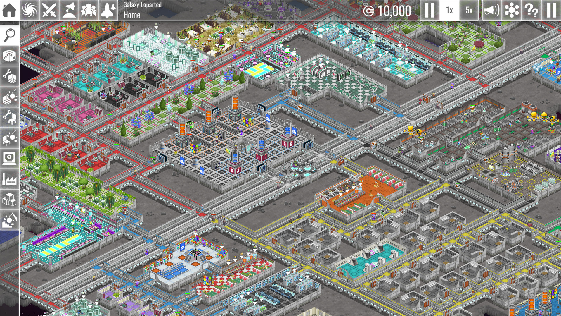
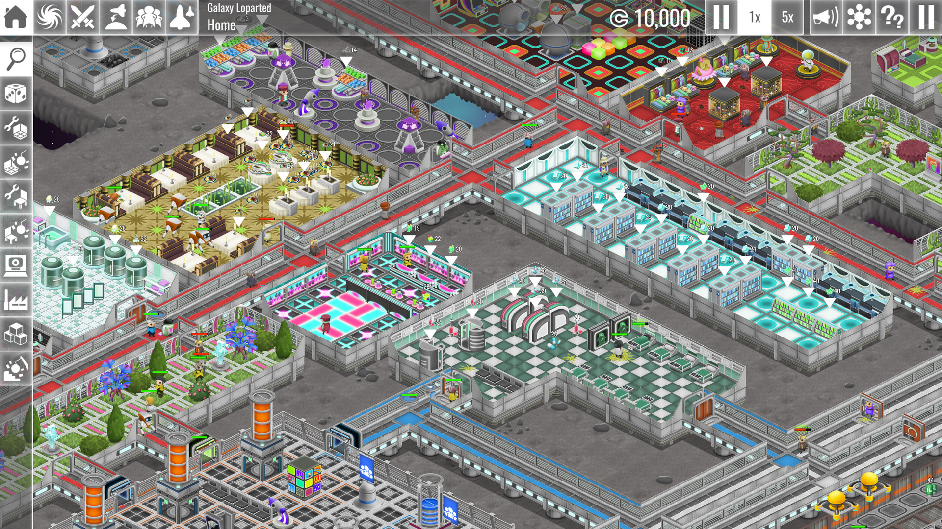
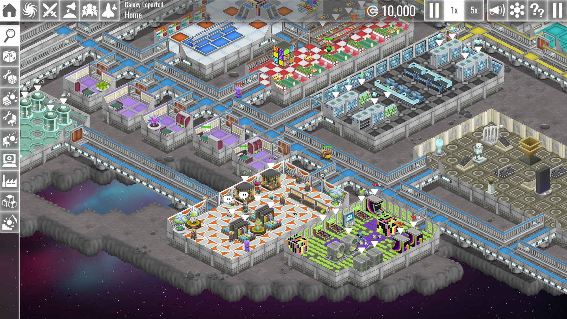
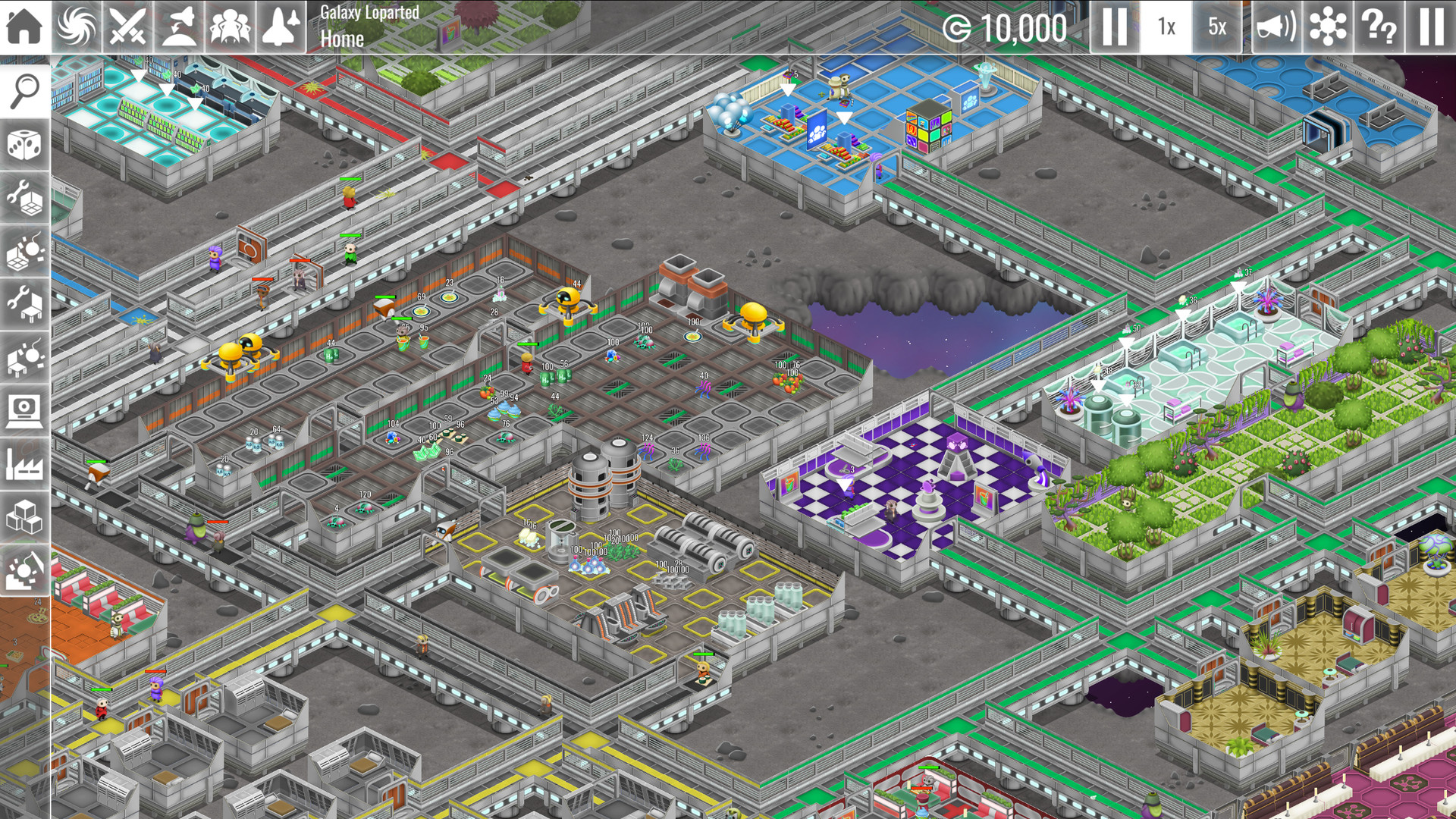
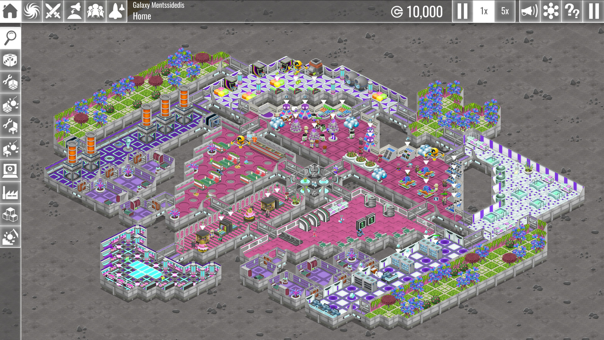
- Design a space station and watch your crew as they build it in real time
- More freedom for your designs: use any room with any objects, color the floor tiles as you wish
- Reinforce your space station with new buildings, management decisions, and staff
- Assemble robots to assist with station chores
- Explore a detailed simulation with many systems to play with -- including manufacturing, research, healthcare, disease, emotional breakdowns, combat, hunger, thirst, cleaning, decay, security, FIRE!, and more
- Handle complex logistics, requiring restocking and inventory control
- Earn in-game cash by growing your space station’s hospitality business
- Designate staff for your bar or your research lab
- Visitors and officers have a mind of their own. Make sure their needs are met!
- Build hospitals to care for the wounded and diseased
- Secure your station with cameras, scanners and turrets
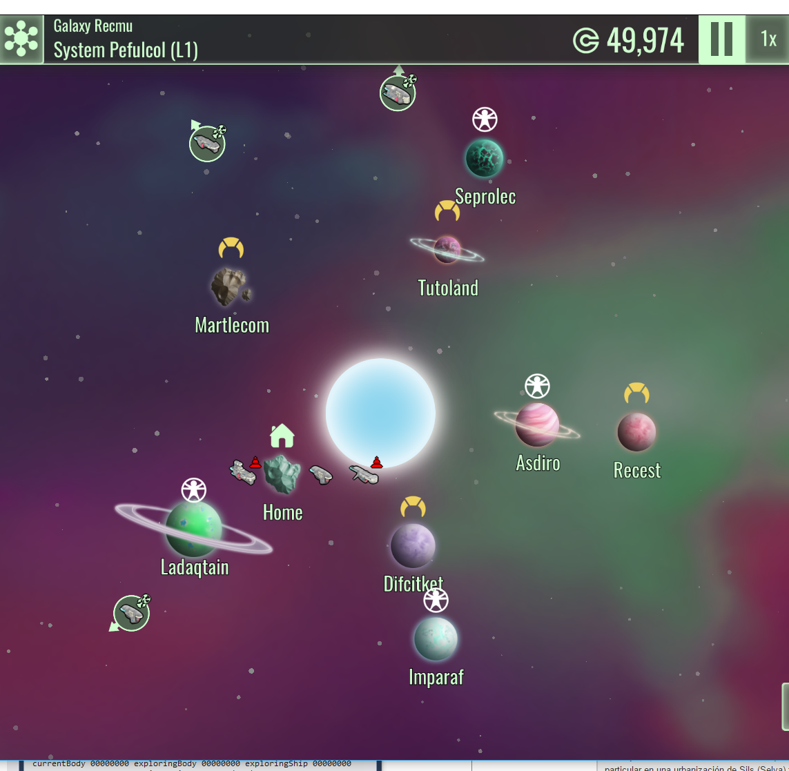
- A randomly-generated galaxy with 100+ planets
- Build spaceships and explore the galaxy
- Explore the surface of planets and asteroids
- Engage in real-time combat to forge alliances and make new enemies
- Find natural resources, civilizations and ancient ruins
- Establish trade routes with your allies
- Develop and download gameplay mods from the Steam Workshop
- And more, much more is coming!
About Weird and Wry
Weird and Wry is a Barcelona game development studio founded in 2014 by two brothers: Carlos and Max Carrasco. Carlos (a programmer) and Max (an artist) share a love for simulation games and classic play -- which heavily influenced The Spatials, their first project. Inspired by the great classic sim games of the '90s, The Spatials combined classic base-building gameplay (based on isometric tile room building) with a real-time combat system and an exploration campaign. The Spatials was released on Steam in March 2015 and took off! Thanks to its success and growing fan base, The Spatials spawned a sequel -- The Spatials: Galactology, which updates the original concept with deeper gameplay and a whole new take on the space station management business.
Development update 2016-09-15
A major eye sore in the galaxy screen is the ship panel or toolbar, located in the lower left area. It also has UX issues, with duplicating the ship avatars and being a limit to how many ships can be in your fleet unless some complicated scrolling is introduced. But not anymore!
The new fleet display concept is "ship bubbles". In the zoomed out galaxy nothing has changed. It will still display all the ships next to their current system or en-route in a wormhole. But the zoomed in system view now displays far away ships in a circle around the planet orbits, in the same overall direction the ship is relative to the star system. This new visualization also has automatic layout code to handle ships in the same system or close to each other:
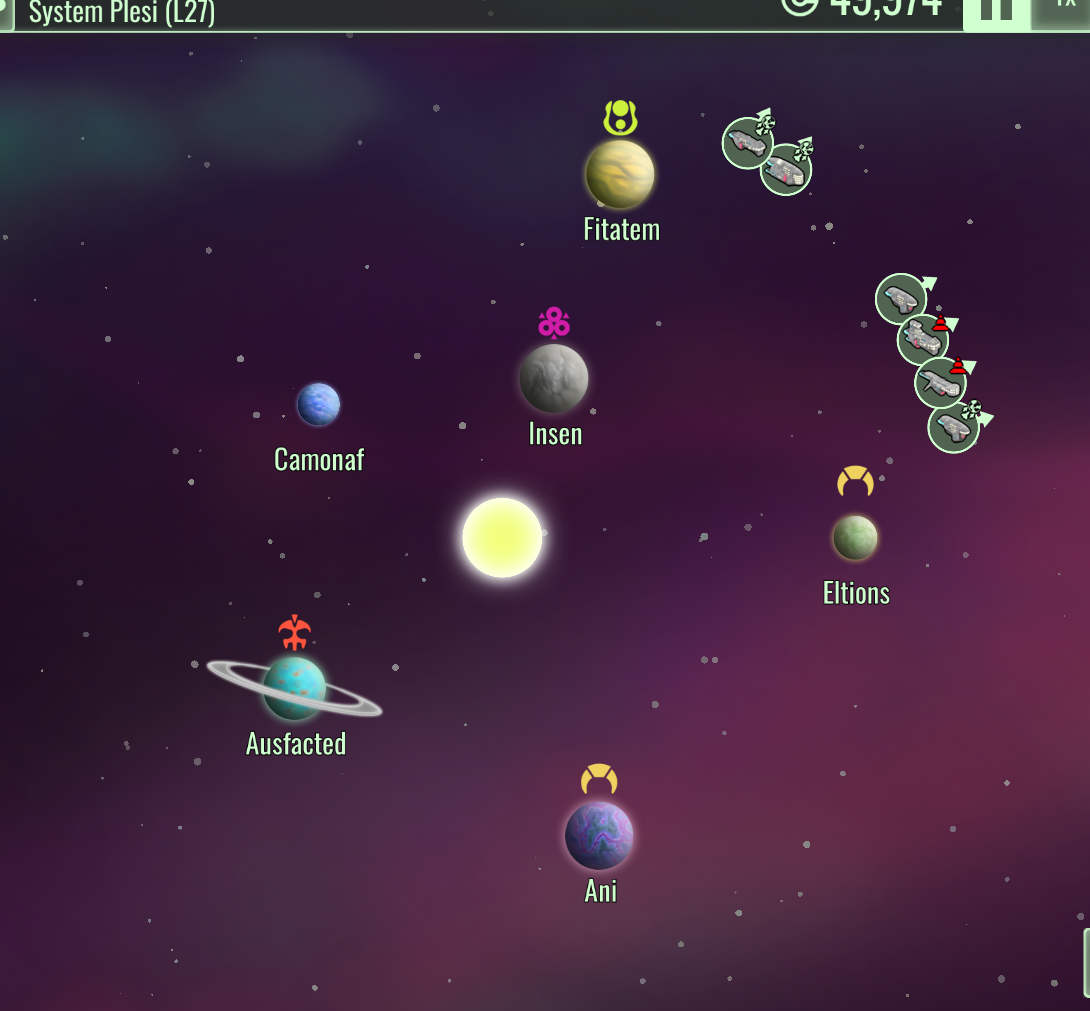
This is a practical and more usable solution to the problems posed by a static toolbar, and is flexible enough to also support NPC ships in the future. Finally, to make the screen even cleaner, a new mode that displays only the galactic bodies and ships has been added:
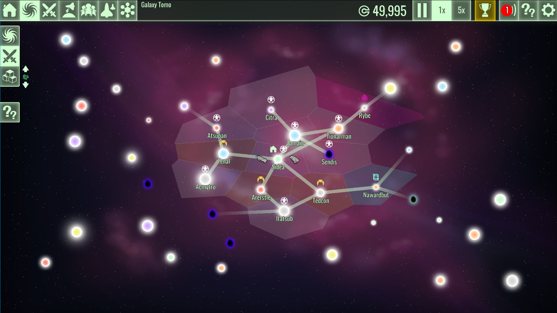
Civs are now distributed in clusters, and own the entire system. This radically simplifies the civ structure in the galaxy and feels a lot more natural. To support this a new visualization mode has been added to display the extents of civs domains over the star systems you've discovered:
Robots will now have a new idle system that compels them to patrol much further than they currently do. This is still compatible with the patrol point, so you can combine both for optimal patrolling behavior.
The big item for 3.3 is revamped map interaction and combat, plus the initial implementation of skills. Work has been started in this area with the interaction revamp. Now right click is devoted for giving direct walking orders (by popular demand, no more walk key!), and when the target area has multiple options, a neat popup menu is displayed:

It's easy to go overboard with this and start adding too many things to the context menu, so special care will be taken to only add options where it makes sense. In particular actions that have a subject-verb-object structure are prime candidates, as in the example ownership action. Combat actions will be better served by the dedicate action bar, which has been improved to display key bindings when they exist:

After launching v3.2 we went back to triaging small and medium improvements to start the v3.3 series. Here's the work in this area for the past week.
New fleet visualization in galaxy screen: "ship bubbles"
A major eye sore in the galaxy screen is the ship panel or toolbar, located in the lower left area. It also has UX issues, with duplicating the ship avatars and being a limit to how many ships can be in your fleet unless some complicated scrolling is introduced. But not anymore!
The new fleet display concept is "ship bubbles". In the zoomed out galaxy nothing has changed. It will still display all the ships next to their current system or en-route in a wormhole. But the zoomed in system view now displays far away ships in a circle around the planet orbits, in the same overall direction the ship is relative to the star system. This new visualization also has automatic layout code to handle ships in the same system or close to each other:
This is a practical and more usable solution to the problems posed by a static toolbar, and is flexible enough to also support NPC ships in the future. Finally, to make the screen even cleaner, a new mode that displays only the galactic bodies and ships has been added:
Civ clustering and influence areas
Civs are now distributed in clusters, and own the entire system. This radically simplifies the civ structure in the galaxy and feels a lot more natural. To support this a new visualization mode has been added to display the extents of civs domains over the star systems you've discovered:
Random patrols for robots
Robots will now have a new idle system that compels them to patrol much further than they currently do. This is still compatible with the patrol point, so you can combine both for optimal patrolling behavior.
Ongoing work: map interaction revamp
The big item for 3.3 is revamped map interaction and combat, plus the initial implementation of skills. Work has been started in this area with the interaction revamp. Now right click is devoted for giving direct walking orders (by popular demand, no more walk key!), and when the target area has multiple options, a neat popup menu is displayed:
It's easy to go overboard with this and start adding too many things to the context menu, so special care will be taken to only add options where it makes sense. In particular actions that have a subject-verb-object structure are prime candidates, as in the example ownership action. Combat actions will be better served by the dedicate action bar, which has been improved to display key bindings when they exist:
[ 2016-09-15 15:33:20 CET ] [Original Post]
Minimum Setup
- OS: Ubuntu 14.04 64 bit
- Processor: 1.3 Ghz or higher (64 bit only!)Memory: 4096 MB RAM
- Memory: 4096 MB RAM
- Graphics: Intel HD 3000+ / AMD Radeon HD 4000+ / NVIDIA GeForce GT 200+
- Storage: 300 MB available spaceAdditional Notes: Requires stable OpenGL 3.2 drivers with GLSL support

GAMEBILLET
[ 6313 ]
FANATICAL
[ 5946 ]
GAMERSGATE
[ 1933 ]
MacGameStore
[ 2282 ]
FANATICAL BUNDLES

Time left:
356104 days, 1 hours, 16 minutes

Time left:
356104 days, 1 hours, 16 minutes

Time left:
8 days, 9 hours, 16 minutes

Time left:
36 days, 9 hours, 16 minutes

Time left:
39 days, 9 hours, 16 minutes

Time left:
40 days, 9 hours, 16 minutes
GMG BUNDLES

Time left:
13 days, 19 hours, 16 minutes
HUMBLE BUNDLES
Time left:
1 days, 3 hours, 16 minutes
Time left:
2 days, 3 hours, 16 minutes
Time left:
9 days, 3 hours, 16 minutes
Time left:
15 days, 3 hours, 16 minutes
Time left:
16 days, 3 hours, 16 minutes
Time left:
21 days, 3 hours, 16 minutes
Time left:
27 days, 3 hours, 16 minutes
by buying games/dlcs from affiliate links you are supporting tuxDB


