
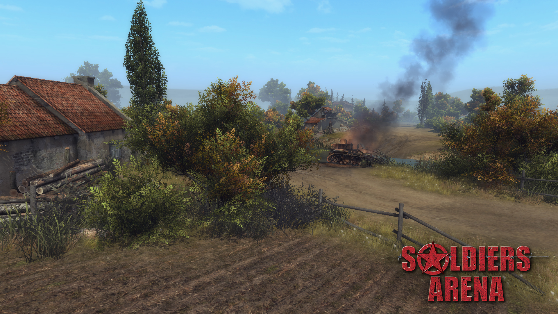
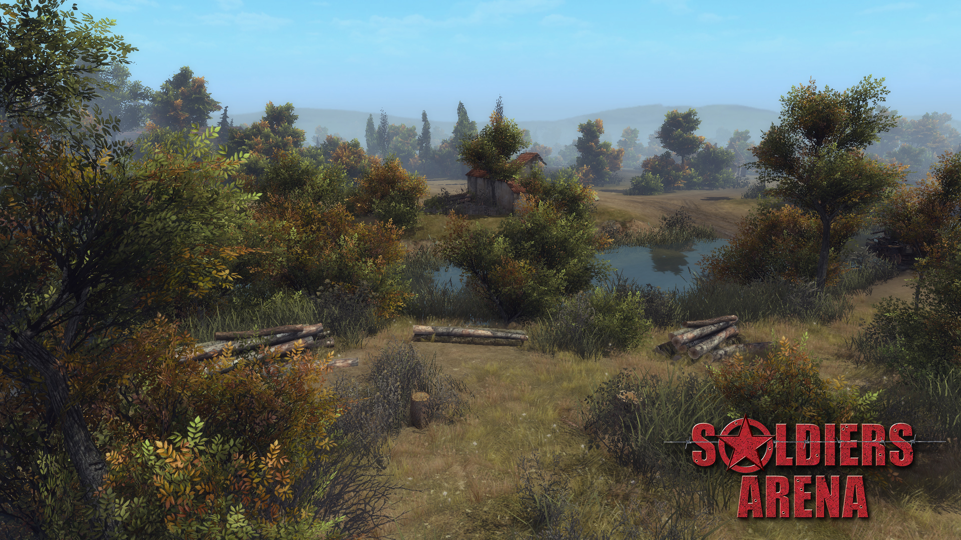
Both new and already battle-proven multiplayer gamemodes to the original tactical gameplay are waiting for you. Interactive destructible environments and the ability to direct-control any combat unit. Steam support: matchmaking, workshop, steamcloud. Redesigned graphics, models and special effects. Conceptual new interface and convenient control, new battlefields and new opportunities.
Features:
- Revival of the “Men of War/Soldiers” game series. This multiplayer tactical RTS absorbed the best of the original series, favourite of players all over the world.
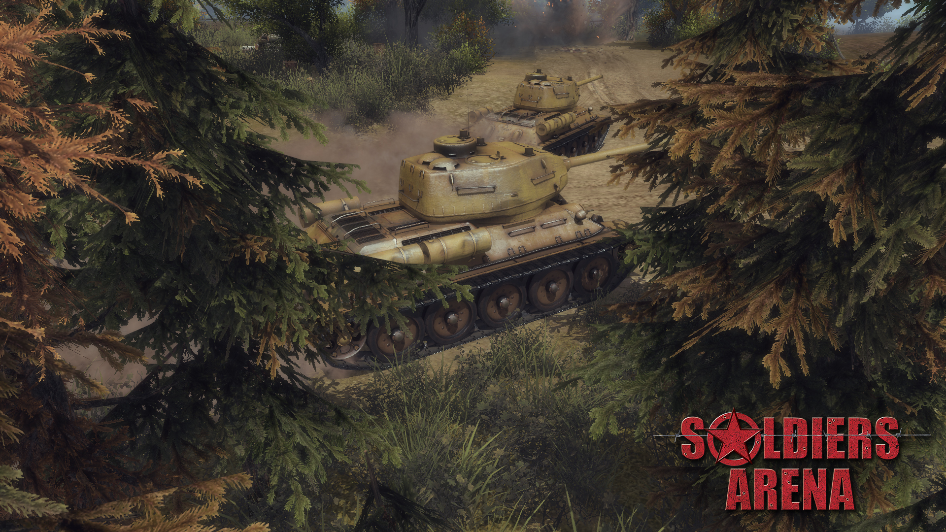
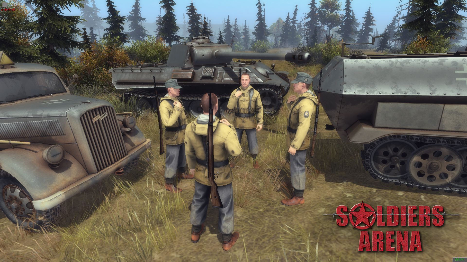
- Huge roster of units. Within a single game session, players will have access to a large number of unique units for every nation: tanks, vehicles, infantry and artillery of various types.
- The “Direct Control” mode. This mode provides the ability to play from the third person for any unit in the player’s army. The movement of the unit, firing the various guns, control of ammunition types, etc. all relying and directly controlled by player and thus the game conveys tactical action in it’s very essence.
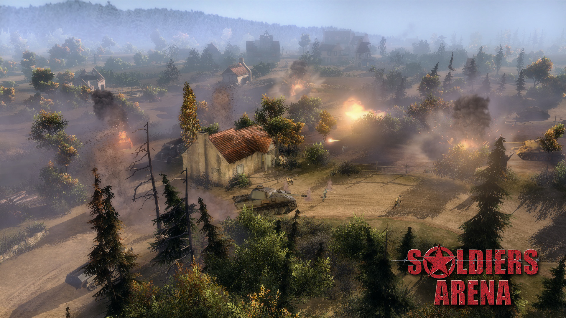
- Destructible interactive environments. During the battle almost any object of the game can be destroyed or set on fire. Furthermore, all objects, including craters from explosions, may be used as cover.
- Atmosphere and realism. Even in large-scale game battles, it is necessary to take into account factors such as the supply of fuel and ammunition of each single unit. The precense of inventories for each unit limits the number and size of transported objects. Guns’ accuracy and penetration decreases with distance. Tired soldiers reduce the movement speed during long crossings. The influence of these and many other factors makes possible to reproduce the battles of World War II with a adequate degree of realism, most involving the player into the atmosphere of heated battles of the past.
- Modular realistic damage system. Any vehicle, regardless of its type, is composed of a set of modules that can be broken or destroyed. Types of ammunition, characteristics of guns, shooting distance, angle of armor, armor plate thickness and the threshold of material fatigue are taken into account, when calculating the piercing capability and damage caused to each of the component. Additionally, there are calculations of the probability of detonation of ammunition, engine fires, damage to wheels or tracks (which leads to immobilization of combat units). If a component is not destroyed, it can be repaired.
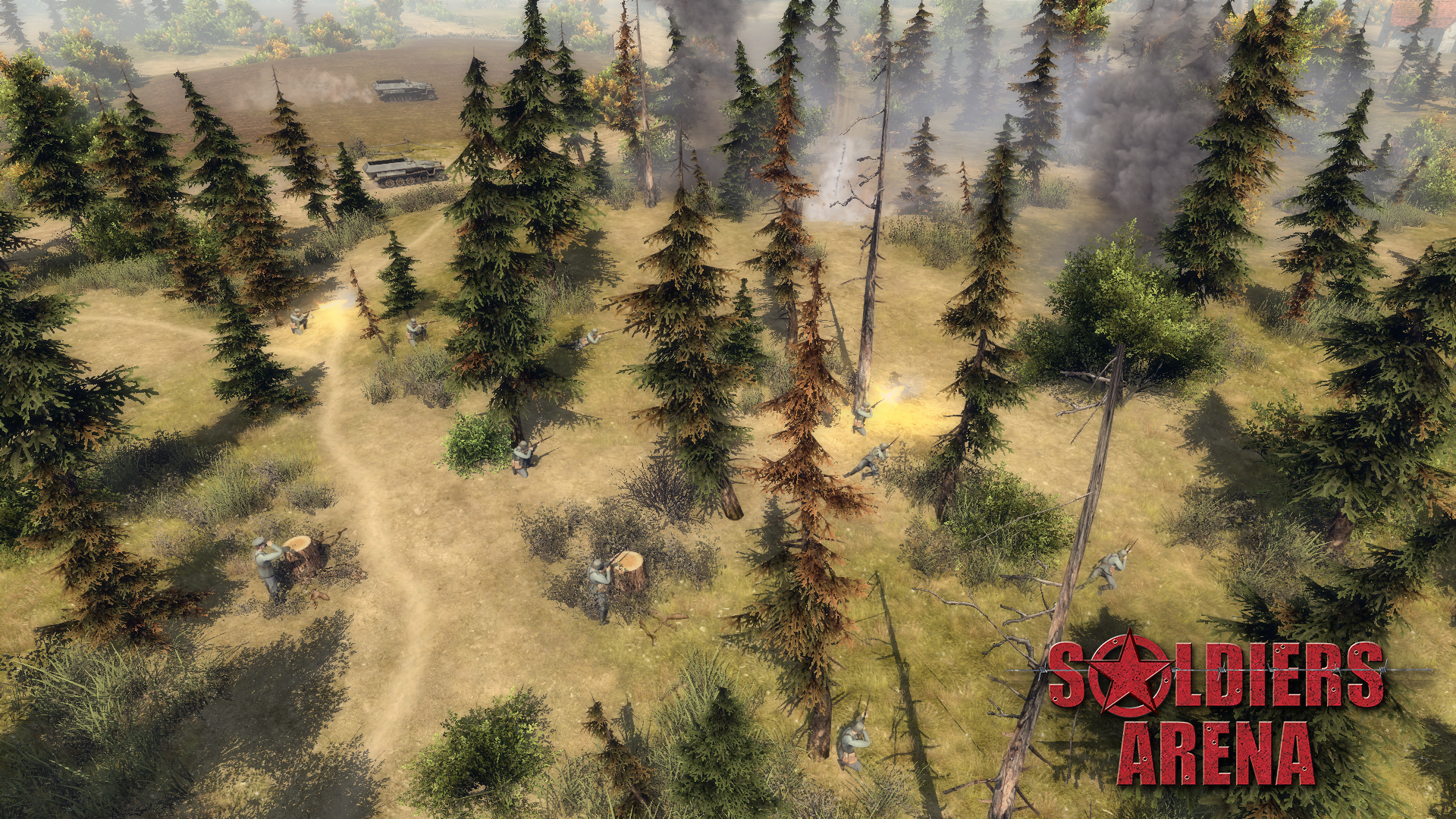
- Wide range of opportunities for infantry. Intelligence, combat, capture and repair of equipment, installation of anti-personnel and anti-tank obstacules of different types, construction of protective structures, health treatment, cover usage, ability to change through primary and secondary weapons, capture of buildings and territories.
- Great number of different types of weapons and ammunition. Pistols, submachine guns, machine guns, rifles and carbines, various types of grenades, dynamite, mines, knives and other items of equipment that are unique to each nation.
- Advanced Artificial Intelligence (Advanced AI). Infantry’s behaviour based on the feedback information from their own sensors (vision and acoustics), as well as allies’ signals. This allows the use of diversionary tactics, sending scouts into the enemy's rear, as well as to open the visibility with the help of special devices - observation towers, binoculars, telescopic tubes and sniper scopes. The morale of the infantry depends on the balance of forces on the battlefield - the soldiers may decide to advance or to withdraw from the fight.
- Conceptual new interface for convenient control.
- Enhanced game engine Gem2. Reworking of the game engine allows to provide a new level of graphics, the implementation of new and improvement already familiar to users game mechanics.
- OSX, Mac. Linux support.
- Full Steam support. Matchmaking, workshop, steamcloud, tradecards, achievments, steamstats, inventoryitems.
Hello friends. Today we are launching a series of Soldiers: Arena diaries, devoted to the changes in the interface. For a start, we will talk about its general concept.
It's no secret that in the “Men of War” series of games, a lot of players complained about the cumbersome interface, that looked like a fighter jet cockpit. He covered a large part of the game space, and frightened off beginners just at the first sight. The new interface concept makes it possible to solve all these problems by adding more convenience to the players in the management and hiding the elements, which unnecessary at the moment.
So, when creating this concept, we proceeded from the following five principles:
The interface must be understandable to the user on a subconscious level. Therefore it is necessary to get rid of or change all non obvious elements.
It is necessary to minimize the interface, while not limiting the convenience of its use.
The user should be able to customize the interface for himself to manage the game as comfortable as possible for him.
With all of this interface must be informative. Player must have an opportunity to assess the situation on the battlefield and take the necessary decisions with a cursory glance. To do this, he must understand the conditions, limitations and capabilities of his units (all this had to be kept in mind before).
Player needs to respond quickly to changing situations, so he needs a quick access to all currently commands.
So interface in Soldiers: Arena are looking like this now [img] http://bestway.com.ua/images/projects/Soldiers-Arena/screenshorts/soldiers_dev2016-03-1721-13-30-248.png[/img] (it is worth noting that the graphics part of the interface is not final).
In future issues we will explain in detail about all the innovations of the interface due to the chosen concept. It is obvious that at first everything new and unusual is viewed with suspicion. But we are confident that, ultimately, you will like the result.
Minimum Setup
- OS: Ubuntu 12.04
- Processor: 2 GHz Intel Dual CoreMemory: 4 GB RAM
- Memory: 4 GB RAM
- Graphics: 3D Hardware Accelerator Card Required - OpenGL 3.0 compatibleNetwork: Broadband Internet connection
- Storage: 5 GB available space
Recommended Setup
- OS: Ubuntu 15.04
- Processor: Intel Core i5-2.5GHzMemory: 8 GB RAM
- Graphics: NVIDIA GeForce GTX 560 or AMD Radeon HD 7750 with 1 GB VRAM or betterNetwork: Broadband Internet connection
- Storage: 5 GB available space
[ 6377 ]
[ 5887 ]
[ 750 ]
[ 1993 ]
[ 570 ]

Time left:
356102 days, 15 hours, 1 minutes
Time left:
356102 days, 15 hours, 1 minutes
Time left:
6 days, 23 hours, 1 minutes

Time left:
34 days, 23 hours, 1 minutes

Time left:
37 days, 23 hours, 1 minutes

Time left:
38 days, 23 hours, 1 minutes

Time left:
12 days, 9 hours, 1 minutes
Time left:
0 days, 17 hours, 1 minutes
Time left:
7 days, 17 hours, 1 minutes
Time left:
13 days, 17 hours, 1 minutes
Time left:
14 days, 17 hours, 1 minutes
Time left:
19 days, 17 hours, 1 minutes
Time left:
25 days, 17 hours, 1 minutes
Time left:
2 days, 3 hours, 1 minutes
Time left:
9 days, 23 hours, 2 minutes

Time left:
11 days, 22 hours, 2 minutes
Time left:
17 days, 5 hours, 12 minutes


