Luckless Seven is the story of Mark Vesco’s coming of age. Once an inspired youngster, Mark finds himself living a listless, dutiful existence just two years out of high school. When a group of old friends contacts Mark about reuniting with them, the stars align to allow him to join his old friends in a nationwide competitive tournament.
Take control of Mark as he and six friends set out to compete in Arithia’s most popular game, Ekosi. This fast and fun card game is inspired by KOTOR’s Pazaak, and the stakes couldn’t be higher. With a little experience, money, and luck, take Mark from a modest amateur to an Ekosi champion!
Which card to play won’t be the only difficult choice for Mark, though. Along his journey, Mark will have to make several decisions that will challenge him morally, ethically, and socially. More than just a card game, Luckless Seven invites you to take control of the whole person. Who will Mark be on his quest for glory?

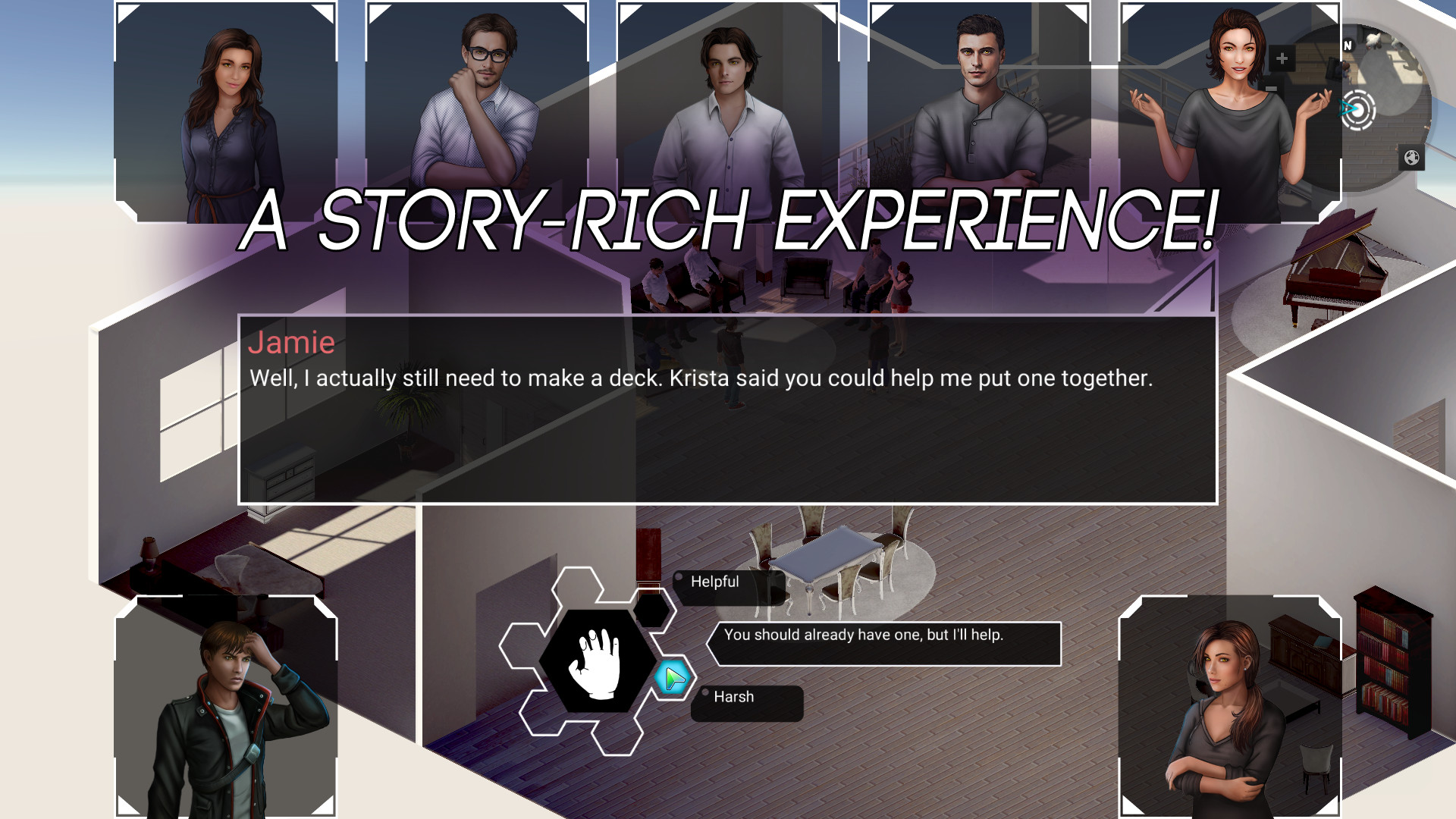
- A story-rich experience that uses choice to explore identity formation and social relationships.
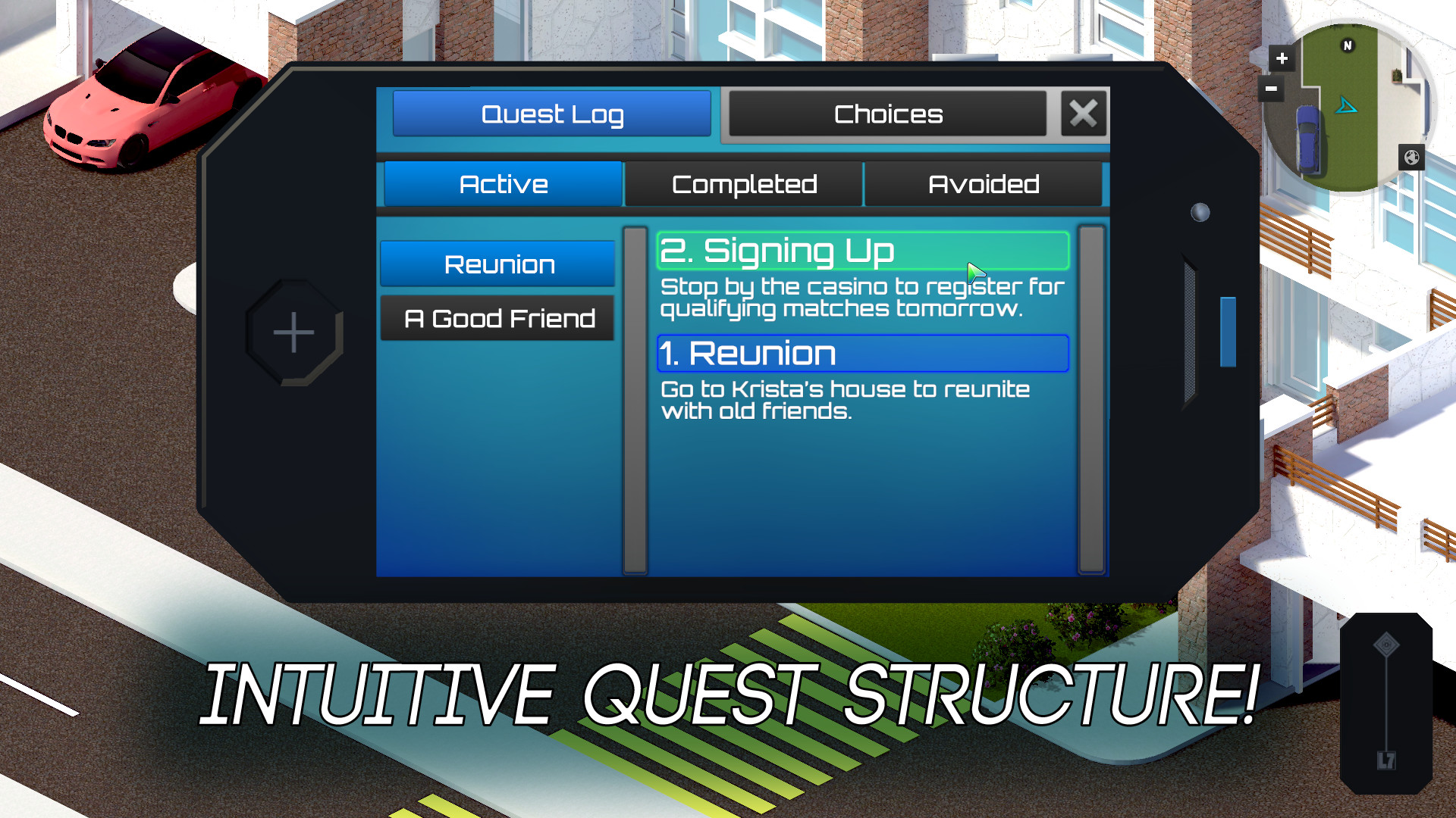
- An intuitive, straight-forward quest structure that offers a wealth of enriching sidequests for the player to discover.
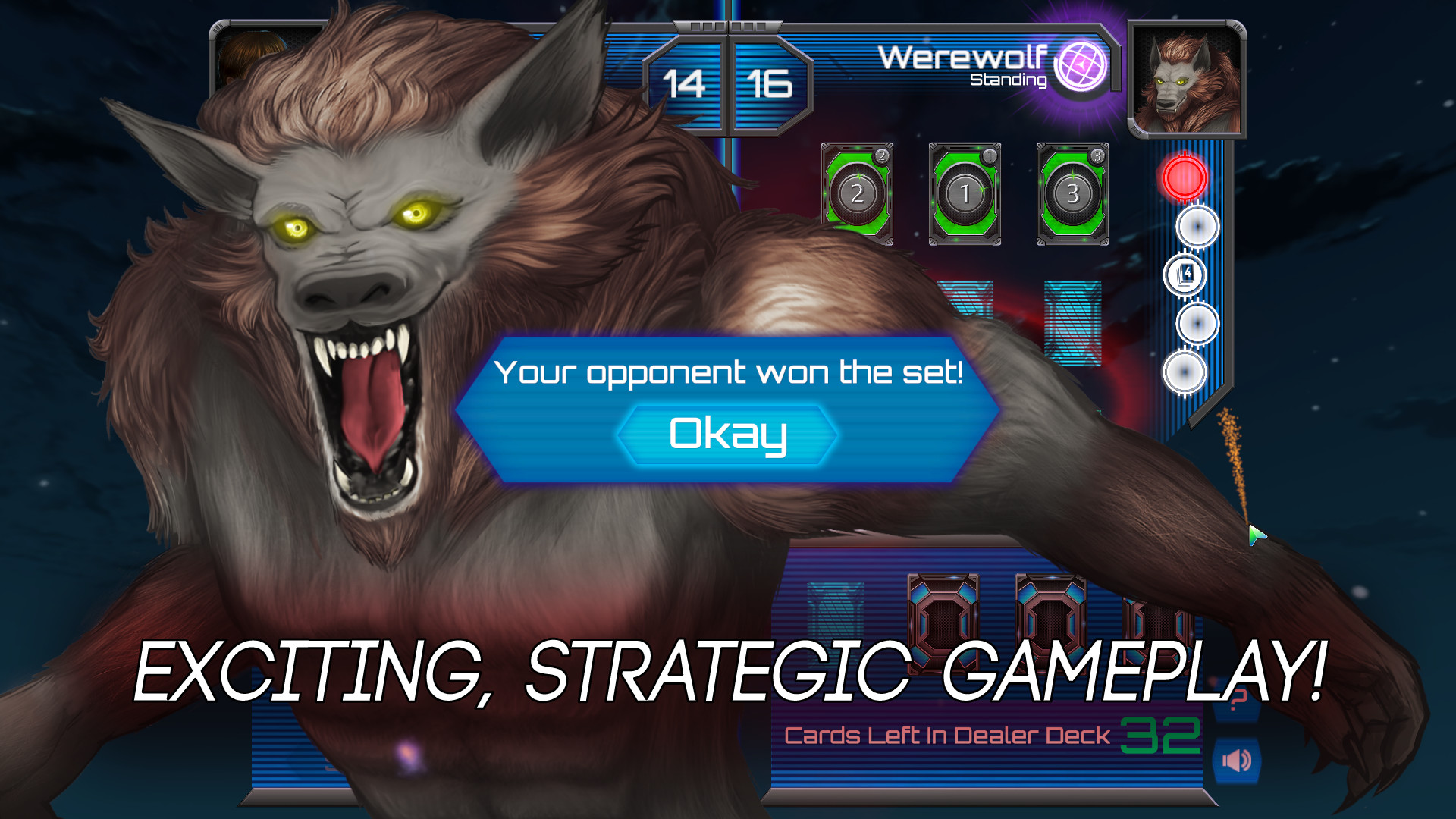
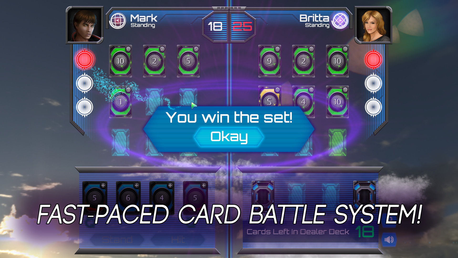
- Exciting, strategic gameplay in a fast-paced card battle system inspired by Pazaak.
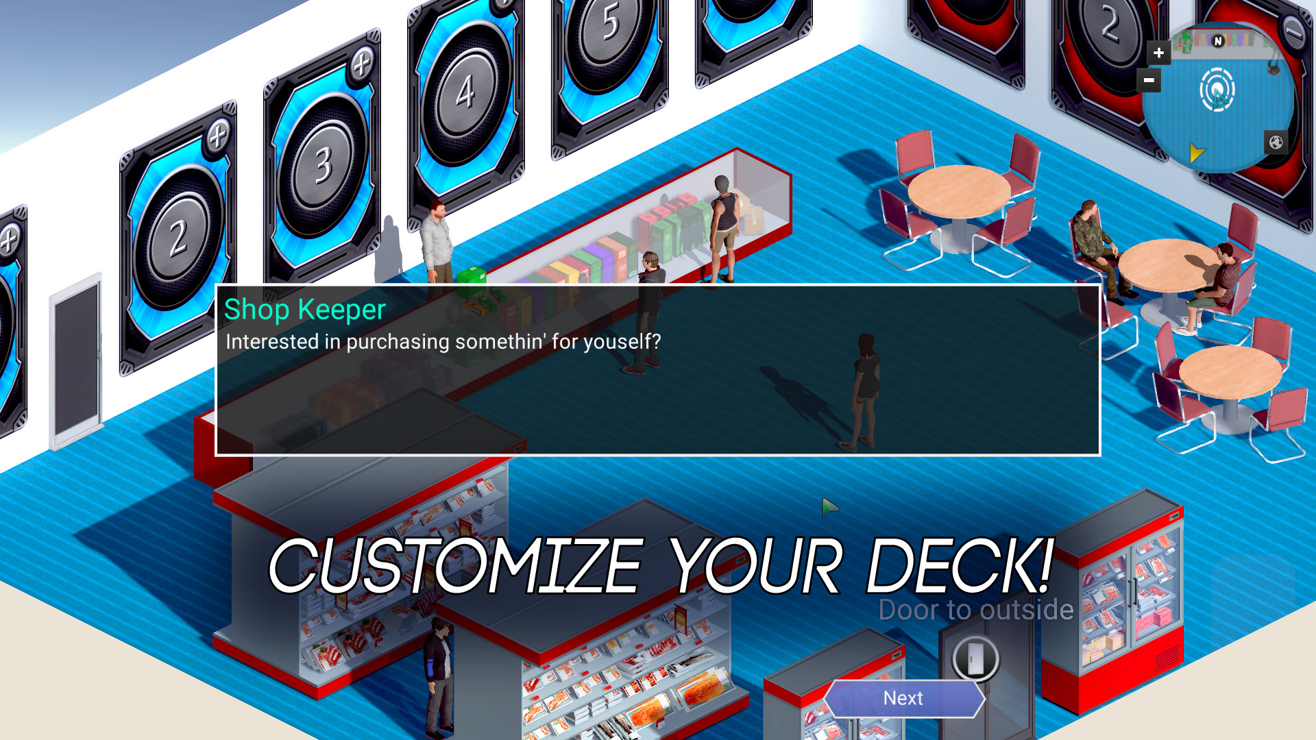
- Customize your deck! Visit card shops to turn match victories into new cards as you upgrade your deck.
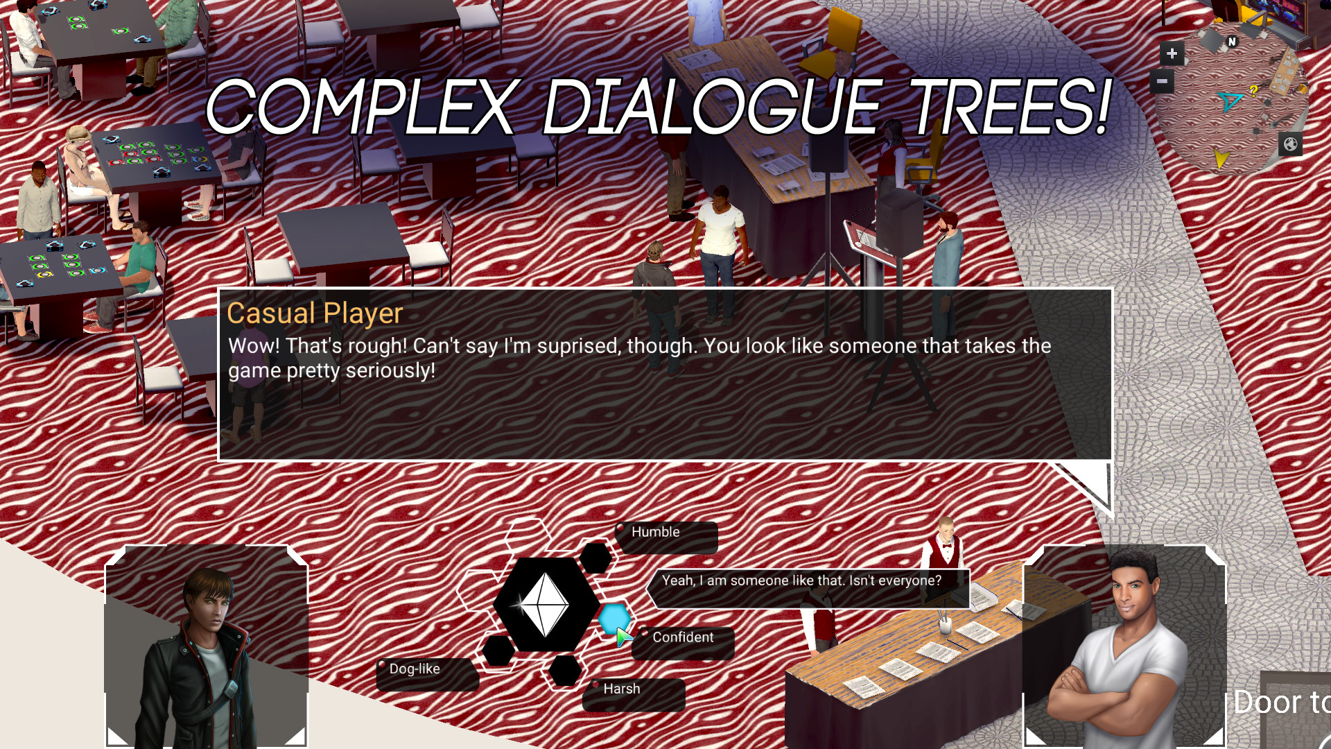
- Complex dialogue trees that allow you to control the direction of dialogues both serious and playful.
- An immersive 3D world - explore a diverse set of isometric environments, both in urban and natural settings
- Original Soundtrack full of energetic battle music and ambient world music.
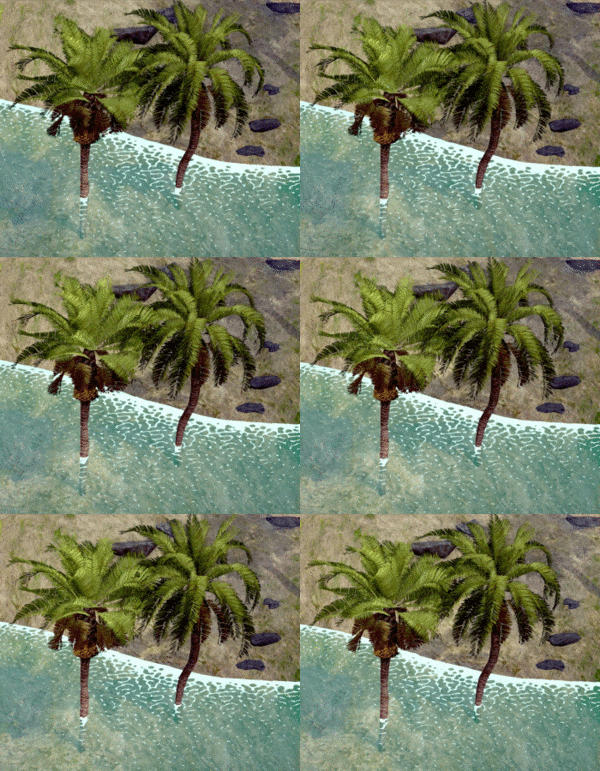
Day 4: The beach received a huge graphics update! New water + Added many new trees, rocks, sandbars, and more! And a massive update to the overall graphics of the game!
Read on our website for the best formatting experience .
Hi everyone,
Tyler again from the Deckpoint Studio team. In our last post, we took the opportunity to reflect on how far we’ve come in the last few years. Since then, we’ve been working our butts off, and I’m happy to share some of that work today.
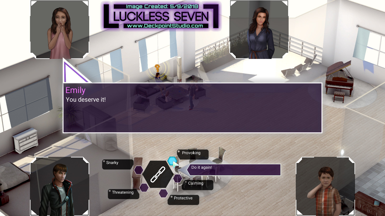
Big graphics update to the dialog system!
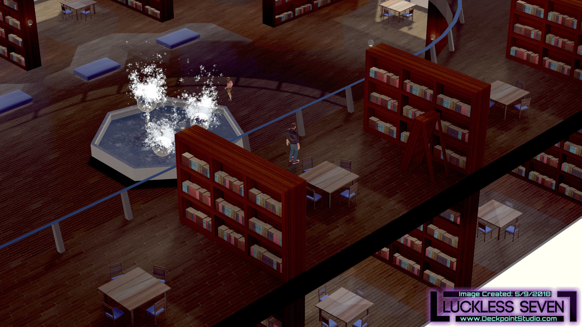
A radical new perspective. A huge change to how the world is viewed! More details about everything further in the dev blog.
BRAND NEW DEMO! Available on Windows, Mac OSX, and Linux! Play on Steam!

Join us on our journey as we develop Luckless Seven! Help shape the game and get access to exclusive content!
But first, a quick word about Ohayocon! In January, we had the opportunity to show off Luckless Seven at the biggest anime convention in Central Ohio. Ohayocon held their first Indie Videogame Showcase, and it was a huge success. We got to meet tons of local gamers and non-gamers alike, and the feedback was really positive.
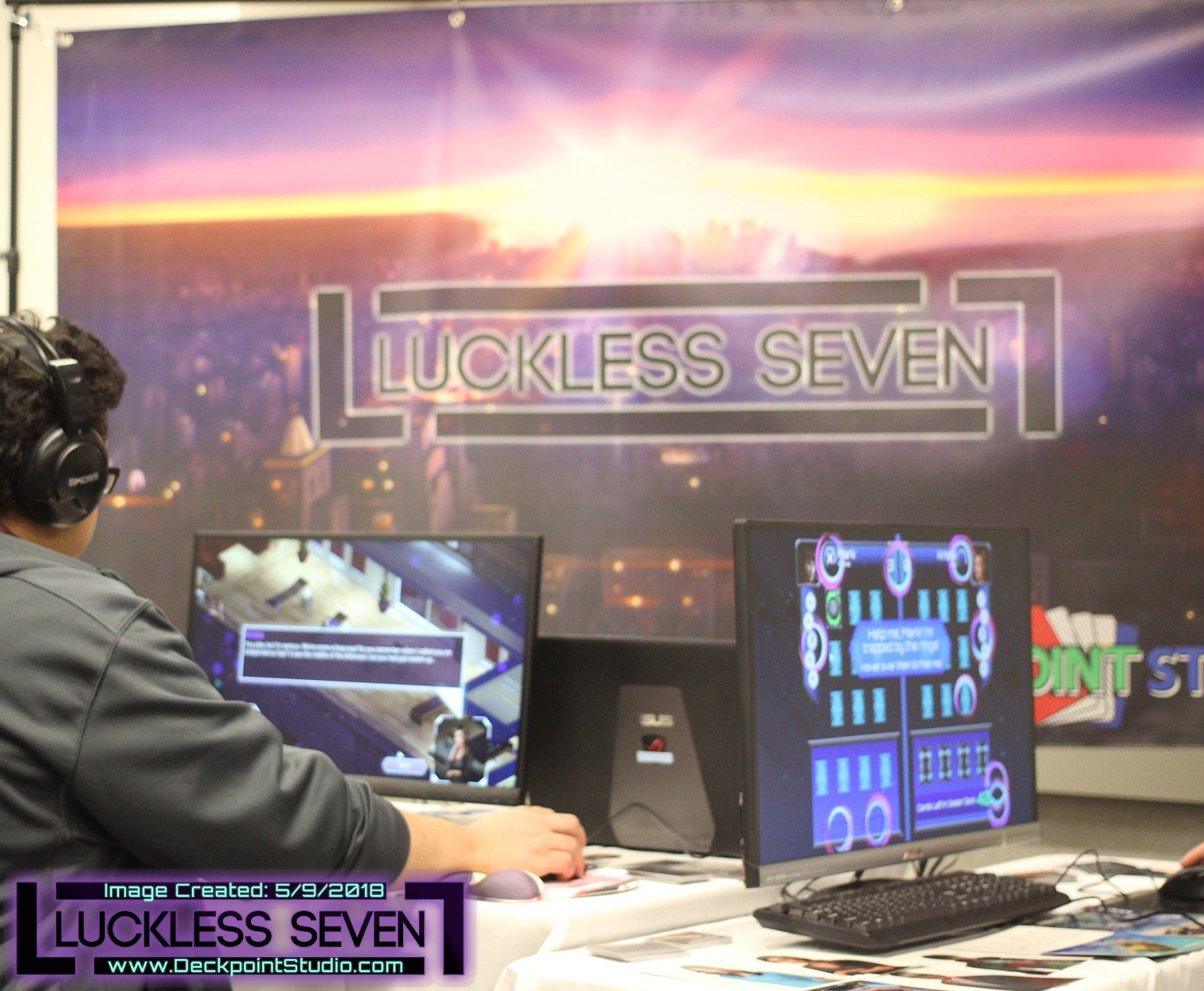
The beautiful Luckless Seven booth at Ohayocon!
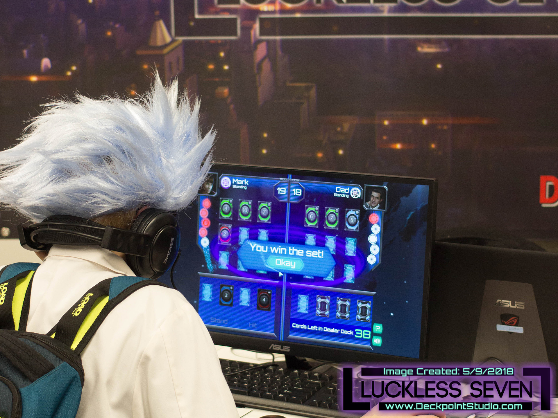
A cosplayer dressed as Rick from the Rick and Morty tv show plays Luckless Seven!
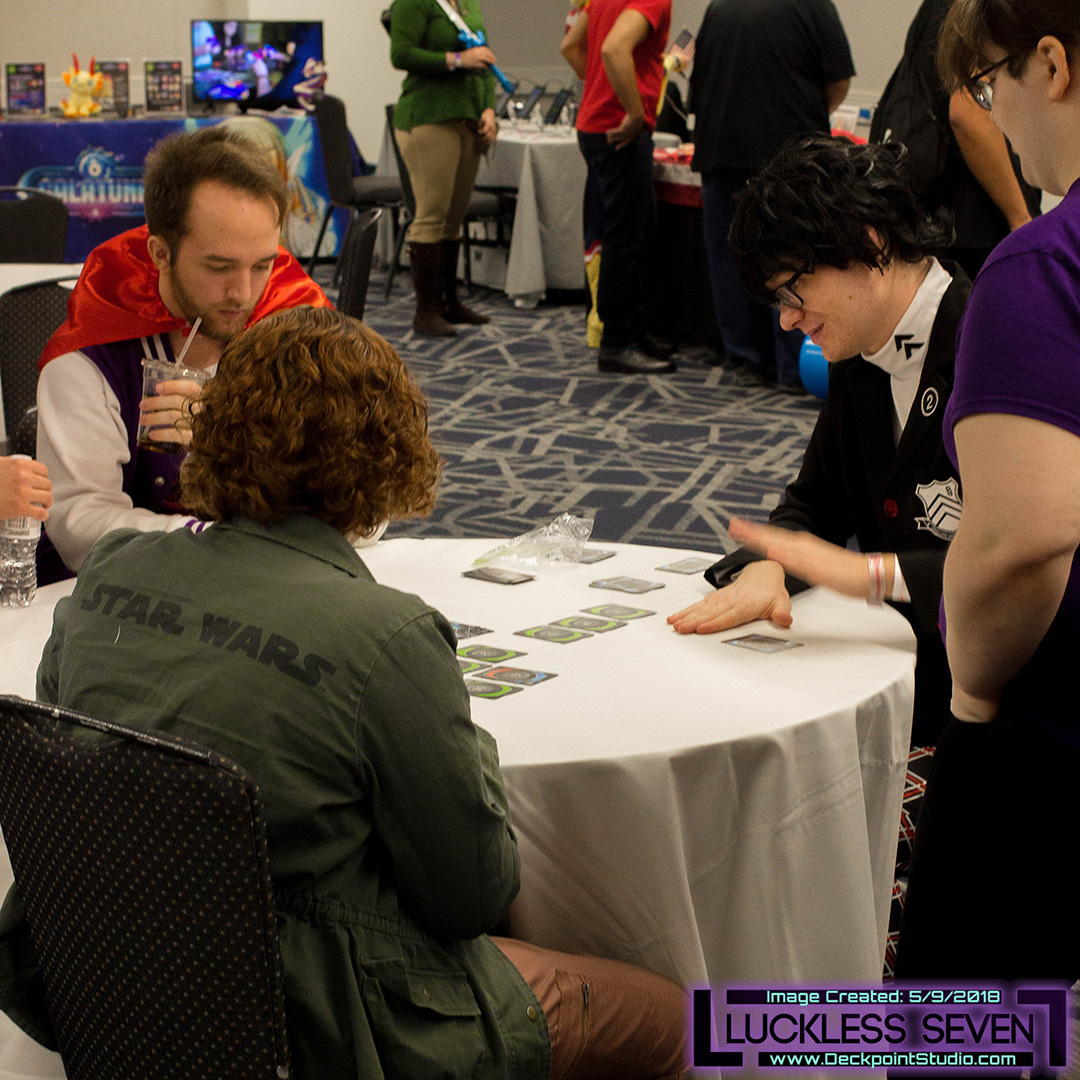
Several IRL Ekosi battles took place throughout Ohayocon. Pictured is Brandon Ledbetter (Deckpoint Studio's composer) who is cosplaying as the protagonist from Persona 5. (He is located on the right with the black suit and black hair.) Also in the picture is Griffin Voyls in the red cape on the left and he created the Ohayocon Indie Videogame Showcase!
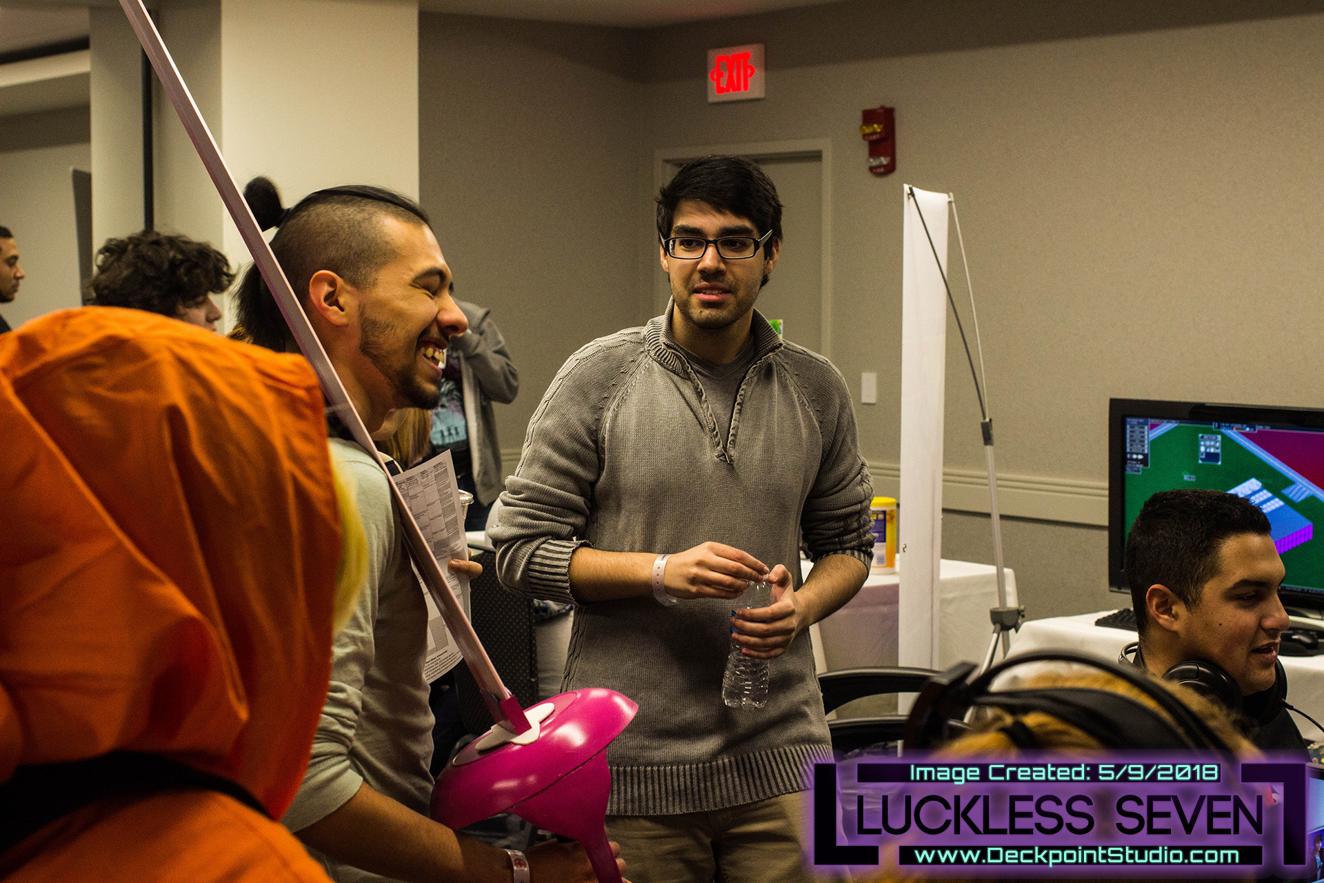
Jesse Kooner (Deckpoint Studio's lead developer) joking with attendees. (Located center with the gray colored sweater.)
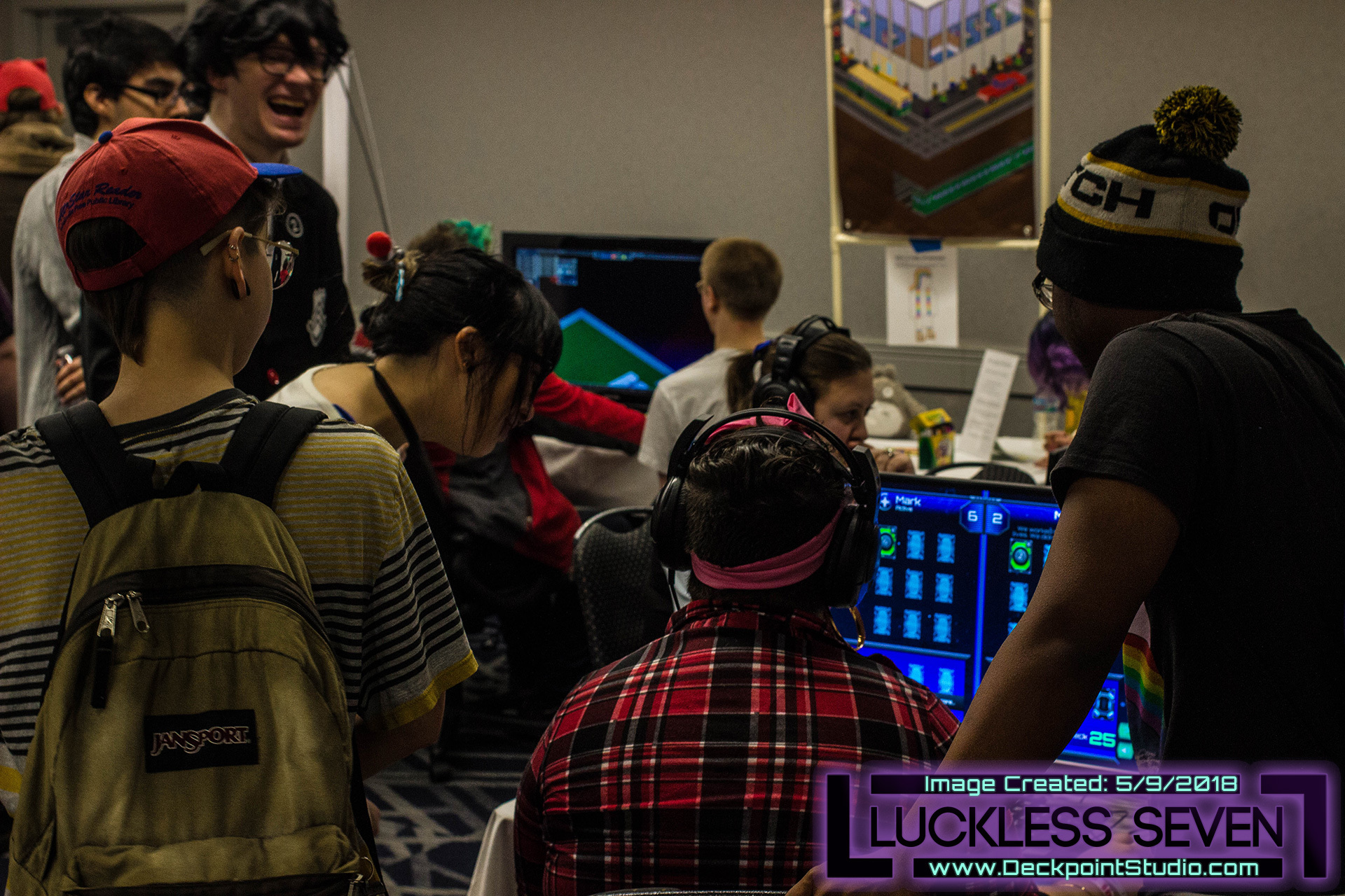
Attendees crowded around the monitors.
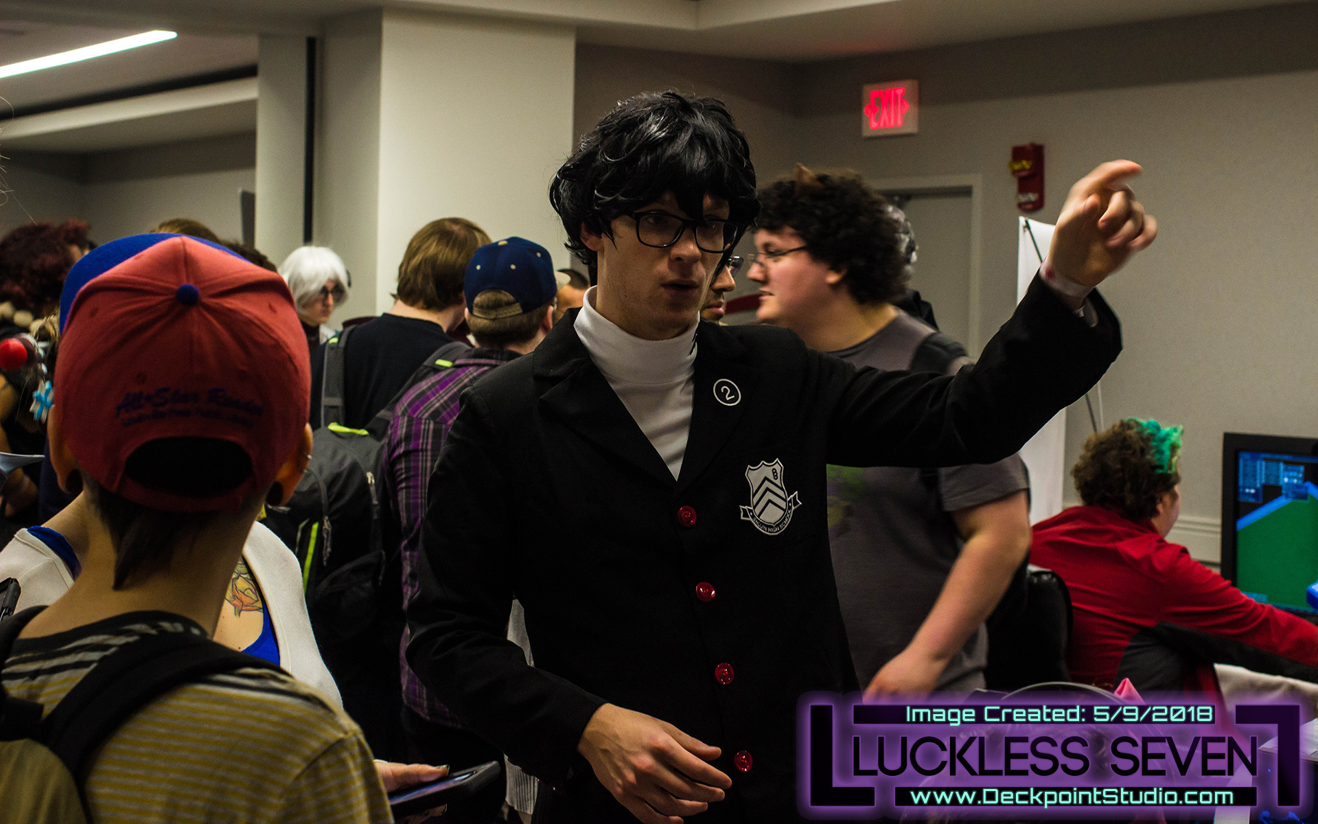
Brandon Ledbetter (Deckpoint Studio's composer) explaining the game to other attendees. (He is located in the center with the black suit and black hair.)
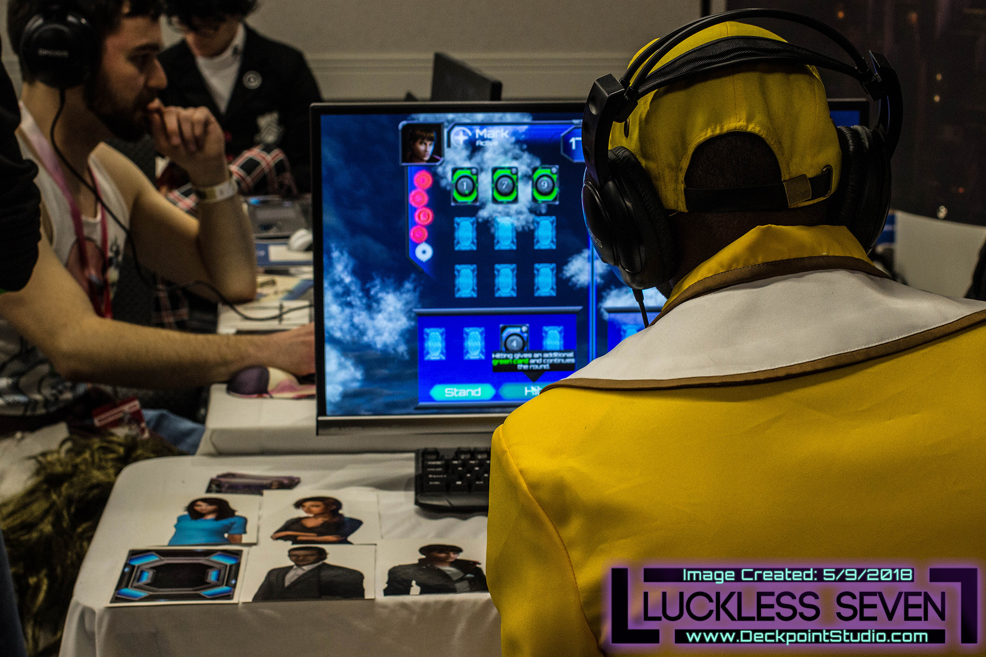
Attendees playing Luckless Seven.
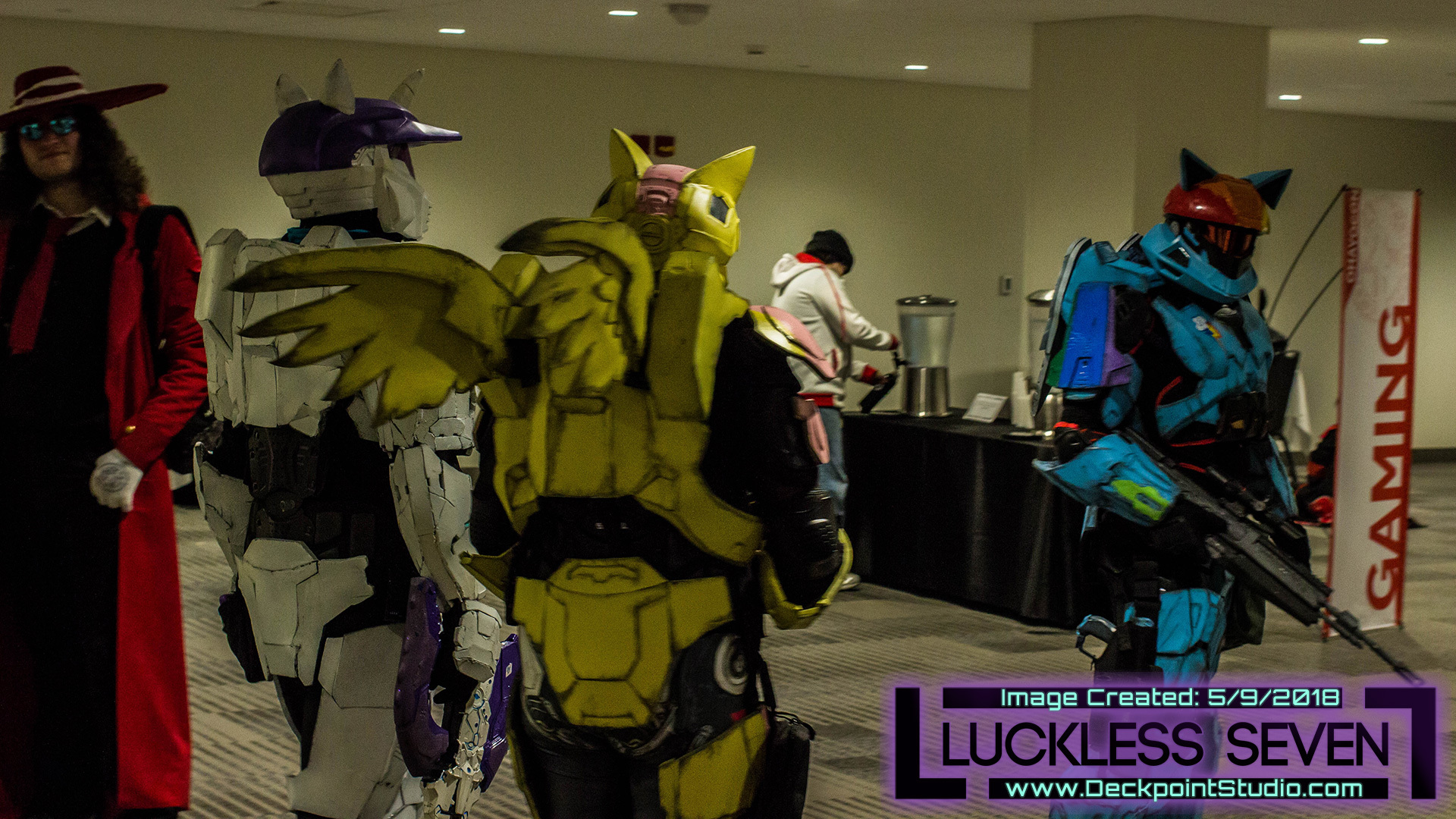
Many great cosplayers at Ohayocon 2018! (This picture was taken in the hallway.)
If you met us at Ohayocon and are sticking around, thanks! It’s always a pleasure for us to talk about the game with enthusiastic local players, which is why we teamed up with our friends at Multivarious Games to do it again last week! We took part in another showcase, this time in conjunction with the release of Ready Player One at the Gateway near OSU’s campus. Good times!
But enough about that! You’re probably on the edge of your seat wondering about the title!
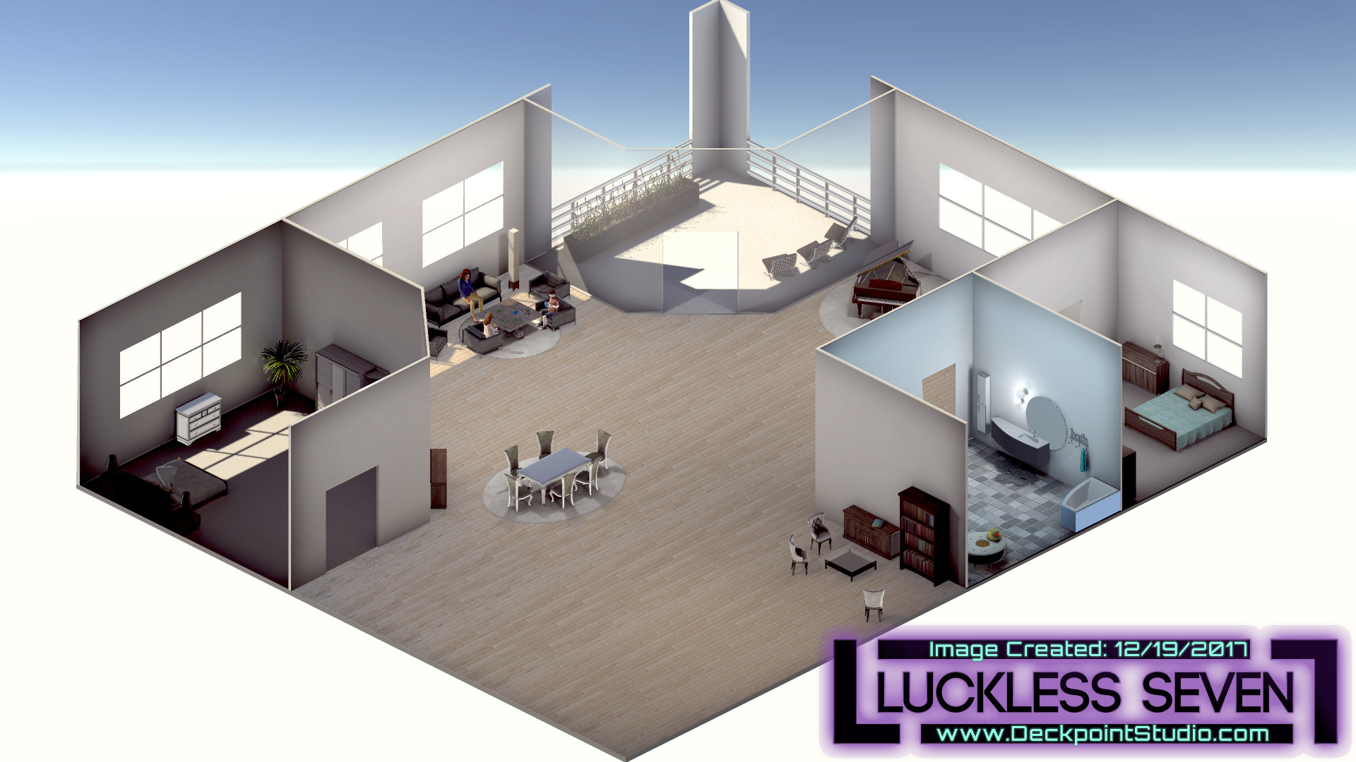
Before: Orthographic - pure isometric. Distance can be difficult to convey because the orthographic camera flattens the image.
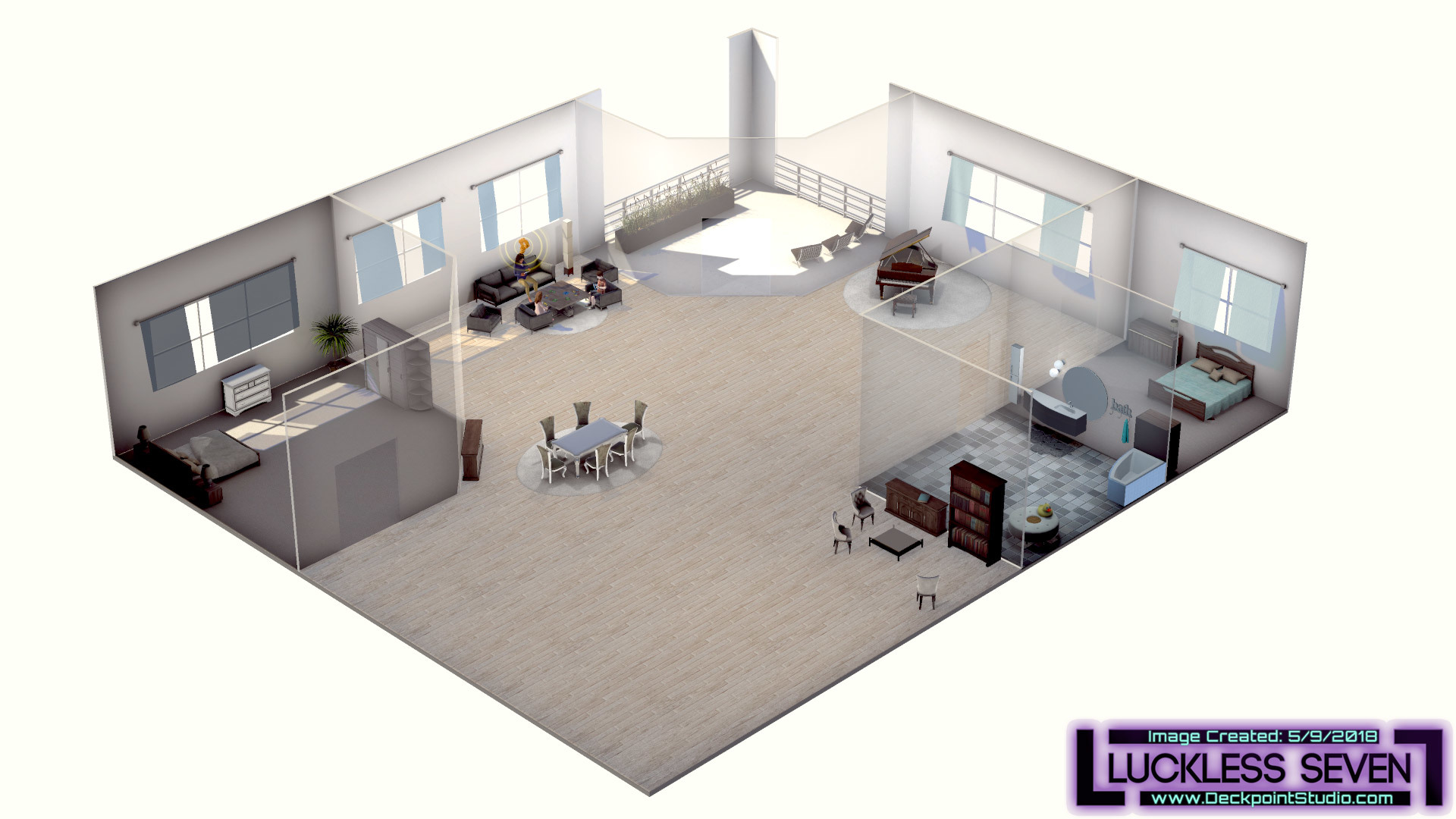
After: Perspective - perspective isometric. Distance is much easier to convey. Items that are far away will now look more distant.
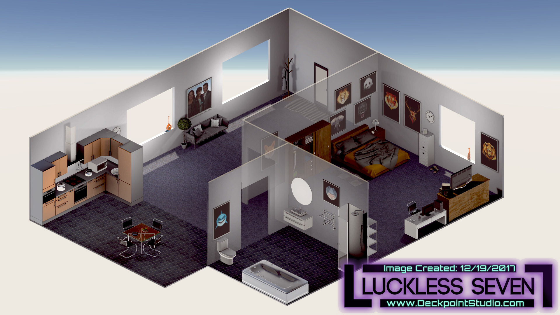
Before: Orthographic - pure isometric. This camera has no field of view.
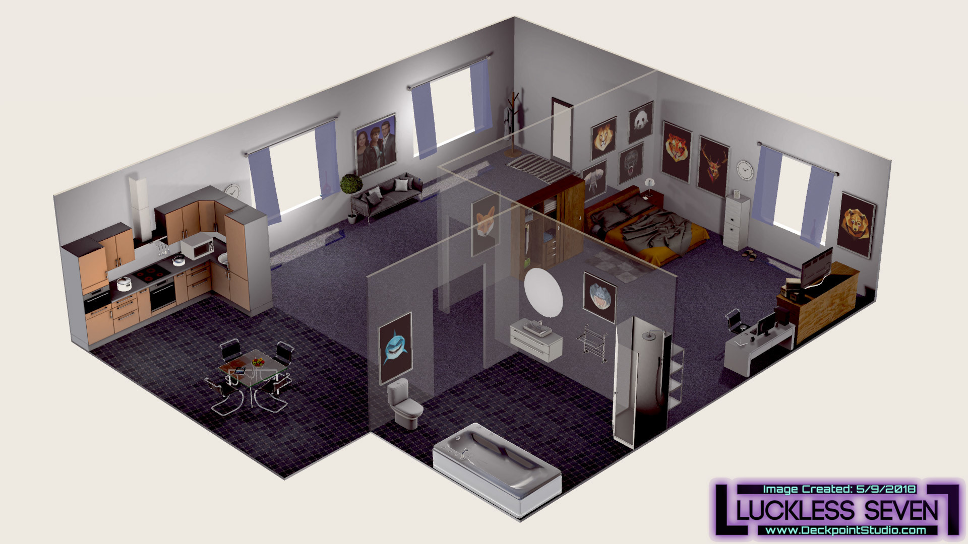
After: Perspective - perspective isometric. This camera uses a very slight field of view.
Surely by now, you’ve noticed that our graphic style is overhead isometric. That’s accomplished using an “orthographic” camera in Unity, But guess what? Those days are gone. We’re switching from what you might call a “pure isometric” style to a “perspective isometric” style. Here’s what that means:
- Pure isometric - No matter where Mark is located, the scene will look the same. Essentially, there is no field of view.
- Perspective isometric - The scene will look different based on where Mark is located. You can see additional walls or sides of objects by moving around them.
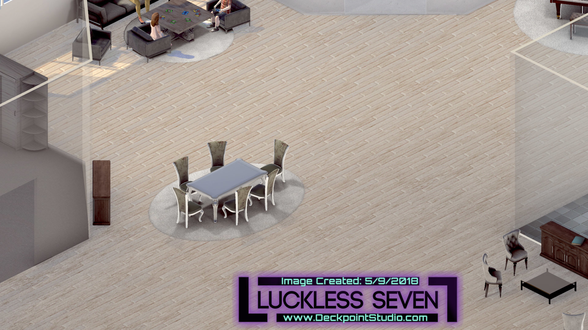
BEFORE: Pure Isometric: A more subtle example. Look at the brown cabinet in the bottom left of the image. Notice that it will look the same no matter where the camera is located.
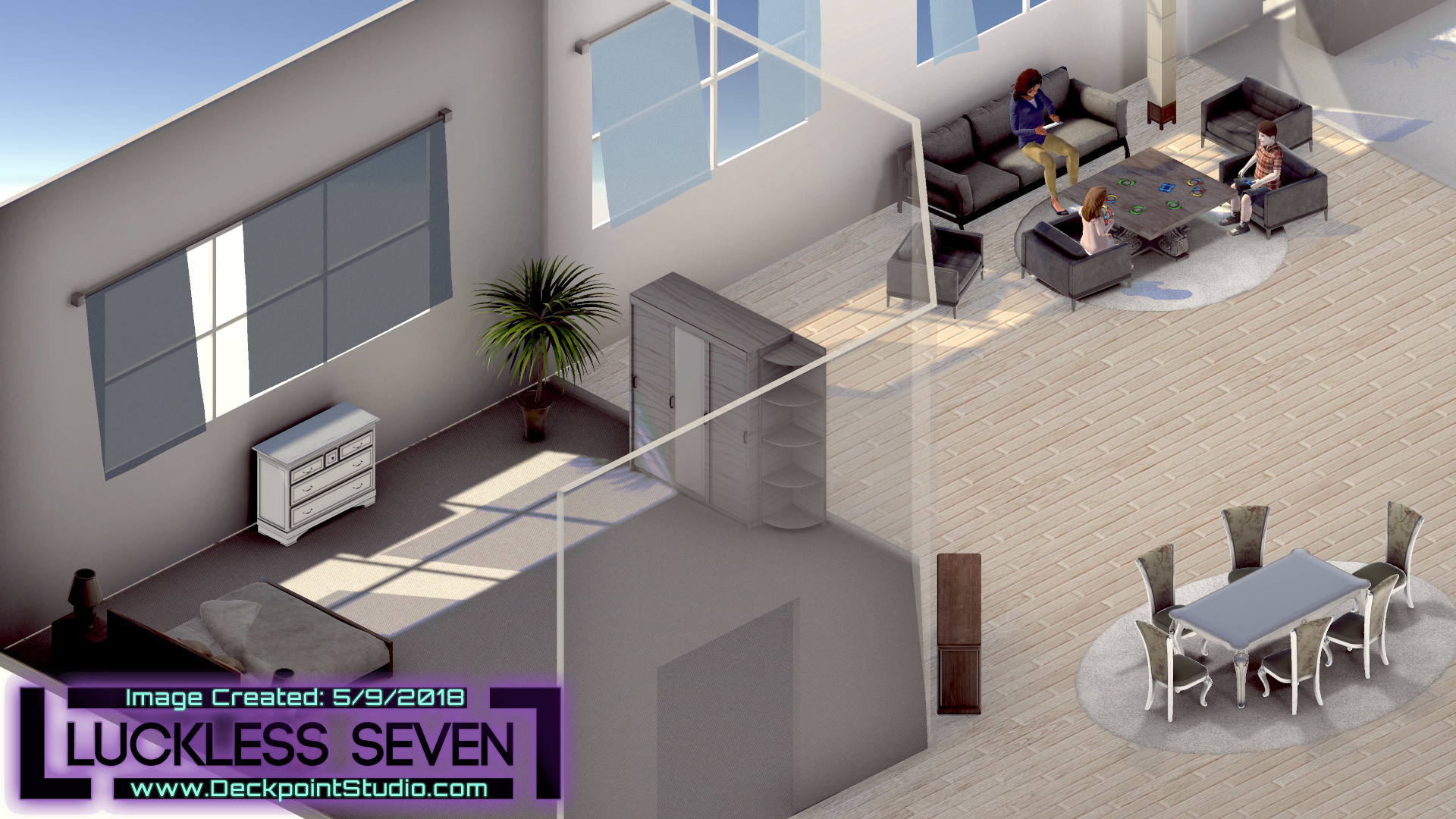
BEFORE: Pure Isometric: A more subtle example. Look at the brown cabinet in the bottom right of the image. Notice that it will look the same no matter where the camera is located.
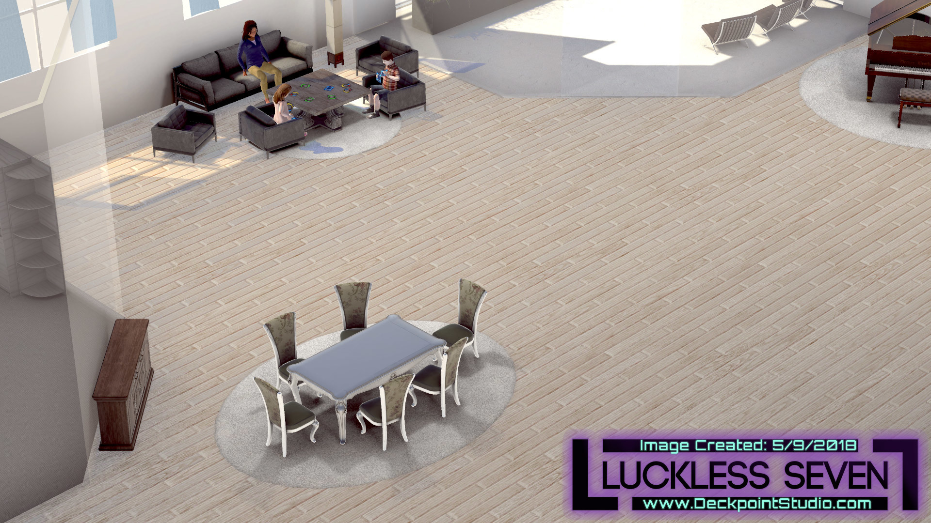
AFTER: Perspective Isometric: A more subtle example. Look at the dark brown wooden cabinet towards the bottom left of the image.
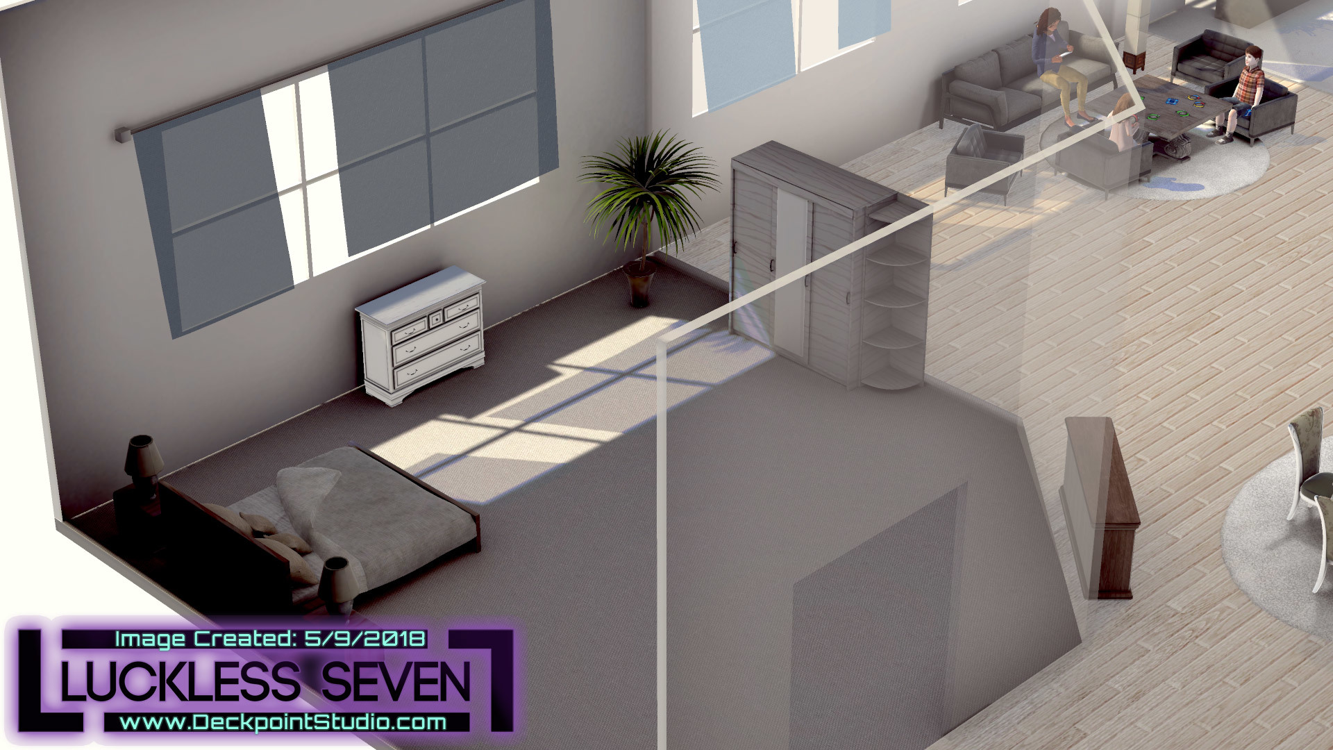
AFTER: Perspective Isometric: Look at the dark brown wooden cabinet towards the bottom right of the image. Now you can see around objects. Before the object held the same viewing angle the entire time.
We’re taking this action because it looks pretty darn good -- better, we think! The perspective camera adds a new energy that makes the world of Arithia feel much more alive. It’s hard to communicate in still images, but it’s an obvious benefit when you’re at the wheel. It’s a pretty big change that has required some UI maintenance (e.g., nudging observation icons) and level design attention over the last several weeks. But totally worth. Also, the new camera has allowed us to introduce some new and impressive water and cloud shadows. All in all, the change has given Luckless Seven a big step forward visually.
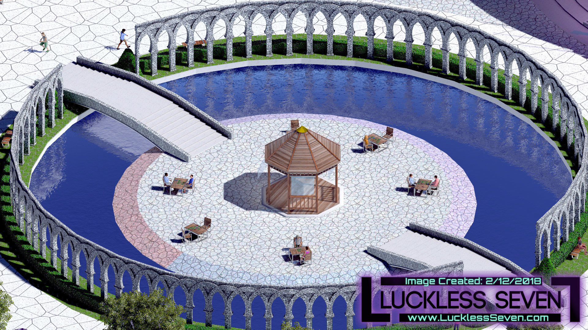
Before: The water before was less colorful and could only be opaque.
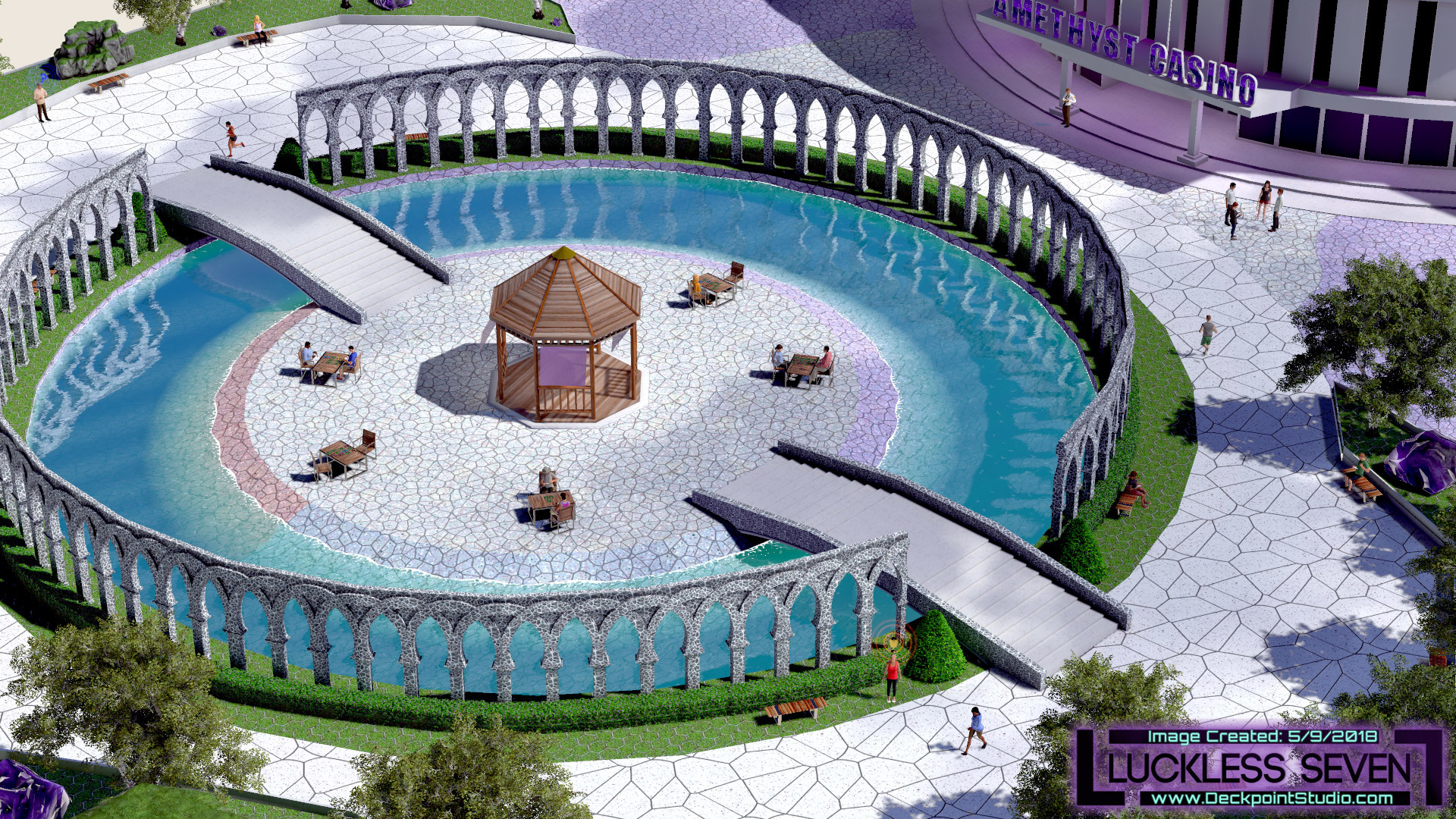
After: New water and cloud shadows! The new water is more colorful and semi-transparent. Cloud shadows add a nice ambient movement in the background.
But that’s not all! Since our last update, we’ve also updated the writing on Day 1. “Again?!” you might ask! It’s true. We’re pretty obsessed with improving the earliest portions of the game, so we took some time recently to review and revamp the Day 1 subquests that players encounter while performing Mark’s day job at the hospital. Our main goal was to bring this legacy dialogue in line with the quality and tone of the rest of the game, which meant eliminating any errors and trimming excess dialogues while maintaining the same humor and informational value from before. We think we’ve done a good job, and we hope you will too!
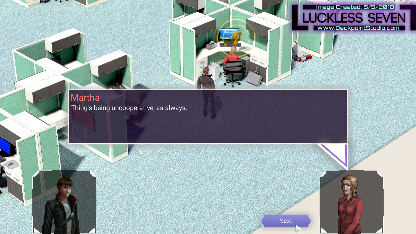
Remade Martha's quest. Rewrote almost all of the dialog.
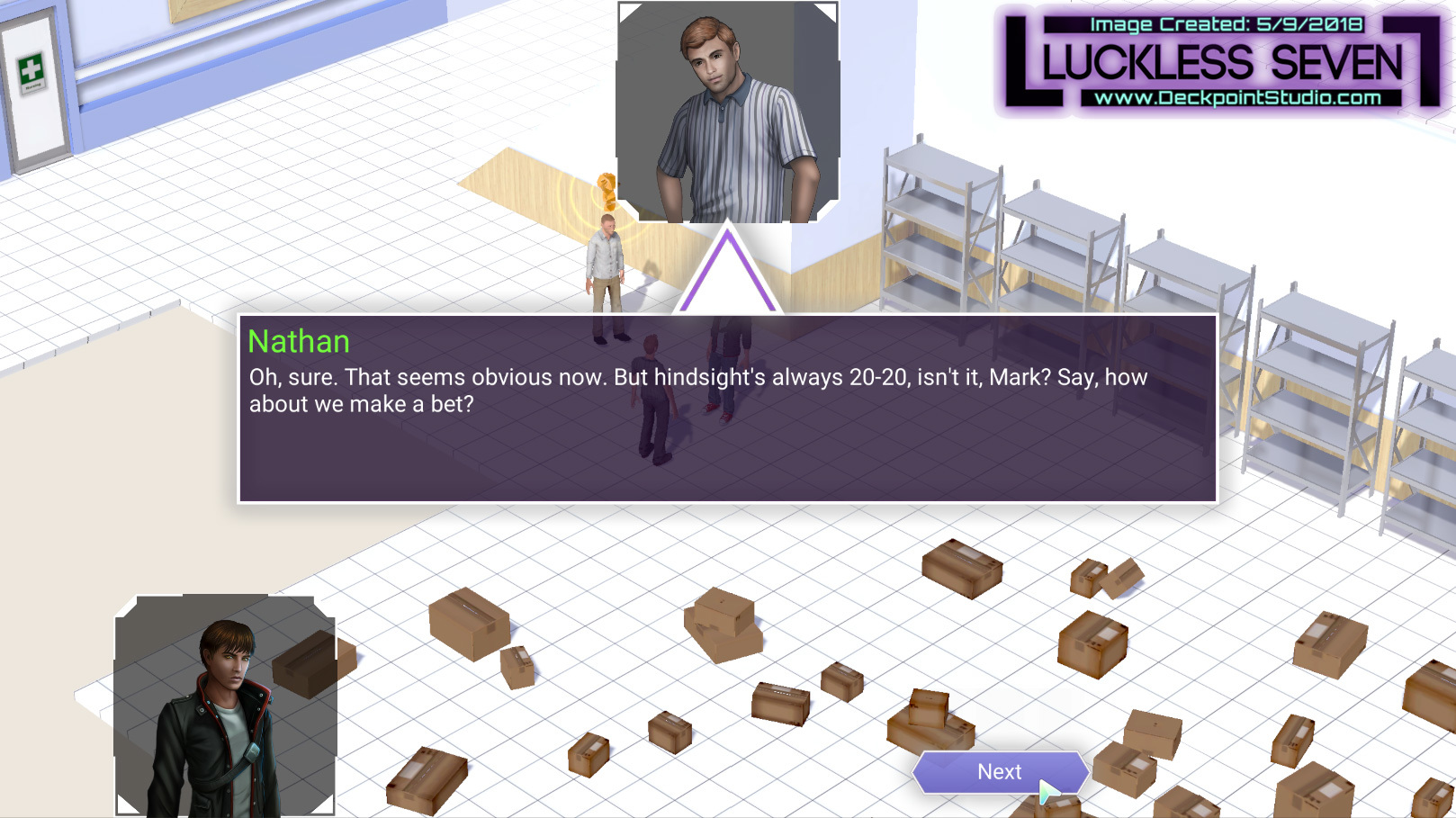
Remade the storage room quest. Rewrote almost all of the dialog.
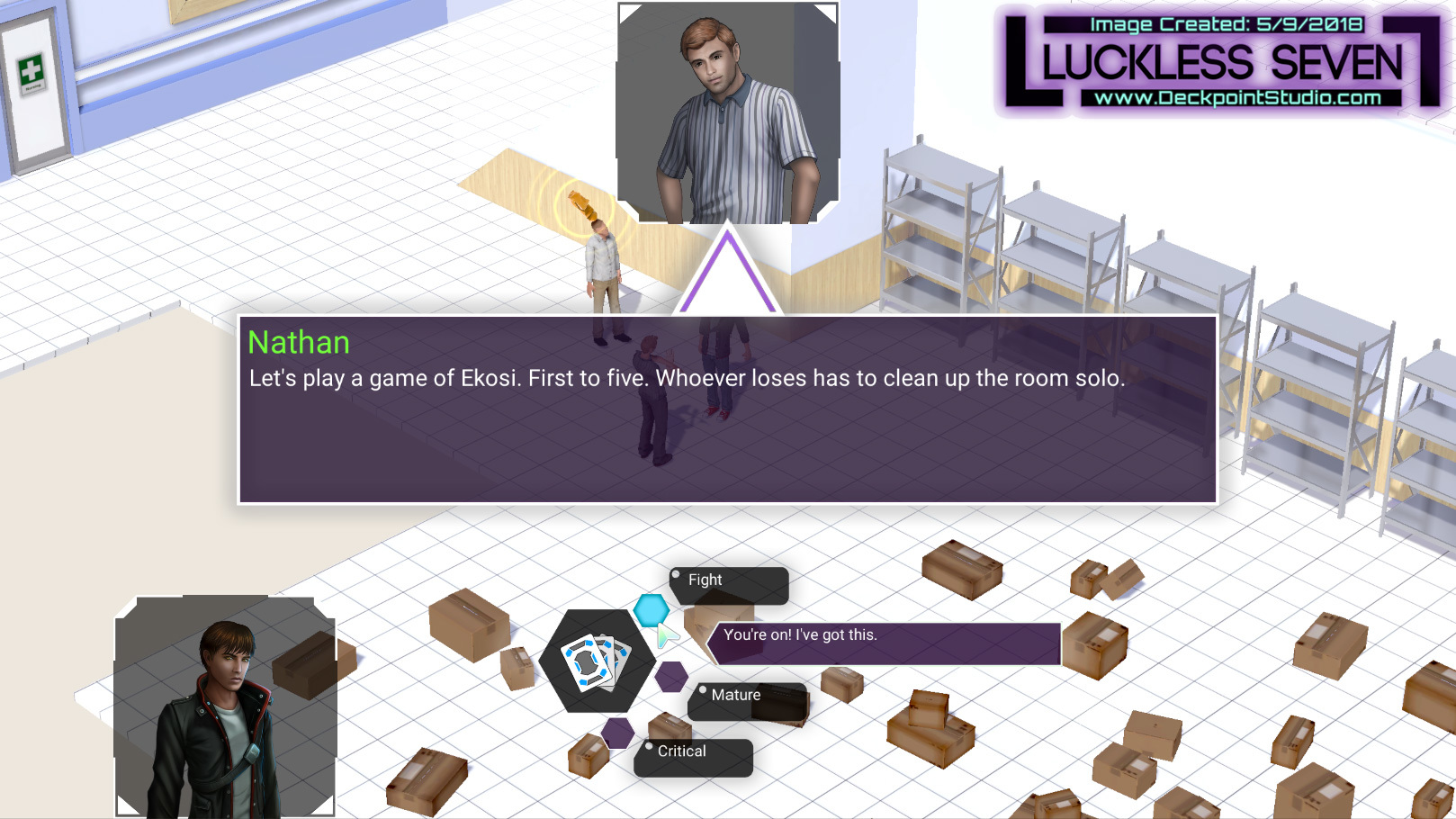
New dialog options.
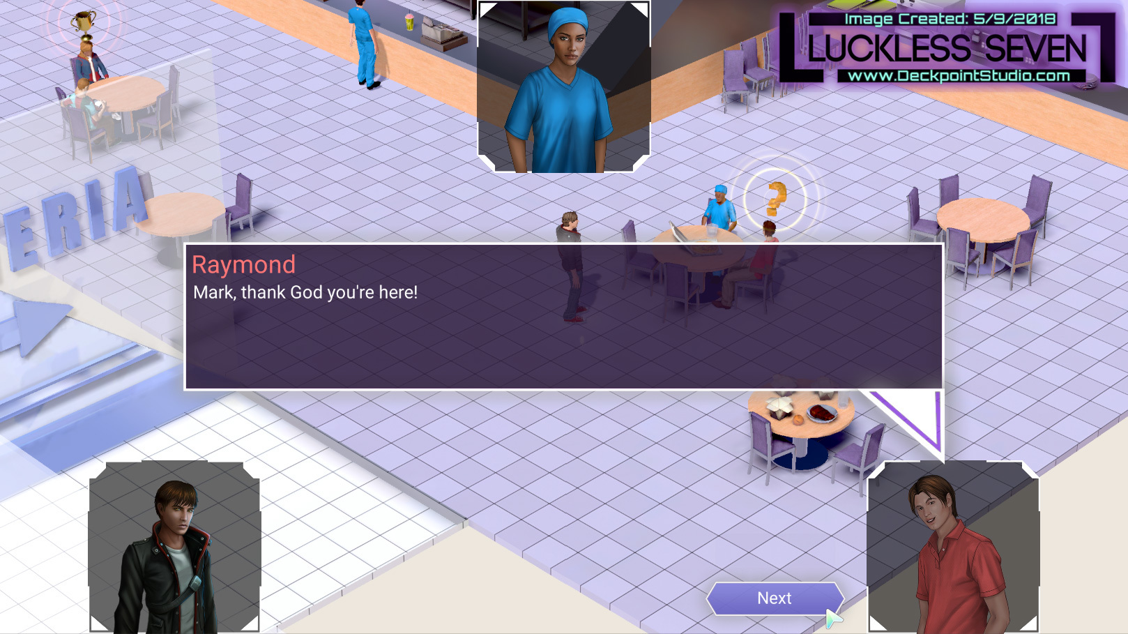
Remade prank call quest. Rewrote almost all of the dialog.

Raymond and Carlie are always up to no good.
Aside from those two main visual/story updates, there are of course a bevy of smaller additions/fixes:
- Dialogue UI improved -- The dialogue interface is a pretty important element to our visual experience, so we’ve made some tweaks to color, transparency, and more to pretty it up.
- Pathing improvements -- In a few key areas (the Amethyst Casino Ext, Krista’s house, Day 4 bridges), we’ve broadened clickable/pathfinding areas to make navigating those tight spaces a little easier.
- Filippelli House Exterior additions -- In addition to those pathfinding tweaks, we’ve also thrown some pool floaties in your way by the pool. This should prevent players from getting lost behind the mansion, plus you get to meet some of Krista’s charming siblings!
- Amethyst Casino Interior additions -- We’ve added strobe lights and pulsing lights to the Amethyst Casino in Patrida to make it feel more alive. We sure do like moving things!
- Amethyst Casino Exterior additions -- You’ll now find that signs for the Amethyst Casino and nearby Ekosi shop feature glowing signs. Again, if it moves, we will add it to our game.
- Day 4 Beach Area improvements -- The switch to perspective camera allowed us to play with new water, and we’ve made a ton of additions to the aquatic Day 4 terrain. You’ll find the beach populated with a lot more rocks and palm trees, plus a few sandbars. We think it looks even better than before!
- Also, there are curtains now. They move. We like that.
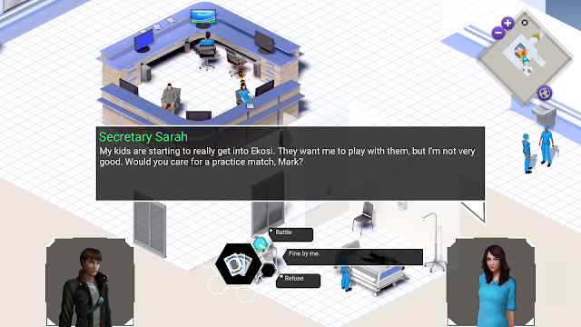
Before: The dialog system before had arrows that were too small and the dialog choice buttons could be difficult to see in very bright or very dark backgrounds.
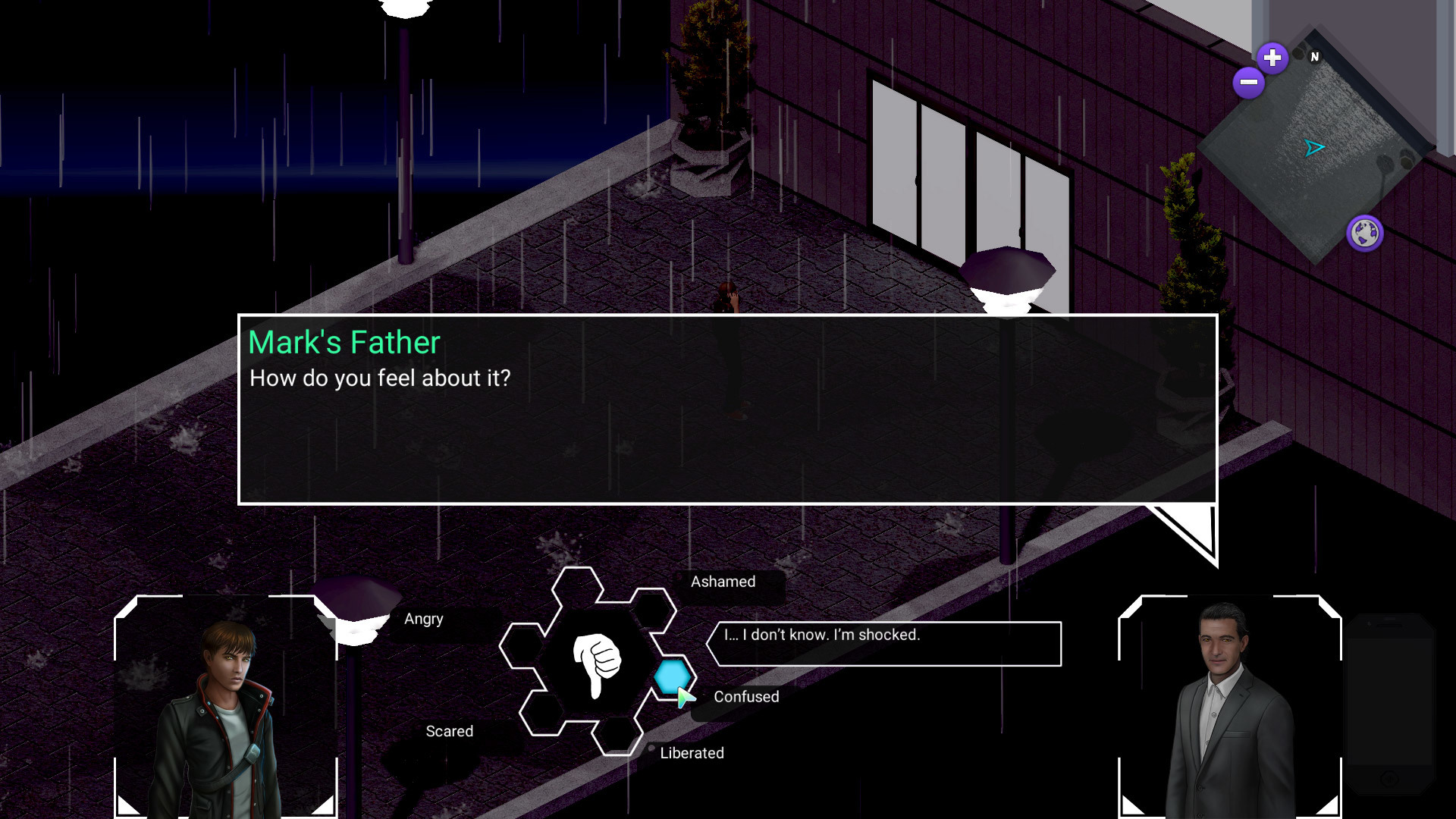
Before: Dark areas made the dialog system difficult to see and distinguish from the background.
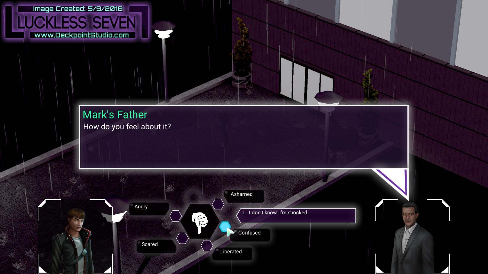
After: Graphics update to the dialog system! The center box is colored purple and the edges have a fading white border. The arrows are also significantly larger to make it easier to see the character who is talking.
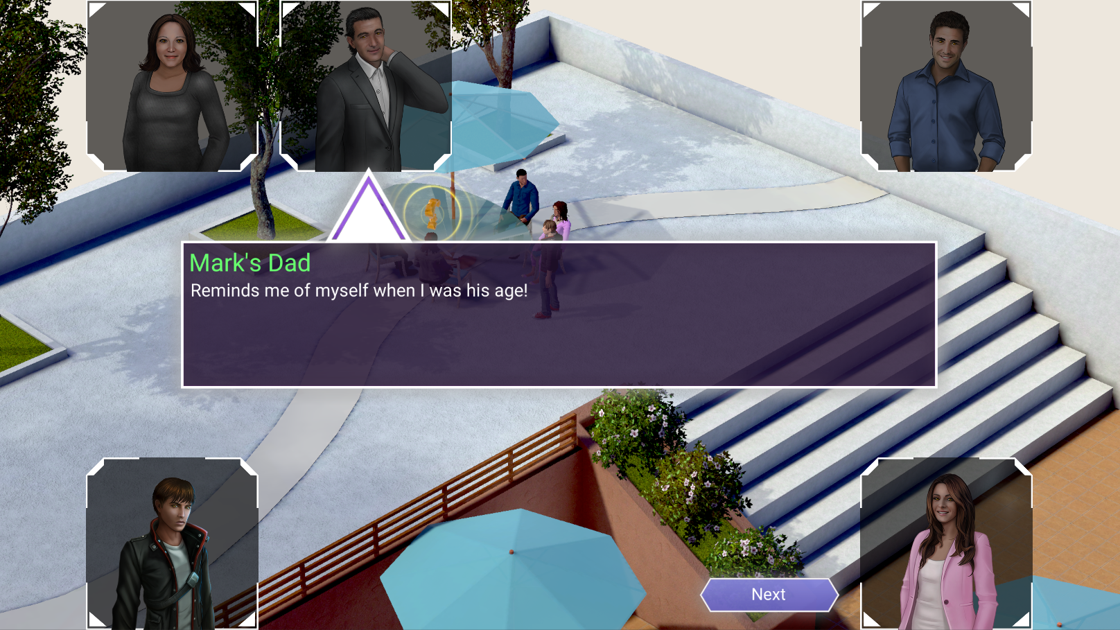
After: Graphics update to the dialog system!
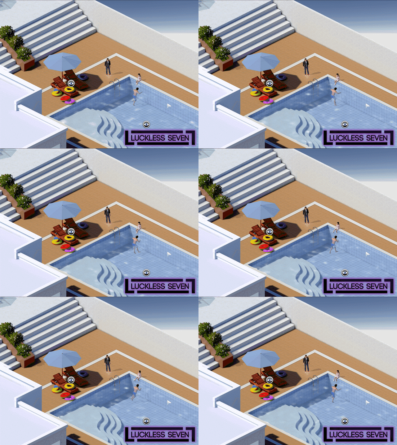
Before: Pool area.
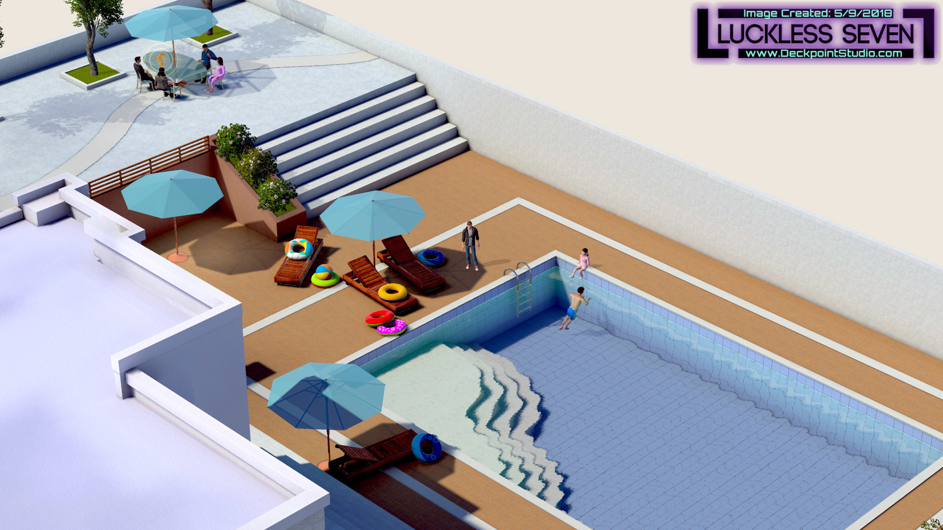
After: Added more furniture, some rocks, new water, and cloud shadows. Removed the left staircase.
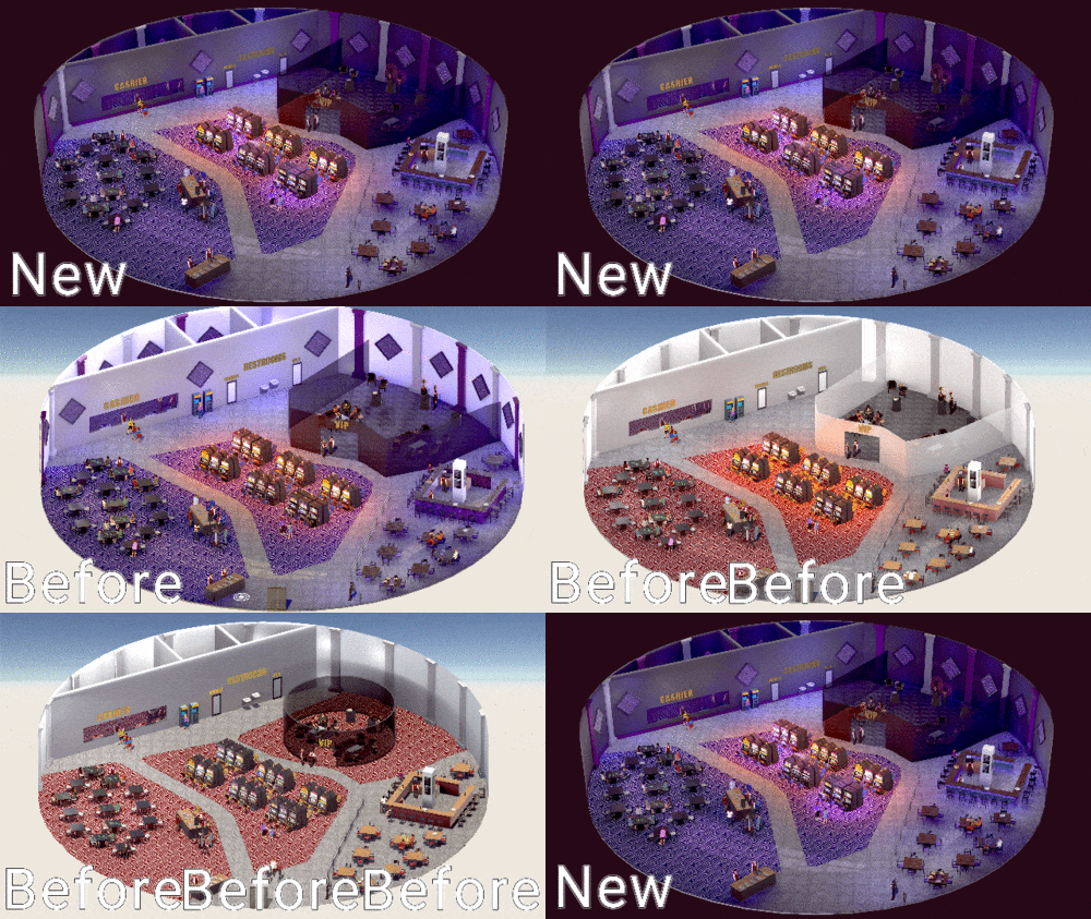
The evolution of the Amethyst Casino. The latest update brings many ambient moving effects added like the fading casino lights, the restaurant moving walls, and the slot machine siren lights. Also, the walls are darkened and there are new shaders.
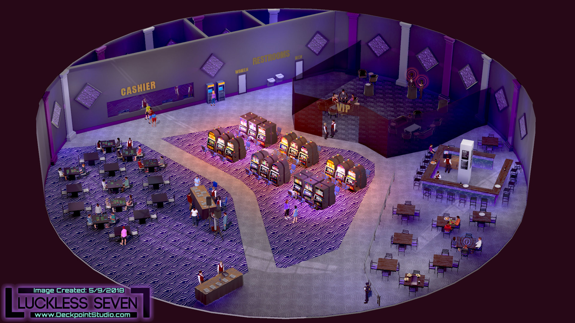
Amethyst Casino Interior. Many new ambient effects and darker walls.
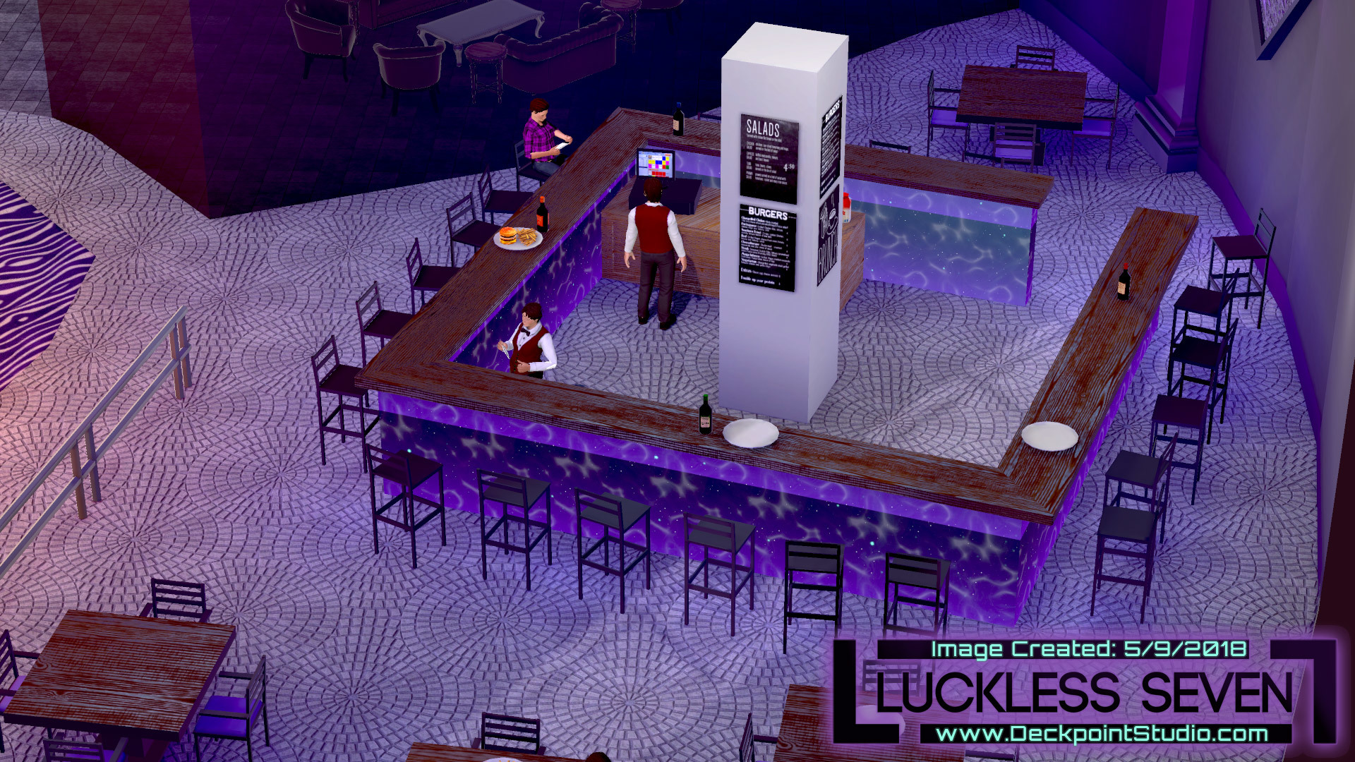
Amethyst Casino restaurant walls now move.
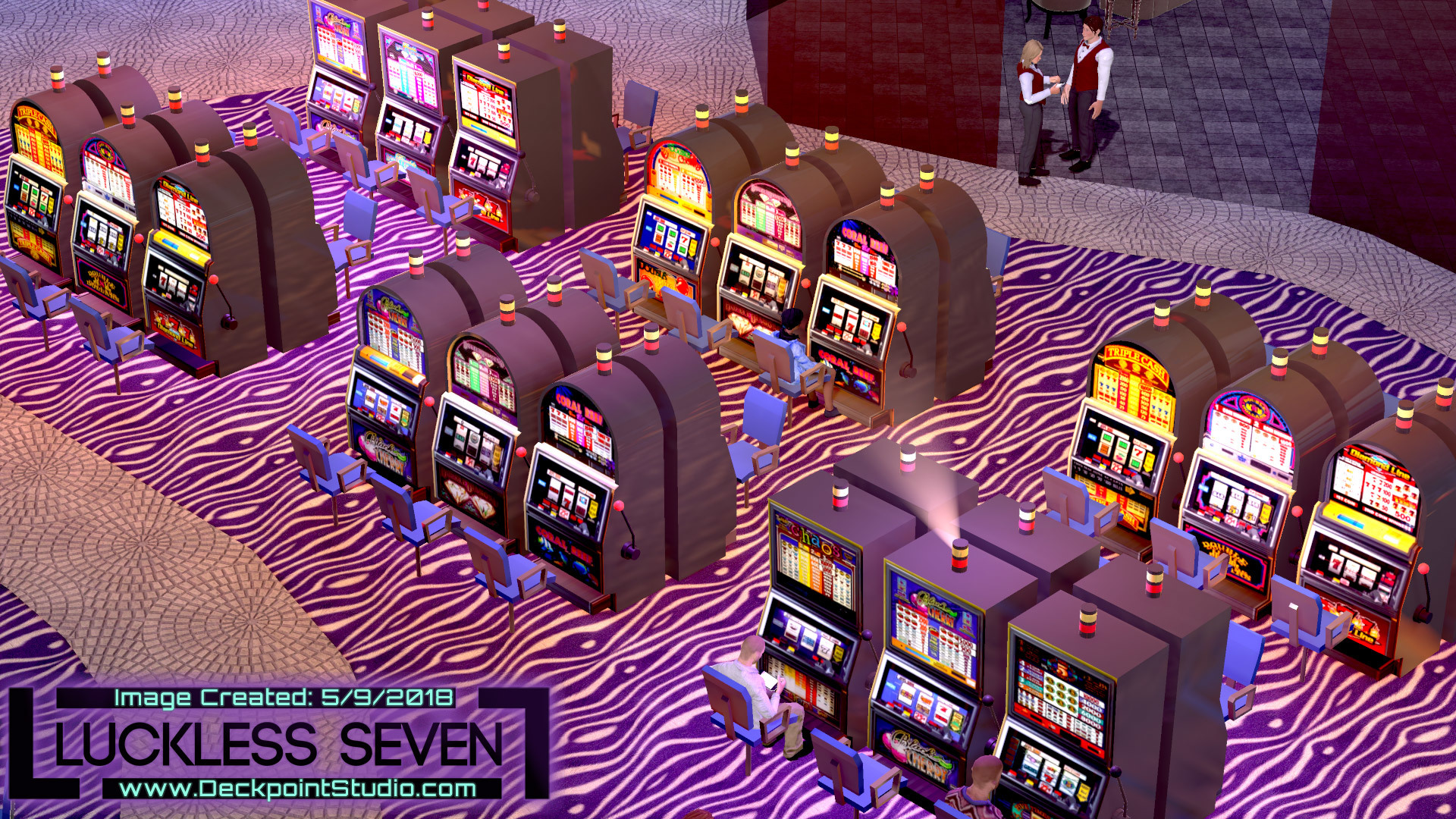
The slot machine area now has siren lights that go off every so often.
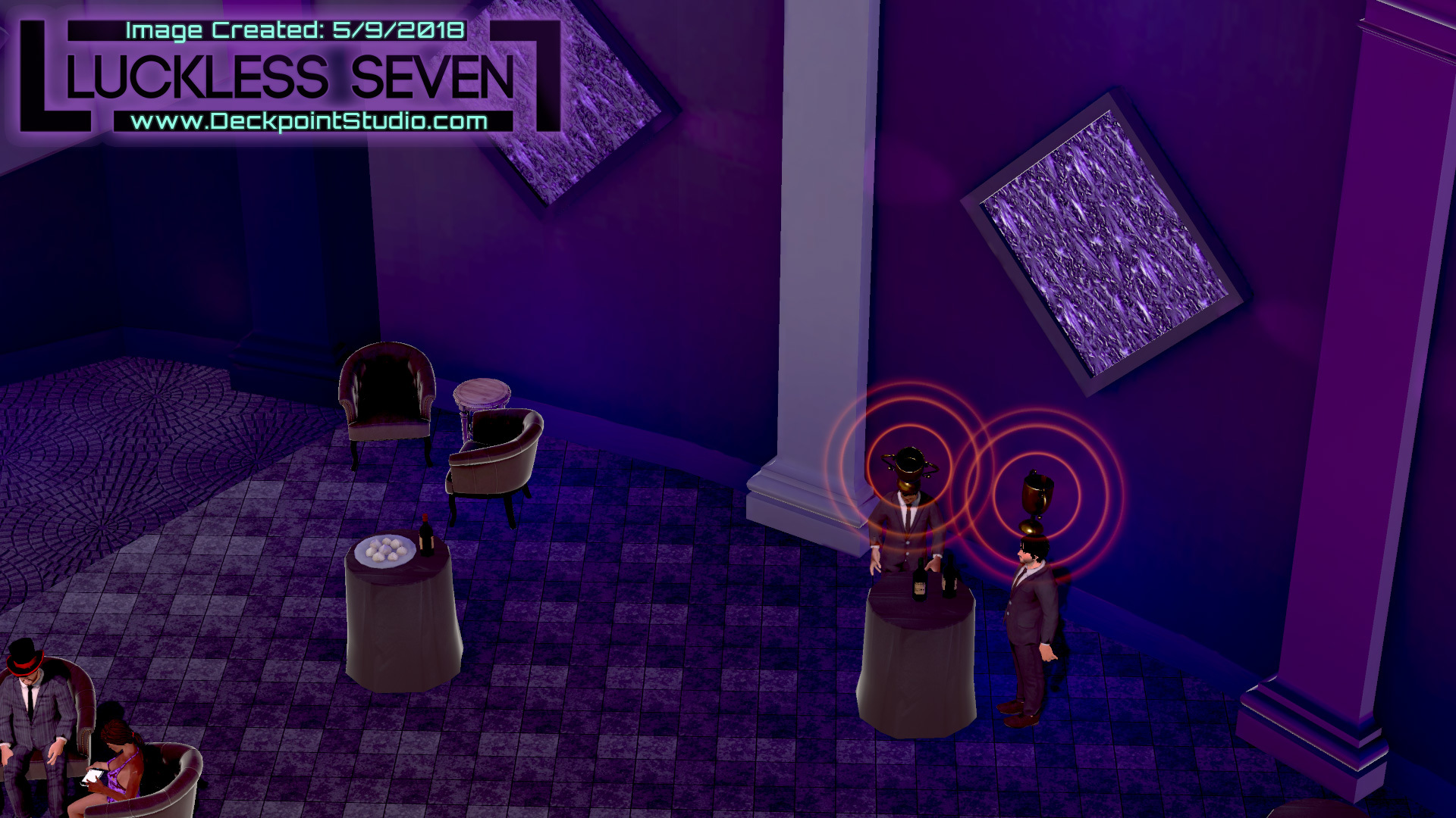
The VIP lounge feels so much more VIP with darker walls.
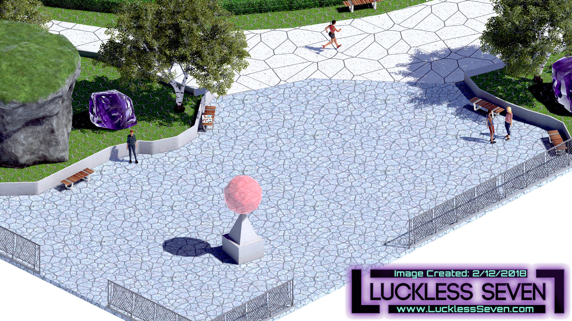
Before: The statues were giant transparent orbs.
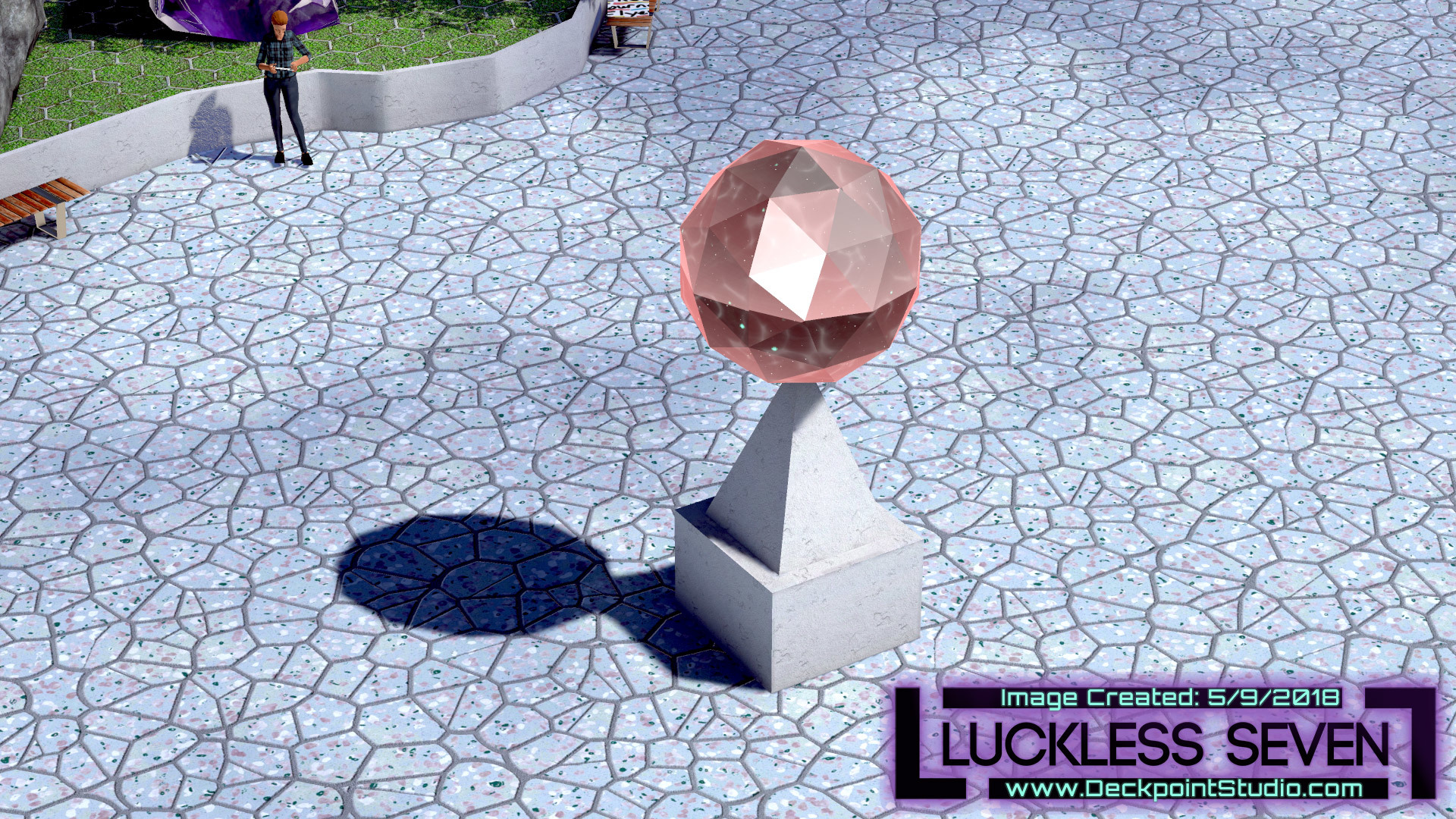
After: No longer just giant transparent orbs! Now they move! And are opaque!
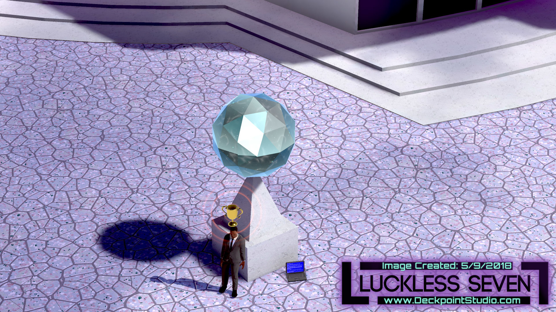
Shiny.
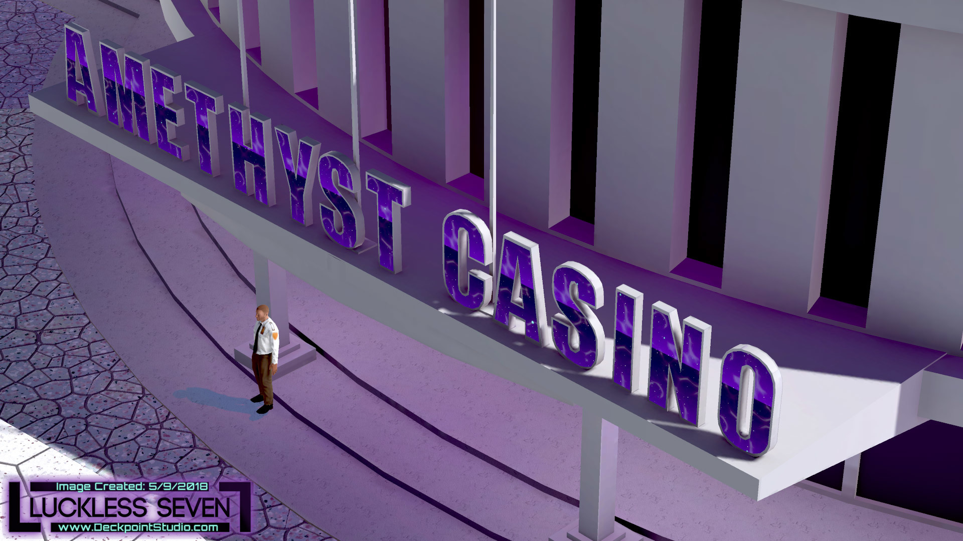
The Amethyst Casino sign has movement inside the letters.
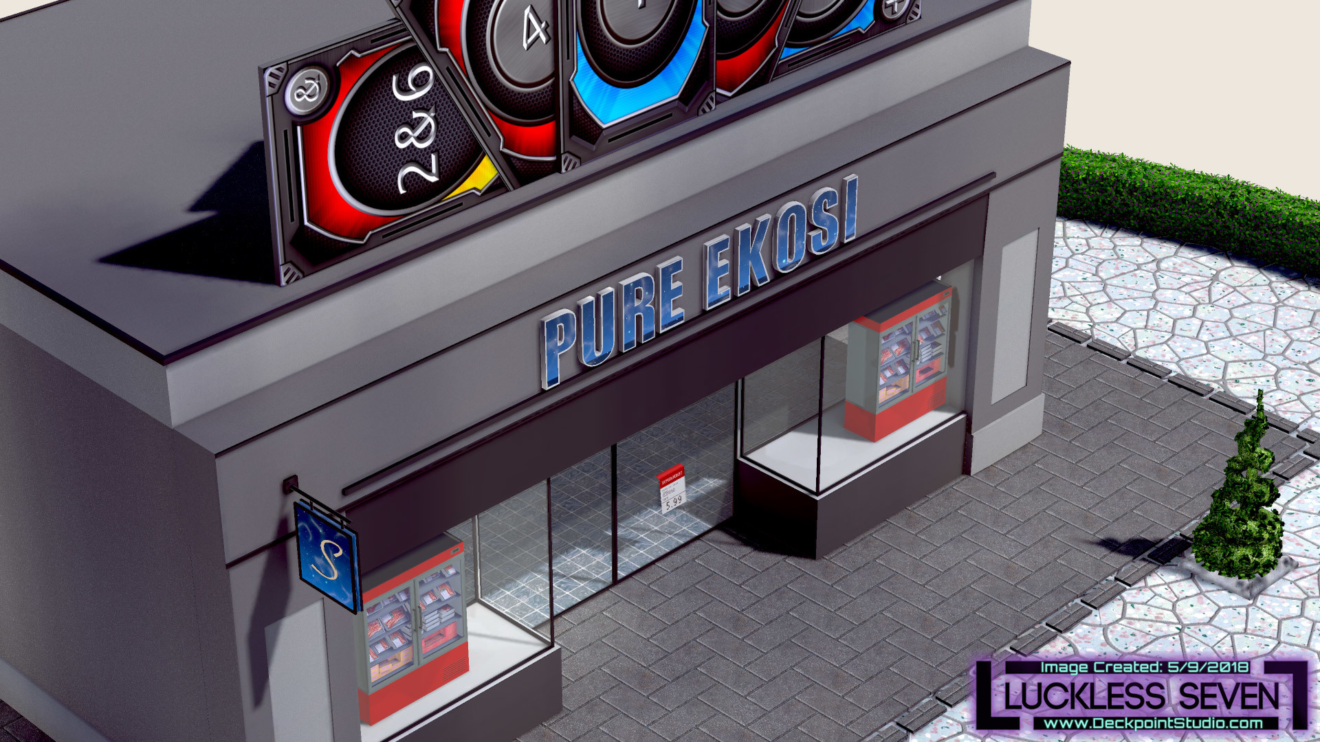
The Pure Ekosi sign has movement inside the letters.
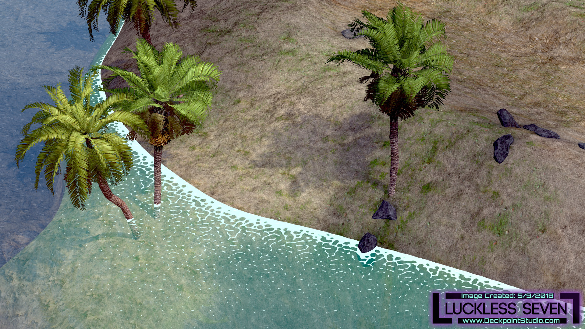
Day 4: The beach received a huge graphics update! New water + Added many new trees, rocks, sandbars, and more! NEW: Water moves up and down. The water is now transparent and has foam towards the shore.
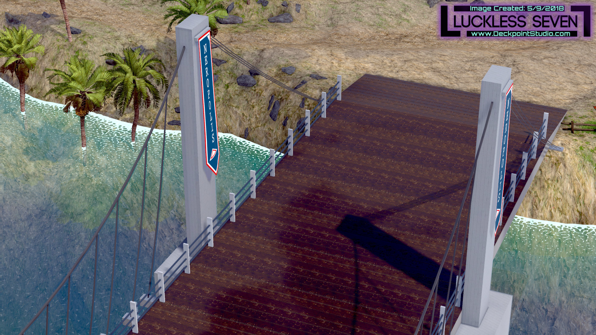
Crossing the bridge looks very different now.
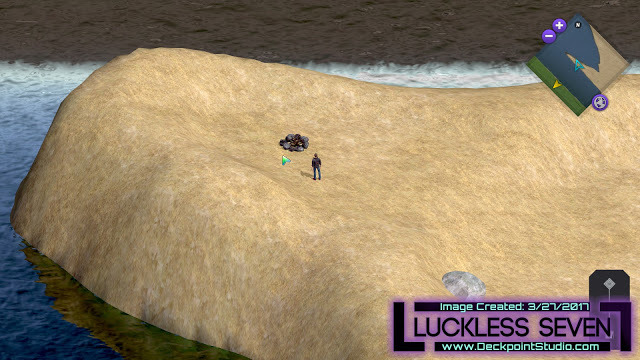
Before: The campfire site during the day. It was too empty. Also in this picture is the old water.
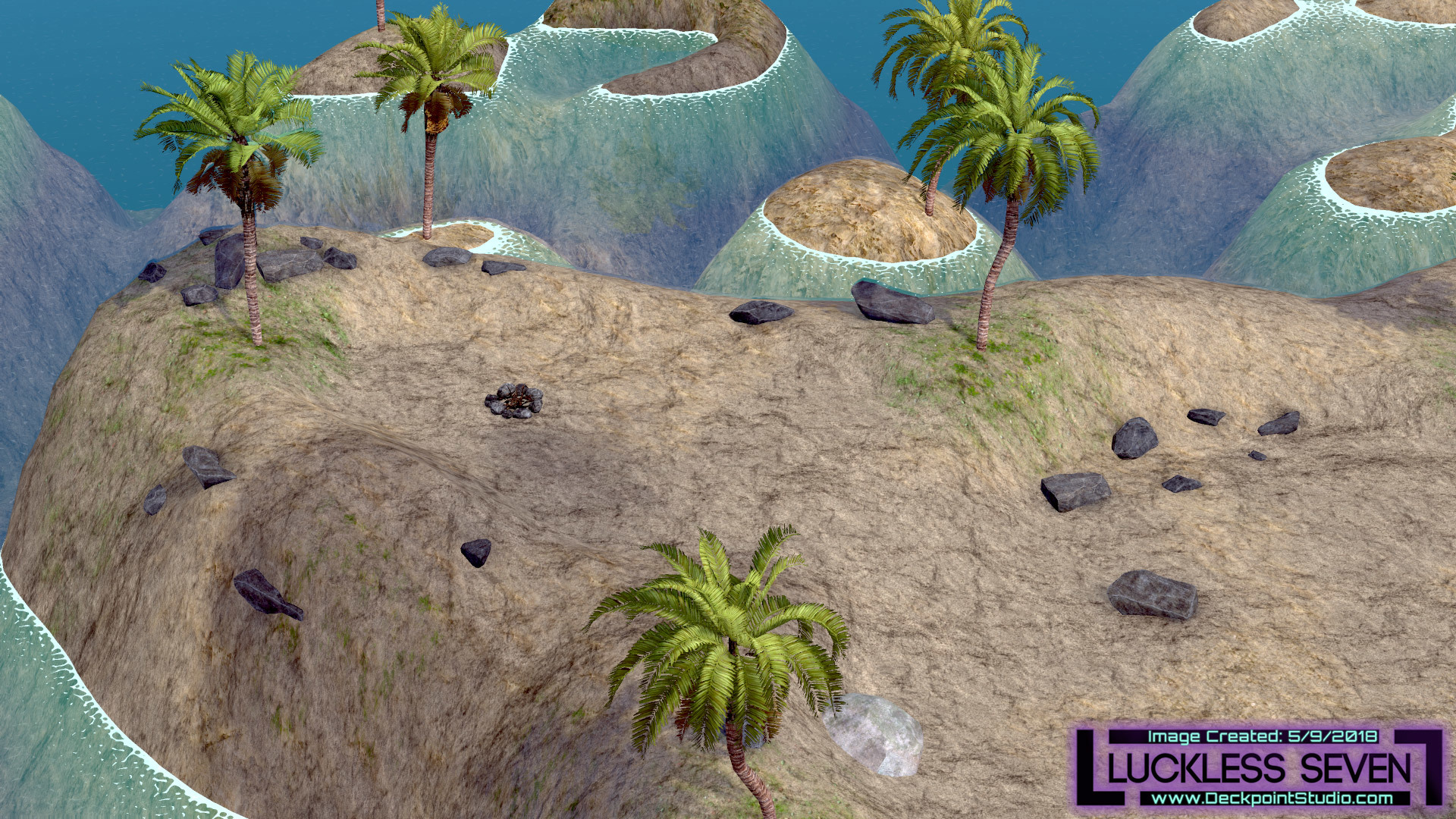
After: The campsite area has received some love and looks much more tropical.
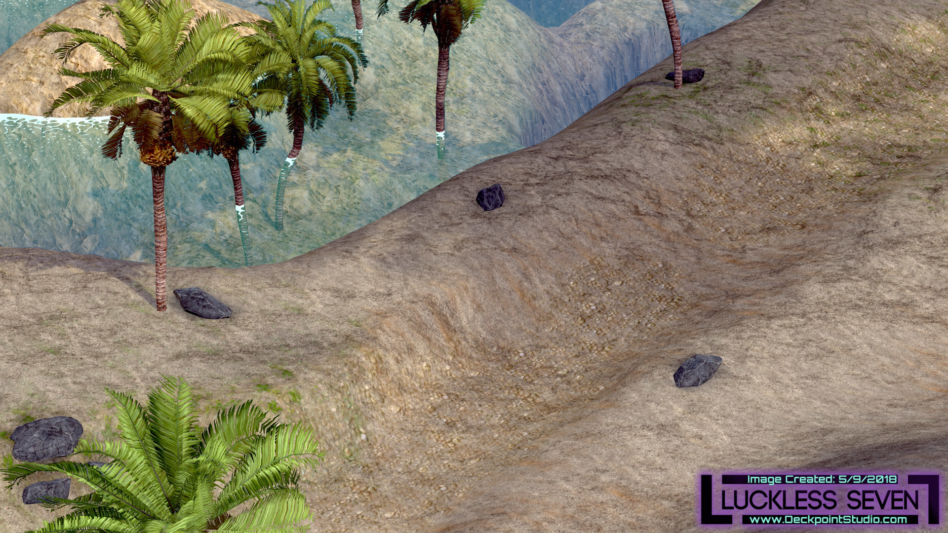
A new trail to the beach has been added.
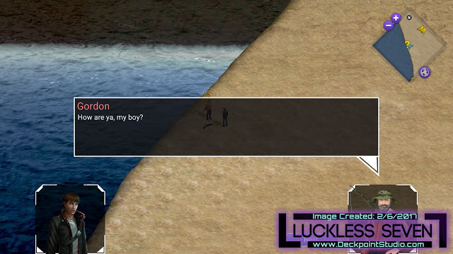
Before: The fisherman on a lonely coast. Also in this picture is the old water and old dialog graphics.
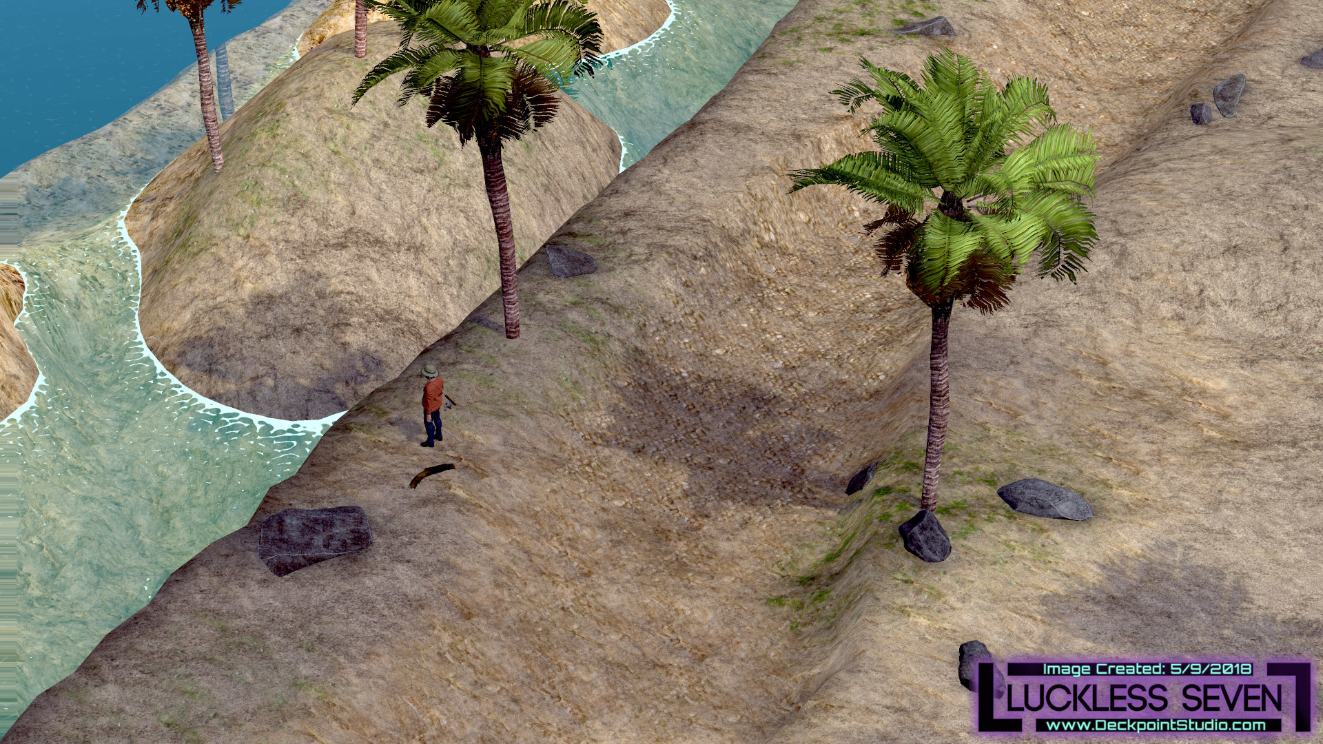
After: The Fisherman on a tropical lonely coast.
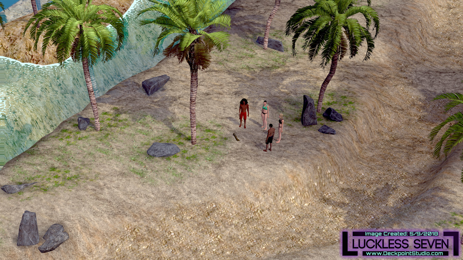
A group of friends hanging out on the beach.

The Filipelli home interior walls are more transparent. And added curtains!
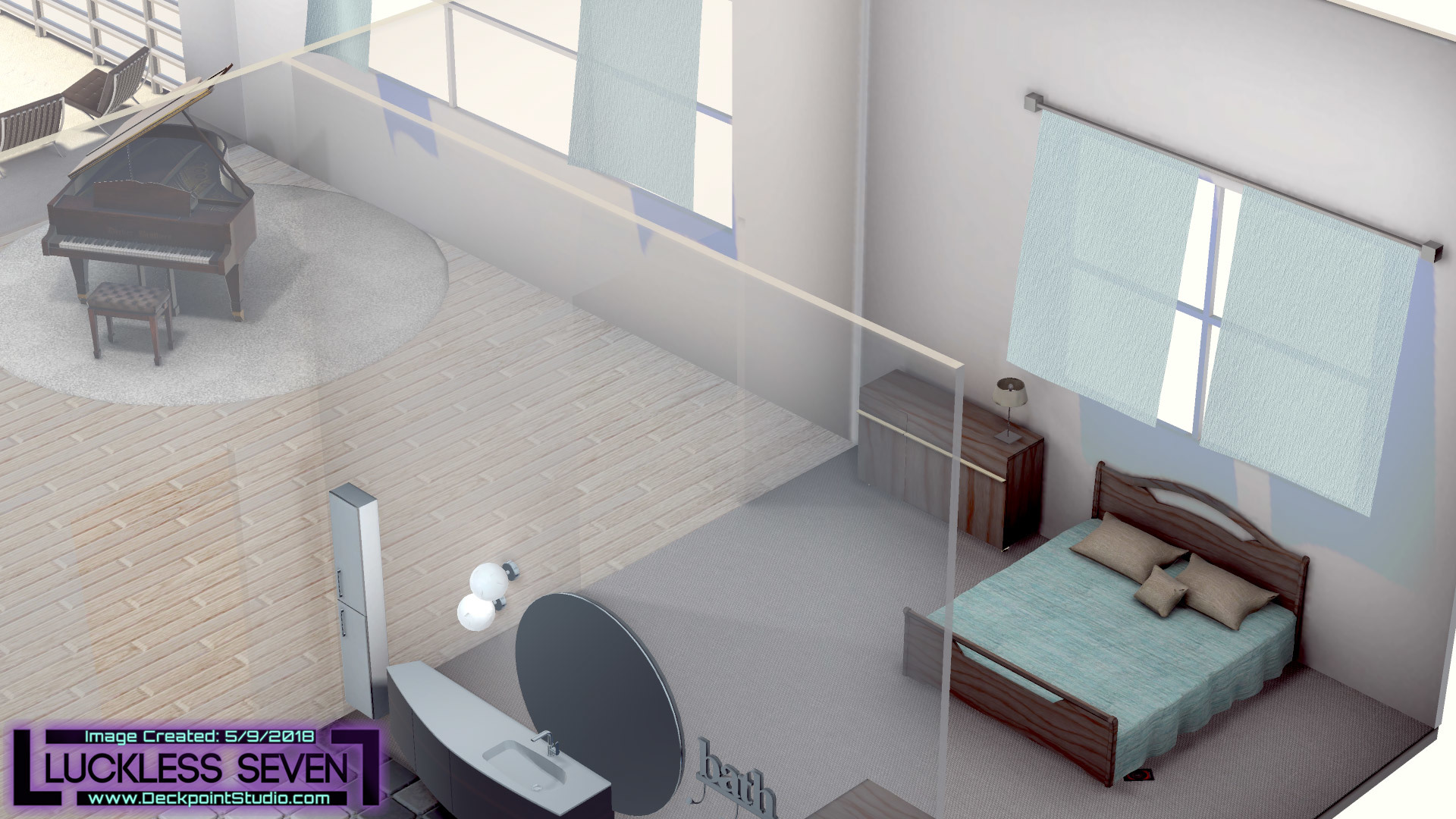
Look at those curtains!

Mark's home interior walls are more transparent. And added curtains!
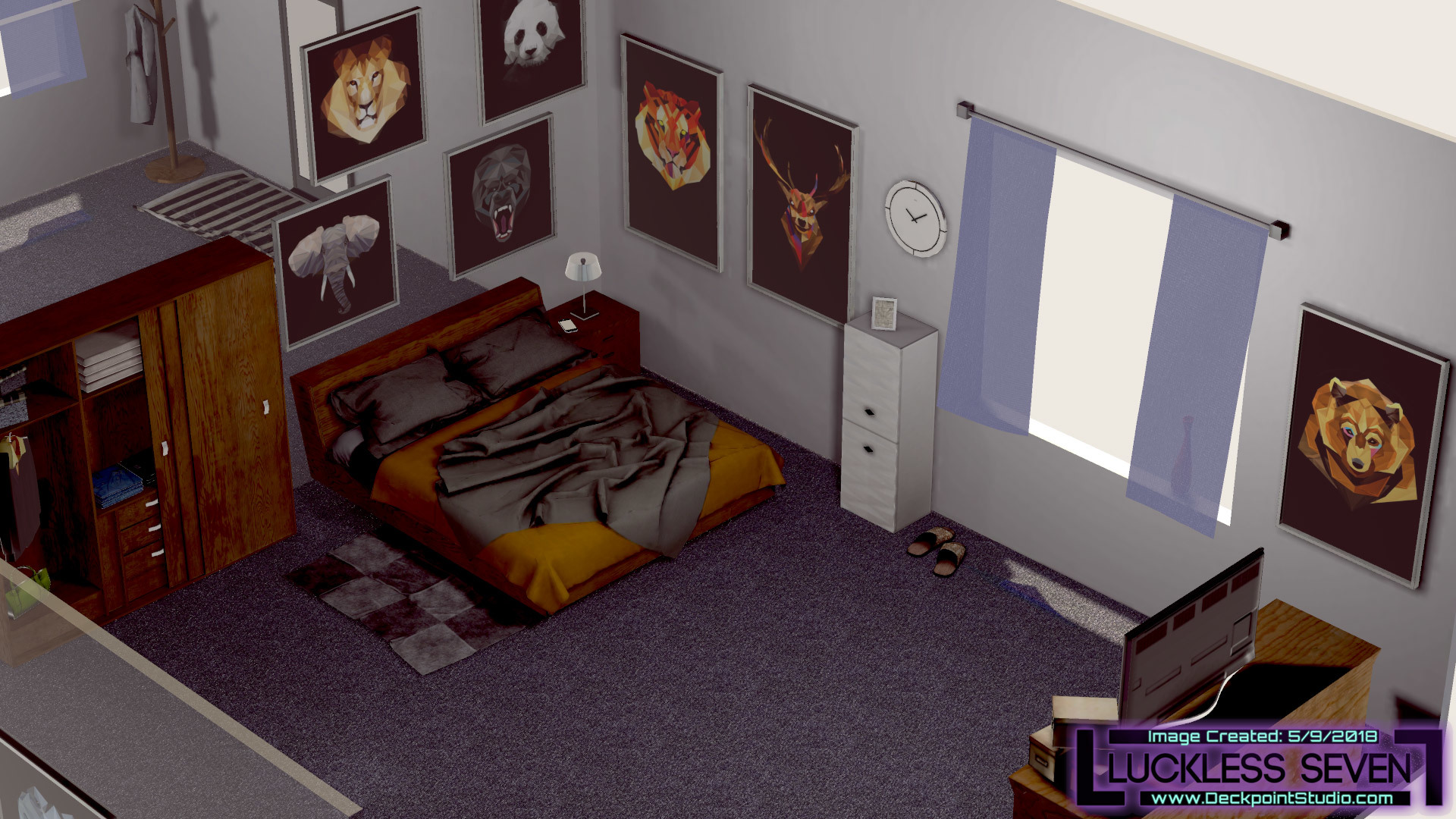
Curtains!

Join us on our journey as we develop Luckless Seven! Help shape the game and get access to exclusive content!

If you haven't done so already, follow and wishlist Luckless Seven on Steam!
There’s plenty more to come, as always. Next time, my partner Jonny will be bringing you a history of the changes to the Ekosi board over time. And you know we’ll be working on half-a-dozen different improvements to the existing game plus new content. ;)
If you have an opportunity, take a few minutes and download this update. It’s a big one! We’re excited to hear what you think of the perspective camera, so give it a spin and tell us your thoughts!
Until next time,
Tyler
Download the demo on Steam or IndieDB .
Read on our website for the best formatting experience .
Minimum Setup
- Processor: i3Memory: 3 GB RAM
- Memory: 3 GB RAM
- Graphics: GeForce GT 635M
- Storage: 8 GB available spaceAdditional Notes: Minimum Screen Resolution 720x480
Recommended Setup
- Processor: i5Memory: 6 GB RAM
- Graphics: GeForce GT 740
- Storage: 8 GB available spaceAdditional Notes: Recommended Screen Resolution 1920x1080
[ 6408 ]
[ 5913 ]
[ 2906 ]
[ 2497 ]
[ 1317 ]
[ 1040 ]
[ 32815 ]
[ 867 ]

