

- Multiplayer support: play with friends and strangers!
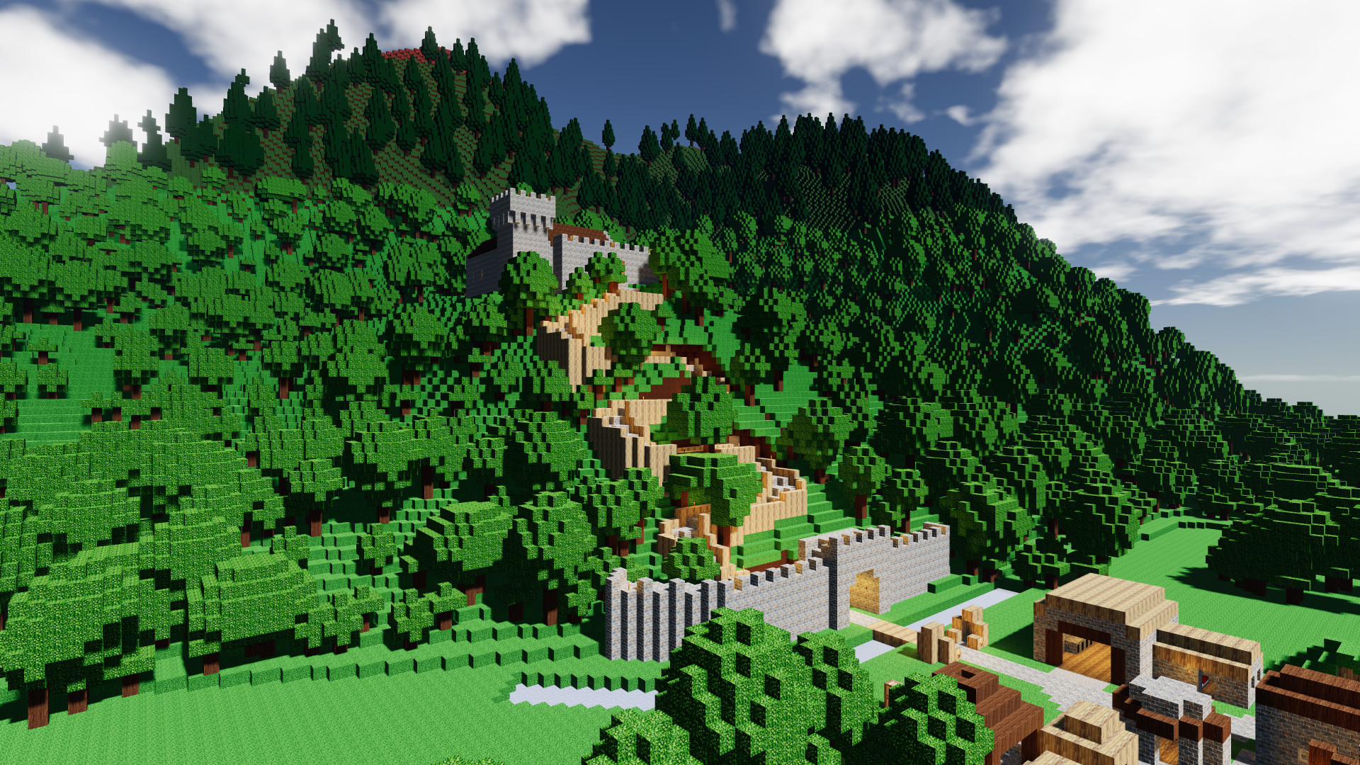
- Advanced pathfinding: colonists and zombies will find their way in the world you've build. They will dynamically navigate stairs, bridges and tunnels.
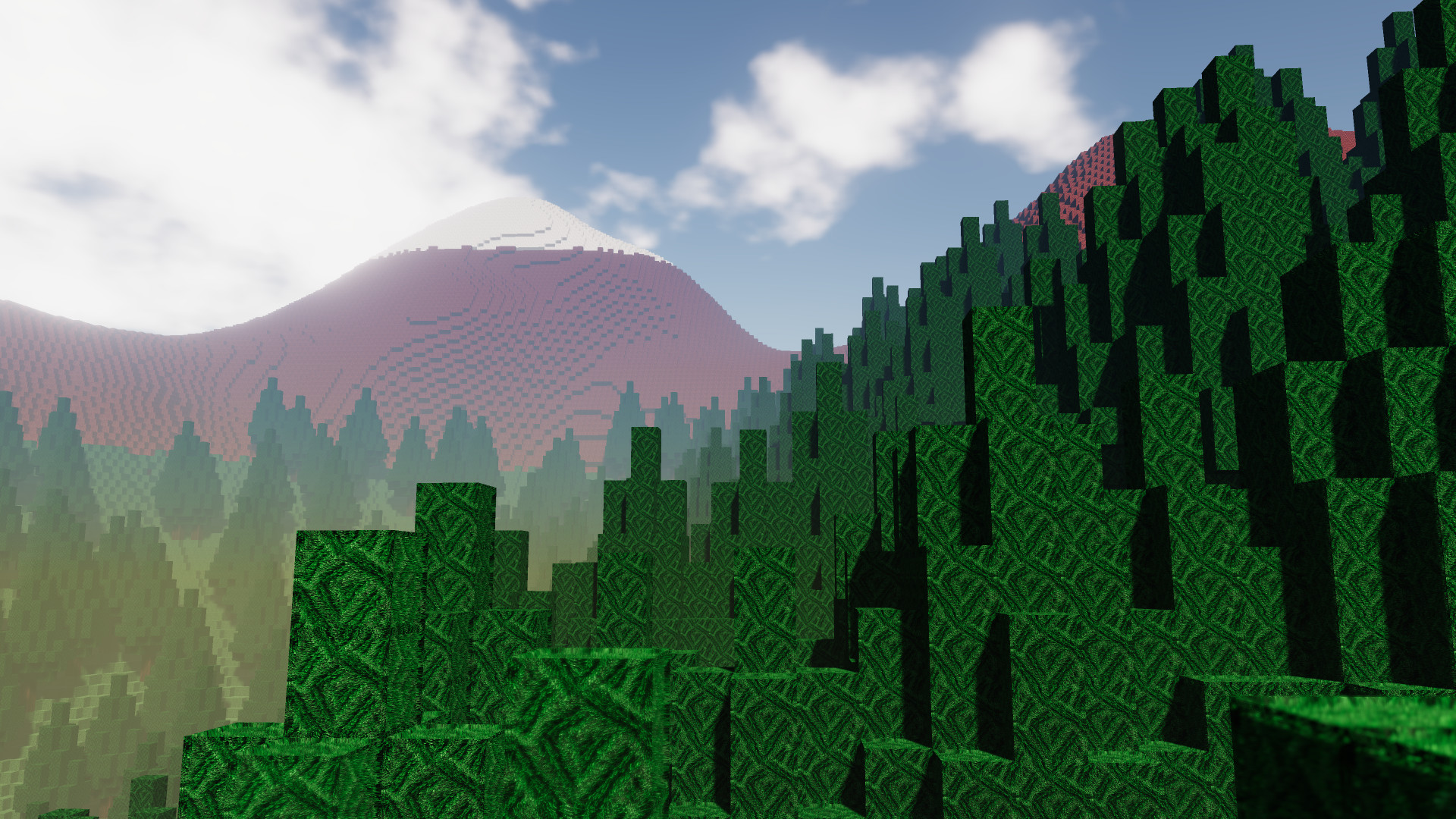
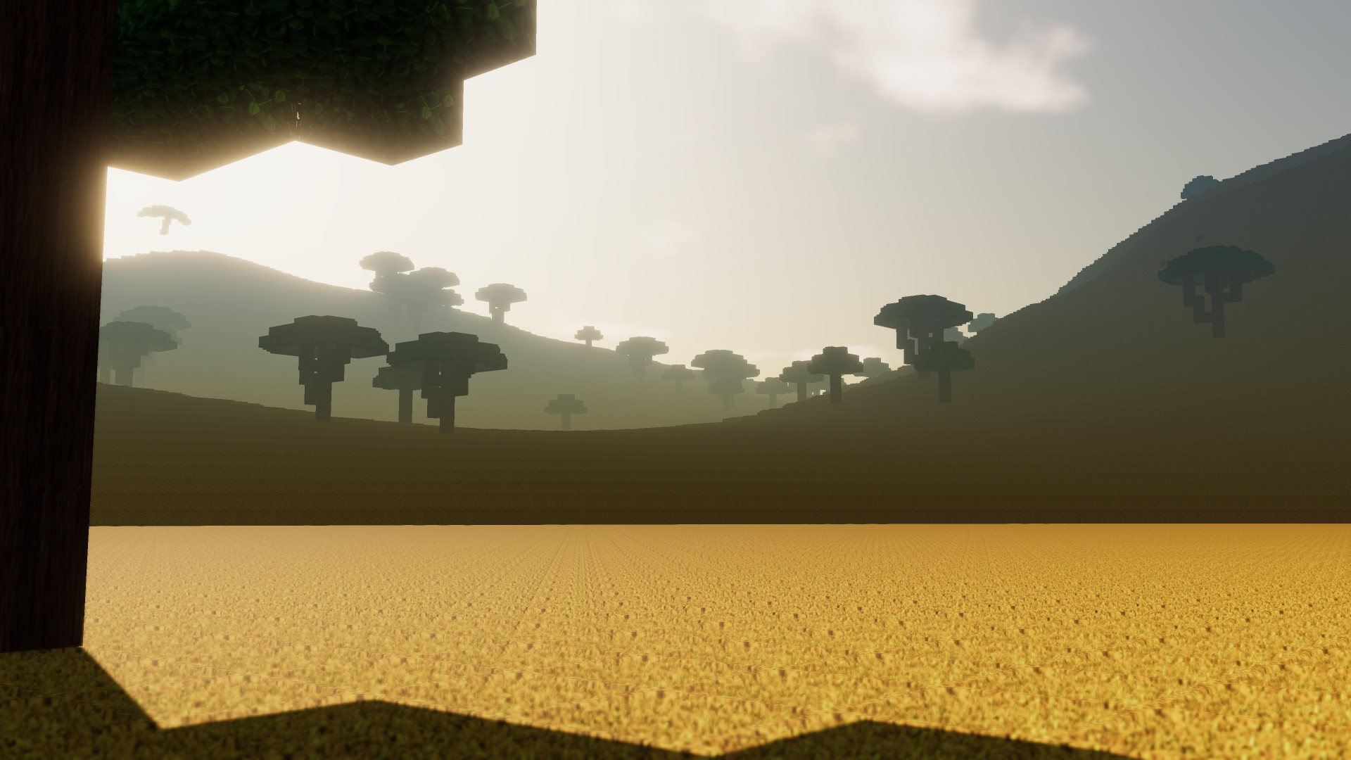
- Explore a world with realistically placed biomes. A giant jungle in the center of the world, surrounded by savannas, deserts and temperate biomes. Two polar regions in the far north and south.
- Support for textures and language packs created by players
- Dynamic lighting and eye adaptation
- Voice your suggestions and be part of the development of Colony Survival!

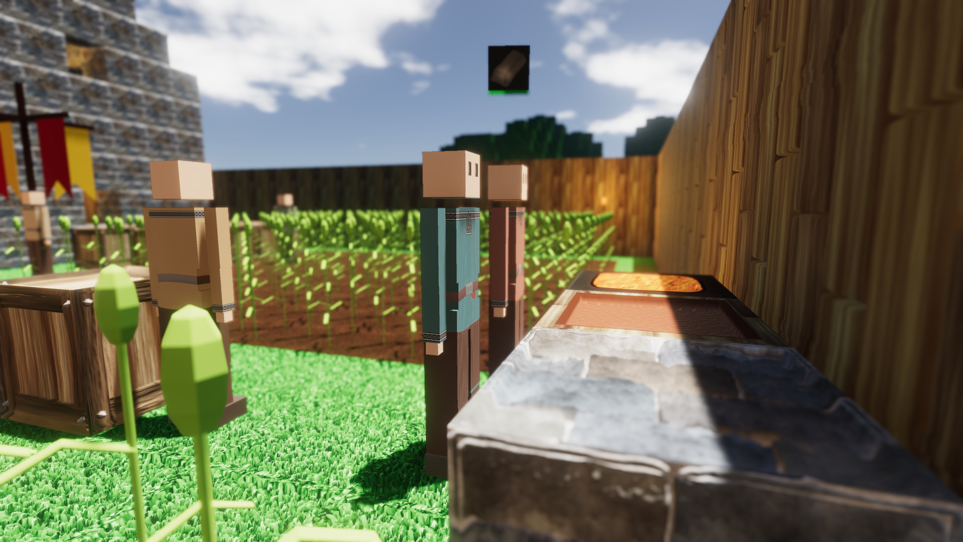
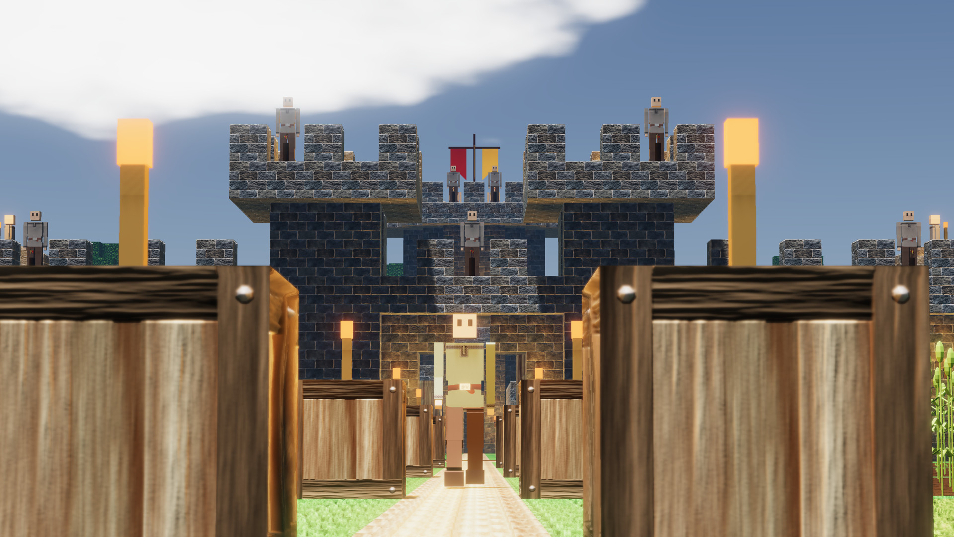
Landrus submission, one of the winners of the contest!
This morning, we reached the deadline of the contest for Artificial Extinction ! Weve picked the 10 winners and sent them all a Steam Key for AE. A lot of the submissions were very creative and impressive, so thanks to all participants! Boneidle, a winner whose submission was already featured in last weeks blog, even put his huge and detailed world on the Steam Workshop , so all of us can explore his spaceship. Other winners might do the same this weekend, so keep an eye on the Workshop! Check an album of all the winners here . You can also still open #submissions-only on the Discord for more info.

We've also made decent progress on the update this week. The search bar from the stockpile has been refactored, improved and added to the statistics menu. And thats also how we added categories. The search bar is a bit smarter now: it accepts commands like cat:, < and >. Cat: searches for entire categories, so cat:food will return a list of all food items. The angle brackets can be used to search for items that are below or above a certain threshold. For example, >1000 will return all item stacks that are larger than 1000. As you can see in the screenshot, these commands can also be combined! And these commands work in both search bars, the one in the stockpile and the one in the statistics menu.
There are now three things left on our to-do-list:
- Theres quite a bit of empty space left next to the search bar in the stockpile. We want to put some buttons there that automatically put useful commands in the search bar, like cat:job. That should help to explain the new feature a bit.
- There should be a tab with non-stockpile data in the statistics menu, data like the amount of colonists, % idling of different jobs, and happiness.
- Wed like to add a drop-down menu where you can select other colonies and see their statistics

Image above is currently in-game, image below is an imperfect mock-up in Photoshop. The sentence that is lost in the second image should be visible in a tooltip.
While Zun is working on the statistics, Im creating detailed mock-ups for a big revamp of the interface. We were always pretty utilitarian guys. If it works, it works, and it doesnt matter too much how it looks. But lately, Ive noticed how my preferences are changing. Ive been playing more other games, and Im drawn to games with smooth, intuitive UIs and a bit repulsed by complex, unwieldy ones. Just take a look at this trailer:
https://www.youtube.com/watch?v=CcF9V-0l2P0
Im not really into wine or winemaking but just look at how smooth and beautiful the graphics and the UI are! A couple of weeks ago I mainly thought our UI needed some shading, a couple of textures and fancier, consistent buttons and sliders, but Hundred Days proves me wrong completely. Theyve got a very minimalistic UI with flat colors, but it looks very professional and intuitive.
An important difference between our UI and theirs seems to be categorization? Our brains only have limited processing power, so when we look at a new menu, we cant instantly read and comprehend all the text and icons. When all the options and info are all just thrown into your face without clear categorization, you have got to do the processing to determine what is what. Which options are important, what should you read and what can be safely ignored for now? Its not clear, so youve got to think.
A better UI removes a lot of the required processing. It visually distinguishes between more and less important options and texts. A different kind of description is a different size/color/etcetera, making it instantly clear that youre looking at different things.
While thats certainly an aesthetic upgrade, it isnt merely aesthetic. It fundamentally improves the ease and joy of playing the game. So were taking a long and hard look at the UI and in the update after statistics, itll be changed pretty radically!
Bedankt voor het lezen :D
Reddit // Twitter // YouTube // Website // Discord
Minimum Setup
- OS: Ubuntu 12.04+. SteamOS+; 64-bit
- Processor: Intel Pentium G620 (2.5 Ghz dual core) or equivalentMemory: 2 GB RAM
- Memory: 2 GB RAM
- Graphics: Intel HD Graphics 5000. 1280x720 display
- Storage: 300 MB available spaceAdditional Notes: Work in progress: new features may raise the bar. optimizations may lower the bar
Recommended Setup
- OS: Ubuntu 12.04+. SteamOS+; 64-bit
- Processor: Intel i5-2300 (2.8 GHz quad core) or equivalentMemory: 4 GB RAM
- Graphics: Nvidia GTX 750 or equivalent. 1920x1080 display. supporting openGL 4.2+Network: Broadband Internet connection
- Storage: 1 GB available spaceAdditional Notes: Work in progress: new features may raise the bar. optimizations may lower the bar
[ 6482 ]
[ 1519 ]
[ 2422 ]

Time left:
356124 days, 6 hours, 36 minutes

Time left:
356124 days, 6 hours, 36 minutes

Time left:
0 days, 14 hours, 36 minutes

Time left:
0 days, 14 hours, 36 minutes

Time left:
12 days, 14 hours, 36 minutes

Time left:
19 days, 14 hours, 36 minutes

Time left:
12 days, 14 hours, 36 minutes

Time left:
12 days, 14 hours, 36 minutes
Time left:
28 days, 14 hours, 36 minutes
Time left:
0 days, 8 hours, 36 minutes
Time left:
1 days, 8 hours, 36 minutes
Time left:
1 days, 8 hours, 36 minutes
Time left:
2 days, 8 hours, 36 minutes
Time left:
6 days, 8 hours, 36 minutes
Time left:
8 days, 8 hours, 36 minutes
Time left:
12 days, 8 hours, 36 minutes
Time left:
13 days, 8 hours, 36 minutes


