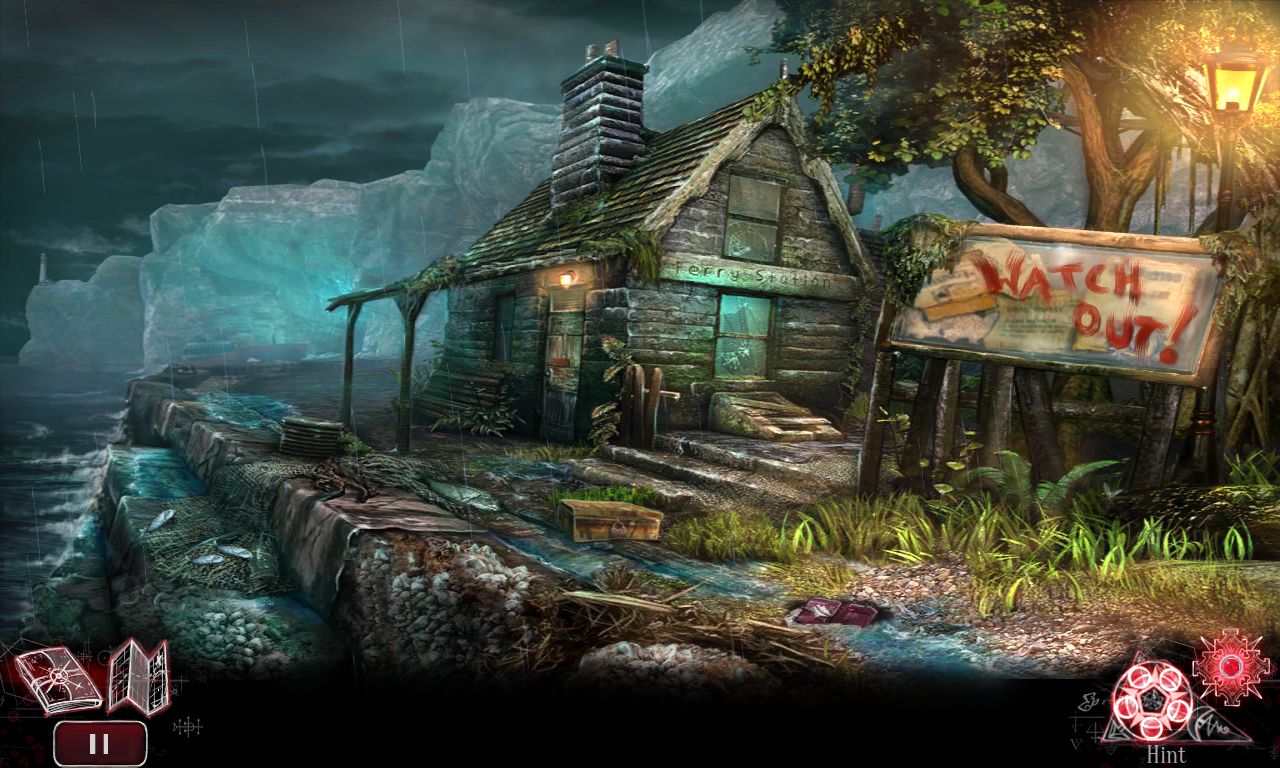
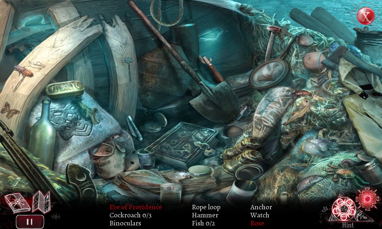
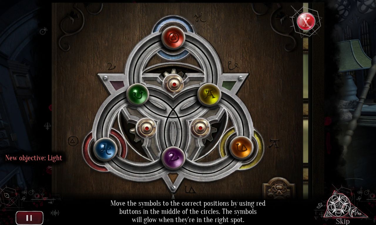
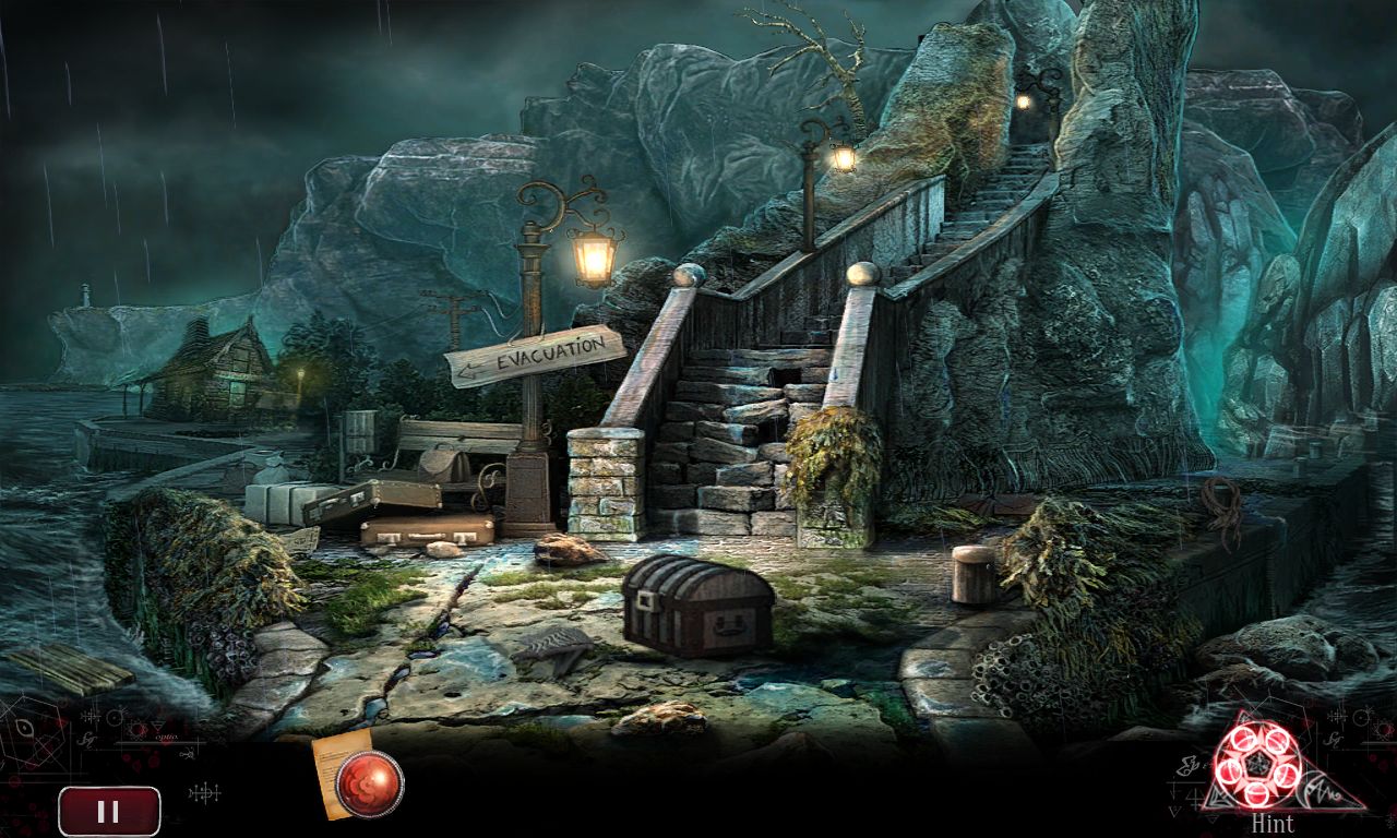
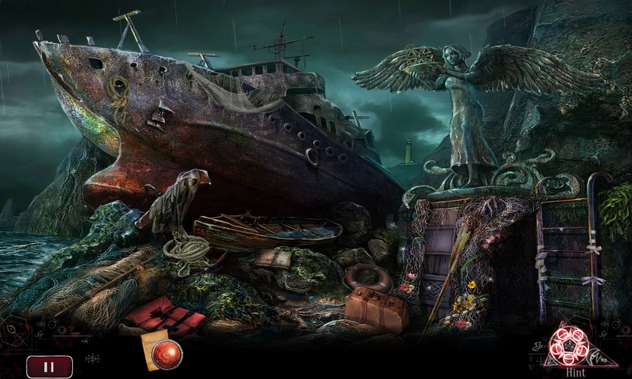
Explore the story of the former student of Professor Child, who comes to her mentor's aid following his mysterious disappearance on a quest to uncover the secrets of the philosopher's stone.
Embark on a wonderful adventure which will lead you to an island inhabited by a mysterious order. Face a dangerous enemy trying to claim an unbelievably powerful ancient artifact and save your mentor!

Embark on a wonderful adventure which will lead you to an island inhabited by a mysterious order. Face a dangerous enemy trying to claim an unbelievably powerful ancient artifact and save your mentor!

Features
- explore 37 Intriguing Locations!
- Discover the secrets of 31 challenging mini-games!
- Search for clues in 14 scenes with hidden objects!
- Don't let evil take over the world!
Why we've changed the art style of Irony Curtain?
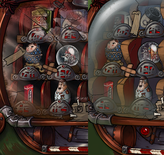
The before screenshots weve shown are undoubtedly the ones that look brilliant detailed backgrounds, vibrant colours and original characters. And thats the whole point. It looked awesome on static graphics but the puzzles and navigating through the level seemed frustrating just BECAUSE of all those things. When everything is so detailed every object fights for your attention so it feels like pixel hunting all the time. It is crucial for us to have the best possible gameplay without any frustrations and unfortunately, the previous style caused a lot of it.
One of Irony Curtain's minigames: the very detailed BEFORE (left) version and simpler AFTER (right) version
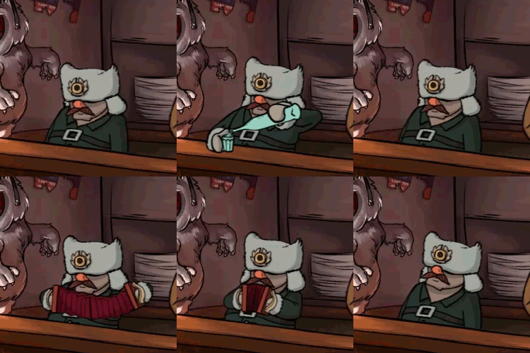
The characters in the early prototype we've were made with a technique called cutout animation, a form of stop-motion animation that uses flat objects (think about the paper theatre that youve probably played as a child) . Right now Evan and other characters from the game are animated in a traditional stop-motion way that requires simpler textures on the models. And simpler textures mean simpler art style everywhere in order to keep the project consistent.
BEFORE:
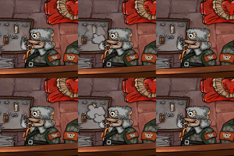
[b]
AFTER:[/b]
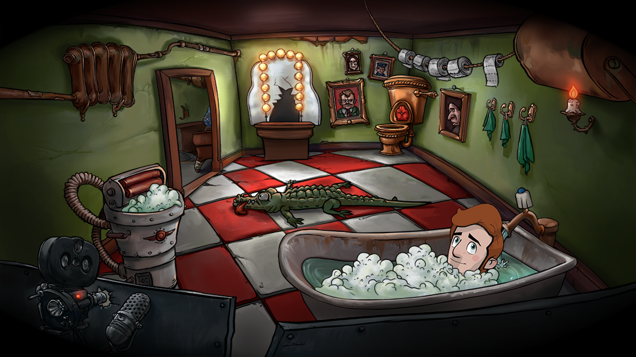
When Evan first arrives at the Leaders Heart Hotel, hes overwhelmed by its monumentality and splendor. The location should reflect that, so weve decided to add a lot of empty space and make the character look really small in comparison to the building. There are locations in the game that didnt change that much though (e.g., Evans bathroom in the hotel room), weve only adjusted them to the current style of the game.
BEFORE:
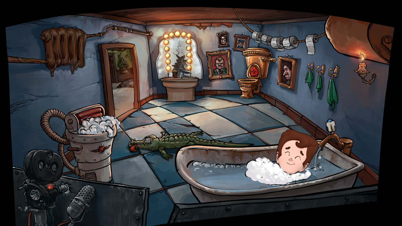
[b]
AFTER:[/b]
In the next episode of Behind Irony Curtain, well show you the creative process behind creating the locations in Irony Curtain. Stay tuned!
Comrades!
Some time ago we showed you how Irony Curtain looked in the early prototype phase and how it looks like now .
Today wed like to talk a little bit more about the reasons behind the change and the whole creative process. Its no doubt that Irony Curtain came a long way from the times when it was just a prototype called simply Matryoshka.
There are three main reasons why weve decided to simplify the art style:
1. The previous style looked great but it didnt play well
The before screenshots weve shown are undoubtedly the ones that look brilliant detailed backgrounds, vibrant colours and original characters. And thats the whole point. It looked awesome on static graphics but the puzzles and navigating through the level seemed frustrating just BECAUSE of all those things. When everything is so detailed every object fights for your attention so it feels like pixel hunting all the time. It is crucial for us to have the best possible gameplay without any frustrations and unfortunately, the previous style caused a lot of it.
One of Irony Curtain's minigames: the very detailed BEFORE (left) version and simpler AFTER (right) version

2. Weve changed the way we animate characters
The characters in the early prototype we've were made with a technique called cutout animation, a form of stop-motion animation that uses flat objects (think about the paper theatre that youve probably played as a child) . Right now Evan and other characters from the game are animated in a traditional stop-motion way that requires simpler textures on the models. And simpler textures mean simpler art style everywhere in order to keep the project consistent.
BEFORE:

[b]
AFTER:[/b]

3. We want the art style to be a part of how we tell the story
When Evan first arrives at the Leaders Heart Hotel, hes overwhelmed by its monumentality and splendor. The location should reflect that, so weve decided to add a lot of empty space and make the character look really small in comparison to the building. There are locations in the game that didnt change that much though (e.g., Evans bathroom in the hotel room), weve only adjusted them to the current style of the game.
BEFORE:

[b]
AFTER:[/b]

In the next episode of Behind Irony Curtain, well show you the creative process behind creating the locations in Irony Curtain. Stay tuned!
[ 2018-12-28 15:09:28 CET ] [Original Post]
Minimum Setup
- OS: Ubuntu 12.04 (32/64bit)
- Processor: 1.5 GHzMemory: 512 MB RAM
- Memory: 512 MB RAM
- Graphics: 128 MB VRAM
- Storage: 1 GB available space
Recommended Setup
- OS: Ubuntu 12.04 (32/64bit)
- Processor: 2 GHzMemory: 1 GB RAM
- Graphics: 256 MB VRAM
- Storage: 1 GB available space
GAMEBILLET
[ 6313 ]
FANATICAL
[ 5787 ]
GAMERSGATE
[ 1933 ]
MacGameStore
[ 2282 ]
FANATICAL BUNDLES
GMG BUNDLES
HUMBLE BUNDLES
by buying games/dlcs from affiliate links you are supporting tuxDB

