
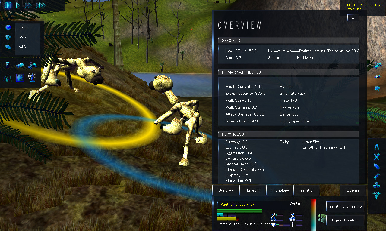
Variation
- Every creature is uniquely defined by its genes.
Mutation
- Child creatures are slightly randomly modified versions of their parent(s).
Natural Selection
- The environment affects every creature in their struggle to survive.
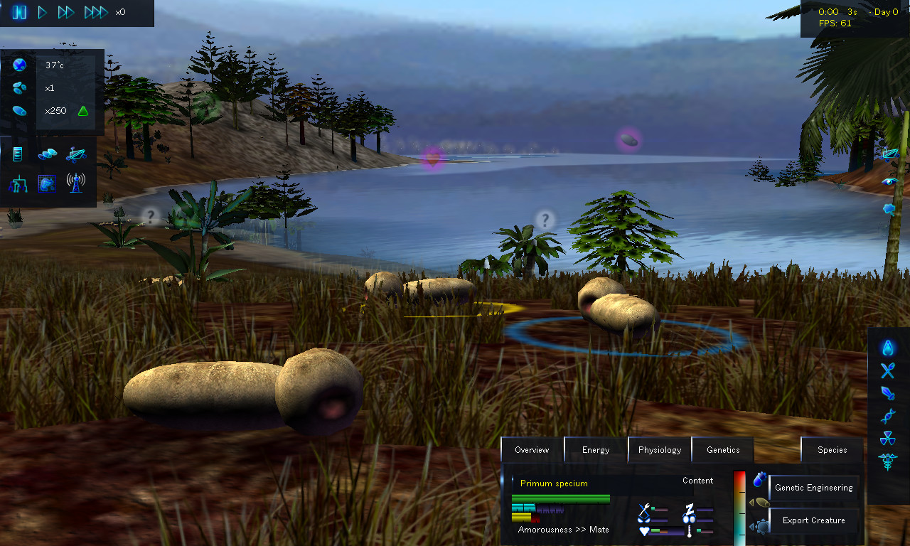
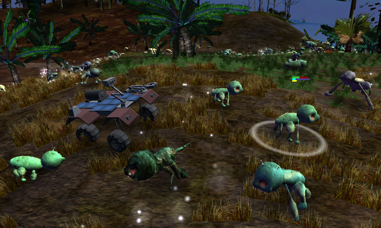
Observe or Guide
Whether you just want to observe, watch and study as the tree of life constructs itself from a single species, or you want to be an active influence on the development of the species in the game, the choice is up to you! Take a hands-on approach by using the nursery, an isolated area where you can tinker with the gene pool to your heart’s content. Use rovers to decide which creatures get to eat today and which ones starve! Create global catastrophes like an ice-age or a world-spanning flood to weed out the most vulnerable species. Or simply sit back and watch the life-and-death saga unfold!
Tell Your Story
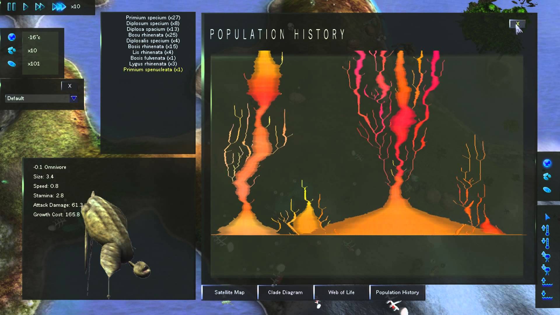
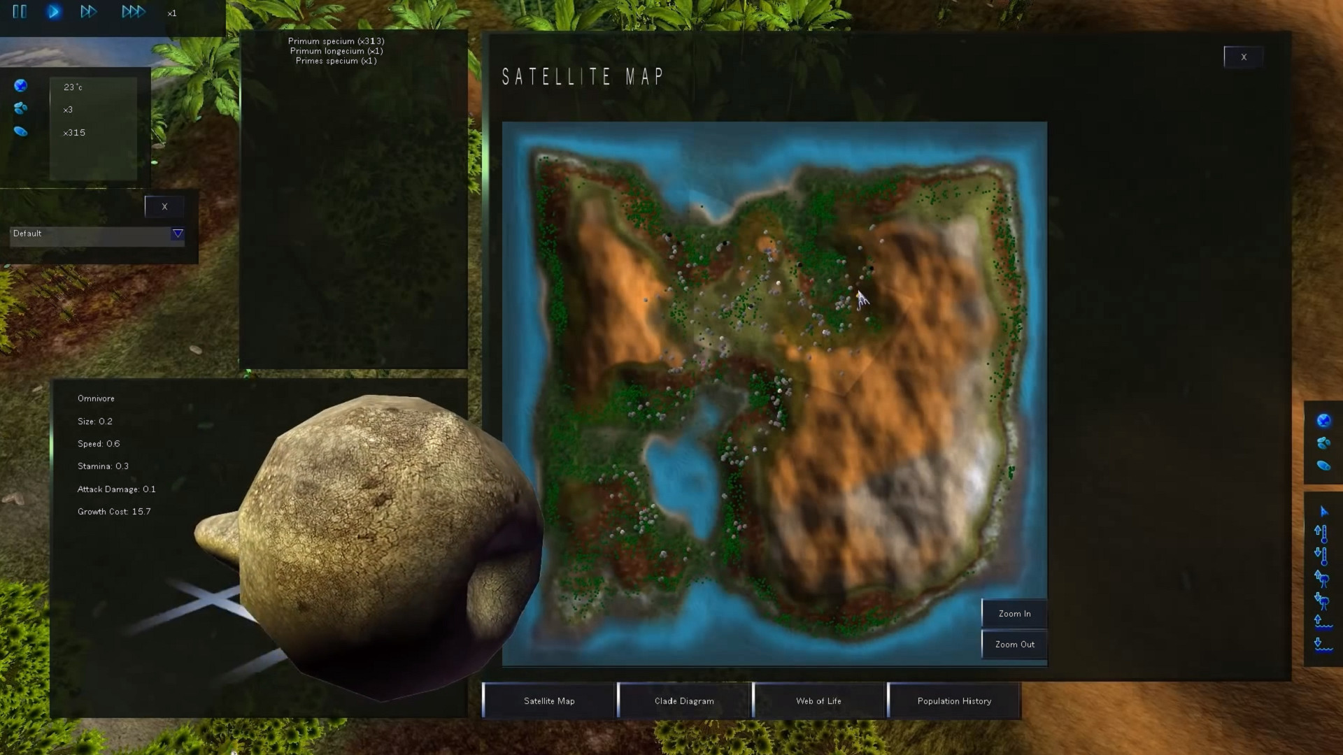
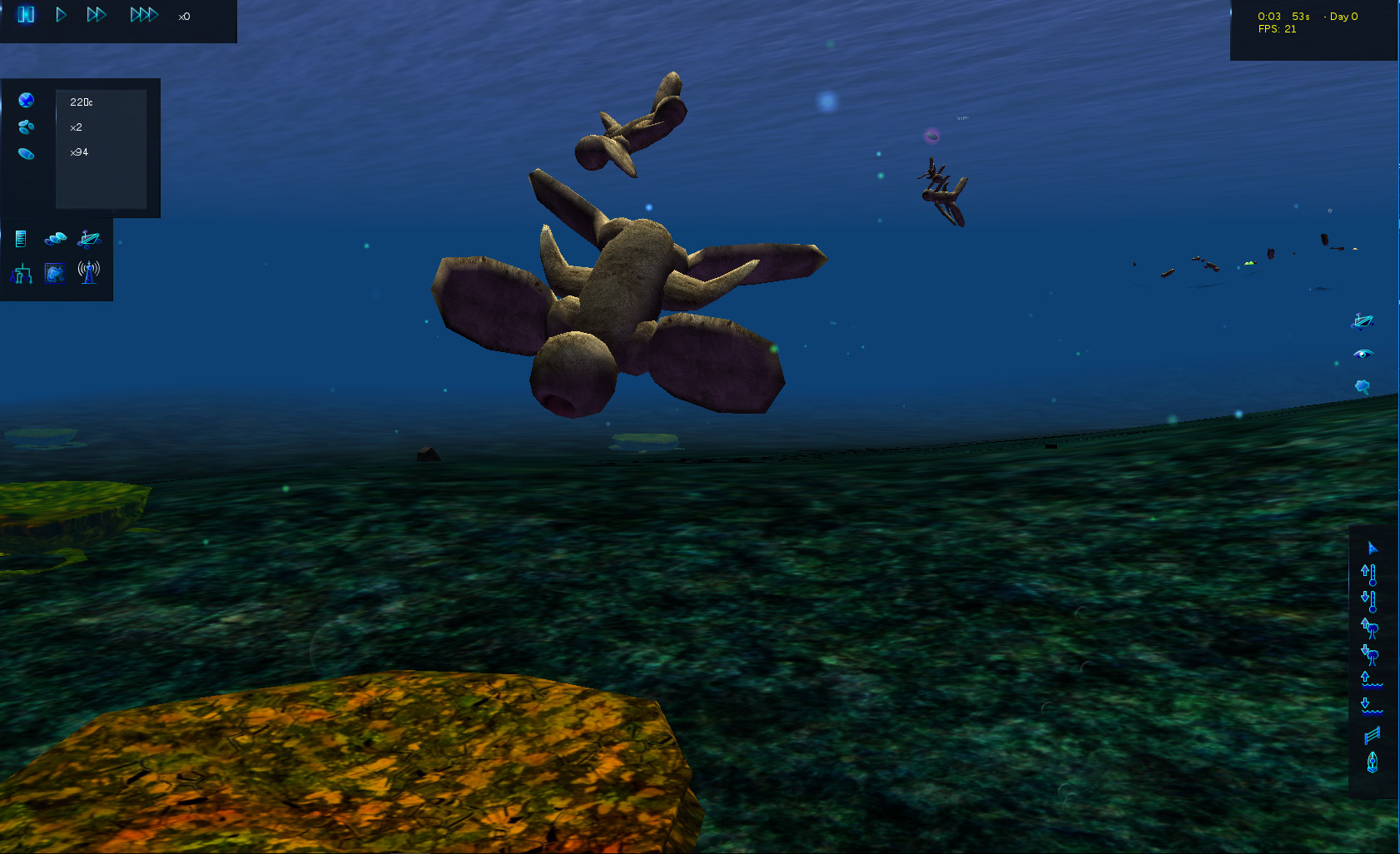
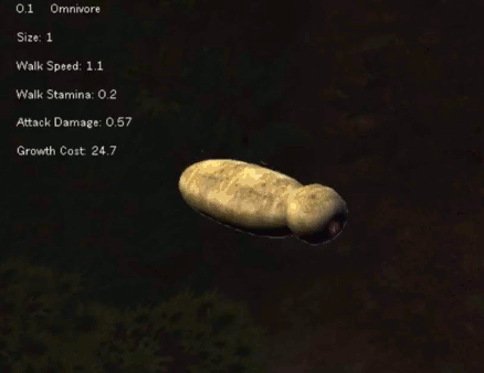
However you treat your evolutionary sandbox, we give you the tools to tell it’s story! View every single evolutionary step in detail using the clade diagram, see where each species are living using the satellite map, get a better picture of how varied your gene pool actually is with the web of life, and view every possible detail on each creature using the creature inspection tools.
- Species: Artificial Life, Real Evolution Linux Depot [1.44 G]
Geez, the SeasonalCycleEditor UI control has well and truly gone through a its fair share of iterations now.
The goal here is to provide an intuitive interface for customizing the duration, magnitude and offset of seasonal temperature/fertility cycles, which themselves follow a straightforward sine curve.
The first version of this control utilized a straightforward 2D texture of a sine curve, which I figured I could stretch, tile and crop to create the cycle graph. As mentioned in a previous post, that attempt failed because frickin arithmetic, how does it even work, science cant explain that.
So I scrapped the sprite-based control and made this shader-based control instead:

Technically, this is two controls: the temperature and fertility curves are rendered separately on top of one another. Its a somewhat prettier result, but it lacks polish and isnt exactly intuitive: 6 handles on a single surface is way too many, and if it wasnt labelled seasonal cycle itd be quite difficult to guess at its purpose.
Not good enough. Try again:

Better. Separating the curves was a good call. Their units (Celsius and percentage respectively) are unrelated, so sharing graph space only makes it more difficult to label the Y-axis.
Labeling the seasons was also a good call. I originally considered Spring/Summer/Autumn/Winter, but Wet/Hot/Dry/Cold are more descriptive and less tied to real-world seasons.
Also, theyre shorter. Easier to fit on the UI.
The result is still non-optimal, however. I dont like that the hot and cold season bars overlap with the wet and dry seasons, a) because thats not accurate (hot shouldnt start as soon as cold ends!) and b) because its not how we *think* about seasons. Sure, were aware that in reality one fades into the other, but in our minds, the concept of spring is distinct and separate from the concept of summer.
To be maximally intuitive, a graph like this should reflect the mental model the player has of the thing being graphed.
One more try:

Much better. Still could use some tweaks, labels, and a brighter season description bar (my laptop has a very bright screen, which makes it hard to see how dark some parts of the game are until I export the screenshots to a different machine), but its very much getting there. Im happy to leave it here for the moment and make progressive tweaks to the design as I push forward to 0.13.
Cheers,
Quasar
Cross-posted from: https://speciesdevblog.wordpress.com/2019/09/27/tis-the-seasons/
Minimum Setup
- OS: Ubuntu 12.04 or higherMemory: 600 MB RAMStorage: 500 MB available space
- Memory: 600 MB RAMStorage: 500 MB available space
- Storage: 500 MB available space
Recommended Setup
- OS: Linux Kernel 4.0. Mesa 12. X11 7 (or above)
- Processor: Dual CoreMemory: 512 MB RAM
- Graphics: OpenGL 3.0
- Storage: 512 MB available space

[ 6370 ]
[ 5870 ]
[ 1991 ]
[ 1943 ]
[ 986 ]

Time left:
356099 days, 18 hours, 51 minutes

Time left:
356099 days, 18 hours, 51 minutes

Time left:
4 days, 2 hours, 51 minutes

Time left:
32 days, 2 hours, 51 minutes

Time left:
35 days, 2 hours, 51 minutes

Time left:
36 days, 2 hours, 51 minutes

Time left:
9 days, 12 hours, 51 minutes
Time left:
4 days, 20 hours, 51 minutes
Time left:
10 days, 20 hours, 51 minutes
Time left:
11 days, 20 hours, 51 minutes
Time left:
16 days, 20 hours, 51 minutes
Time left:
18 days, 20 hours, 51 minutes
Time left:
22 days, 20 hours, 51 minutes
Time left:
2 days, 10 hours, 6 minutes

Time left:
7 days, 2 hours, 52 minutes

Time left:
9 days, 1 hours, 52 minutes

Time left:
14 days, 9 hours, 2 minutes


