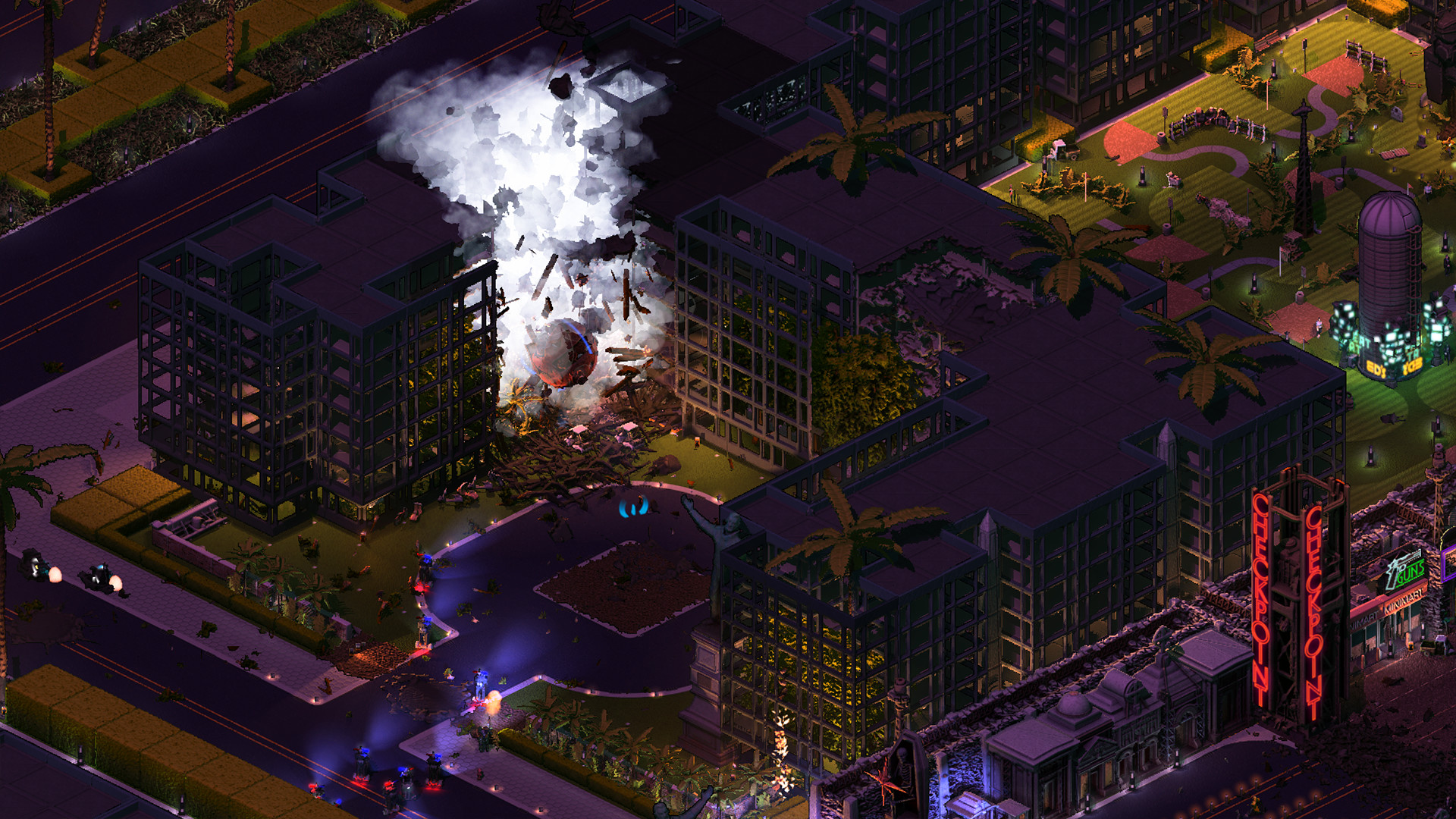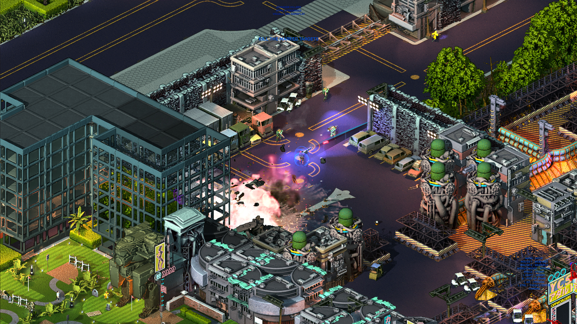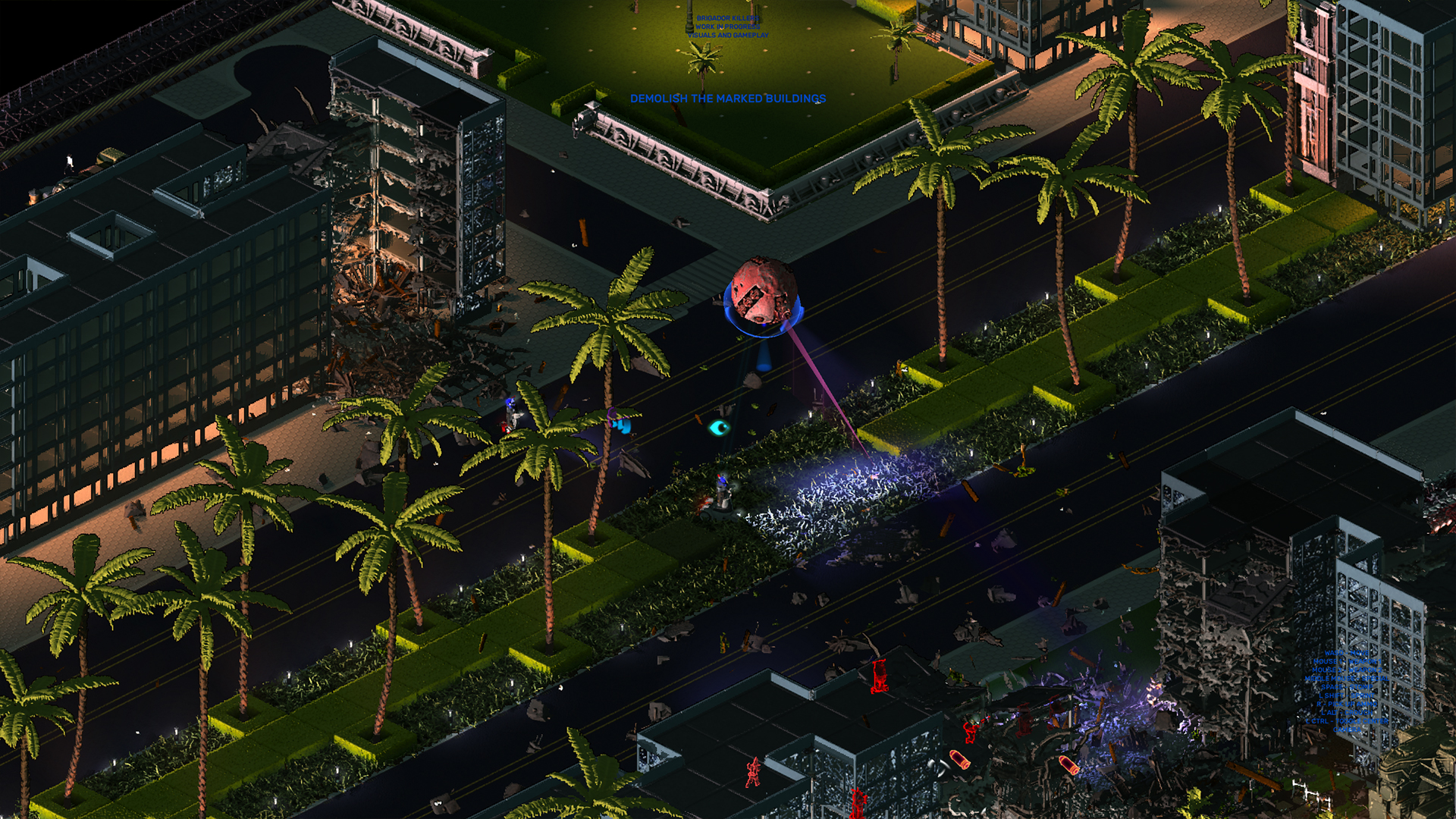
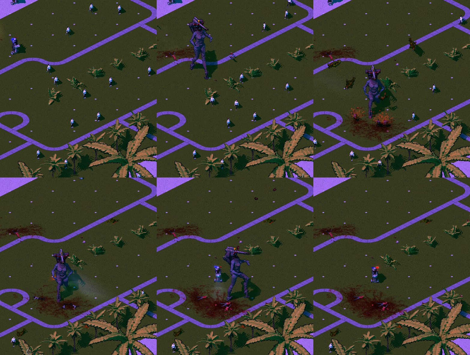
BRIGADOR KILLERS is an intense story-driven isometric action game. Can a secret hit team of Solo Nobreans get revenge on the traitors deep in enemy territory, and still get out alive? The mercenary violence of BRIGADOR (2016) spills over onto a new planet, with revised controls and an all-new storyline mode.
WISHLIST NOW!
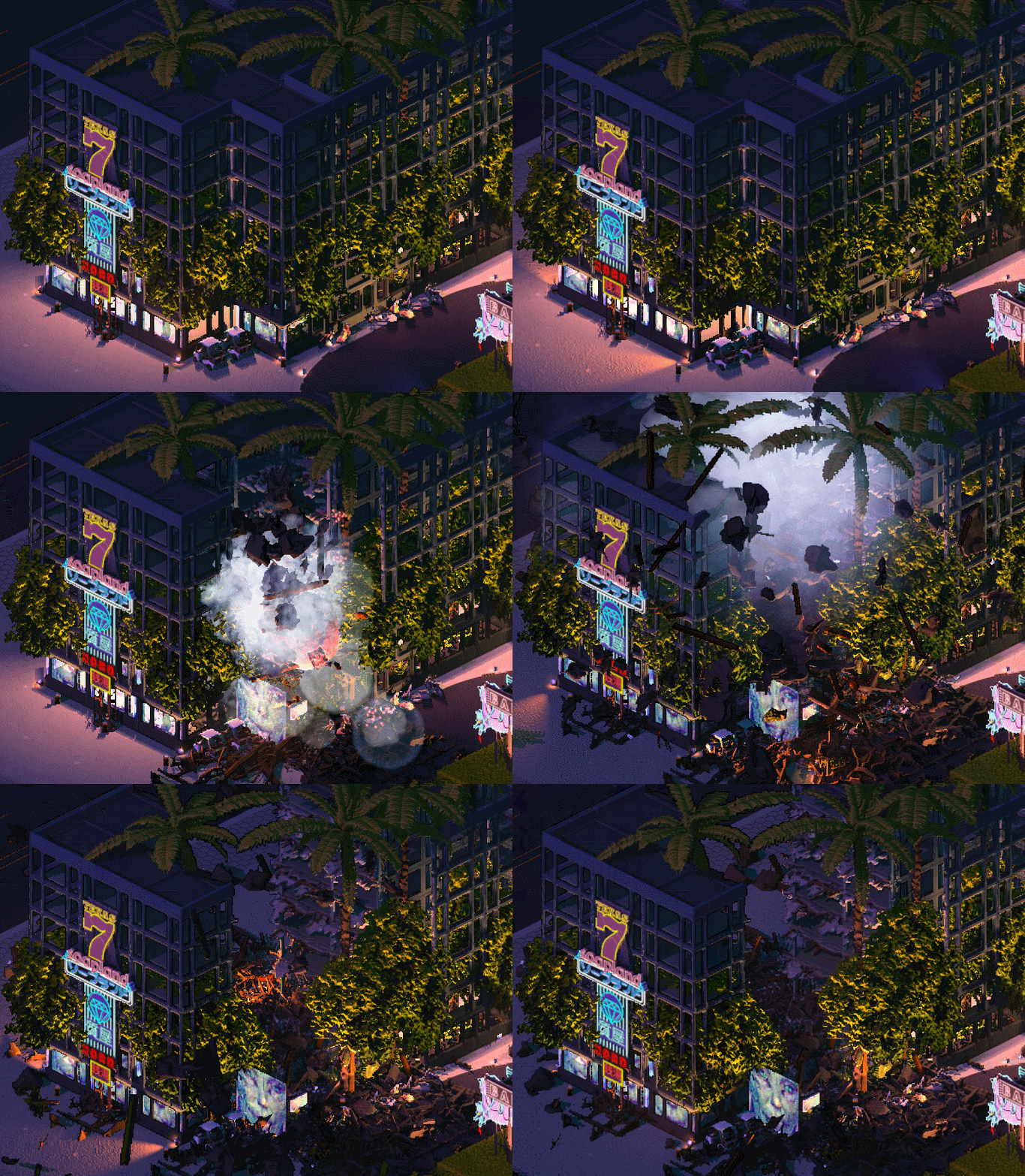
The challenges of putting a McMansion in a video game
McMansions , which are called "subhouses" in the game files, are one of my favorite prop sets in Brigador: Up-Armored Edition. The moment I blasted through one of them with a Banshee MG and saw it immediately collapse, I thought to myself "Oh, they're flimsy, that makes sense!". Working on the upgraded version of the McMansion for Brigador Killers was a challenging and occasionally painful quest that asked me to reconsider what constitutes good architecture.
The subhouse as it appears in Brigador: Up-Armored Edition, divided into its constituent tiles
Subhouses, as good as they are, needed a lot of reworking to fit into BKs design requirements. With the increased fidelity and visual scale, as well as a greater focus on infantry combat, I had to show the collision boxes a lot more respect than the previous game, effectively blocking myself from using some of the modelling techniques deployed in Brigador. Significant deviations from the tile grid had to go for a while, returning only when the code team pushed an update that allowed us to put down what are called qprops (as the name suggests, its a prop that takes up one-quarter of a standard tile in the engine).
The modularity issue also needed to be tackled. The original game's subhouses were modelled from the top down, in that they were a complete house model divided into tiles. This approach allowed for the greater utilization of half-destroyed states, where destroying one of the building tiles reveals the ruins and debris "inside" of adjacent tiles as in the image above. However, this approach significantly limited the ways tiles could be combined together.
Last, but not least, the visual scale had to be more realistic. If our player character is standing next to a building, it would be better if they could visually "fit" inside it, at least when it comes to something as spacious as the houses of the wannabe ruling elite.
The Villa La Rotonda , just outside Vicenza in Northern Italy, designed by Italian Renaissance architect Andrea Palladio
Since ordinary McMansions with their seemingly nonsensical combinations of volumes were too hard to work with from the get-go, I had to pick something simpler I could start tinkering with. The Villa La Rotonda immediately checked many boxes. A Renaissance masterpiece, I saw it has all the essential elements I could easily cut into tiles: entrance groups, corners, internals, dome... With this the basic combinatorics were born: tiles can be facade or corner, one or two storeys high, all with a front-facing sloping roof, meant to be assembled around core internal tiles.

An initial mockup of possible combinatorics
Importantly, the Villa La Rotonda also provided a general style guide. McMansions come in many different shapes and styles, but understanding that all those variations won't seamlessly click together, I had to narrow it down to just one. Italian quickly became the choice for good reason: it was thematically appropriate for Miami-inspired Mar Nosso and also worked better with more gentle roof slopes. This meant I could model my two-story pieces without occupying too much screen real estate with the jarring roof tiling.
With all the prep work done there was only one question: how do I turn a UNESCO World Heritage Site into complete shit?
First iteration of the new McMansion in BK
There were a few hard constraints left to set due to the modularity requirement mentioned earlier. The primary color has to be uniform to call less attention to the tile grid. In addition, all sets (I made three, which are differentiated by the wall and foundation design) have to share the same floor and roof heights.
As for the rest, well one thing I noticed while looking at IRL examples of McMansions is that there is not a single architectural rule left unsullied. Rhythm, composition, using your classical references correctly you name it, its disrespected. This was the paradigm I had to adopt. If a particular set corner had plain rectangular windows, its corresponding facade tiles should use ornate phallus-shaped ones instead. If one particular element had to, by all the rules of good taste, align with another misalign them, but only slightly, lest someone think it was intentional. If the set you're making looks medieval, add one (just one) Neoclassical tile for good measure. If the tile you've made screams "entrance group" at you, conveniently forget to add a door.
And after youve broken everything, make a couple of tiles that actually look normal for once, just to subvert the meta rule you've set for yourself. But even then, remember: its "tacky", not "classy". After all, we're making a mass-produced steel-frame property investment, not some aristocratic manor. This approach came in handy when I was working on side wall greebles. Sure, I want them to have pipes and AC units just like in the original subhouses, but what's the proper nouveau riche way to do this? It's by ignoring the back-alley aesthetic and painting all of it with the primary wall color, of course.

Final iteration of the McMansion in Brigador Killers, divided into its constituent tiles
This brief article on McMansions omits many aspects of what could be a much longer story. There are other tales such as my work on actual wall and floor constructions, or the accompanying topiaries set inspired by the album cover of Supertramps Breakfast in America , or how I discovered some of the mappers were combining unfinished McMansion assets with office buildings behind my back. Regardless, I hope you enjoyed reading this as much as I did working on them, albeit without the minor existential crisis where you question how your education led you to this point.

P.S. We are running a very short survey about the exact make and model of controller you use to play on your computer. We particularly want to hear from those who played Brigador on controller. Participation in this survey is anonymous, but at the end you can submit your email address to be entered into a raffle to win something from our merchandise store. You will only be emailed if you win. This survey will run until October 31st 2024.
We asked one of our artists for an explainer on what theyve been working on. This time its Igor again, who previously helped us write this post , and has decided to drill down on his favorite building prop.

This is me playing on Manyson. The map cs_manyson.
-Anonymous youth, circa 2000s
McMansions , which are called "subhouses" in the game files, are one of my favorite prop sets in Brigador: Up-Armored Edition. The moment I blasted through one of them with a Banshee MG and saw it immediately collapse, I thought to myself "Oh, they're flimsy, that makes sense!". Working on the upgraded version of the McMansion for Brigador Killers was a challenging and occasionally painful quest that asked me to reconsider what constitutes good architecture.
New design, new problems

The subhouse as it appears in Brigador: Up-Armored Edition, divided into its constituent tiles
Subhouses, as good as they are, needed a lot of reworking to fit into BKs design requirements. With the increased fidelity and visual scale, as well as a greater focus on infantry combat, I had to show the collision boxes a lot more respect than the previous game, effectively blocking myself from using some of the modelling techniques deployed in Brigador. Significant deviations from the tile grid had to go for a while, returning only when the code team pushed an update that allowed us to put down what are called qprops (as the name suggests, its a prop that takes up one-quarter of a standard tile in the engine).
The modularity issue also needed to be tackled. The original game's subhouses were modelled from the top down, in that they were a complete house model divided into tiles. This approach allowed for the greater utilization of half-destroyed states, where destroying one of the building tiles reveals the ruins and debris "inside" of adjacent tiles as in the image above. However, this approach significantly limited the ways tiles could be combined together.
Last, but not least, the visual scale had to be more realistic. If our player character is standing next to a building, it would be better if they could visually "fit" inside it, at least when it comes to something as spacious as the houses of the wannabe ruling elite.
Italian inspiration

The Villa La Rotonda , just outside Vicenza in Northern Italy, designed by Italian Renaissance architect Andrea Palladio
Since ordinary McMansions with their seemingly nonsensical combinations of volumes were too hard to work with from the get-go, I had to pick something simpler I could start tinkering with. The Villa La Rotonda immediately checked many boxes. A Renaissance masterpiece, I saw it has all the essential elements I could easily cut into tiles: entrance groups, corners, internals, dome... With this the basic combinatorics were born: tiles can be facade or corner, one or two storeys high, all with a front-facing sloping roof, meant to be assembled around core internal tiles.

An initial mockup of possible combinatorics
Importantly, the Villa La Rotonda also provided a general style guide. McMansions come in many different shapes and styles, but understanding that all those variations won't seamlessly click together, I had to narrow it down to just one. Italian quickly became the choice for good reason: it was thematically appropriate for Miami-inspired Mar Nosso and also worked better with more gentle roof slopes. This meant I could model my two-story pieces without occupying too much screen real estate with the jarring roof tiling.
With all the prep work done there was only one question: how do I turn a UNESCO World Heritage Site into complete shit?
Rules, or lack thereof

First iteration of the new McMansion in BK
There were a few hard constraints left to set due to the modularity requirement mentioned earlier. The primary color has to be uniform to call less attention to the tile grid. In addition, all sets (I made three, which are differentiated by the wall and foundation design) have to share the same floor and roof heights.
As for the rest, well one thing I noticed while looking at IRL examples of McMansions is that there is not a single architectural rule left unsullied. Rhythm, composition, using your classical references correctly you name it, its disrespected. This was the paradigm I had to adopt. If a particular set corner had plain rectangular windows, its corresponding facade tiles should use ornate phallus-shaped ones instead. If one particular element had to, by all the rules of good taste, align with another misalign them, but only slightly, lest someone think it was intentional. If the set you're making looks medieval, add one (just one) Neoclassical tile for good measure. If the tile you've made screams "entrance group" at you, conveniently forget to add a door.
And after youve broken everything, make a couple of tiles that actually look normal for once, just to subvert the meta rule you've set for yourself. But even then, remember: its "tacky", not "classy". After all, we're making a mass-produced steel-frame property investment, not some aristocratic manor. This approach came in handy when I was working on side wall greebles. Sure, I want them to have pipes and AC units just like in the original subhouses, but what's the proper nouveau riche way to do this? It's by ignoring the back-alley aesthetic and painting all of it with the primary wall color, of course.

Final iteration of the McMansion in Brigador Killers, divided into its constituent tiles
This brief article on McMansions omits many aspects of what could be a much longer story. There are other tales such as my work on actual wall and floor constructions, or the accompanying topiaries set inspired by the album cover of Supertramps Breakfast in America , or how I discovered some of the mappers were combining unfinished McMansion assets with office buildings behind my back. Regardless, I hope you enjoyed reading this as much as I did working on them, albeit without the minor existential crisis where you question how your education led you to this point.

P.S. We are running a very short survey about the exact make and model of controller you use to play on your computer. We particularly want to hear from those who played Brigador on controller. Participation in this survey is anonymous, but at the end you can submit your email address to be entered into a raffle to win something from our merchandise store. You will only be emailed if you win. This survey will run until October 31st 2024.
[ 2024-09-30 09:12:53 CET ] [Original Post]
Minimum Setup
- Processor: 2.6 GHz or fasterMemory: 4 GB RAM
- Memory: 4 GB RAM
- Graphics: AMD Radeon 5770 / NVIDIA GTX 460 or better
- Storage: 1 GB available spaceAdditional Notes: Mouse and keyboard or controller required.
GAMEBILLET
[ 6509 ]
GAMERSGATE
[ 4480 ]
MacGamestore
[ 2953 ]
FANATICAL BUNDLES
HUMBLE BUNDLES
by buying games/dlcs from affiliate links you are supporting tuxDB

