

Orphan Age is a life-sim game where you look after a band of orphans in a cyberpunk warzone.
Set against the backdrop of an unforgiving, neon-lit dystopian warzone, your only battle is the fight for survival, scraping out a living in the face of extreme danger. You will guide a band of orphans, each with their own skills, emotions, strengths, weaknesses and fears, through a dangerous and ever-changing city in a bitter struggle for survival. Constantly balancing risk and reward, you must make the big decisions to ensure the group stays alive. Build up your base, scavenge, craft and explore the city for new recruits, whilst ensuring there are enough supplies to keep going, even when it seems all hope might be lost.
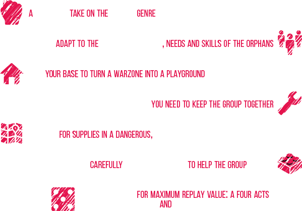

Orphan Age plays as a single player campaign with a lot of replayability inspired by the 4X genre. But there’s a twist! 4X stands for Exploration, Exploitation, Expansion and Extermination. In Orphan Age, we replace Extermination with Empathy, bending the 4X genre into a 4E.

The city of Orphan Age is ever-changing and procedural. You won't find the same building twice. There are high risks and high rewards when you explore. You can find rare resources, Orphans to recruit, but you can also get wounded or worse...
Exploration is similar to the expeditions of Fallout Shelter: procedural text adventures. They offer more complexity though, because you have to make decisive choices while you're out of the orphanage.

Hundreds of resources are left to be scavenged in the Orphanage or in the city. They are classified in 6 categories that allow you to eat, drink, take care of wounds and to craft the items and resources you need to build your Orphanage.

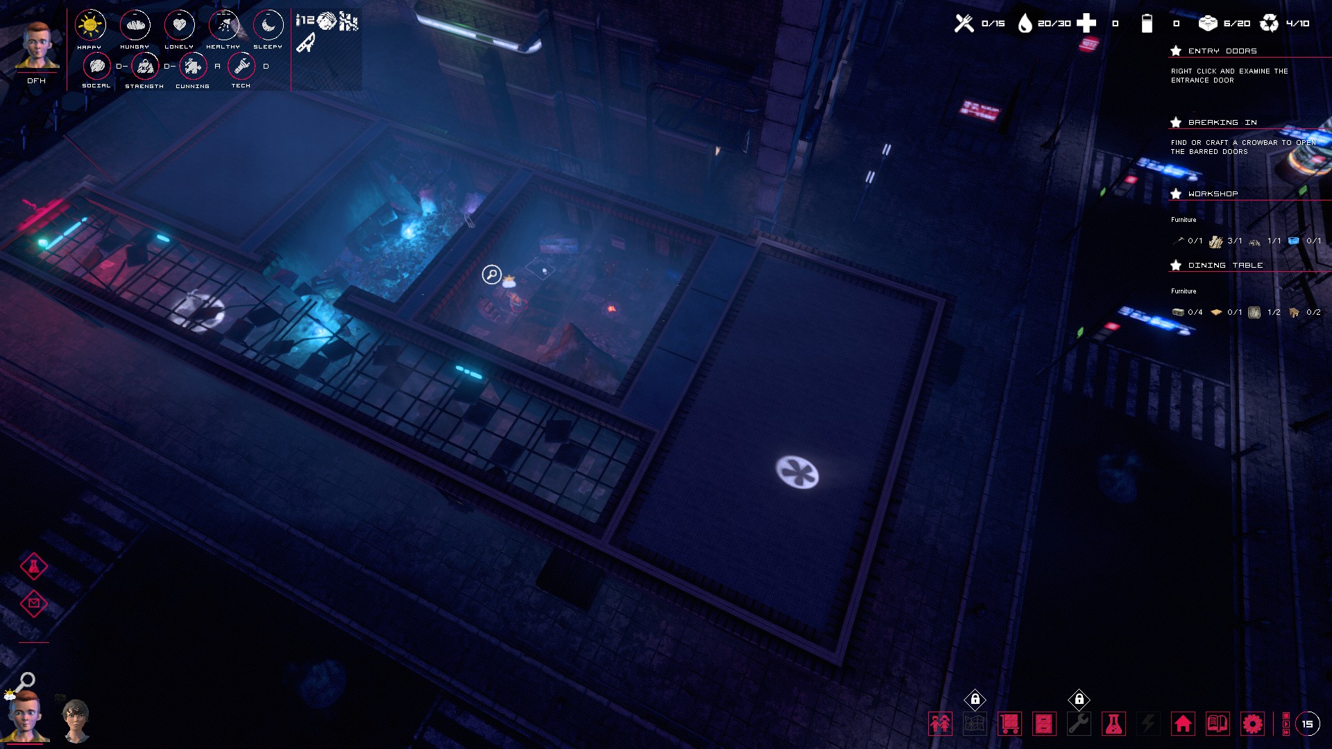
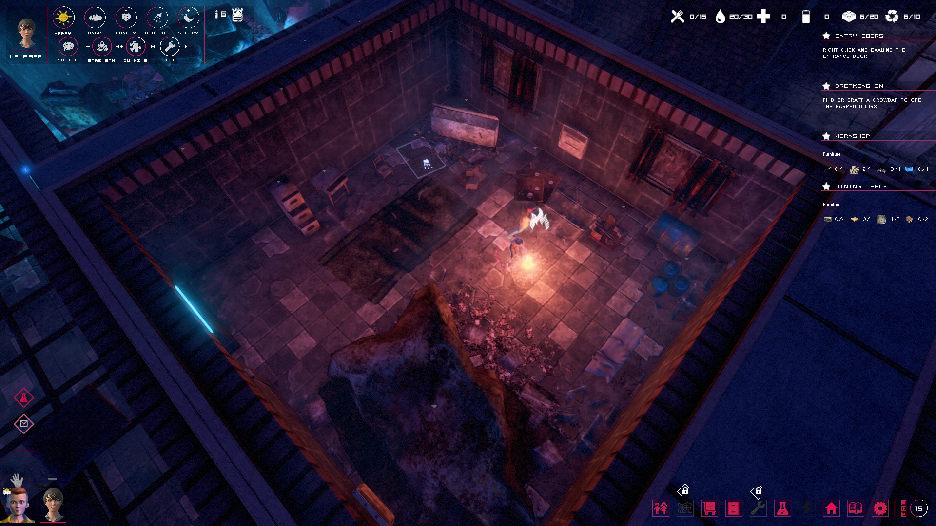
The Orphanage is the place your Orphans call home. The environment surrounding the Orphans greatly affects their moods. Try to keep the rooms lit, warm, furnished and clean for the happiness of all!
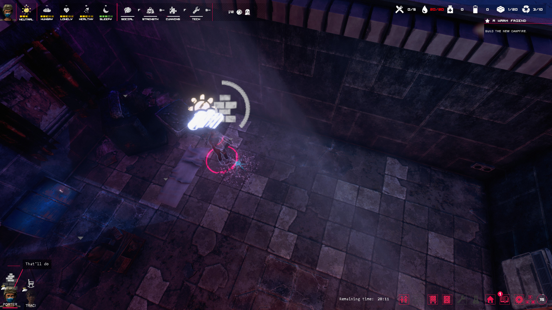
There are 38 different items of furniture to build (beds, playgrounds, science mats, campfire, heaters...) and each one can be upgraded.
Research allows you to discover better furniture and improve living conditions for the orphans.

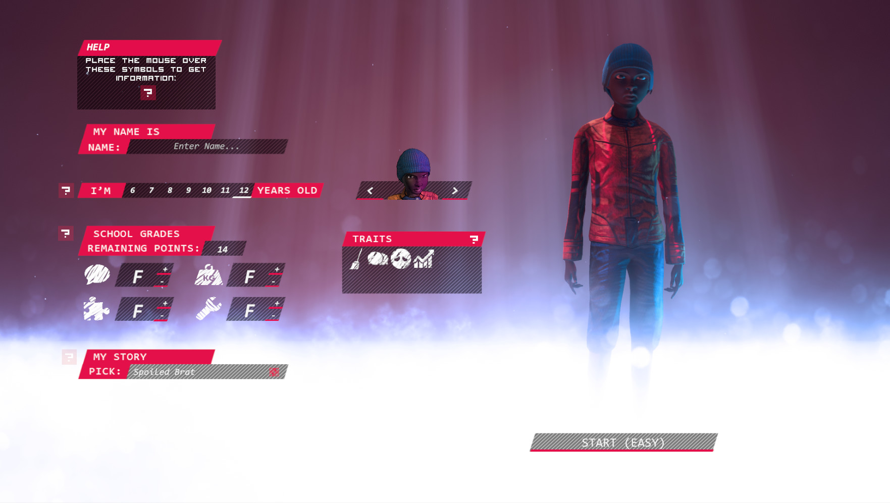
Orphan Age is a deep micro-simulation making each Orphan unique in personality and in gameplay. The Orphans have different ages, set of skills, backgrounds and personality traits. Depending on who they are and how well they are, the Orphans will take different paths anytime there is an issue to be discussed.
INFO:
- Available in Early Access this winter
- For PC, Mac & Linux
- Comes with a companion visual novel Orphan Age: Diaries


Ahoy mateys!
The last few weeks have been busy around the studio, so this posting will include some studio updates and a chat with Adrien Forestier, captain, founder, and game director about last months most talked about topic: the Orphan Age art style update. We saw the replies across Kickstarter, Steam, and social media wondering why there was a stark difference between the demo and the game as it looks now, and wed like to take you through the decisions that led to these changes and share news of how the art style is continuing to evolve.
How would you describe the art style for Orphan Age when it was shown off during the Kickstarter and the Steam demo?
[i]It was supposed to be semi-realistic low-tech cyberpunk. Since I was making most of the art and Im not an artist, it was very inconsistent and ugly for a big part. Most of it was made of assets bought here and there where I tried to adjust the texture so they could match together. Since I couldnt paint properly, most textures would look vaguely realistic.
The interface was pretty futuristic but was also super inconsistent in style with grunge, LCD, hand painted, and holographic elements.[/i]

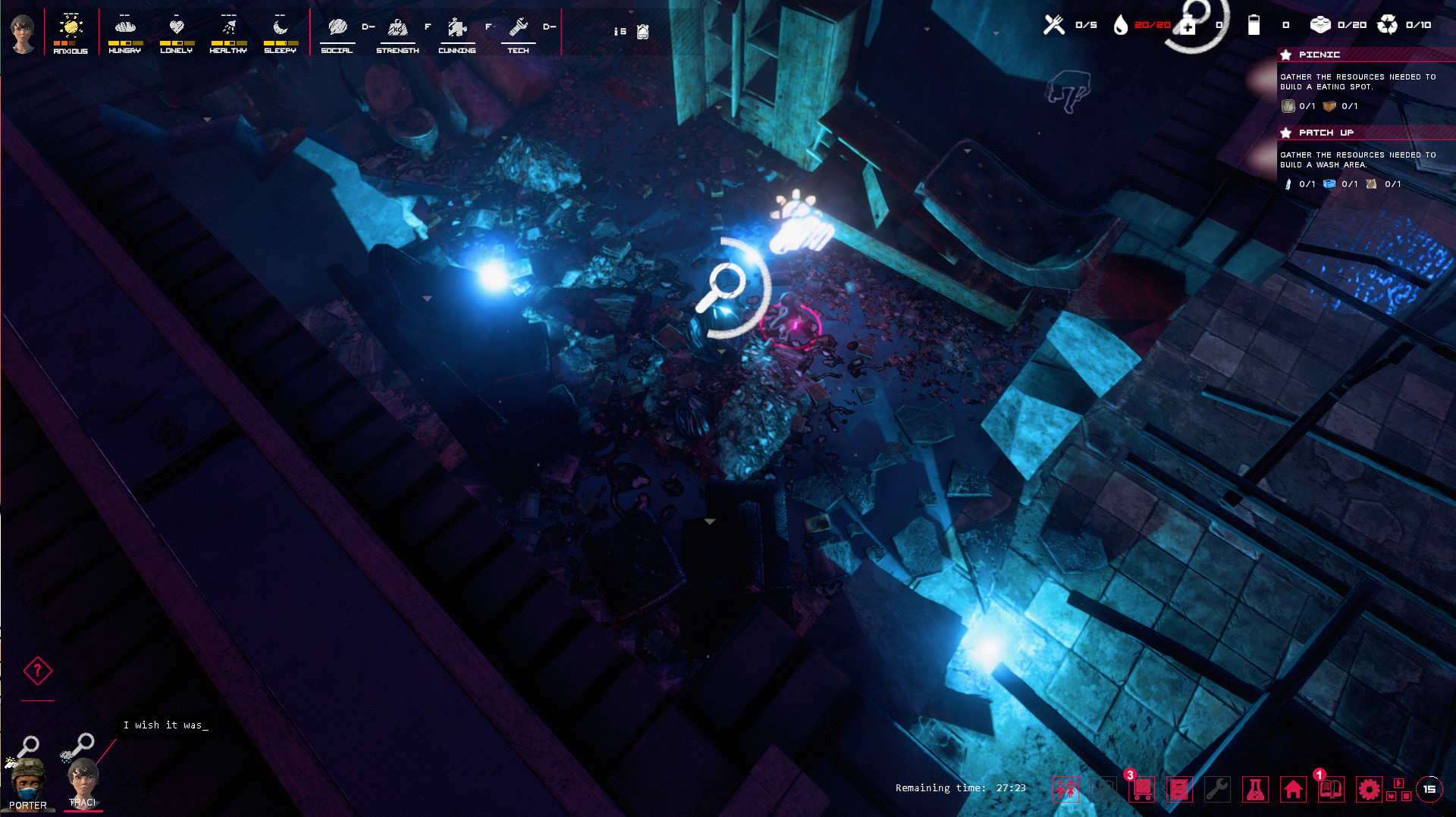
What I liked though was the lighting which was very hazy and neon lit. (It was able to hide a lot of the ugliness of the game. Ha ha.) There was a downside though, we didnt have a day/night cycle and the game was in a perpetual night which caused issues with there being no feeling of time.
How would you describe the current art style?
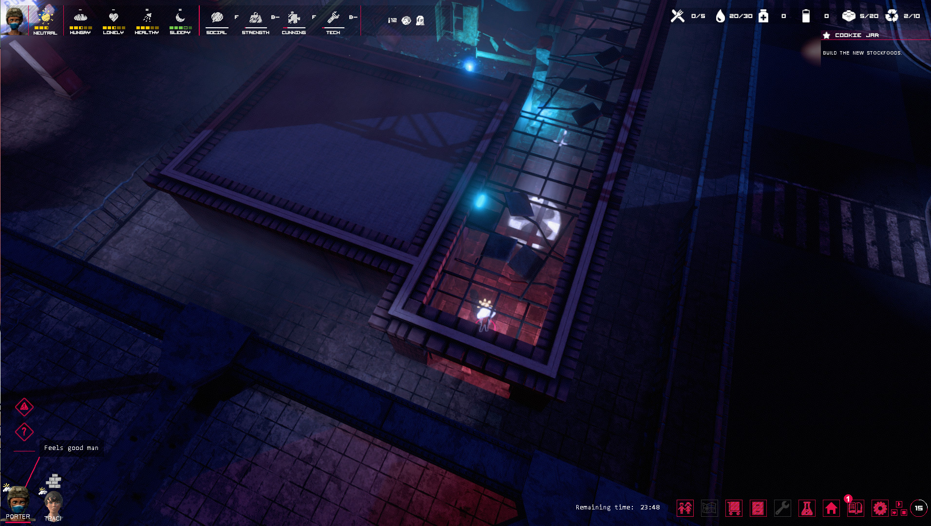
[i]The version weve been working with is still semi-realistic but this time with hand painted textures. This helps a lot with readability since we have more control over the contrasts of the 3D objects on screen. We want to keep this dark vibe in the world.
With the previous art style, we found there was a lack of details visible, as seen in this scene:[/i]

Alternatively, this had been our goal for Orphan Ages final look:

[i]In the most recent concept, we can see that there is enough contrast for the space to be readable despite the lack of light. Everything is destroyed but its not noisy. There is a bit of environmental storytelling (chains were used to rip the door behind the counter and something was dragged from here).
The hand painted style of the textures brings two big advantages here:
First, almost nothing is shinylow specularity of the 3D materialsthis gives us more control on the contrast and ties everything together. Second, the (almost) absence of normal maps/bumps on the different materials reduces the noise that would come with the level of detail we would get with a more realistic style. In less technical terms, the textures are less detailed and the volumes are easier to understand.
Before, the game was hard to read, textures were too detailed, and it would put a strain on the eyes after a long play session.
While the 3D of Orphan Age stays pretty dark, its not the case anymore with the interface which is more in line with the fact that the protagonists are kids. Our goal is simple: the 3D world is the world seen with an adult gaze, but the UI is seen from a childlike point of view. This allows us to convey more emotions like what our characters are feeling right now. That being said, the current interface is too bright and colorful, overly contrasting with the 3D world.[/i]
On the subject of the UIs brightness, the above concept art is not the final version then?
[i]No, its not, as we had been discussing internally finding external support for revising our UI design and the visual tone of the game. Weve entered an exploration phase with an external development studio who are working on concept art for what Orphan Age can look like, maintaining our desire for the scenes to be dark, but readable, but the UI to not feel contrasting to the overall experience.
Their own feedback included thoughts on the UI being too bright, noting that we may have overcorrected from the far too dark original visuals. As we are still very early in the process with them, we have nothing to share, but once we have the concept art in place well begin sharing with the community for your thoughts and feedback.[/i]
What was the decision that originally led to changing the art style?
What were working towards now was always the art style that we envisioned, but we didnt have the skills to achieve it. Im not a fan of realistic games. I personally think that they tend to age very badly where non-realistic games can stay beautiful for a longer period.
Do you have any final thoughts on our plans for the art style?
[i]Most of the interface that has been shown in the screenshots is a work in progress that does not represent our aim for the final, definitive look and feel of the UI. I completely understand the feeling of a downgrade when you look at a screenshot with a WIP UI and lighting.
That being said, we think that with the 3D, the music, and the stories in the game, Orphan Age is quite bleak. Its still about kids fighting to survive in a dangerous future, there are many ways to lose and only a few chances to make it to a safe place.
We feel that working with an external studio will allow us to continue to have the childlike UI that should create an interesting contrast between the reality of the world the children live in and how they feel through it. Something to consider is that whatever the living conditions, kids will be kids. Its something that has been very well documented from the street urchins of Victorian England to the footballers of the favelas. In this regard, one of our core inspirations is the beautiful photo Bath Time in Gaza by Emad Nassar.[/i]

[i]Our goal remains as it was, to create a beautiful and dark story, but one containing a strong current of hope throughout. As we develop this, we appreciate the feedback the community across all platforms provides. The response on the art style aligned with the feedback we had been receiving in our search for an external art contractor, which showed we were on the right path. But even when the feedback doesnt align with our own thoughts, we still need it because it will help us continue to keep our ship afloat as we sail to our destination.
Until next time, please keep your thoughts and feedback coming our way.[/i]
_________________________________
One final thought on the art: We will be updating the Steam store page as soon as we have sufficient art to do so. Taking down the demo last month was step one in painting a more accurate picture of what Orphan Age is, while our next step will be a partial revamp of the Steam store page.
Around the Studio
In September our beloved apprentice and developer Lucas Rossignol completed their 3-year apprenticeship, becoming a full time member of the crew. A hearty huzzah for Lucas!

Were planning further local testing phases for anyone either located in or near Bordeaux that wants to come by the studio to try out the latest build. If youve already submitted the form, you dont need to submit again unless any information has changed. If youre not local, you can also fill out the form, though were not looking for remote playtesters yet. (Hopefully very soon though!)
You can find the form here: https://forms.gle/MNN2wfjcJRhfGnV66
Finally, our next news update is scheduled for the first week of November. This is planned to be our previously discussed high-level look at how weve been building Orphan Age, with a look at our development packages*. We felt the art style discussion took a bit of priority, which is why we delayed this topic by a few weeks.
*Place your bets with the boatswain on whether we maintain this topic or switch it up again.
For now though, let us know if you have any questions in the comments and if theres anything else youre hoping to see or learn in future updates. (And before anyone says Id like to learn when the game is actually releasing, we know and well shout that from the top deck as soon as we can confidently share a defined time.)
Minimum Setup
- OS: 64 bits
- Processor: Intel Core i3 / AMD Ryzen 3Memory: 4 MB RAM
- Memory: 4 MB RAM
- Graphics: DX11 Compatible
- Storage: 2 MB available space
Recommended Setup
- OS: 64 bits
- Processor: Intel Core i5 / AMD Ryzen 5Memory: 8 MB RAM
- Graphics: DX12 Compatible
- Storage: 4 MB available space
[ 6418 ]
[ 5749 ]
[ 1960 ]
[ 2357 ]
[ 713 ]
[ 1040 ]


[ 32766 ]


[ 859 ]

Time left:
356096 days, 11 hours, 21 minutes

Time left:
356096 days, 11 hours, 21 minutes

Time left:
0 days, 19 hours, 21 minutes

Time left:
28 days, 19 hours, 21 minutes

Time left:
31 days, 19 hours, 21 minutes

Time left:
32 days, 19 hours, 21 minutes

Time left:
54 days, 11 hours, 20 minutes

Time left:
6 days, 5 hours, 21 minutes
Time left:
1 days, 13 hours, 21 minutes
Time left:
7 days, 13 hours, 21 minutes
Time left:
8 days, 13 hours, 21 minutes
Time left:
13 days, 13 hours, 21 minutes
Time left:
15 days, 13 hours, 21 minutes
Time left:
19 days, 13 hours, 21 minutes
Time left:
20 days, 13 hours, 21 minutes
Time left:
20 days, 13 hours, 21 minutes

Time left:
6 days, 0 hours, 22 minutes

Time left:
8 days, 0 hours, 22 minutes
Time left:
11 days, 1 hours, 32 minutes
Time left:
19 days, 22 hours, 23 minutes


