

The Hand of Merlin is a turn-based rogue-lite RPG in which Arthurian legend clashes with cosmic horror. Recruit a company of up to three mortal heroes and guide them in spirit on a desperate journey from Albion to Jerusalem. Explore a richly-imagined medieval setting on the brink of apocalypse. Trade with merchants, improve your heroes and unearth ancient relics. Search for the lost fragments of your soul, scattered across the multiverse - and save as many worlds as you can.

Enjoy a compelling story inspired by Arthurian legend, the Matter of France, and the history of Al-Andalus - with an unusual twist. Make choices in interactive encounters that change every time you play. Written by Jonas Kyratzes (The Talos Principle, Serious Sam 4) and Verena Kyratzes (The Lands of Dream, Serious Sam 4).

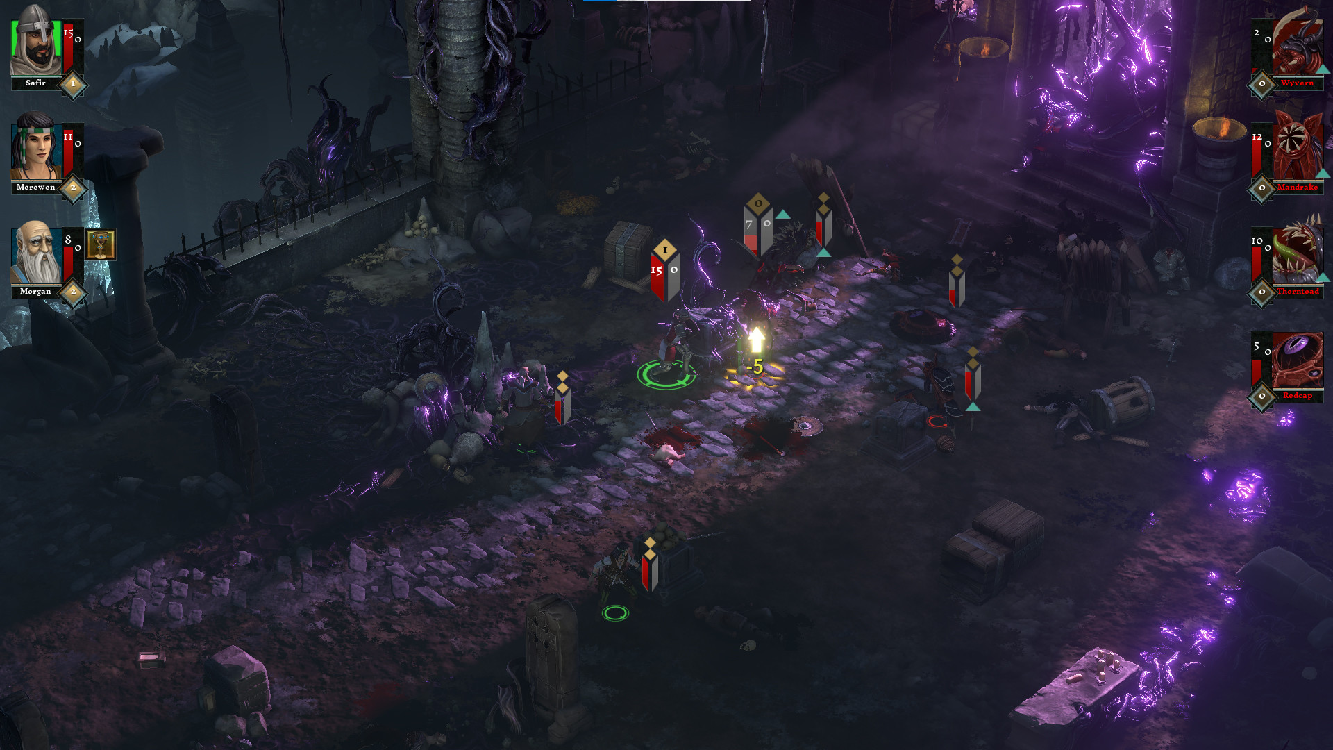
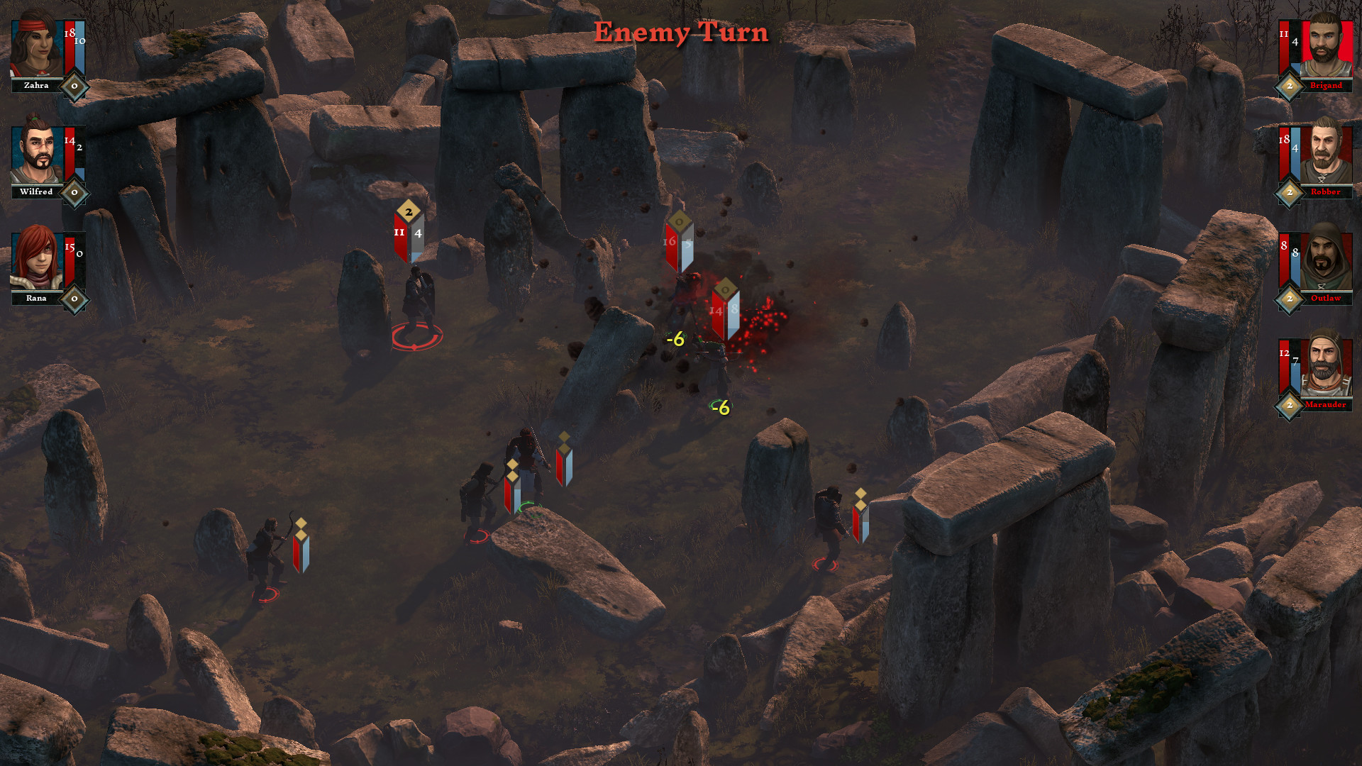
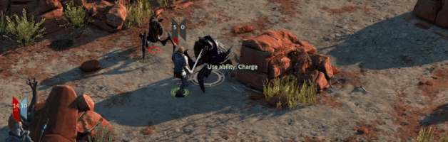
Master the tactics of squad-based and turn-based combat to conquer both human and demonic foes. Your enemies will be tough and ruthless; make use of cover, set up ambushes and coordinated attacks, harness synergies between different Hero classes and skills.

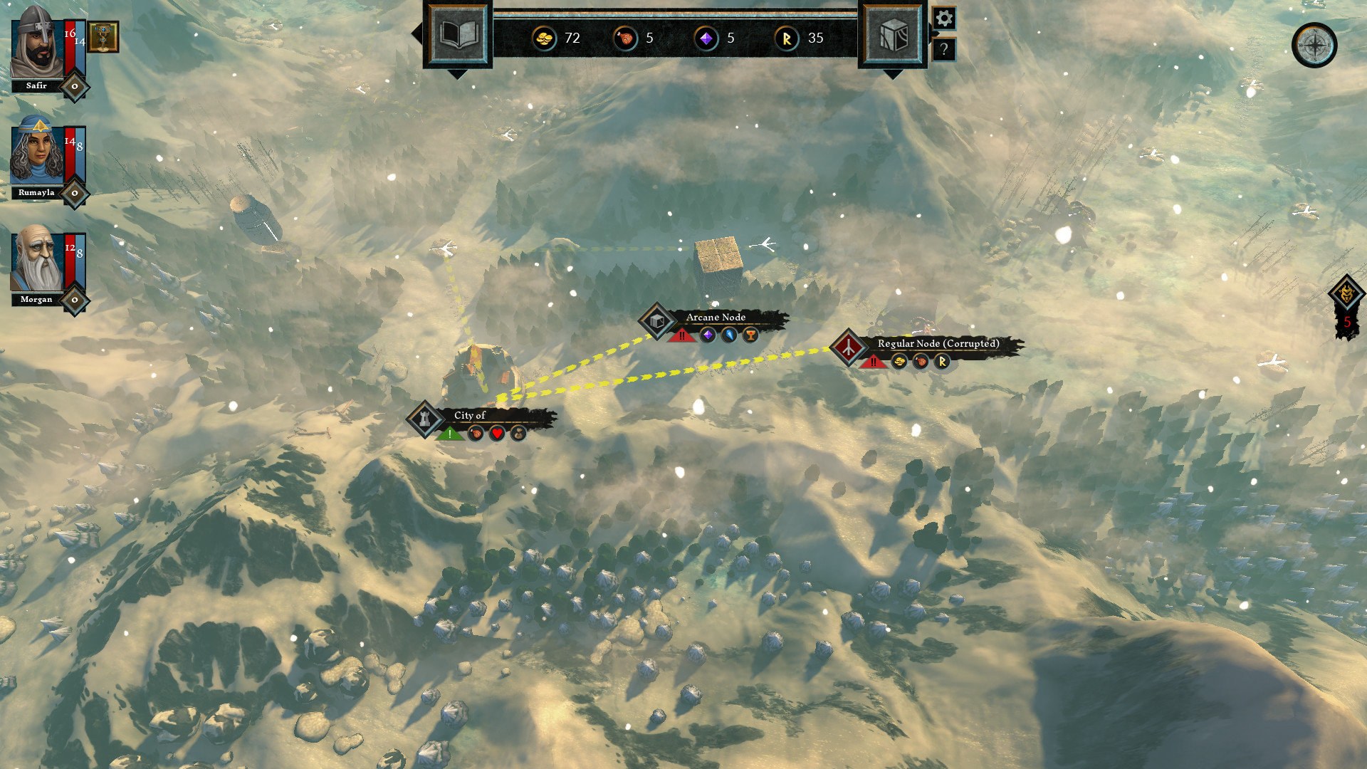
Carve a path across the lands of Albion, Marca Hispanica and Al-Andalus. Will you take a dangerous route, risking life and limb in pursuit of a legendary relic? Or will you choose a safer path? Plan and prepare. Negotiate, barter, fight. Tackle challenges. Suffer losses. Recruit new Heroes. Earn Gold, Supplies and Renown. Be careful: your choices are permanent, as is death. But don't tarry - evil never rests.

Use Renown to level up your Heroes, and choose between a randomized set of new skills or improved attributes. But choose wisely! Select skills with great synergy and balance your party for the road ahead.

As you jump from one parallel dimension to the next, history is reshaped. Different kings rule the land, changing the encounters, characters, and events. No two worlds are ever quite the same, and each journey will be unique. And should your heroes fall, remember: defeat is not the end, only a new beginning.

Seek out towns to improve your arms and armor, or stumble upon hermit artisans in the wild. With every day that passes, the world plunges deeper into darkness, and you will need all the equipment gold can buy.

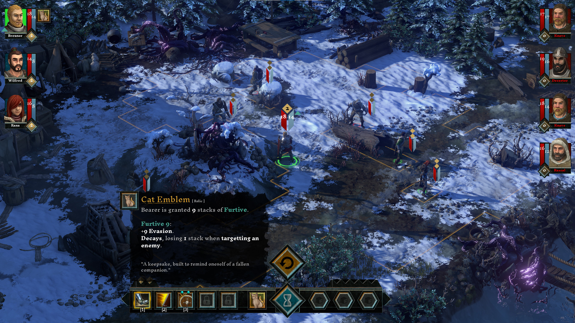
From a peasant's humble luck charm to the legendary sword wielded by Arthur himself, items imbued with magical power are scattered about the world. Some you will be able to purchase from merchants and collectors, but others will have to be earned through acts of heroism - or displays of wit.
Rain thunder and brimstone upon your foes! Seek out and gather Soulstones to restore your power and unlock new Spells. Even if defeated, your spirit will retain all of your collected arcane knowledge as you jump into the next dimension.
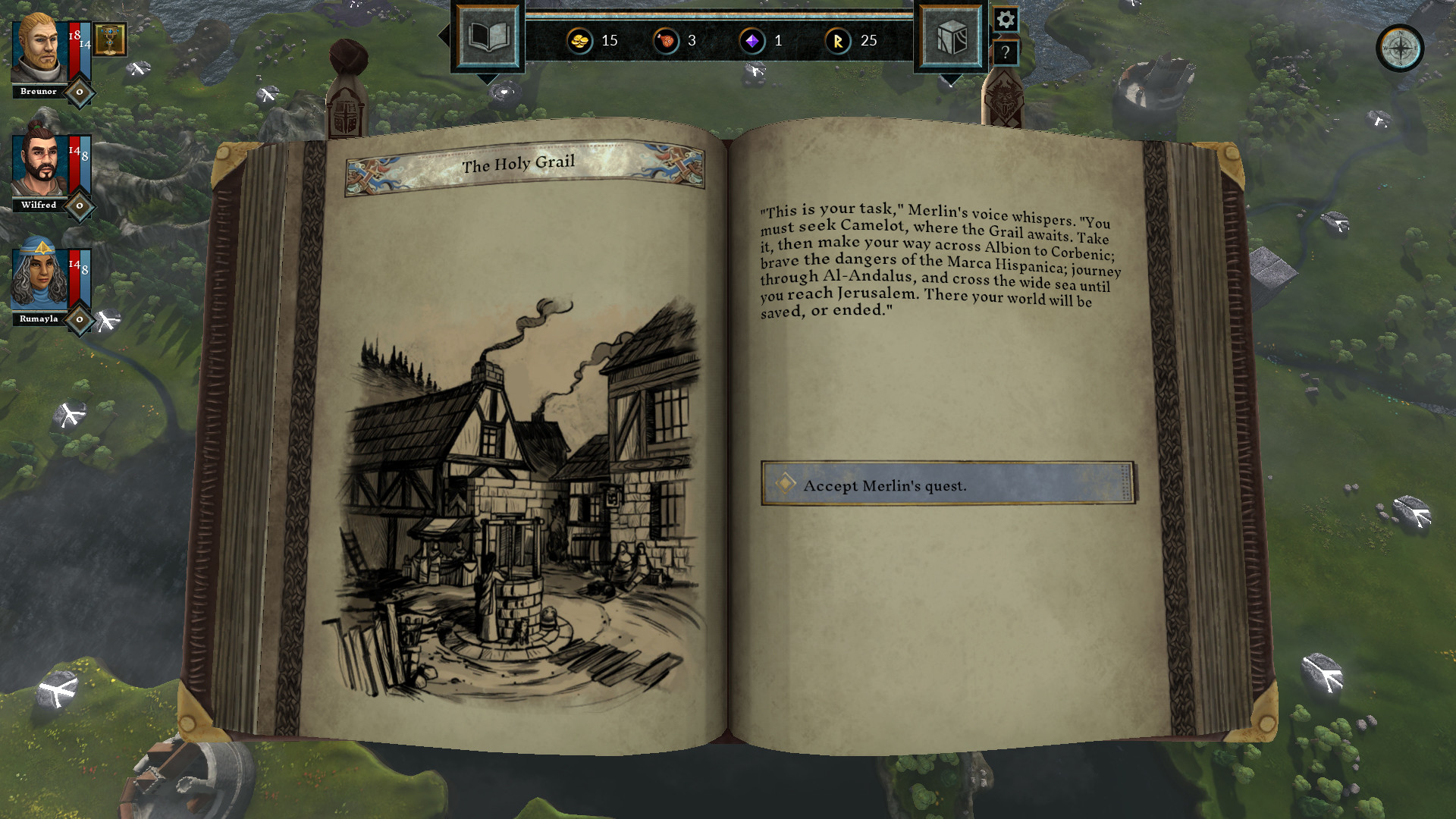
There are as many worlds as there are stars in the sky. In each stands Camelot; in each there is a Grail. But there is only one Merlin, and his eternal burden is to stand against the horror from beyond. Each world that is saved is saved forever; each world that is lost is lost for good.
https://store.steampowered.com/app/600610/The_Hand_of_Merlin/
- GameBin_Linux [91.57 M]
- Common_Linux [23.65 M]
Hello there, players.
My name is Kaz. Im a 3D and concept artist who was working on the Hand of Merlin from its very beginnings. For todays blog post I gathered up some very old concept art to take you through our monster design journey.
When the game was still in its diapers, we had no concrete idea what style or atmosphere we wanted our enemies to portray. We had general narrative pointers - but no aesthetics to accompany them. This was an important decision to make early on because enemies are, of course, a very important part of communicating the nature of the danger youre facing and for complimenting the overall story of the game. We knew we wanted them to feel completely alien to our heroes, but still aesthetically fit together with each other to make it clear that they come from the same place. Very dangerous and strange place. A different universe, even.
We went through dozens of distinct ideas, ranging from the remains of prehistoric animals to creepy half-functioning robots from the future. Even a combination of the two, perhaps animated by some unknown alien force. We gave crystals and elementals a go, carnivorous plants, tar and slime, rock/lava themed goliaths, insects and even some fleshy horrors inspired by the Silent Hill series. At one point we even entertained the thought of animal hybrids, though we decided those looked too familiar and not scary enough, even if explained by external alien corruption.
Its important to note that the design of the abominations was heavily influenced by the technical and gameplay limits, as well. For example, the fact that the enemies were supposed to fit a square-shaped tile underneath them made any ideas for monsters with elongated bodies unviable.
A lot of quick sketches were made, many of which were never even fully coloured, let alone finalised.
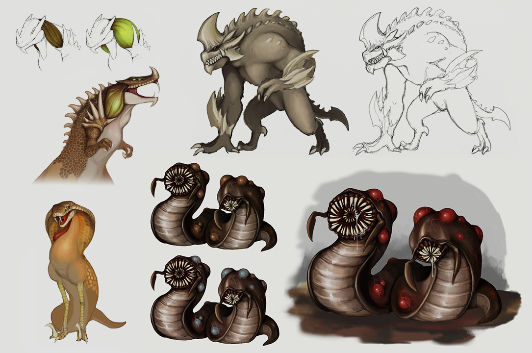
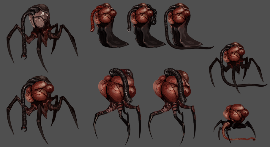
Picking a colour theme for our abominations was important as well. We wanted the creatures to sport hues which were as uncommon in nature as possible, to make them more alien. This colour palette would also be the identifying aesthetic of the corruption itself - the strange force seeping into our healthy world and gradually killing it. The monsters were to be its deadly harbingers.
After a lot of testing (with fire-orange and neon green being a dominant choice in the beginning), we opted for the dark purple, red and black. We felt that the combination of these colours represented the right amount of darkness and mystery, while looking very unnatural and dangerous when placed on the world and skirmish maps against the rocks and foliage. It really popped out in contrast to the healthy green and made the scenery look infected, sickly.
The monsters born from this unnatural darkness would be a combination of aliens and insects, with a dash of something reminding the players of plants and vines. Something, we believed, would be the strangest and scariest from the perspective of the people in the medieval times who had no concept of any monsters beyond their era-appropriate mythology.
We also decided to avoid giving them eyes (with the exception of the Redcap, our eyeball-pancake), realising that the monsters looked much more scary and unrelatable if they had no identifiable face.
Most of the early concepts never saw the light of the day, being pushed under the rug with the rest of the discarded ideas. However, some early drawings were a nice base for the evolved purple designs later on. Once we had our general aesthetic flashed out, we could make new designs or modify some of the existing initial ideas to fit the needs of the gameplay mechanics assigned to the particular monster.
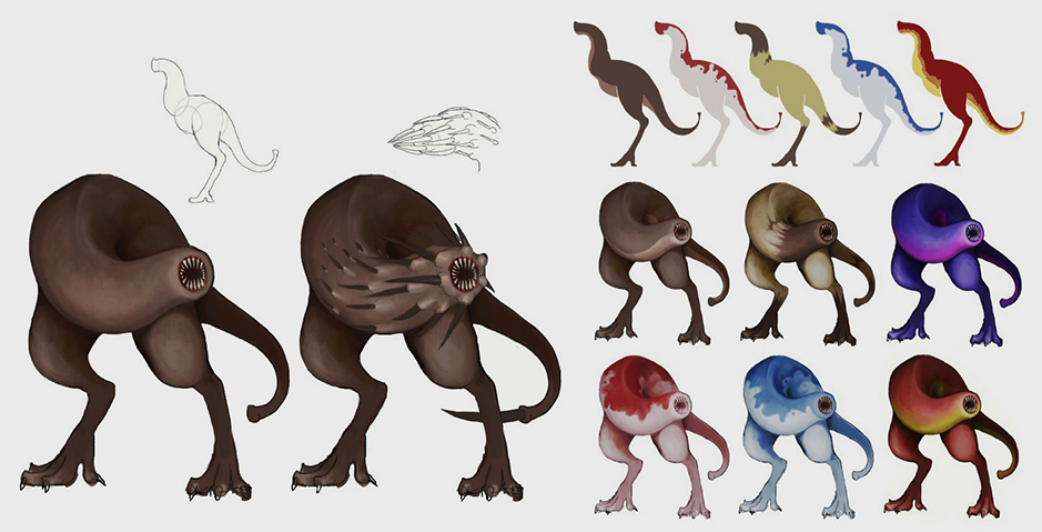
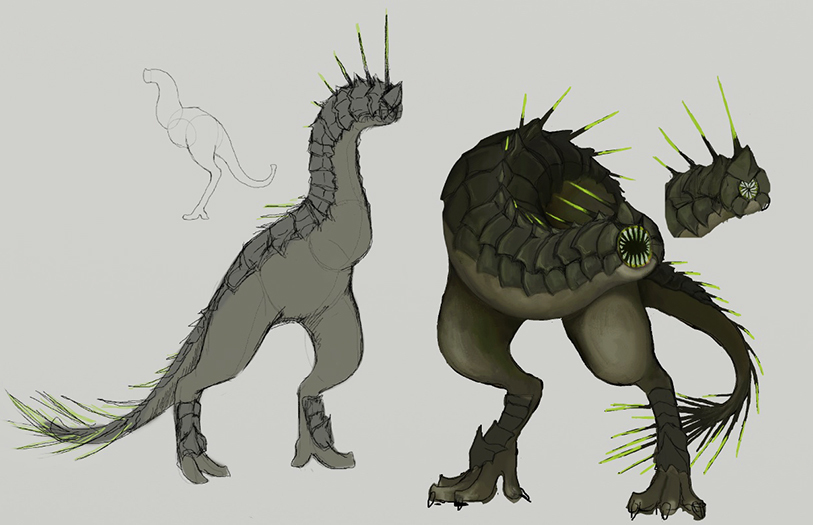
Heres an example.
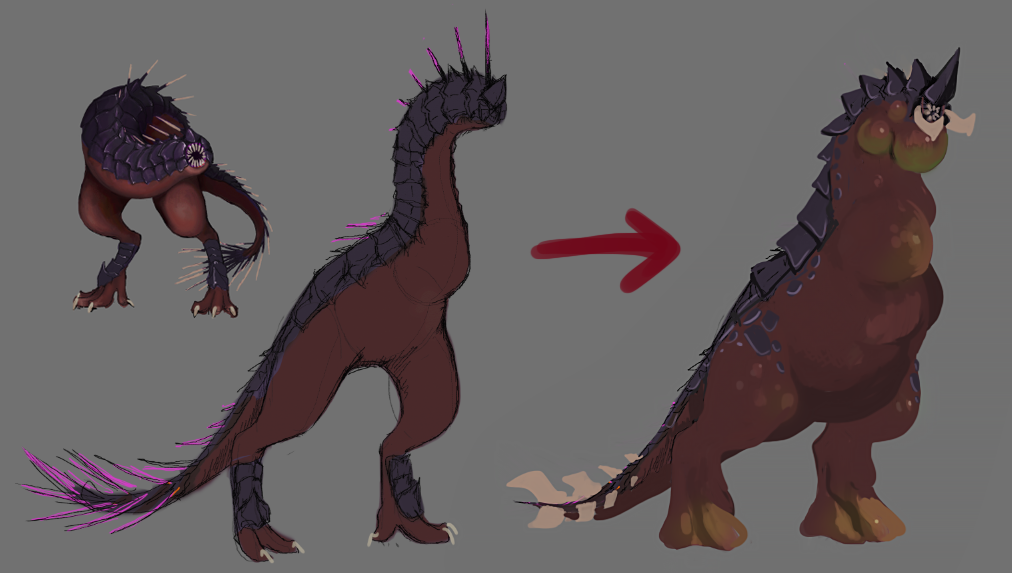
Our game designer, Mat, needed a monster which could run around freely and attack from a distance. This fit nicely with the existing birdlike (or dinosaur) concept we already had, since it looked quite agile and was designed to shoot quills. However, Mat wanted this monster to have a lot of health at its disposal, while not being particularly well armoured. Hence, its sturdy armour plates were removed or shrunk, while its overall mass was increased by adding tumours and wild flesh. This made the enemy look like it could soak more damage to its HP, while also playing on the morbid/sickly aesthetic.
Next, Mat wanted this creature to be able to infect the heroes with a lingering ailment from afar, but also to push away the units in its melee range without causing a lot of damage. This lead to the quills and needles of the original design being dropped, in exchange for something big and blunt. In this case, to stay true to the dinosaur inspiration, a set of heavy protruding tail bones were added.
For the lingering negative status effect the poison of choice was Well, poison. More accurately, venom. A dash of sickly green was added to the swollen tumours to represent the venom sacks; and with that the monster design for the Basilisk enemy was finalised.
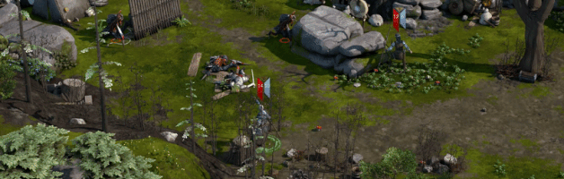
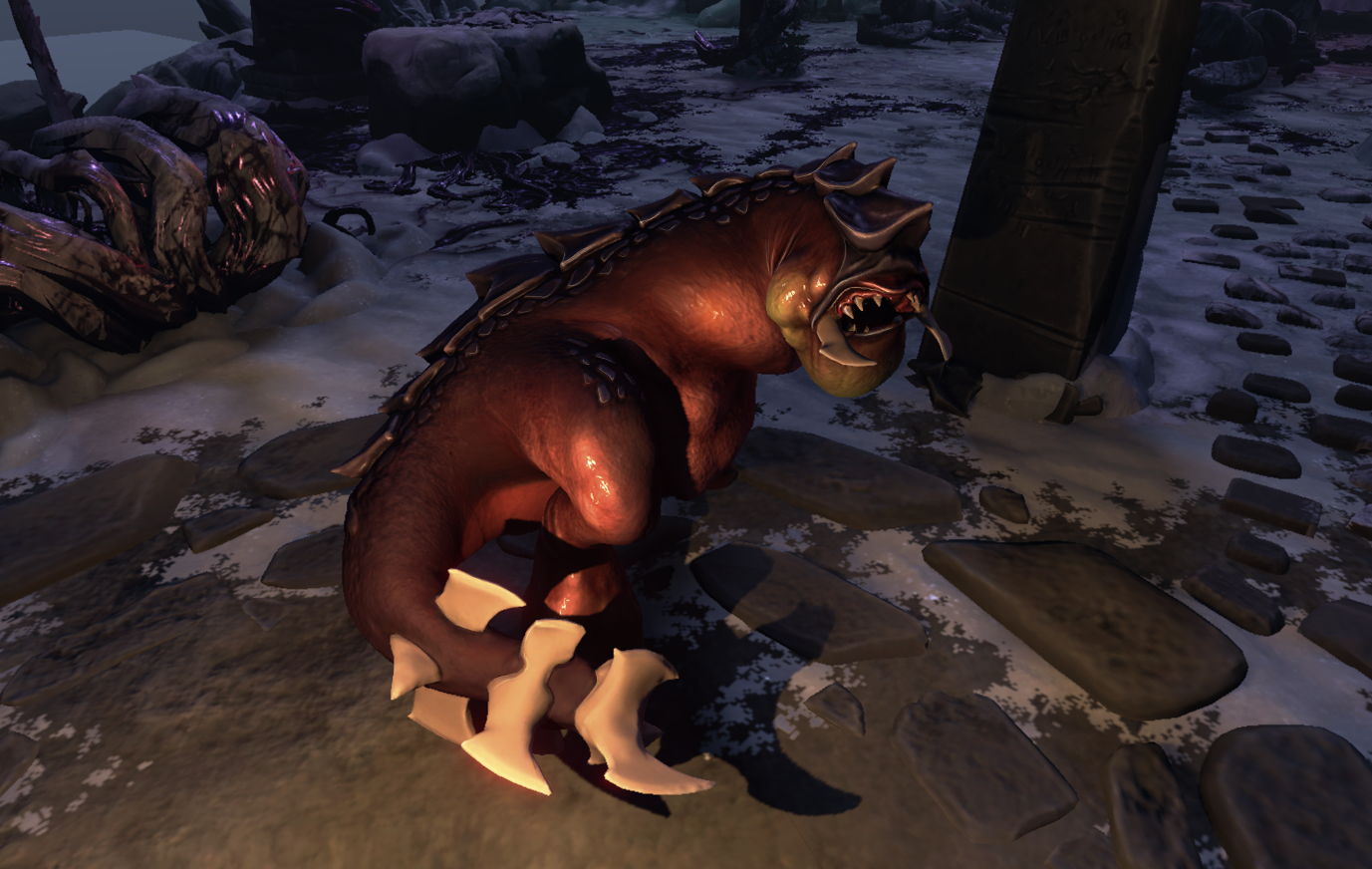
Heres a picture of this enemy as it looks now in the game.
I hope you enjoyed this short overview of our monster creation history. I, myself, find its evolution to be quite interesting.
Join us on our Discord server !
Kaz
Minimum Setup
- OS: Linux SteamOS 3.0 or Ubuntu 18.04 LTS
Recommended Setup
- OS: Linux SteamOS 3.0 or Ubuntu 18.04 LTS
[ 6408 ]
[ 5913 ]
[ 2906 ]
[ 2497 ]
[ 1317 ]
[ 1040 ]


[ 32815 ]


[ 867 ]

Time left:
356094 days, 21 hours, 2 minutes
Time left:
356094 days, 21 hours, 2 minutes

Time left:
27 days, 5 hours, 2 minutes

Time left:
30 days, 5 hours, 2 minutes

Time left:
31 days, 5 hours, 2 minutes

Time left:
52 days, 21 hours, 1 minutes

Time left:
33 days, 5 hours, 2 minutes
Time left:
4 days, 15 hours, 2 minutes
Time left:
5 days, 23 hours, 2 minutes
Time left:
6 days, 23 hours, 2 minutes
Time left:
11 days, 23 hours, 2 minutes
Time left:
13 days, 23 hours, 2 minutes
Time left:
17 days, 23 hours, 2 minutes
Time left:
18 days, 23 hours, 2 minutes
Time left:
18 days, 23 hours, 2 minutes
Time left:
20 days, 23 hours, 2 minutes
Time left:
4 days, 10 hours, 3 minutes
Time left:
6 days, 10 hours, 3 minutes
Time left:
9 days, 11 hours, 13 minutes
Time left:
18 days, 8 hours, 4 minutes


