
SHAPE A GRAND TOMORROW
Paradox Development Studio invites you to build your ideal society in the tumult of the exciting and transformative 19th century. Balance the competing interests in your society and earn your place in the sun in Victoria 3, one of the most anticipated games in Paradox’s history.THE ULTIMATE SOCIETY SIMULATOR
- Lead dozens of world nations from 1836-1936. Agrarian or Industrial, Traditional or Radical, Peaceful or Expansionist... the choice is yours.
- Detailed population groups with their own economic needs and political desires.
- Reform your government and constitution to take advantage of new social innovations, or preserve the stability of your nation by holding fast to tradition in the face of revolutionaries.
- Research transformative new technology or ideas to improve your national situation.
DEEP ECONOMIC SYSTEM
- Expand your industry to take advantage of lucrative goods, taxing the profits to improve national prosperity.
- Import cheap raw materials to cover your basic needs while finding new markets for your finished goods.
- Secure vital goods to fuel your advanced economy and control the fate of empires.
- Balance employing available labor force with the needs for new types of workers.
PLAY ON A GRAND STAGE
- Use your diplomatic wiles to weave a tangled global web of pacts, relations, alliances, and rivalries to secure your diplomatic position on the world stage.
- Employ threats, military prowess and bluffs to persuade enemies to back down in conflicts.
- Increase your economic and military strength at the expense of rivals.
- Accumulate prestige and the respect of your rivals as you build an industrial giant at home or an empire abroad.

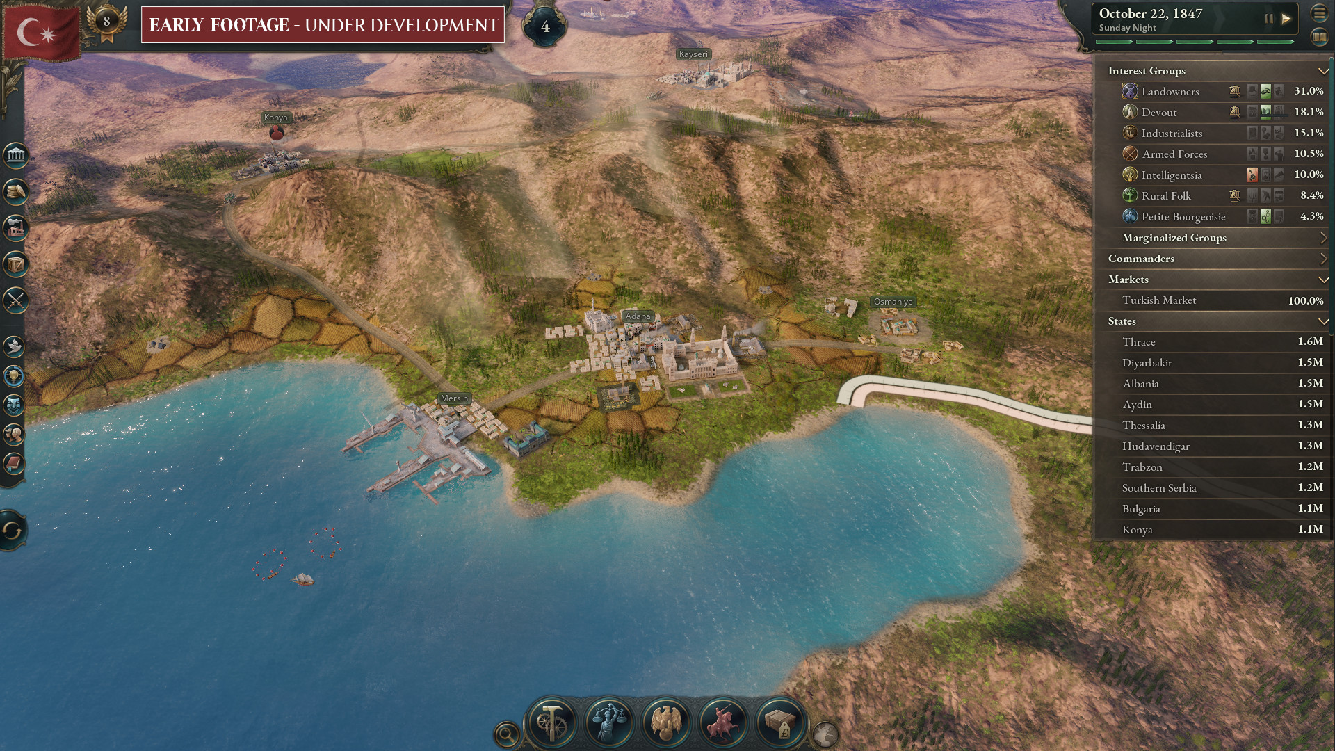
Hello all! My name is Kenneth and I am the 2D Art Lead on Victoria 3. Working on the games user interface (UI in short) with my team is a big part of what I do on the game. From here on, whenever the word UI is mentioned, it refers to an overview of these 3 categories (Panels, Buttons and Icons) which make up the UI of the game! The majority of the information and the decisions a player makes happens in the UI.
There is a huge opportunity to engage and immerse the player into the world of Victoria 3 through the UI. As mentioned in the previous Dev Diary, the UX teams focus is to make this massive amount of information approachable and accessible. Us, in the UI team, work extremely closely with them, to display all that information in a visually appealing way.
Art Pillars and how it ties with UI
We have 3 core pillars for Victoria 3s art style. These pillars guide the overall art direction and capture the feelings we want to convey in the game which includes of course, the UI!Prestigious - The UI is inspired by the extravagance and luxuries of the upper class in the Victorian era. It should feel elegant and exquisite.
Vintage and Idyllic -Vintage here means something from the past that is of high quality. The Romanticism Art movement is a source of inspiration for the art direction. It seems fitting given that it originated in the 1800s and the idealisation of the idyllic past and nature fits in nicely with the Vintage feel that we want to incorporate in the UI.
Detailed yet Approachable - High level of detail with intricate elements but used sparingly so it does not become cluttered and overwhelming.
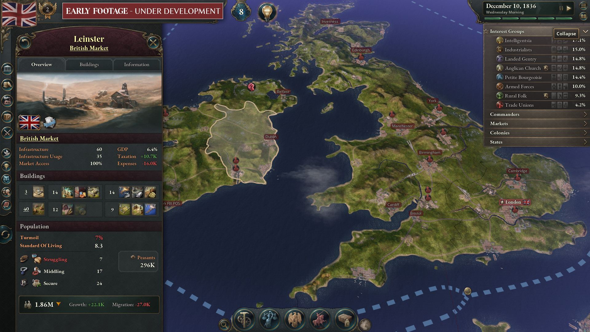
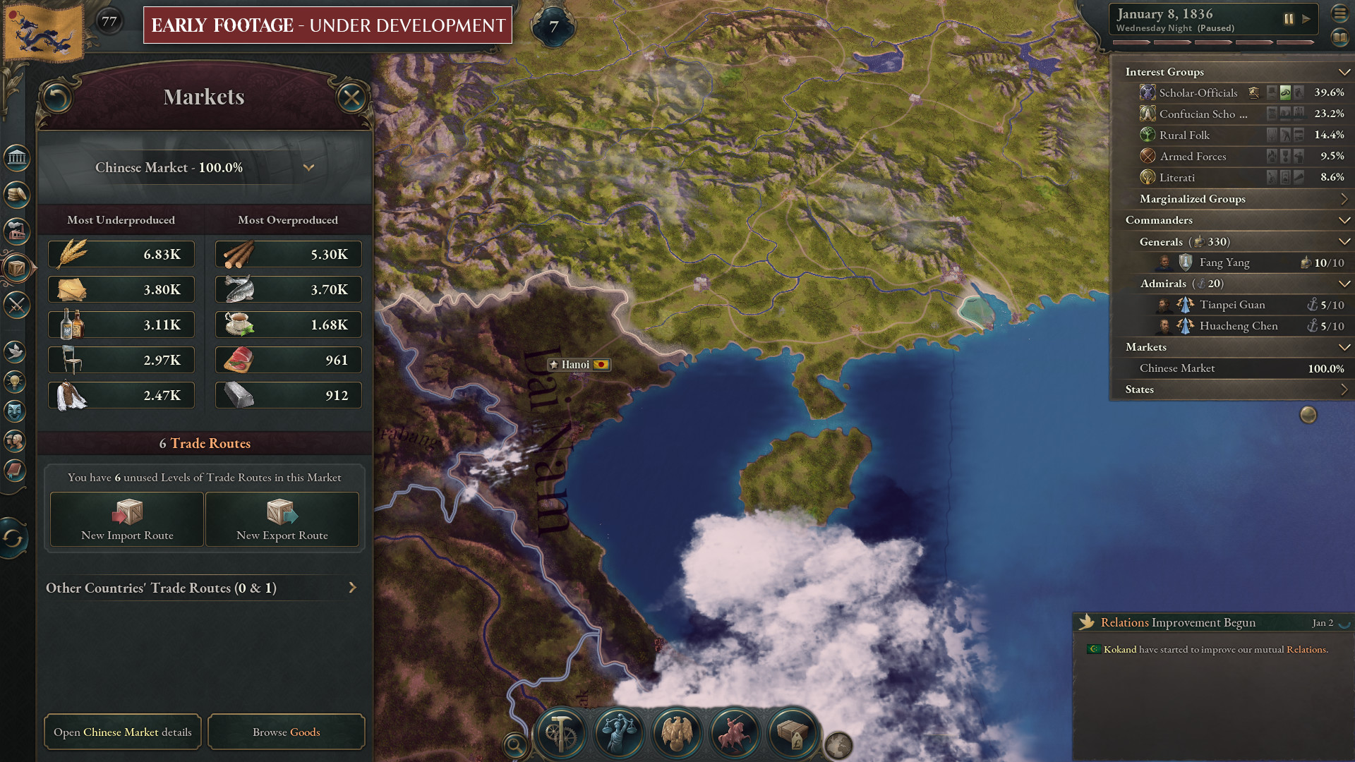
UI panel
UI panels form the base or background of every single UI menu (be it, fullscreen, popups, or on the sides) in the game. If its not on the map, it's on an UI panel.We chose to incorporate Art Nouveau elements into the panels. Art Nouveau is primarily inspired by nature and the natural forms and curves of plants and flowers. This aligns with the Art pillar Vintage and idyllic. The style is also prominent in the architecture of the upper echelons of society in the 1800s. Its intricate details evoke a feeling of extravagance and elegance which aligns with the other two art pillars. We need to be careful not to put in too many detailed patterns as this will distract the main function of an UI: which is to display information to the player! Hence, we focus the rich details on frames and borders of the panels as well as headers where the title of the menu resides.
This is an UI panel. Elaborate patterns with a touch of gold and faded fabric textures adds that extra layer of prestige and vintage feel prominent in the Victorian era.

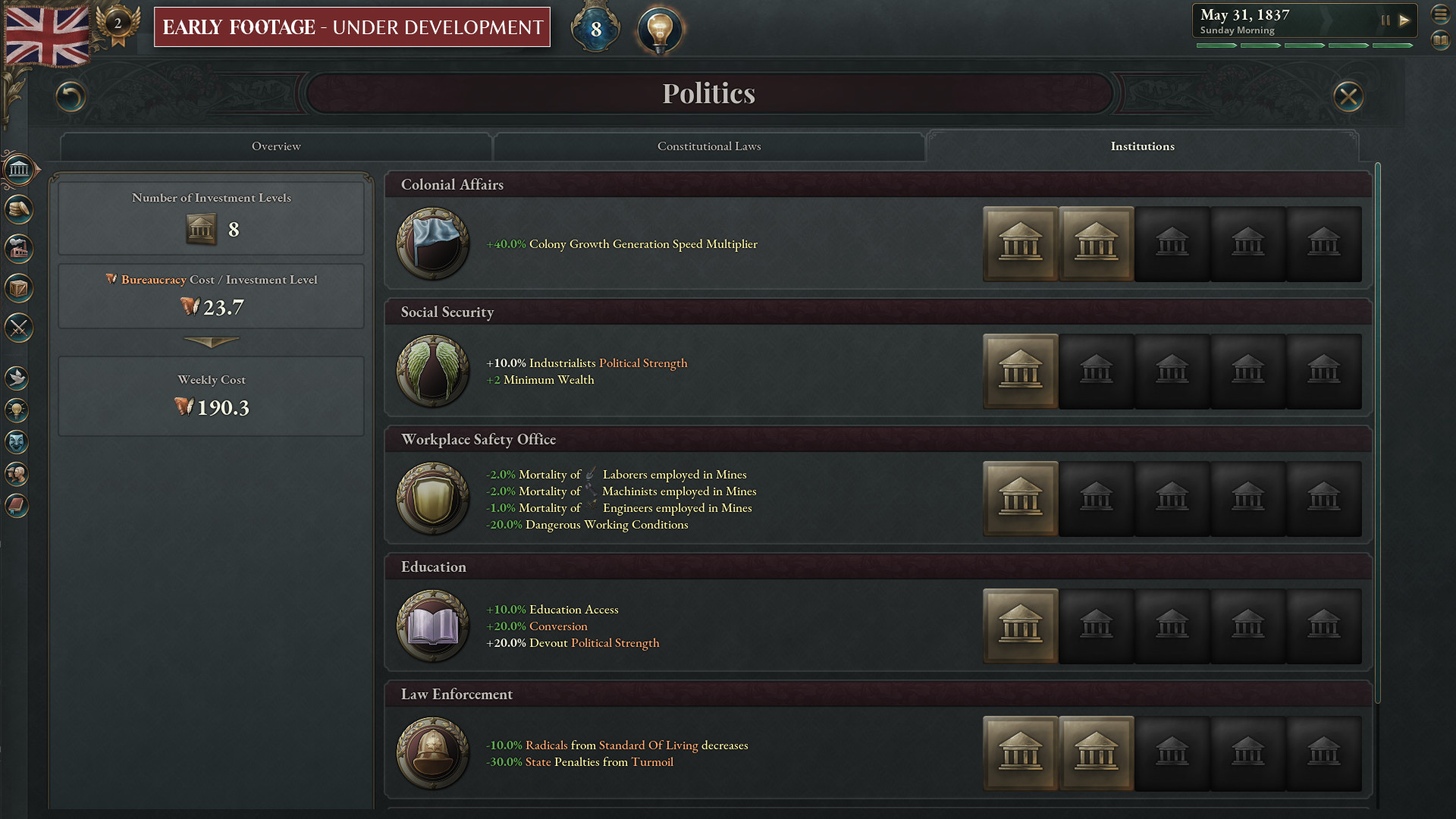
Buttons
Buttons are the main elements in the game and UI that the player interacts directly with. From the UX point of view, players would need to identify the buttons almost instantaneously. Buttons should be identified either as Navigation buttons (buttons that lead you to another UI screen) or Action buttons (buttons that perform an action that affects the game world). With that in mind, we sought to create a template for the games buttons while aligning it with our core art pillars.We use wood as a texture for the buttons for the aged, vintage feel. All buttons have an emerald colour with two different shades to differentiate between Action and Navigation buttons.
Different shades of emerald for the buttons. Action buttons also have a thin gold border to differentiate them further while still having both types recognised as buttons.

There would be some UI screens that would have multiple buttons on them. How can we draw attention to higher priority buttons (if any)? Our solution: Give them a more prestigious look, by adding Art Nouveau elements around the borders and corners of the button!

Icons
Icons are a major part of the UI of Paradox games and of course, this is no different in Victoria 3. Icons in the game come in a wide variety of shapes, sizes, styles and colours, and we use them to represent a host of different things, mechanics, statistics and attributes in the game. I will break down some of the different ways in which we use the icons and hopefully yall will gain a better insight into our design process.Buildings and Goods
This group of icons are by far, the most visual and detailed in the game. They are representations of actual things in the game world. These icons are akin to mini illustrations and their primary purpose is to enhance immersion and fuel the imagination of our players.
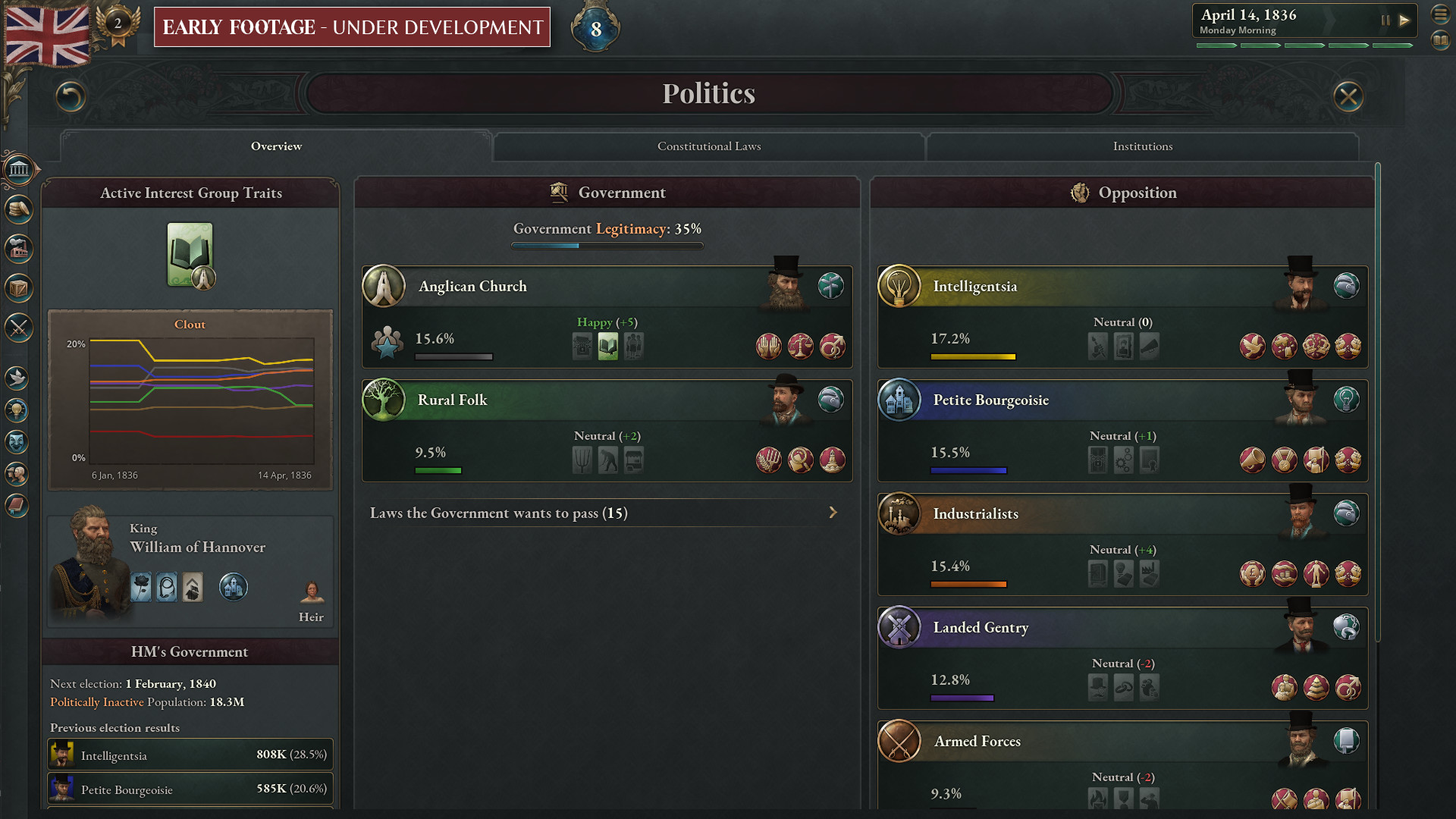
Events, Technologies and Pop groups
Academia and Dynamite are both technologies that a player can research but one seems to be a little abstract while Dynamite is an actual object in real life. How then, do we approach such icons as a group? For technology and event icons, we decided to use objects from the real world or several objects to represent them. Since most of these icons are going to be pretty big (for an icon), we decided to go for a highly detailed and realistic rendering to enhance immersion. It is pretty straightforward for a technology like Dynamite. For Protest events, we use something a little more symbolic like a hand holding a loudhailer.
Pop groups are represented by our amazing character models and icons. Since the character models will be a tad hard to see when scaled down, we use icons to support them. The same guidelines apply when designing Pop icons. For example, Machinists are represented by a wrench.

The final group of icons I am going to talk about is a broad group which represents game mechanics, their categories, attributes and stats. These icons tend to show up in multiple different UI screens and are not very big (for an icon). They may need to appear in different sizes as well. Many of them would need to be recognisable when they are small. Therefore, we reduce the amount of details on these icons drastically and instead focus on a few choice colours and the silhouettes.
Battalions appear in many different UI screens and in a variety of sizes.


We can also use colour coding on these icons to make them more recognisable. For example, we can have positive condition icons being green and negative condition icons being red.

Interest Groups (IG) icons are a more complex example of colour coding. Players may not immediately remember and understand all the colour coding within each sub category of icons but our hope is that this will get more familiar and identifiable over time. Other examples of this are the Lens category icons.

Tutorial
In the previous Dev Diary, Aron and Henrik have briefly mentioned the tutorial. I am going to talk a little about the art that goes into helping players understand our incredibly deep and complex mechanics better. We believe that the combination of tooltips, text explanations and infographics will help visualise the game mechanics better. Most infographics you find online (go ahead, do a Google search) have a clean, stylised and very modern look. We see an opportunity here to make it fit with the Victorian era better. This can definitely be an area where immersion is enriched and of course, strengthen our art pillars. We took inspiration from newspaper illustrations and blueprint illustrations of the Victorian era and adopted it for our infographics. And as icing on the cake, we overlaid the drawings on top of an aged paper background.
Thats all from me! I hope you have enjoyed the brief overview of the UI of Victoria 3! Join us next week as Daniel, our Content Design Lead will talk about Journal Entries!
Minimum Setup
- OS: TBC
- Processor: TBC
- Graphics: TBCSound Card: TBC
Recommended Setup
- OS: TBC
- Processor: TBC
- Graphics: TBCSound Card: TBC

[ 6374 ]
[ 5785 ]
[ 751 ]
[ 2194 ]

Time left:
356103 days, 18 hours, 43 minutes

Time left:
356103 days, 18 hours, 43 minutes
Time left:
8 days, 2 hours, 43 minutes

Time left:
36 days, 2 hours, 43 minutes

Time left:
39 days, 2 hours, 43 minutes

Time left:
40 days, 2 hours, 43 minutes
Time left:
13 days, 12 hours, 43 minutes
Time left:
0 days, 20 hours, 43 minutes
Time left:
1 days, 20 hours, 43 minutes
Time left:
8 days, 20 hours, 43 minutes
Time left:
14 days, 20 hours, 43 minutes
Time left:
15 days, 20 hours, 43 minutes
Time left:
20 days, 20 hours, 43 minutes
Time left:
26 days, 20 hours, 43 minutes


