SHAPE A GRAND TOMORROW
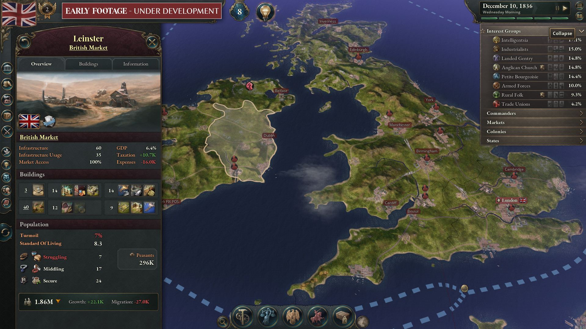
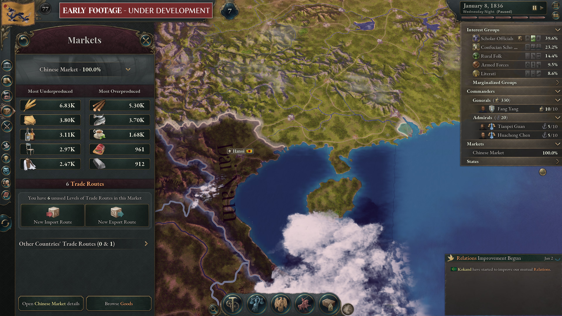
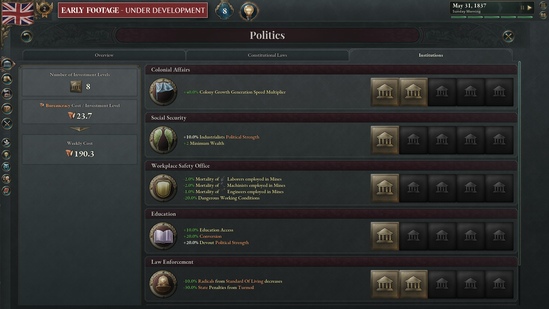
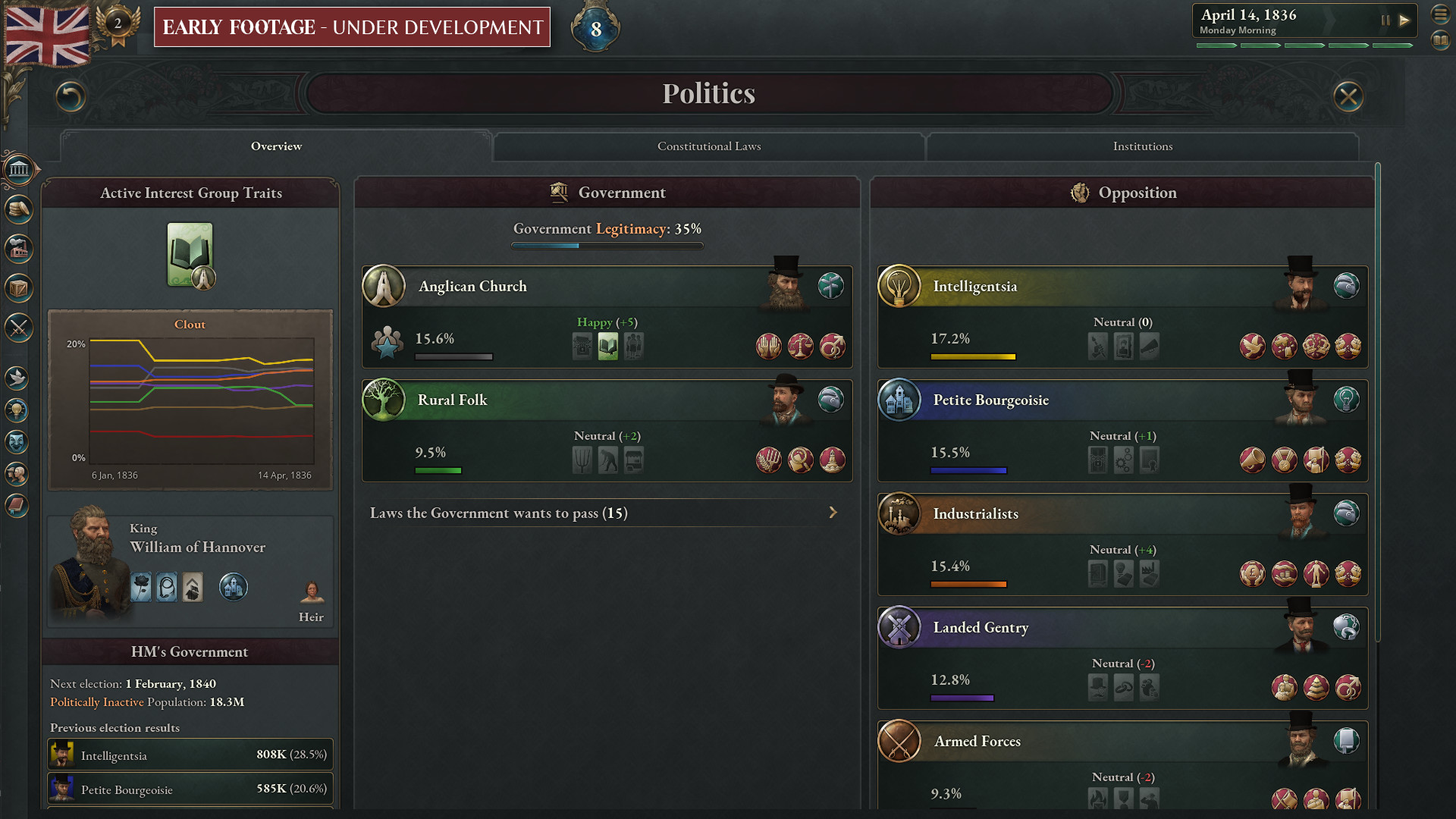
Paradox Development Studio invites you to build your ideal society in the tumult of the exciting and transformative 19th century. Balance the competing interests in your society and earn your place in the sun in Victoria 3, one of the most anticipated games in Paradox’s history.THE ULTIMATE SOCIETY SIMULATOR
- Lead dozens of world nations from 1836-1936. Agrarian or Industrial, Traditional or Radical, Peaceful or Expansionist... the choice is yours.
- Detailed population groups with their own economic needs and political desires.
- Reform your government and constitution to take advantage of new social innovations, or preserve the stability of your nation by holding fast to tradition in the face of revolutionaries.
- Research transformative new technology or ideas to improve your national situation.
DEEP ECONOMIC SYSTEM
- Expand your industry to take advantage of lucrative goods, taxing the profits to improve national prosperity.
- Import cheap raw materials to cover your basic needs while finding new markets for your finished goods.
- Secure vital goods to fuel your advanced economy and control the fate of empires.
- Balance employing available labor force with the needs for new types of workers.
PLAY ON A GRAND STAGE
- Use your diplomatic wiles to weave a tangled global web of pacts, relations, alliances, and rivalries to secure your diplomatic position on the world stage.
- Employ threats, military prowess and bluffs to persuade enemies to back down in conflicts.
- Increase your economic and military strength at the expense of rivals.
- Accumulate prestige and the respect of your rivals as you build an industrial giant at home or an empire abroad.
Dev Diary #117 - The UX of Sphere of Influence

However, many of these actions are things you want to be able to do on the go which led us to work a lot with our context menus such as our right-click menus. One of the most used right-click menus in the game is the Country & State right-click menu, but it is also one of the largest. Unsurprisingly enough, it is the right-click menu we wanted to put even more things into now as we have added ways for you to interact with your Subject and your Overlord. This sparked some rethinking of how we can make the right-click menus more compact while still retaining the intuitivity.
End result,
Before:The current chonky Country right-click menu in 1.6.

After: Right-clicking Hannover as Great Britain now gives a heavily compacted right-click menu with your Overlord Actions and Diplomatic Actions neatly grouped under their respective drop-down menu.

Opening the Overlord Actions drop-down gives you the full list of potential actions.

Similarly, right-clicking one of your own States neatly stores all Decrees under its own drop-down menu. Also notice the smaller round buttons for go-to, zoom-to and pin/unpin next to the Country and State headers.
This might be more of a technical improvement on the development side of things, but it definitely benefits us all in the end. The Subject, Overlord, and Bloc Member Actions all fall under the same umbrella as Diplomatic Actions and it was clear early on during development of this expansion that we were in dire need to get their tooltips sorted out with a clear pattern with all of these new actions coming in. Both to make it easier to work with them and to benefit the end result for us players. We have two versions of tooltips, fancy custom tooltips (Cooltips) and regular tooltips, that might not be obvious to you as a player, but if you are implementing them, there is a very clear difference in what you can do with them. The regular tooltip gives us very little flexibility to what you can do since it is basically only a long text string that we build with line breaks while the Cooltip essentially is another UI panel where we have full flexibility to do whatever the GUI system can do (everything!). In other words, me as a UX designer can do a lot of cool changes directly in a Cooltip without much of a hassle while it is much more of a struggle editing regular tooltips, generally speaking. You would mainly see the difference in-game by looking at the tooltip headers and the structure of the tooltip. Most of the time, a Cooltip has an icon in the top left corner with a larger header and a type concept in the top right corner, while the regular tooltip has no icon and only a regular text header. If the tooltip feels a bit nicer and a bit more structured, it is most likely a Cooltip, even though we do have some nice regular tooltips out there as well of course.
We took the time to move all of the above Diplomatic Actions over to a Cooltip, meaning we (especially I) get more direct agency over these tooltips, what they contain and how they are structured. The Diplomatic Actions are still very text heavy tooltips, but I will bring this up again later when we talk about Power Blocs and you will see more of the neat power of Cooltips.

The Guarantee Independence Diplomatic Action as a typical regular tooltip with a normal header, a breaking line followed by the rest of the tooltip content. In this case, most of it is coming from code making it difficult for me as a UX designer to change anything on the go.

The same action as a typical Cooltip with an icon and a larger header that easily can be made contextual. In this case, we are hovering the button for an ongoing Guaranteeing Independence action and it gives us the action prompt of Stop doing this rather than just the name of the action. In the Cooltip, I can be the one adding this contextual header, while in a regular tooltip I could not and I would have to steal precious time from one of our programmers. This goes for all you modders out there as well, go crazy!
In a similar fashion, we have worked on the confirmation popups for the Diplomatic Actions to be consistent with the tooltips and clearly show the difference of starting and stopping an action.

The confirmation popup for Stop Guarantee Independence.
While you probably will encounter Lobbies more often in Events and Journal entries, or by seeing their reactions to various diplomatic actions, they also have an info panel when selected.

The new Lobby info panel..
In the Lobby info panel, you can see each Interest Group that supports the Lobby along with their Approval (since it is directly impacted by the Lobbys overall Appeasement).
Most importantly, you can also see all actions that would affect this Lobbys Appeasement. While the Lobbies that are in the game currently are somewhat straightforward (Pro-Lobbies encourage you to do friendly actions towards their favored Country). This is something we have the potential to greatly expand upon in the future and make it more involved.

An Interest Groups support of this Lobby.
You can also see why a certain Interest Group is supporting this Lobby. While it might be unlikely that you can force an Interest Group out of a Lobby due to their reasons, it does mean it is easier to tell why Lobbies form in the first place.
We also wanted players to be able to see Lobbies outside their own Country. While this may not affect your decisions as often as your own Lobbies, it is still nice to see the people of other Countries reacting to your benevolent power projection. As such we use the map mode in the Political Lens to show your Lobbies, along with any Lobbies from other Countries that concern your Country.

Map markers for your Lobbies targeting other countries and other countries Lobbies targeting you in either a pro or anti way.

Lobbies in Foreign Countries appear in their respective Countries Info Panel.
We ended up with a combination of ways of illustrating this division of a buildings ownership. Some more clear than others, but our hope is that the combination of all of them will make it intuitive.
To visually represent the combination of ownership of a specific building, we used a horizontal bar divided by ownership:
If you look at the horizontal bar in the middle, you can see the representation of different ownership based on the instructions above. Also note that you can filter this whole list on Owner in the filters to the left. Filters being: All | Nationally Owned | Privately Owned | Foreignly Owned.
Similarly, we use the same kind of horizontal bar for Financial Districts and Manor Houses that owns other buildings, but then it is divided by the buildings it owns:
Note the Manor Houses with their red horizontal bars indicating that all buildings they own are buildings in Great Britain as Great Britain's map color is red.
These specific patterns might not be intuitive to start with when you do not know them and have no one explaining them to you, but the intention is for it to become a subconscious thing that you learn as you play. In the end, you will probably not notice when and how this helps you see the different ownerships since you have been exposed to them through the whole game and gradually learnt them, all the while you now only glance at the bar and instantly know what owns what (insert Praying Patrick meme here).
We have also experimented with putting some visualization of ownership on the map, working with arrows pointing from the owned building to the owning building. While doing so, we ended up adding visualization to input and output of Goods to a building as well. It all resulted in a big mix of arrows pointing and animating in all kinds of directions on the map. It felt a tad bit overwhelming at first, so we tweaked and toned it down slightly, and after playing with it for a while many of us felt we could not play without it.

[i]In the example of looking at the Tooling Workshop in Burgundy above you can see all of the following on the map:

For Financial Districts, you get a visual representation on the map of where in the world it has invested its money by looking at the animating yellow arrows.

Arrows for Input and Output of Goods animating to or out from the selected building, and oh yes, you can cycle through the associated buildings more easily now as all buildings that have anything to do with the selected building show up as map markers on the map and you can click them.

This Financial District owns a whole bunch of stuff for sure! Indicated by all the animated arrows going to this Financial District. The specific number of building levels owned by this Financial District are shown as a number on each of the owned buildings on the map with the accumulated total being the total level of the Financial District (25 in this case).
Being in a Power Bloc is a grand thing. We want you to experience that and clearly feel how it is affecting you in all its pros and cons (mostly pros). Since Power Blocs are such grand things, we have worked a lot with the visual representation of them on the map, giving you full customizability of your Power Bloc if you happen to form one or be the leader of one, to give each Power Bloc its true unique feeling and look. This is of course mirrored in the mechanics as the different Central Identity Pillars are profoundly different from each other in what they do and unlock. Add the Principles to the mix and the options are quite varied, and I need to make tooltips that fits all this variation! As you may imagine, all the possible versions of a Power Bloc have been a challenge to present in a way that does not mean custom solutions for each version. One way we have tackled this is early structuring of game concepts and being consistent in the use of them. An example of this is the way we have structured the Central Identity Pillars cooltip into segments based on the game concepts of: Power Bloc, All Bloc Members, Bloc Leader, and Non-leader Bloc Members. This structure is then reused in all other identities cooltips with a segment potentially being removed if there are no effects for that specific game concept / group in that Identity.

The cooltip for the Central Identity Pillar Military Treaty.

The cooltip for the Central Identity Pillar Religious Convocation. To tie this back to how neat Cooltips are, if you look at the Primary Principle Groups in the above cooltips, you get to see the true power of the Cooltips as we have the ability to put larger icons, boxes, and basically whatever we feel like into the tooltip itself. This would not be possible in a regular tooltip that is text only.
As a more general thing for update 1.7, we have worked a lot with making sure most of the new concepts and values we have added have icons associated with them for better recognizability and coherence. New concepts like Leverage, Cohesion, and Power Bloc Members all get their unique icon as you can see below.

The WIP list of all Power Blocs at the start of the game. Each Power Bloc rocking its own style.

[i]The outliner with some ongoing diplomatic actions under a dropdown menu.
[/i]
Next up, in association with the Foreign Investment feature, we have taken a pass on the construction queue. One thing we noticed during early playtesting was the lack of feedback when foreign investment is happening and where it is happening. This was both from the perspective of you doing the foreign investment and others investing in you. We then took the liberty to split the construction queue up into clearer parts. A national queue and a foreign queue, the national queue includes everything you or your pops are building both domestically and abroad while the foreign queue includes everything other Countries or their pops are building in your Country. We added filters to your national queue for both the location (domestic or abroad) and funding (where does the money come from).

Your national queue with the filters open.

In a second tab of the Construction panel, you find all foreign queues in your country grouped by country.
Apart from these larger general UX improvements, we have been working hard with tweaking the UI and UX based on your feedback from the forums and discord, so please do not be shy and keep the feedback coming. We might not be responding to it all, but we for sure are collecting and reading all of it. For now, I hope you enjoyed getting a small glimpse from a UX perspective of Victoria 3s first major expansion. You will have to wait for the patch notes to see all of the UX and UI improvements in detail. Take care until then or come back next week to delve deeper into the Power Bloc feature with our lead game designer Lino!

Hi, Aron here. Im one of the User Experience (UX) designers on Vicky 3 and I would like to give you an overview of our UX focus we have had in the Sphere of Influence expansion and the accompanying free update. I will start with the UX focus for our new features followed by the more general improvements.
Subject Improvements
In this feature we have broadened the agency you have over your Subjects as an Overlord significantly. You can read more in-depth about the feature here . Naturally, we have put the majority of the interactions under the Diplomacy panel to have a clear central place to look for them, but also to make this panel more interactable. Previously, it has been more of an informational panel than a place where you interact, but that we are here to change!
However, many of these actions are things you want to be able to do on the go which led us to work a lot with our context menus such as our right-click menus. One of the most used right-click menus in the game is the Country & State right-click menu, but it is also one of the largest. Unsurprisingly enough, it is the right-click menu we wanted to put even more things into now as we have added ways for you to interact with your Subject and your Overlord. This sparked some rethinking of how we can make the right-click menus more compact while still retaining the intuitivity.
End result,
- The common actions such as Go-to country, Pin country to Outliner, and Zoom-to country have been moved to the headers with simple icon buttons, following the standard we already have set up for them in other panels.
- Actions that go under the same category such as Diplomatic Actions, Subject Actions, Overlord Actions, and Bloc Member Actions get to live under their own drop-down menu.

Before:The current chonky Country right-click menu in 1.6.

After: Right-clicking Hannover as Great Britain now gives a heavily compacted right-click menu with your Overlord Actions and Diplomatic Actions neatly grouped under their respective drop-down menu.

Opening the Overlord Actions drop-down gives you the full list of potential actions.

Similarly, right-clicking one of your own States neatly stores all Decrees under its own drop-down menu. Also notice the smaller round buttons for go-to, zoom-to and pin/unpin next to the Country and State headers.
This might be more of a technical improvement on the development side of things, but it definitely benefits us all in the end. The Subject, Overlord, and Bloc Member Actions all fall under the same umbrella as Diplomatic Actions and it was clear early on during development of this expansion that we were in dire need to get their tooltips sorted out with a clear pattern with all of these new actions coming in. Both to make it easier to work with them and to benefit the end result for us players. We have two versions of tooltips, fancy custom tooltips (Cooltips) and regular tooltips, that might not be obvious to you as a player, but if you are implementing them, there is a very clear difference in what you can do with them. The regular tooltip gives us very little flexibility to what you can do since it is basically only a long text string that we build with line breaks while the Cooltip essentially is another UI panel where we have full flexibility to do whatever the GUI system can do (everything!). In other words, me as a UX designer can do a lot of cool changes directly in a Cooltip without much of a hassle while it is much more of a struggle editing regular tooltips, generally speaking. You would mainly see the difference in-game by looking at the tooltip headers and the structure of the tooltip. Most of the time, a Cooltip has an icon in the top left corner with a larger header and a type concept in the top right corner, while the regular tooltip has no icon and only a regular text header. If the tooltip feels a bit nicer and a bit more structured, it is most likely a Cooltip, even though we do have some nice regular tooltips out there as well of course.
We took the time to move all of the above Diplomatic Actions over to a Cooltip, meaning we (especially I) get more direct agency over these tooltips, what they contain and how they are structured. The Diplomatic Actions are still very text heavy tooltips, but I will bring this up again later when we talk about Power Blocs and you will see more of the neat power of Cooltips.

The Guarantee Independence Diplomatic Action as a typical regular tooltip with a normal header, a breaking line followed by the rest of the tooltip content. In this case, most of it is coming from code making it difficult for me as a UX designer to change anything on the go.

The same action as a typical Cooltip with an icon and a larger header that easily can be made contextual. In this case, we are hovering the button for an ongoing Guaranteeing Independence action and it gives us the action prompt of Stop doing this rather than just the name of the action. In the Cooltip, I can be the one adding this contextual header, while in a regular tooltip I could not and I would have to steal precious time from one of our programmers. This goes for all you modders out there as well, go crazy!
In a similar fashion, we have worked on the confirmation popups for the Diplomatic Actions to be consistent with the tooltips and clearly show the difference of starting and stopping an action.

The confirmation popup for Stop Guarantee Independence.
Lobbies
Political Lobbies are a quite straightforward feature from a UX perspective (read more about Lobbies here ).While you probably will encounter Lobbies more often in Events and Journal entries, or by seeing their reactions to various diplomatic actions, they also have an info panel when selected.

The new Lobby info panel..
In the Lobby info panel, you can see each Interest Group that supports the Lobby along with their Approval (since it is directly impacted by the Lobbys overall Appeasement).
Most importantly, you can also see all actions that would affect this Lobbys Appeasement. While the Lobbies that are in the game currently are somewhat straightforward (Pro-Lobbies encourage you to do friendly actions towards their favored Country). This is something we have the potential to greatly expand upon in the future and make it more involved.

An Interest Groups support of this Lobby.
You can also see why a certain Interest Group is supporting this Lobby. While it might be unlikely that you can force an Interest Group out of a Lobby due to their reasons, it does mean it is easier to tell why Lobbies form in the first place.
We also wanted players to be able to see Lobbies outside their own Country. While this may not affect your decisions as often as your own Lobbies, it is still nice to see the people of other Countries reacting to your benevolent power projection. As such we use the map mode in the Political Lens to show your Lobbies, along with any Lobbies from other Countries that concern your Country.

Map markers for your Lobbies targeting other countries and other countries Lobbies targeting you in either a pro or anti way.

Lobbies in Foreign Countries appear in their respective Countries Info Panel.
Building Ownership Revision & Foreign Investment
When we started development of the Building Ownership Revision & Foreign investment (read more about the feature specifics here ), we had to create several early prototypes to see if this is feasible to communicate in a good and intuitive way before giving this feature the green light. Buildings are such a fundamental piece of our game and making any major changes to them must be made with care. The prototypes showed that the struggle will definitely be to illustrate who owns what of a specific building and how much, but also the opposite perspective, when looking at a Financial District for example, which buildings the Financial District owns and how much of each building, from which country, and so on. This is also where we have spent the most time to ensure it is properly communicated to the player.We ended up with a combination of ways of illustrating this division of a buildings ownership. Some more clear than others, but our hope is that the combination of all of them will make it intuitive.
To visually represent the combination of ownership of a specific building, we used a horizontal bar divided by ownership:
- The icon on the bar will represent one of the following:
- Owning Country
- Owning Pop Type
- Owning Building
- Orange: Your government
- Light Blue: Your pops
- Gray/white: Local population or government
- Yellow: Foreign investors that are not you
- We have tried using colors that work best for most color blindnesses.

If you look at the horizontal bar in the middle, you can see the representation of different ownership based on the instructions above. Also note that you can filter this whole list on Owner in the filters to the left. Filters being: All | Nationally Owned | Privately Owned | Foreignly Owned.
Similarly, we use the same kind of horizontal bar for Financial Districts and Manor Houses that owns other buildings, but then it is divided by the buildings it owns:
- The icon on the bar will represent the building it owns.
- The color is from the country of the building it owns.

Note the Manor Houses with their red horizontal bars indicating that all buildings they own are buildings in Great Britain as Great Britain's map color is red.
These specific patterns might not be intuitive to start with when you do not know them and have no one explaining them to you, but the intention is for it to become a subconscious thing that you learn as you play. In the end, you will probably not notice when and how this helps you see the different ownerships since you have been exposed to them through the whole game and gradually learnt them, all the while you now only glance at the bar and instantly know what owns what (insert Praying Patrick meme here).
We have also experimented with putting some visualization of ownership on the map, working with arrows pointing from the owned building to the owning building. While doing so, we ended up adding visualization to input and output of Goods to a building as well. It all resulted in a big mix of arrows pointing and animating in all kinds of directions on the map. It felt a tad bit overwhelming at first, so we tweaked and toned it down slightly, and after playing with it for a while many of us felt we could not play without it.

[i]In the example of looking at the Tooling Workshop in Burgundy above you can see all of the following on the map:
- Ownership arrows are yellow and they go from the buildings State to the owning Building (Manor House or Financial District).
- Ownership arrows are red if the owning building is a Government building and the arrows then go from your Capital State to the building instead.
- Input Goods arrows are orange.
- Output Goods arrows are green.
- Arrows are thick if in the same state, a bit thinner if in a neighboring state, and very thin and transparent if further away.

For Financial Districts, you get a visual representation on the map of where in the world it has invested its money by looking at the animating yellow arrows.

Arrows for Input and Output of Goods animating to or out from the selected building, and oh yes, you can cycle through the associated buildings more easily now as all buildings that have anything to do with the selected building show up as map markers on the map and you can click them.

This Financial District owns a whole bunch of stuff for sure! Indicated by all the animated arrows going to this Financial District. The specific number of building levels owned by this Financial District are shown as a number on each of the owned buildings on the map with the accumulated total being the total level of the Financial District (25 in this case).
Power Blocs
One new left side menu button, a whole new panel, several new popups, and several new large scale visualizations on the map. This feature is grand. Trying to tie it all together UX wise has been a lovely challenge. You can read the specifics about Power Blocs here , but also a shout out to the awesome Art we have seen from the Art team especially for this feature as Max is telling you all about in the Art of Sphere of Influence .Being in a Power Bloc is a grand thing. We want you to experience that and clearly feel how it is affecting you in all its pros and cons (mostly pros). Since Power Blocs are such grand things, we have worked a lot with the visual representation of them on the map, giving you full customizability of your Power Bloc if you happen to form one or be the leader of one, to give each Power Bloc its true unique feeling and look. This is of course mirrored in the mechanics as the different Central Identity Pillars are profoundly different from each other in what they do and unlock. Add the Principles to the mix and the options are quite varied, and I need to make tooltips that fits all this variation! As you may imagine, all the possible versions of a Power Bloc have been a challenge to present in a way that does not mean custom solutions for each version. One way we have tackled this is early structuring of game concepts and being consistent in the use of them. An example of this is the way we have structured the Central Identity Pillars cooltip into segments based on the game concepts of: Power Bloc, All Bloc Members, Bloc Leader, and Non-leader Bloc Members. This structure is then reused in all other identities cooltips with a segment potentially being removed if there are no effects for that specific game concept / group in that Identity.

The cooltip for the Central Identity Pillar Military Treaty.

The cooltip for the Central Identity Pillar Religious Convocation. To tie this back to how neat Cooltips are, if you look at the Primary Principle Groups in the above cooltips, you get to see the true power of the Cooltips as we have the ability to put larger icons, boxes, and basically whatever we feel like into the tooltip itself. This would not be possible in a regular tooltip that is text only.
As a more general thing for update 1.7, we have worked a lot with making sure most of the new concepts and values we have added have icons associated with them for better recognizability and coherence. New concepts like Leverage, Cohesion, and Power Bloc Members all get their unique icon as you can see below.

The WIP list of all Power Blocs at the start of the game. Each Power Bloc rocking its own style.
General Improvements for 1.7
Those icons work as a perfect segway to the more general UX improvements coming in the free update 1.7 accompanying the expansion. First out, the Outliner. In 1.6 we were sooo done with the old chonky outliner and replaced it with something new and fresh. As always when you replace anything with something new, there are a lot of edges to smooth out and the outliner was no exception. In 1.7, we have taken another pass and delved into more of these edges and details. Among many smaller tweaks, the outliner has been compacted even more with additional dropdown menus. Both ongoing diplomatic actions and the list of players (in multiplayer) are now under their own dropdown menus if there are more than one at any time. Some of the already existing dropdowns such as Interest Groups have also been changed to be closed by default.
[i]The outliner with some ongoing diplomatic actions under a dropdown menu.
[/i]
Next up, in association with the Foreign Investment feature, we have taken a pass on the construction queue. One thing we noticed during early playtesting was the lack of feedback when foreign investment is happening and where it is happening. This was both from the perspective of you doing the foreign investment and others investing in you. We then took the liberty to split the construction queue up into clearer parts. A national queue and a foreign queue, the national queue includes everything you or your pops are building both domestically and abroad while the foreign queue includes everything other Countries or their pops are building in your Country. We added filters to your national queue for both the location (domestic or abroad) and funding (where does the money come from).

Your national queue with the filters open.

In a second tab of the Construction panel, you find all foreign queues in your country grouped by country.
Apart from these larger general UX improvements, we have been working hard with tweaking the UI and UX based on your feedback from the forums and discord, so please do not be shy and keep the feedback coming. We might not be responding to it all, but we for sure are collecting and reading all of it. For now, I hope you enjoyed getting a small glimpse from a UX perspective of Victoria 3s first major expansion. You will have to wait for the patch notes to see all of the UX and UI improvements in detail. Take care until then or come back next week to delve deeper into the Power Bloc feature with our lead game designer Lino!
[ 2024-05-16 14:02:20 CET ] [Original Post]
Minimum Setup
- OS: TBC
- Processor: TBC
- Graphics: TBCSound Card: TBC
Recommended Setup
- OS: TBC
- Processor: TBC
- Graphics: TBCSound Card: TBC
GAMEBILLET
[ 6357 ]
FANATICAL
[ 5876 ]
GAMERSGATE
[ 750 ]
MacGameStore
[ 1993 ]
INDIEGALA
[ 1017 ]
FANATICAL BUNDLES
GMG BUNDLES
HUMBLE BUNDLES
INDIEGALA BUNDLES
by buying games/dlcs from affiliate links you are supporting tuxDB

