
Command the army!
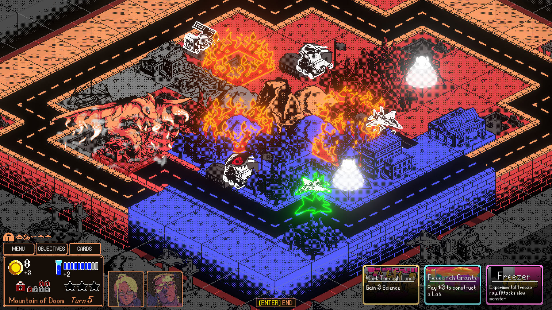
- We need more time! - Park tanks and jets in the monster's path to slow it down (don't worry, we have a good insurance policy).
- Construct buildings! - Let's build some sacrificial army bases and airfields just to keep them busy.
- Deploy experimental weapons! - Conventional weapons aren't enough; deploy experimental weapons such as freeze rays and transforming mechas to keep the kaiju at bay.

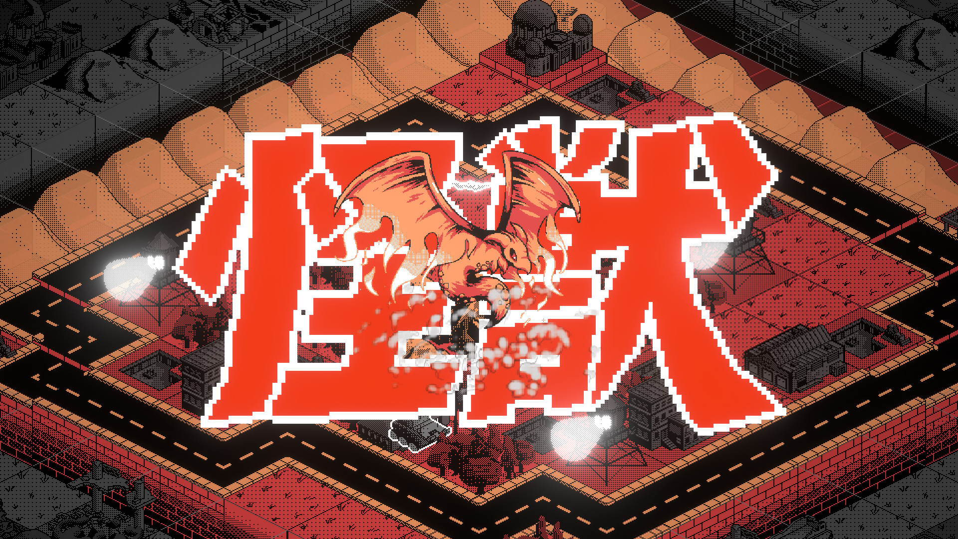
Fight the KAIJU!
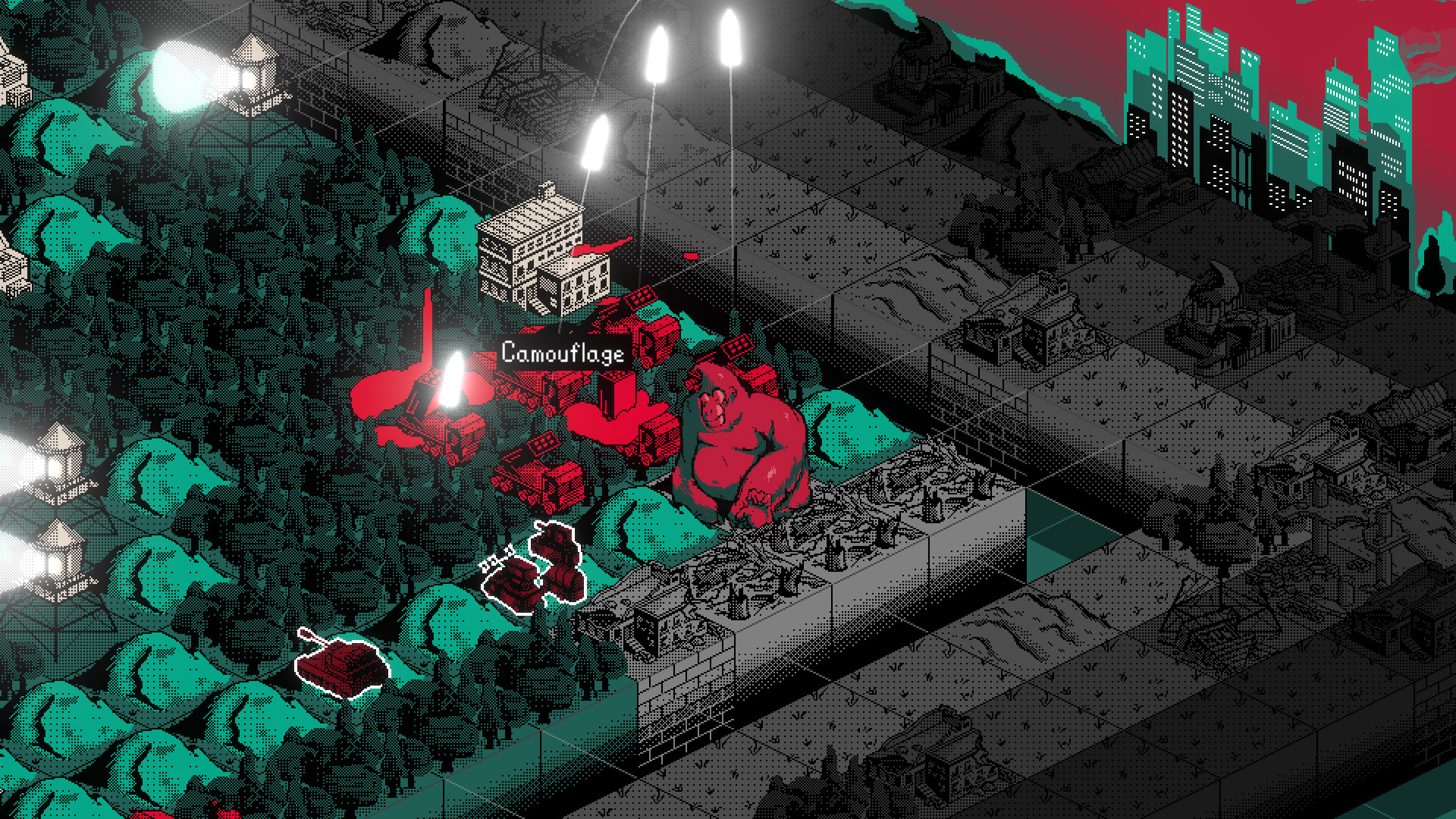
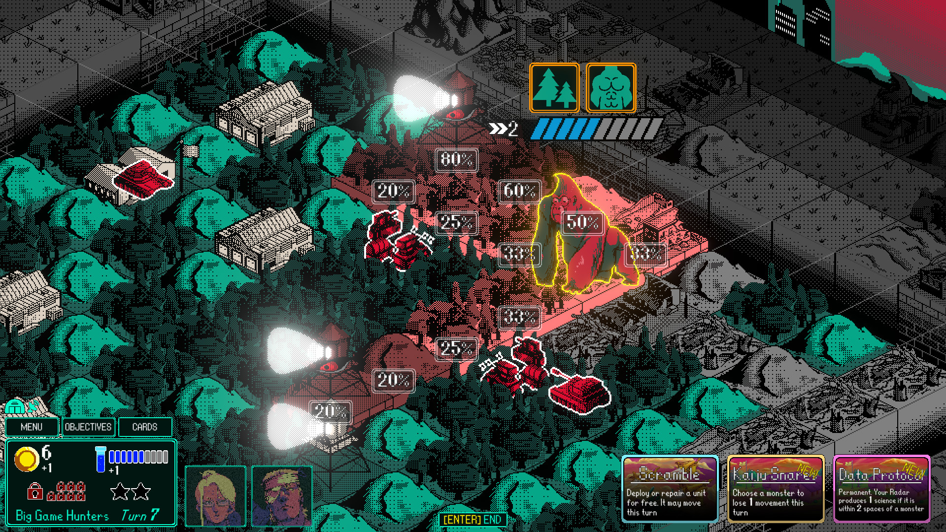
- Five unique creatures! - Each specializing in different types of destruction.
- They mutate! - Tremble in fear as they grow stronger and gain devastating abilities.
- Unstoppable! - Kaiju can't be killed, but can only be slowed down and forced to fall back... for now.
- Predictable! - They move towards the nearest building, and them scientists have mathed the exact odds they step on each tile!
EVACUATE!
Our chief scientist is working on an anti-monster serum, but it's not ready yet! Be prepared to evacuate the laboratory using transport trucks, boats or planes when the monster gets too close.Campaign Mode!
- Uncover the Mystery - Strange things are happening: frequent volcanic eruptions, tsunamis and earthquakes. Find out why over the course of an 8+ hour story-based campaign.
- Embark on a Campaign! - Play missions from all over the world as you progress through the varied campaign. Test your wits in tactical puzzles, command dozens of units in large-scale scenarios, and fend off repeated attacks while developing your city economically in city defense missions.
- Upgrade your ACES - Veteran ACE units accompany you throughout your campaign. Spend medals to upgrade their stats.
- Customize your Project Deck - Unlock powerful Project cards, customize your deck and bring your best to compete on the online leaderboard!
Create your own battles!
- Create your own City or Scenario - Simple and easy to use, scenarios can be crafted in minutes using the drag and drop map editor
- Share your creations online - Share your Cities or Maps online using Steam Workshop integration
- Compete with other players! - Gain the top spot on the Weekly Challenge leaderboards
🎮 Full Controller Support
- Binarystar Infinity Content [2.32 G]
Getting the look and art style of a game right is really important. Like, really important. I'm a programmer by trade, and unfortunately I suck at art. Since I don't have the budget of larger games like Advance Wars or WarGroove I decided to go for a very distinctive, simple and bold art style.
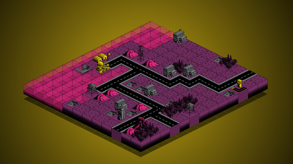
But like all things, it's taking more work than you'd think it would. At first we decided to keep it simple. Real simple. I really liked Into the Breach's pxielly isometric art style. However, I've also really liked the look of those comic book dots (Ben-Day dots) to give shading. The pixel art equivalent of this is dithering. The spacing of black dots gives it an appearance of a gradient, even though we're just using two colours - black and white (look at the forests to see what I mean).

Oof that's some rough UI looking back. Oh well. As for the battlefield, we felt that black and white wasn't enough. What would it look like if we simply coloured each sprite a single colour (with black of course being present)?

Hmm. Not bad. We worked more on our two-tone sprites, and it's shaping up nicely.

Well, that's not terrible. The colours you'd expect are there - water is blue, trees are green. But the dithering combined with pastel colours still isn't quite there yet. Something's missing. Je ne sais quois. It just wasn't bold or striking enough. If someone walks by me (or hopefully other people) playing the game, I want them to stop and say "Woah, what's that?!" It doesn't have to be technically impressive, but it's gotta be striking, bold and distinctive.
My artist friend who I hired for the game suggested looking at old monster movie posters movies themselves for inspiration. Well, the movies didn't help for the art style, but their posters sure did!
You can google them yourself to see what I mean .
We could base our colour palettes from those! We picked out 5 colours from certain posters (with black and gray always being present), and coloured EVERYTHING on the in-game battlefield with those colours. Key interactable items (units, production buildings) got a vibrant bright colour, non-interactable units/buildings got gray, and terrain got shades of our secondary contrasting colours. It had never occurred to me before, but apparently colours on opposite ends of the colour wheel are contrasting (remember I'm a programmer). This revelation really blew my mind.
And there you have it. I think it looks striking, bold and distinctive, if I do say so myself. We still have background and UI to work on, but the battlefield itself is looking pretty nice.
Minimum Setup
- OS: Ubuntu 12.04 or higher
- Processor: 64-bit processor or higherMemory: 2 GB RAMAdditional Notes: It's a 2D game - don't worry about it
- Memory: 2 GB RAMAdditional Notes: It's a 2D game - don't worry about it
Recommended Setup
- Processor: 64-bit processor or higher

[ 6380 ]
[ 5876 ]
[ 1265 ]
[ 2018 ]
[ 986 ]

Time left:
356101 days, 14 hours, 19 minutes
Time left:
356101 days, 14 hours, 19 minutes
Time left:
5 days, 22 hours, 19 minutes

Time left:
33 days, 22 hours, 19 minutes

Time left:
36 days, 22 hours, 19 minutes

Time left:
37 days, 22 hours, 19 minutes
Time left:
11 days, 8 hours, 19 minutes
Time left:
6 days, 16 hours, 19 minutes
Time left:
12 days, 16 hours, 19 minutes
Time left:
13 days, 16 hours, 19 minutes
Time left:
18 days, 16 hours, 19 minutes
Time left:
20 days, 16 hours, 19 minutes
Time left:
24 days, 16 hours, 19 minutes
Time left:
4 days, 5 hours, 34 minutes
Time left:
8 days, 22 hours, 20 minutes
Time left:
10 days, 21 hours, 20 minutes
Time left:
16 days, 4 hours, 30 minutes


