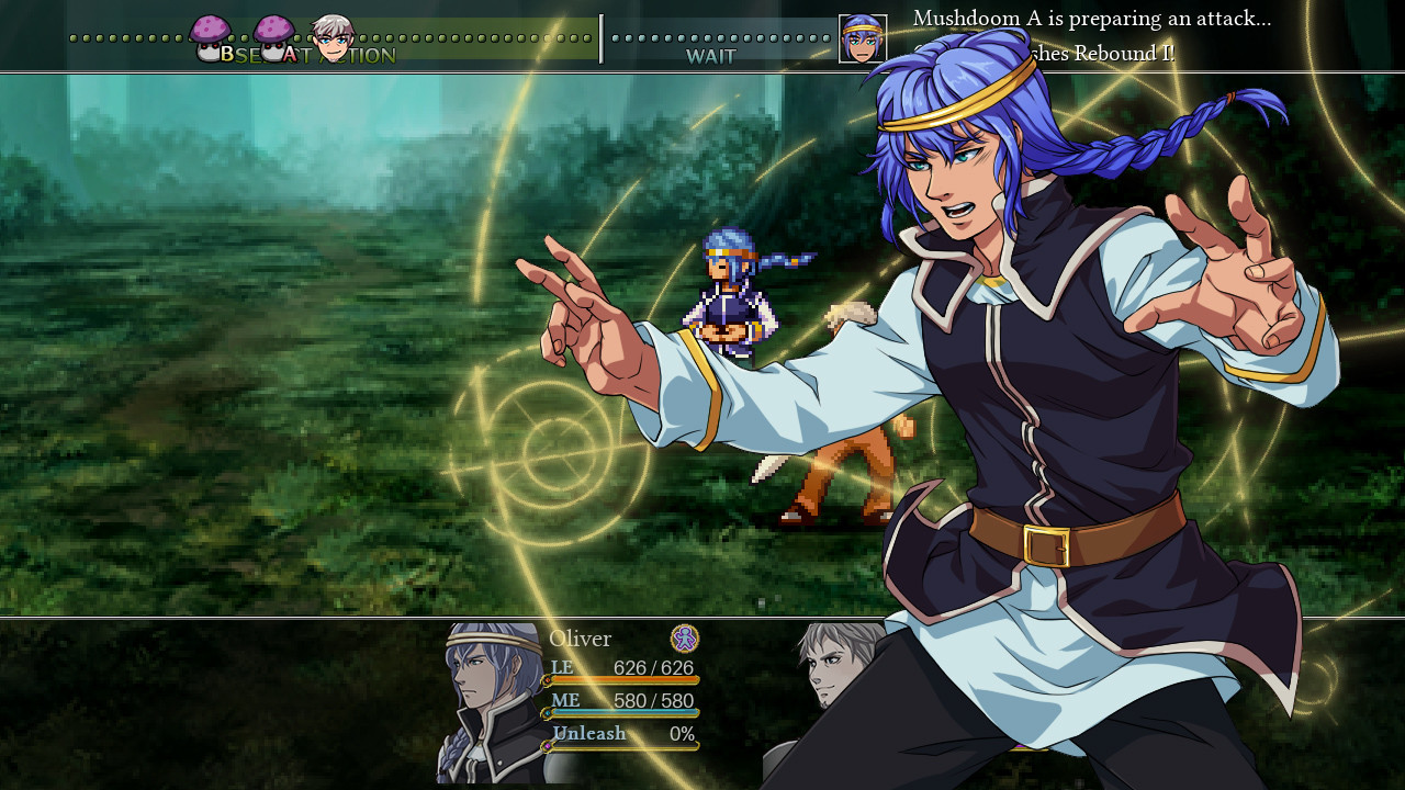
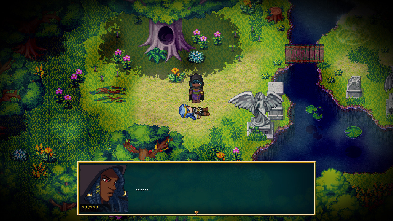
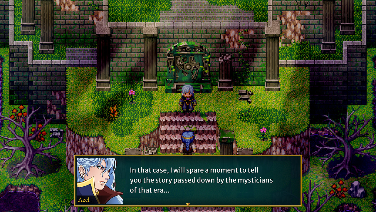
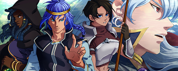
 Lost within the turmoil of Astravia's past, you and your companions must find a way to unite its people before the Cataclysm brings about another age of ruin.
Features
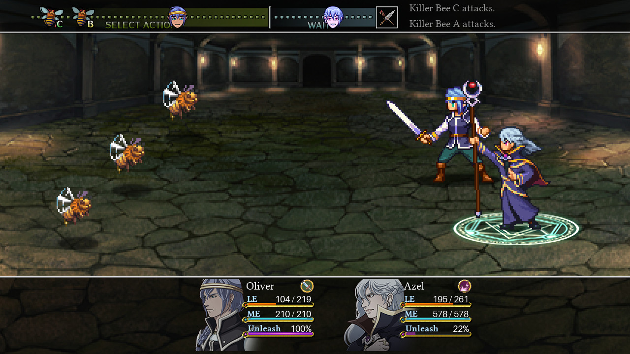
- Exciting, timer-based battle system that relies on quick decision making. The twist: you control the timer; no more waiting for a bar to fill up or for turns to pass.
- A varied cast of playable characters, each with unique combat styles and unique abilities to help you craft the perfect team.
- Vast, explorable world filled with dungeons, caves, and towns. There are challenging puzzles to solve and treasures to find in every corner of Astravia.
- Avoidable enemy encounters. Choose your own playstyle instead of being at the mercy of randomized, repetitive gameplay.
- Modular skill system that allows you to swap abilities between characters, so you never feel locked in to a particular “build”.
- An engaging story supported by varied side-quests. Alongside a fulfilling main quest, meet characters all over the world with their own side-quests and special rewards.
Story
The world of Astravia is in conflict; severed by unrest between mysticians and humans who fear their magic. Once seen as heroes, the flow of time eroded mysticians’ feats into myth, and so anyone who shares their likeness in the present day must instead hide from the ruling country of Valica and its brutal knights.Thus, the wandering mystician Oliver must tread with caution as he escapes the woods of a Valican territory. Spared by a mysterious assassin and at a loss as to how he got there, the stakes are raised even higher when Oliver realizes he must pass through Valica's capitol in order to find answers about his own origins.
Chapter 2 & 3’s synopses will be revealed prior to their release.
New Graphics! (Developer's Log November 2022)

This is definitely a big change, and I was worried whether or not folks who are excited for the game would be disappointed. While the graphics are a lower detail than what was in the demo, I think this is a visual upgrade and a much more appropriate direction.
First, I think it's important to go over what did and didn't change, to address any concerns.

Future updates will all showcase the new design.
The game still plays and feels exactly as it does in the demo--so think of it as a "reskin" of sorts. The user interface will also remain "HD". While this doesn't give the game a fully retro feel, I think it's worth taking advantage of the higher quality text for accessibility reasons.
Additionally, because the original tiles were so challenging to work with, creating later areas was beginning to become disheartening. It felt like no matter what I did, any "unique" graphics just didn't fit right. I found myself spending a very long time on something that, visually, was not acceptable to me.

Lastly, one of the aspects of the game that's been challenging to deal with is the "RPG Maker" look. The original tilesets that the game utilized were from RPG Maker XP, and they were just a bit too similar in pallet and design to the newer RPG Maker default assets. As a result, even the prettiest areas still invoked this "cookie cutter" look that I wasn't satisfied with.
These new tilesets are still technically RPG Maker. But because they're (mostly) 16-bit, and much closer to the SNES/GBA era, I think they invoke a greater sense of nostalgia than the other tiles did. It will also make changing to unique custom tiles a more viable possibility in the future.

The battle scene now looks 2.5D, with battle backgrounds that match the overworld! This change would have been beneficial regardless of whether or not the overworld graphics changed, since the original backgrounds always looked a bit flat.
This is achieved using Crocotile3D. It's been an incredibly helpful tool for recreating the world in 3D and feigning the 2.5D effect:

Alas, it isn't truly 3D, so there won't be any fancy camera effects in battle. But this is something that I'd really like to do for a future game... or later Chapter if feasible.


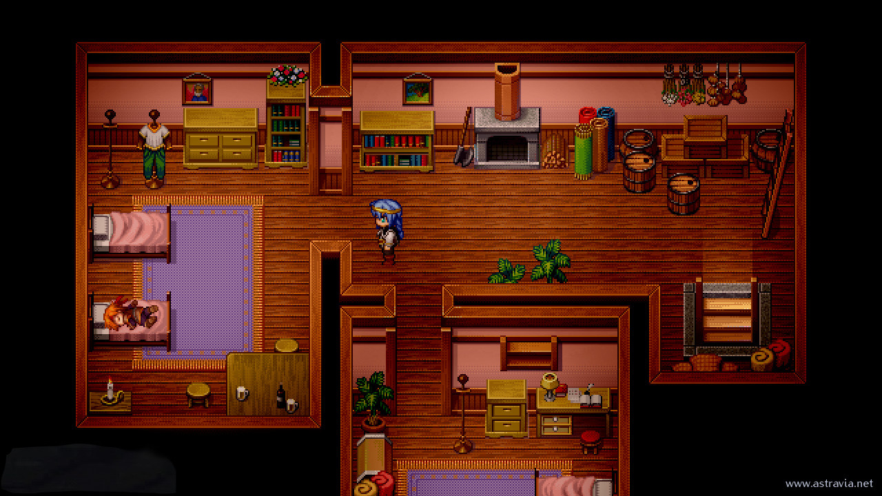
Mordin village in particular feels a lot more homey in the new style:


Creating new tiles for later areas is much less stressful, and as a result I was able to create some maps to preview:


I plan to continue creating the new areas of the game, and now with these new graphics, developer's logs will be much more robust with many more updates to share.
---
Please be sure to let me know your thoughts about this change! You can share them on Steam or in the official Discord server .
I really hope that folks see it as a positive as I have. Because of the new graphics, I feel both more confident in the project and about development as a whole.
I am looking forward to sharing more progress soon!
-Jaiden
Hello everyone,
I am very excited to announce that Legends of Astravia will be taking on a new 16-bit pixel art look, reminiscent of the Super Nintendo / Game Boy Advance games that inspired it!
As some of you might have noticed, the past couple of months of developer's logs have been thin on progress--and that was for good reason. I've been quietly working on this change to the game's graphics.
With it comes a lot of progress, too, and I will explain the reasoning for such a drastic change after having released the demo within this developer's log.
Examples & Reasoning

This is definitely a big change, and I was worried whether or not folks who are excited for the game would be disappointed. While the graphics are a lower detail than what was in the demo, I think this is a visual upgrade and a much more appropriate direction.
First, I think it's important to go over what did and didn't change, to address any concerns.
What Changed
The overworld (map) tiles, character graphics, and character art (as discussed in the last devlog) have changed.
Future updates will all showcase the new design.
What Didn't Change
The engine, battle system, and underlying mechanics are completely the same.The game still plays and feels exactly as it does in the demo--so think of it as a "reskin" of sorts. The user interface will also remain "HD". While this doesn't give the game a fully retro feel, I think it's worth taking advantage of the higher quality text for accessibility reasons.
Why the Change?
First and foremost: development scope. The game is currently already too big, and a lot of work for a solo developer such as myself. The new tiles and character sprites are exactly half as big as the other ones--and the time saved creating new tiles and characters and sprites for later areas is effectively halved as well. In fact, I was able to already replace all of the graphics for the areas featured in the demo.Additionally, because the original tiles were so challenging to work with, creating later areas was beginning to become disheartening. It felt like no matter what I did, any "unique" graphics just didn't fit right. I found myself spending a very long time on something that, visually, was not acceptable to me.

Lastly, one of the aspects of the game that's been challenging to deal with is the "RPG Maker" look. The original tilesets that the game utilized were from RPG Maker XP, and they were just a bit too similar in pallet and design to the newer RPG Maker default assets. As a result, even the prettiest areas still invoked this "cookie cutter" look that I wasn't satisfied with.
These new tilesets are still technically RPG Maker. But because they're (mostly) 16-bit, and much closer to the SNES/GBA era, I think they invoke a greater sense of nostalgia than the other tiles did. It will also make changing to unique custom tiles a more viable possibility in the future.
New Matching 2.5D Battlebacks
As for the battle system, there was some concerns about it clashing with the changes to the overworld. After all, the battler sprites were even higher resolution than the original overworld sprites. However, a special change was made to accommodate this issue...
The battle scene now looks 2.5D, with battle backgrounds that match the overworld! This change would have been beneficial regardless of whether or not the overworld graphics changed, since the original backgrounds always looked a bit flat.
This is achieved using Crocotile3D. It's been an incredibly helpful tool for recreating the world in 3D and feigning the 2.5D effect:

Alas, it isn't truly 3D, so there won't be any fancy camera effects in battle. But this is something that I'd really like to do for a future game... or later Chapter if feasible.
Comparison Screenshots & Ch 1 Teasers
Here are some more screenshots showcasing the change, from the existing demo and including some finally-not-forest areas:


Mordin village in particular feels a lot more homey in the new style:


Creating new tiles for later areas is much less stressful, and as a result I was able to create some maps to preview:


Updated Schedule & Plans
From a development standpoint, I am actually "caught up" to where I was before I started changing the graphics. And because it is going much faster, I feel confident about Chapter 1's progress.I plan to continue creating the new areas of the game, and now with these new graphics, developer's logs will be much more robust with many more updates to share.
What about the demo?
The demo will remain up on Steam as-is with the "old" graphics, until Chapter 1 is closer to its release. At that time, the old demo will be replaced with a special revised demo using the new graphics and more content--including the entire Mordin Village arc for a limited time! No formal release date has been decided for Chapter 1 yet though, so keep an eye on future developer's logs for news on that.---
Please be sure to let me know your thoughts about this change! You can share them on Steam or in the official Discord server .
I really hope that folks see it as a positive as I have. Because of the new graphics, I feel both more confident in the project and about development as a whole.
I am looking forward to sharing more progress soon!
-Jaiden
[ 2022-12-05 13:15:14 CET ] [Original Post]
Minimum Setup
- OS: Ubuntu 20.04 LTS
- Processor: 1.5 GHz Dual CoreMemory: 2 GB RAM
- Memory: 2 GB RAM
- Graphics: 720p Screen Resolution
- Storage: 600 MB available spaceAdditional Notes: Not all Linux versions have been tested. Listed versions are confirmed working. Other distros may work. but are not officially supported yet.
Recommended Setup
- OS: Ubuntu 20.04 LTS
- Processor: 2.0 GHz Quad CoreMemory: 4 GB RAM
- Graphics: Dedicated Card. 1080p Screen Resolution
- Storage: 1 GB available spaceAdditional Notes: Not all Linux versions have been tested. Listed versions are confirmed working. Other distros may work. but are not officially supported yet.
GAMEBILLET
[ 6485 ]
GAMERSGATE
[ 1519 ]
MacGamestore
[ 2422 ]
FANATICAL BUNDLES
HUMBLE BUNDLES
by buying games/dlcs from affiliate links you are supporting tuxDB

