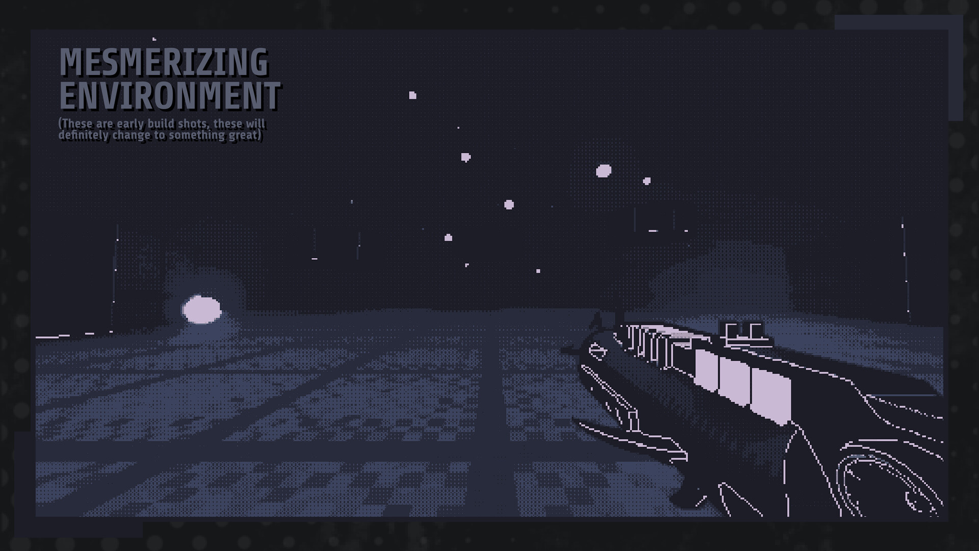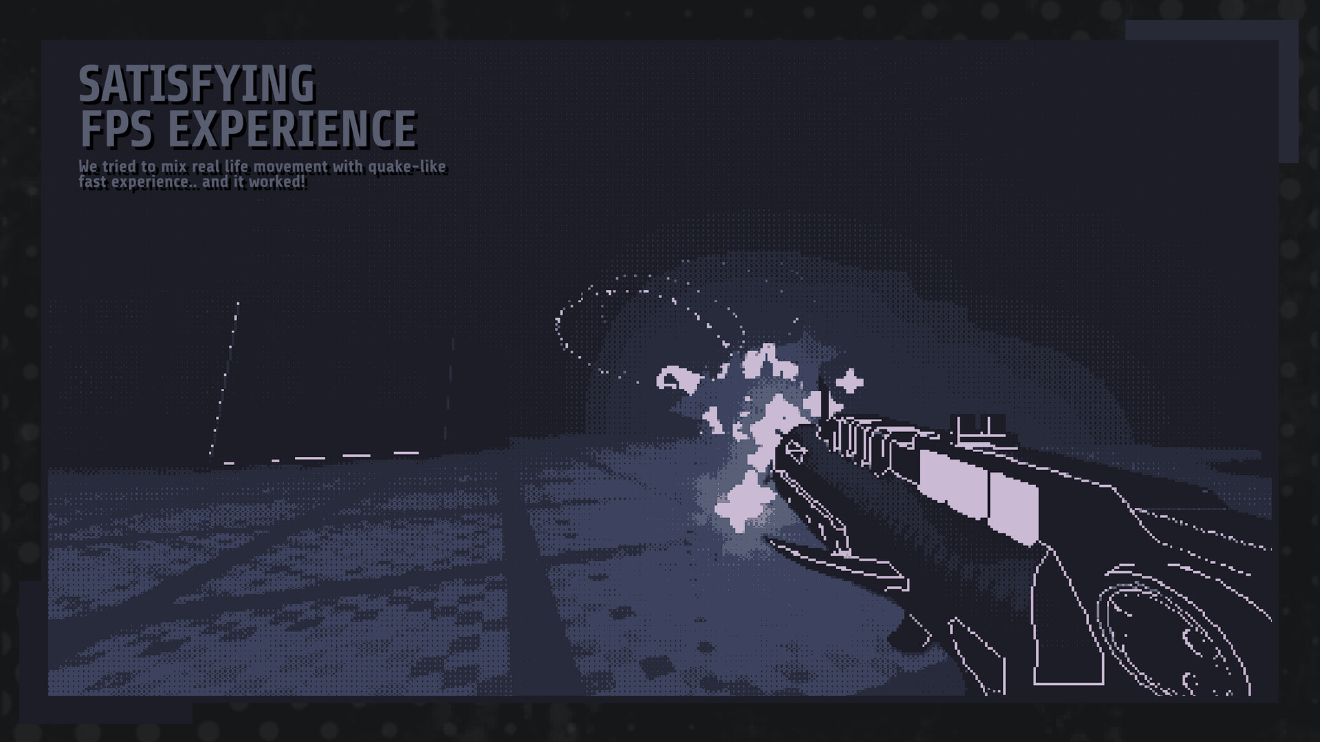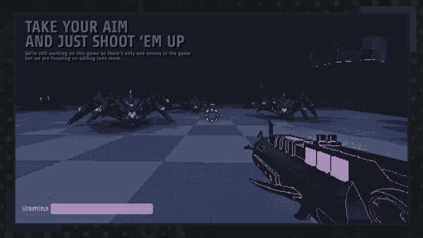
Influenced by 90s FPS and arcade classics, The Void Project offers a thrilling, high-speed shooting experience. Step into a surreal arena, where you'll confront never-ending waves of demon hordes. With a formidable armament and seamless mobility, engage in a battle for survival, striving to outlast the relentless assault. Test your prowess and determination as you vie for seconds on Steam Friends and global leaderboards. Your tenacity and gaming skills will be pushed to their limits.

- Take on 5 bone-chilling demons and their unique variants. (More to be added with future updates)
- Mixture of Quake, UltraKill and Devil Daggers.
- Smooth Gameplay with fast movement.
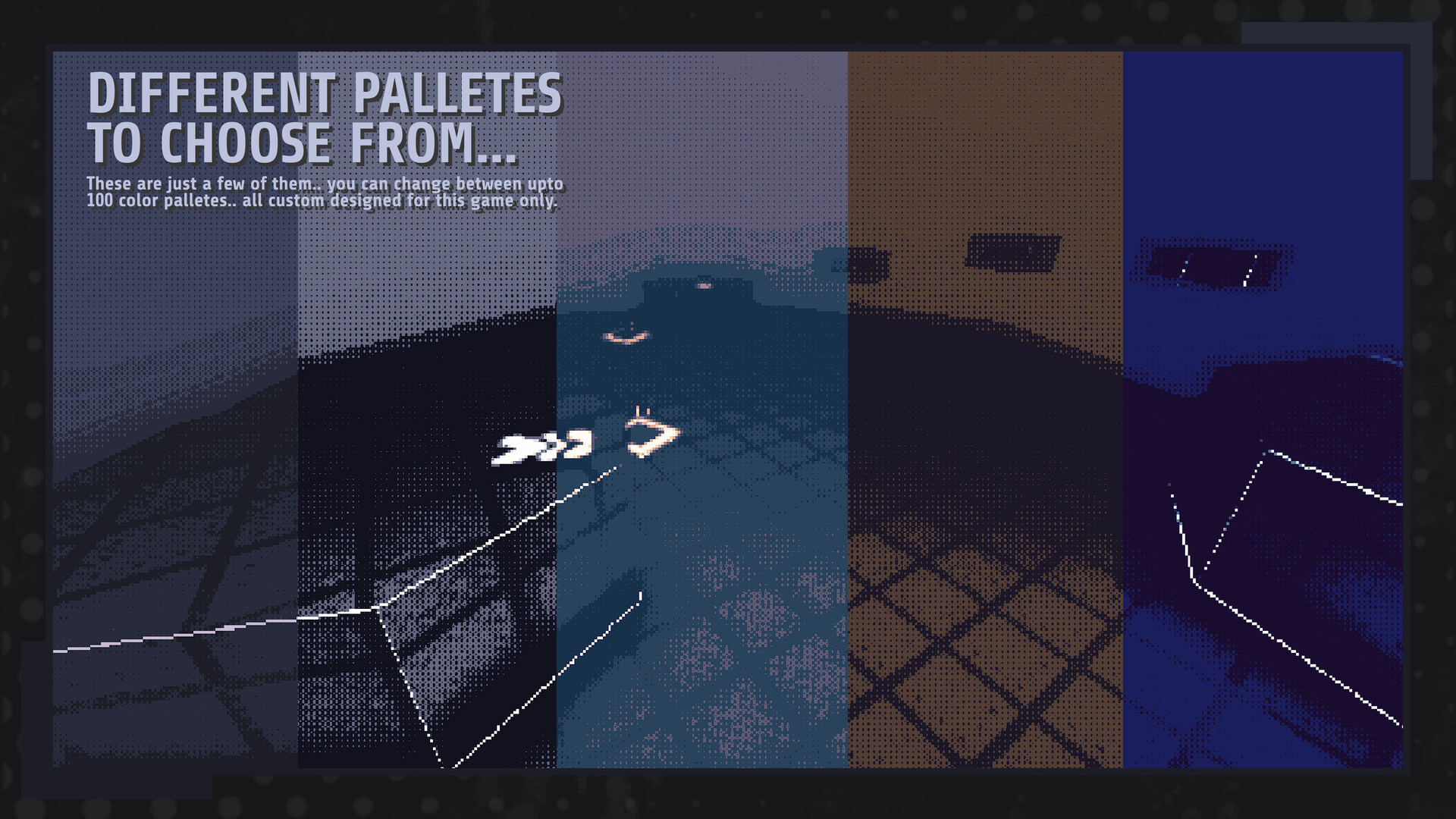
- Change from up-to 50 Color Palette Art Styles, Make this truly your own.
- Master different demons' patterns, Beat as many as you can and top the Leaderboard.
- Slide, Slide-Jump, Dash and Slam your way through the Map.
- Free Updates and Patches to improve your experience further, No Micro Transactions or DLCs.

- Multiplayer system, Possibly PvP Matches (Not Confirmed and might remove this from roadmap)
- More Enemy Types
- Procedural Map Generations (Unique map every Run)
- and much more...
Devlog #4: Significant Game Design & User Interaction Changes
We are currently working on adding two new enemies and planning to add a few more so the game won't look bland and repetitive.
The two new enemies include:
P.S.: Some of these might not make it to the final game version, so keep that in mind.
OLD VISOR:
NEW VISOR:
New Start Screen:
Minor Changes to Main Menu:
Settings Screen (some setting options are not available from the main menu; you have to be in the game to access them. This screenshot is taken from within a game, hence the different background):
Improved Leaderboard Screen (we added a badge system that gives players badges, or "watches," based on their leaderboard ranking):
This is the design system we are going with for other UIs as well.


These were all the changes and updates we wanted to share. The devlog itself became quite long, so sorry for taking up your time. <3 The next devlog will hopefully be the last one and will release with the game itself. See ya.
Hey everyone, its been quite a while since the last devlog. Before we begin, let me thank you all for supporting us. We have almost 500 wishlists right now. I know it's not much, but we are grateful that 500 individuals think our game is worth checking out. <3
Let's begin with the devlog...
Current Game's State
The game is in continuous development, and we are currently working on designing new enemies. Coming up with the first three was easy, but now that we are adding more, we are having some difficulty adjusting their behaviors and appearances. Since the game has a dual-tone art style, many enemies look bad or blurry when seen from far away. We can't change the art style at this stage, as we've already marketed it based on its visuals. So, we are sticking with it for now. (Yes, it's a rookie mistakewe didn't consider future consequences before choosing this art style.)We are currently working on adding two new enemies and planning to add a few more so the game won't look bland and repetitive.
The two new enemies include:
P.S.: Some of these might not make it to the final game version, so keep that in mind.
Hell Hound
Ground Type, Ranged Shooter
Behavior: Spawns randomly on high ground, shoots the player when it sees them, teleports to a new location if the player comes close, and has a huge HPmore like a mini-boss. The game will notify you with visual cues when the Hell Hound has spawned. It appears after the 3rd wave and only once per wave, though it can sometimes appear in the 4th and 5th waves in the same run. Its attack deals small amounts of damage, but if left unchecked, it can be lethal.Earth Worm
Ground Type, Head-on
Behavior: Spawns in the ground and digs its way up to the surface, looks for players around it, and hits them if they come within its attacking range. It's like a slapping hand that surfaces through the ground and smashes you like a bug (weird example). They can't chase or shoot you; they remain in one position, making them easier to kill. However, be warnedthey slap really fast, so if they catch you, you can't escape.Toxic Slime
Ground Type, Poisonous
Behavior: Spawns randomly when you kill the Dynamight. Chances are low, but once they spawn, they chase you indefinitely. They are slow but leave a poisonous trail behind them. If you step on it, you will get poisoned and take damage over 5 seconds. They are hard to kill since half of the bullets deflect off them due to their slimy nature.Dragon
Flying Type, Kinda Boss
Behavior: Spawns in the last wave. It's kind of a bossit spawns only once, has huge HP, deals a lot of damage, but doesn't have unique boss moves. It has only one phase, so you don't have to worry about it being revived multiple times. The main reason for this design is that it's not an action-packed game; it's a fast-paced arena shooter. We want to create enemies that don't take much time and aren't Dark Souls-hard. We aim to add fun and engaging elements (I don't know how to animate cool moves either).Visual Changes
Now, let's talk about some art and visual changes in the game (these are not available in the demo for now but will be after the game releases).Player's Visor
As you know, the old player's visor was just triangular shapes with no design. The new look is more fitting and goes with the game's art style.OLD VISOR:

NEW VISOR:

Art Style
As you've seen in the new visor's image, the art style has somewhat changed. It has become darker than the previous blue-ish dark. Outlines have also changed; they are thinner and less pixelated. We also tinkered with post-processing a lot and added new graphical settings for you to enable or disable, to make it look good or have a nice FPS boost.Redefined UI Changes
The menu hasn't changed much, but the overall color palette and UI design have significantly improved. It is now less clunky and flashy than before. We aimed to give the UI a boxy, stuffy, and bigger feeling, so we redesigned the whole UI. (These are subject to change and are not final.)New Start Screen:

Minor Changes to Main Menu:

Settings Screen (some setting options are not available from the main menu; you have to be in the game to access them. This screenshot is taken from within a game, hence the different background):

Improved Leaderboard Screen (we added a badge system that gives players badges, or "watches," based on their leaderboard ranking):

This is the design system we are going with for other UIs as well.
Weapon Changes
Twins
Now let's talk about weapons. First, Twins (dual pistol weapon): we changed it from shooting physical bullets to raycast bullets, making them much faster and easier to aim. They also have a new model. The previous model was a placeholder and not designed by us. This one is a new and improved version of the Twins. They shoot the same, with no changes in behavior, apart from having more juice.
Chrono
About Chrono (shotgun): not much has changed in its behavior. The only thing that changed is its modelit looks much cooler now. We refined some shader elements when the shotgun is active, making it look visually good and giving a sense of adrenaline when shooting. Bullet time for the win!
These were all the changes and updates we wanted to share. The devlog itself became quite long, so sorry for taking up your time. <3 The next devlog will hopefully be the last one and will release with the game itself. See ya.
[ 2024-07-31 14:33:46 CET ] [Original Post]
GAMEBILLET
[ 6395 ]
FANATICAL
[ 5907 ]
GAMERSGATE
[ 2907 ]
MacGameStore
[ 2497 ]
INDIEGALA
[ 1732 ]
LOADED
[ 1040 ]
ENEBA
[ 32822 ]
Green Man Gaming Deals
[ 867 ]
AllKeyShop
[ 40401 ]
FANATICAL BUNDLES
GMG BUNDLES
HUMBLE BUNDLES
INDIEGALA BUNDLES
by buying games/dlcs from affiliate links you are supporting tuxDB
