
9/10
"The most innovative shooter I’ve played in years." - Jimquisition
9.5/10
"unlike anything else I've played." - Polygon
9/10
"may very well belong in the same set as System Shock and Half-Life” - The Daily Dot
5/5
“SUPERHOT IS THE MOST INNOVATIVE SHOOTER I’VE PLAYED IN YEARS!” - Washington Post
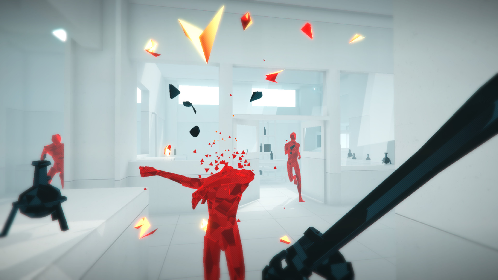
Blurring the lines between cautious strategy and unbridled mayhem, SUPERHOT is the FPS in which time moves only when you move. No regenerating health bars. No conveniently placed ammo drops. It's just you, outnumbered and outgunned, grabbing the weapons of fallen enemies to shoot, slice, and maneuver through a hurricane of slow-motion bullets.
With its unique, stylized graphics SUPERHOT finally adds something new and disruptive to the FPS genre. SUPERHOT’s polished, minimalist visual language helps you concentrate on the most important - on the fluidity of gameplay and cinematic beauty of the fight.
SUPERHOT features:
- Endless Mode - How long can you last against unyielding waves of enemies?
- Challenge Mode - Take on SUPERHOT with your bare hands, no restarts, timed runs, and more.
- Replay Editor - Edit and upload your best runs for all to see on Killstagram.com
- Extras - Delve further into SUPERHOT with mini-games, ASCII art, and [redacted].
Thirty months in the making. Thousands of hours put into development and design. From its humble origins in the 7 Day FPS game jam, through a hugely successful Kickstarter campaign to a plethora of awards and nominations from industry experts, SUPERHOT is a labor of love by its independant, dedicated team and thousands of backers from all around the globe.
🎮 Full Controller Support
- SUPERHOT Content - Linux [3.9 G]
The following is a weekly devlog for MIND CONTROL DELETE, the Early Access standalone expansion to the original SUPERHOT. Check it out HERE
[b][i]“The limits of my language mean the limits of my world.”
Ludwig Wittgenstein[/i][/b]
So this time let’s not spoil anything from the upcoming update. Let’s stay clear from that and let you have a bit of surprise when it arrives, ok ?
This time let’s talk a bit about one little aspect of SUPERHOT: MIND CONTROL DELETE that might come unnoticed at first glance. The visual language of SUPERHOT games and how we use it.
Anyone who did any quality and usability tests with their game will tell you that watching someone else play your projects for the first time can be really painful experience. You sit down, watch as the player struggles with your tutorials, forgets basic game mechanics or gets completely lost in your levels. Than you cry a little and redesign everything.
With game immersion everything comes down to communication with the player. Allowing him/her to understand what the heck you are trying to say. Player should understand your game from the get go without you saying a word.
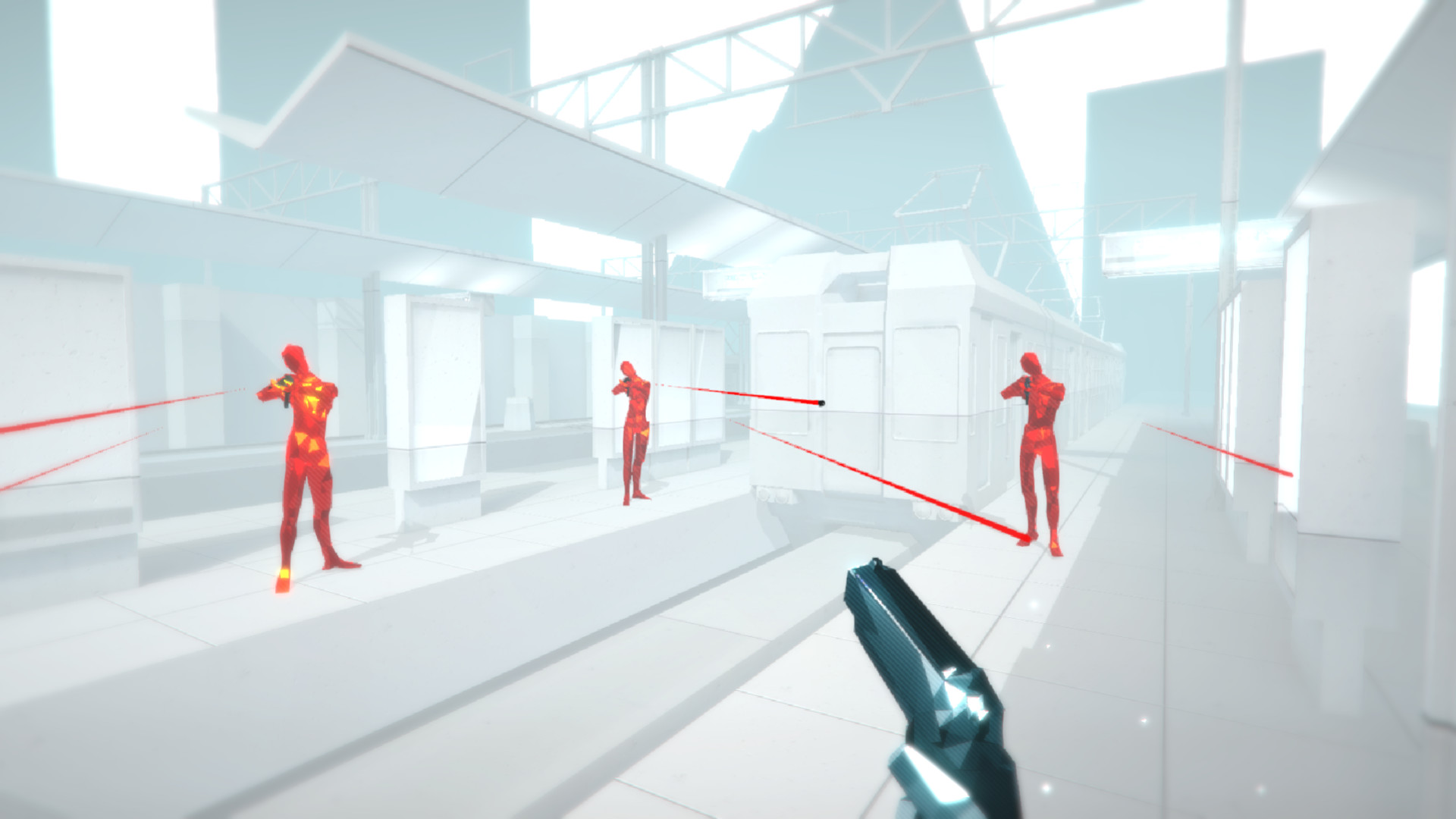
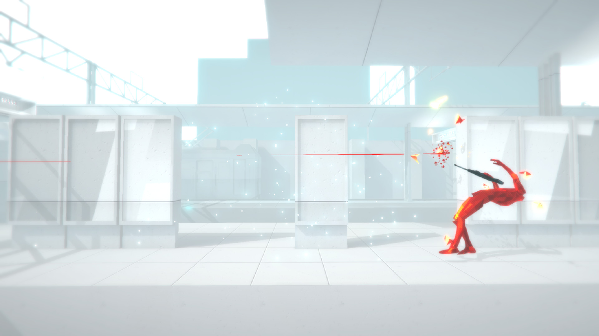
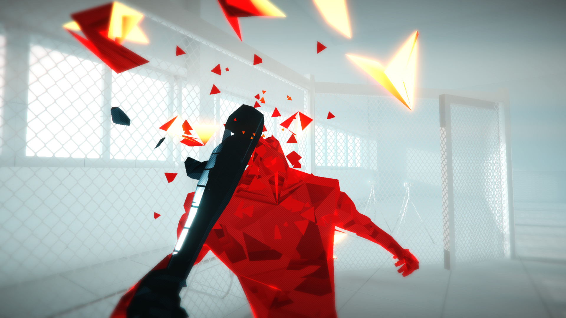
By limiting SUPERHOT to three colors we gave ourselves a clear and easy to read visual language. Red is bad, black is usable, white is the background. Game about shooting red dudes with black guns in white space. Clear enough?
While this set up is easy to understand for the player it poses a bit of design difficulties and limitations. Adding new content can be a bit challenging since it needs to fit into our restricted visuals.
Like for example the recent addition of new enemies to the game. Both concrete and red weapon guy had to be conceived within the limits of our preset visual scheme.
Thanks to that players can immediately guess what is the difference between new enemy types and how to approach them. There was no need for additional explanation since players were familiar with the visual cues used in the design of new opponents.


Another fine example is the updated visual cue of hotswitch. We decided to add more umpf to the way game tells you when the hotswitch is possible. It needed to be obvious and clear for the player so he could hotswitch without any overthinking. Marcin our art director added this sweet shader that makes red guy glitch whenever you hover your crosshair over them and hotswitch is ready.
This small addition does two things:
Let’s you know when you can hotswitch but also lends itself visually to the glitchy aspect of MCD.
Even the way we approach level design in SUPERHOT: MIN CONTROL DELETE follows certain rules imposed by our visual language. I’ll let Marcin The Art Dir do the talking. I stole a few pages from our internal design bible that he wrote and illustrated.
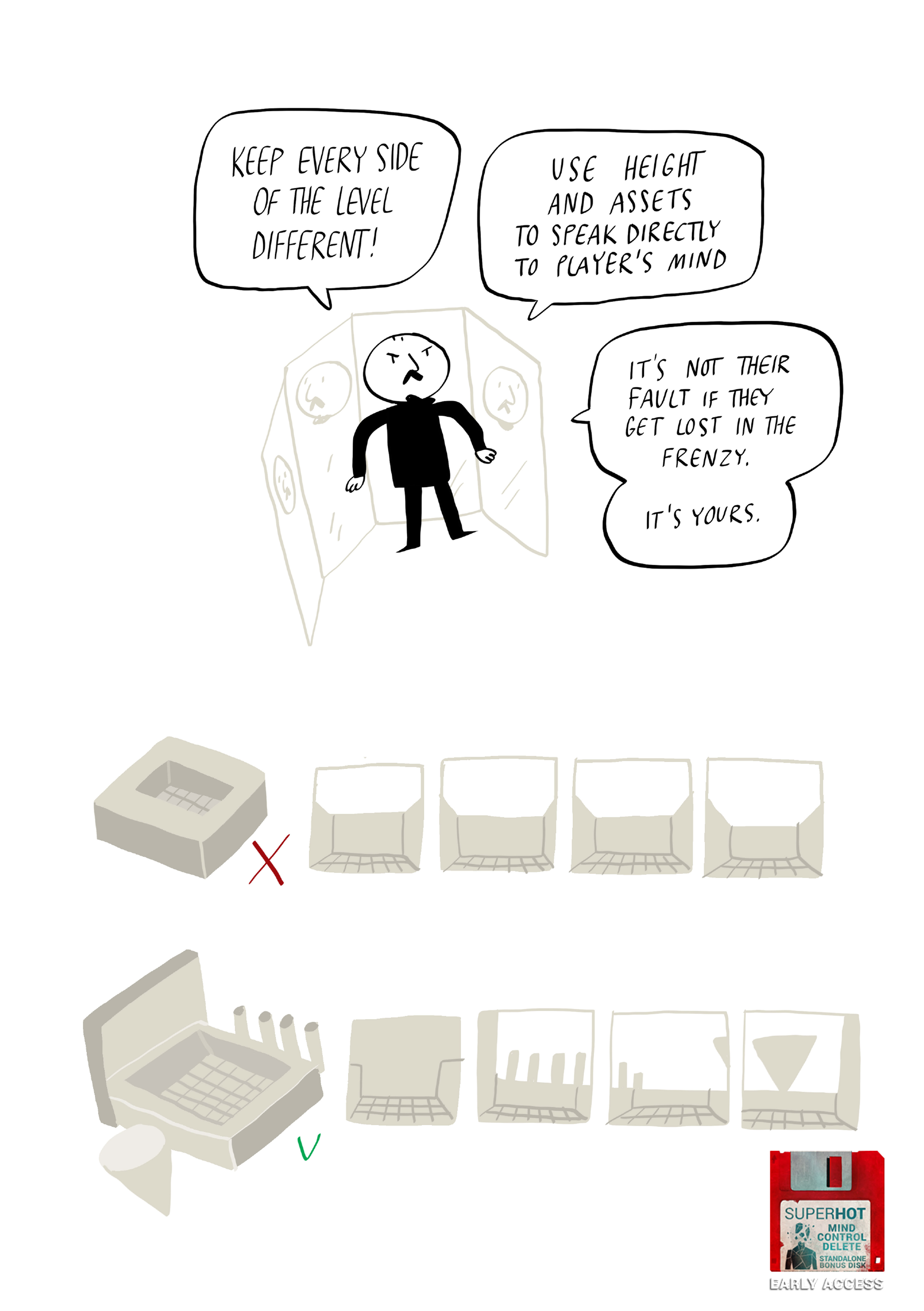
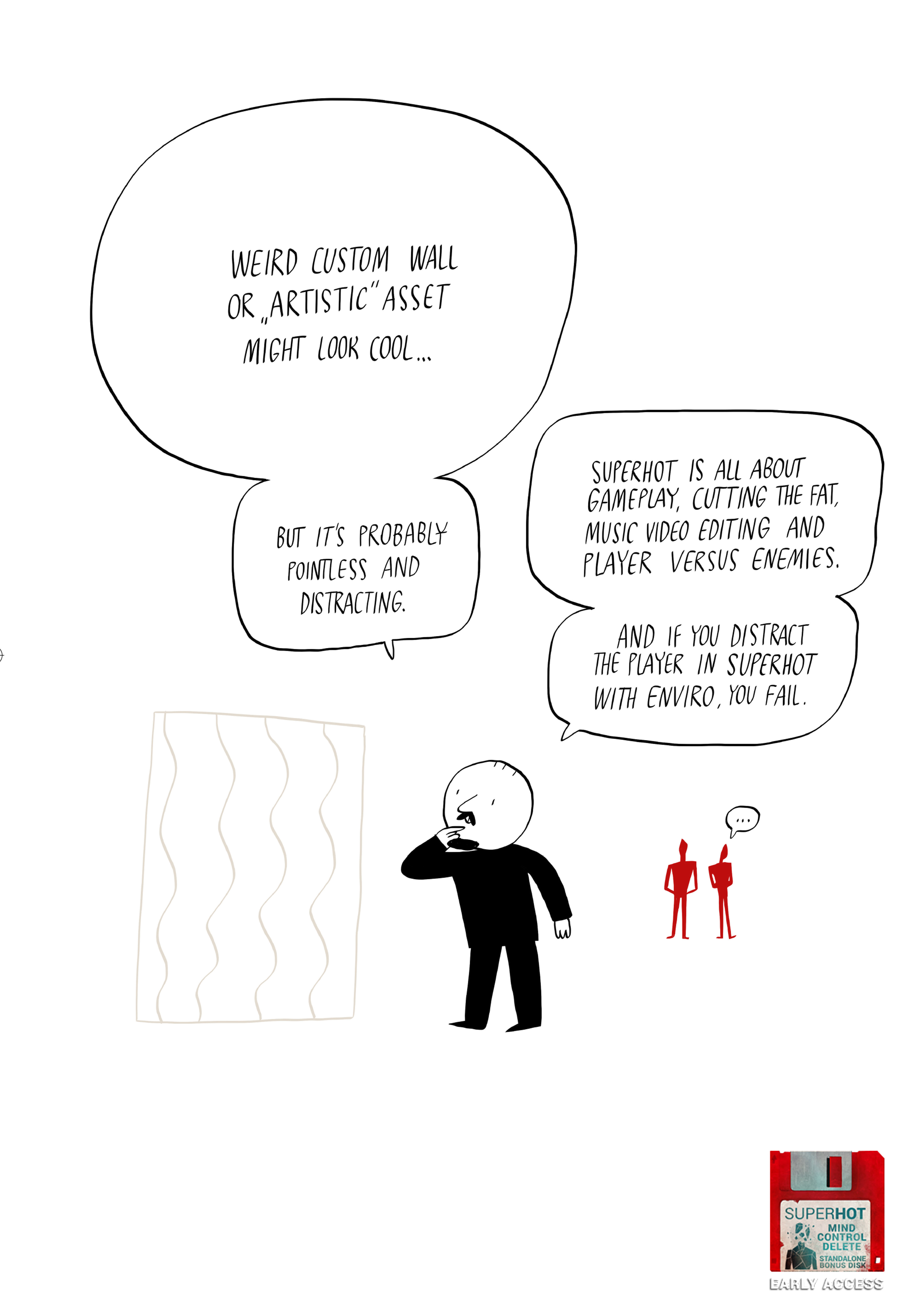
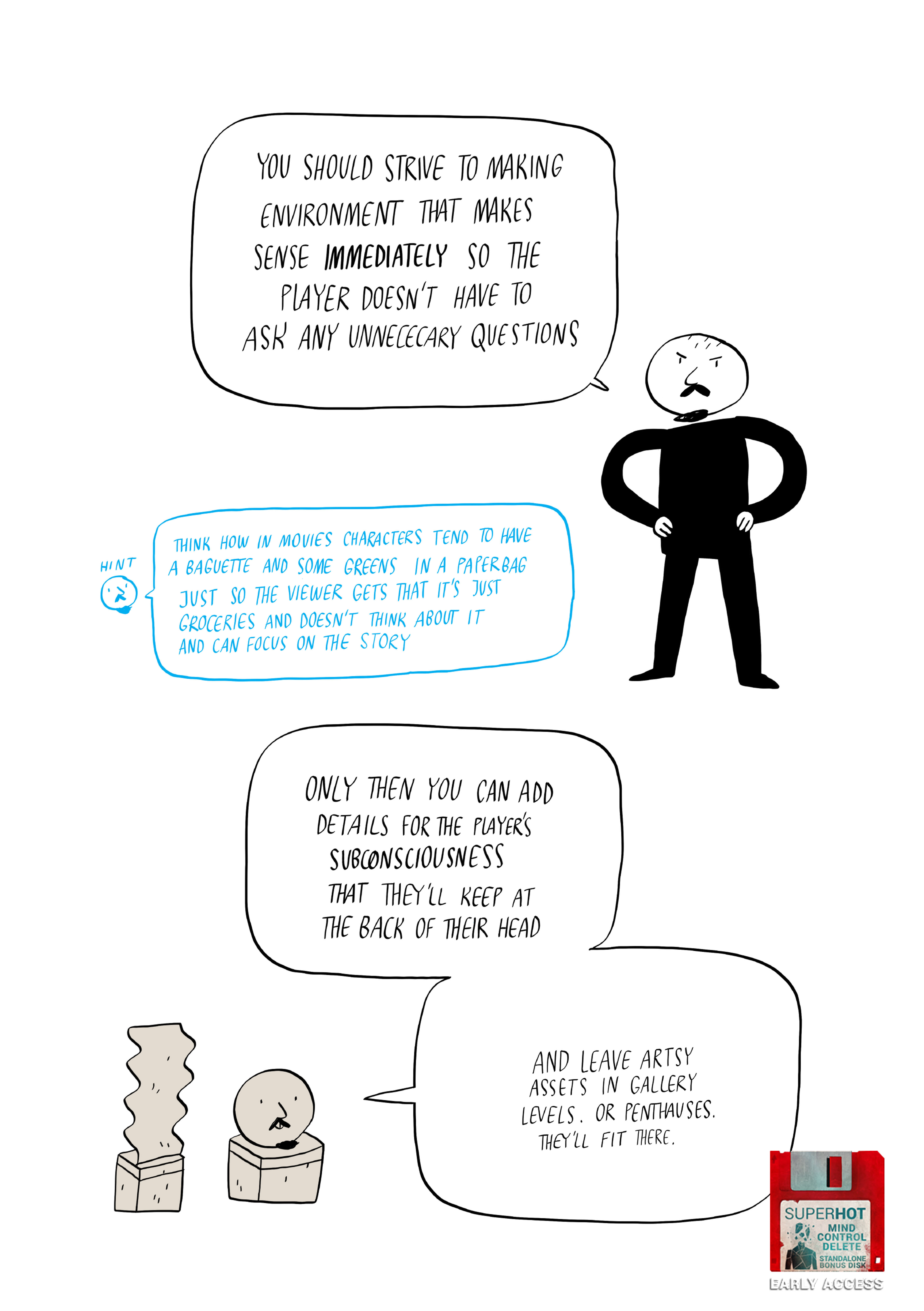
As you can see he is talking about environments that “make sense”, are not “distracting” and using the design of levels to "talk" to player. That’s creating and following a clear vocabulary of visual language. Everything so that the players might enjoy time bending gameplay of SUPERHOT: MIND CONTROL DELETE without hassle.
You can’t immediately see most of our visual design choices in MCD and honestly, you shouldn’t be able to. Because as cheesy as it might sound , what you feel during gameplay is far more important than what you know.
We don’t want you to think. We want you to react. Your mind is software and it only interferes with your immersion ;)
I could go on about visual and interactive language for hours so let’s stop here.
Hopefully I didn’t bore you to death .
Create your own reality
Szymon from SUPERHOT team
[ 6367 ]
[ 5899 ]
[ 1587 ]
[ 2438 ]
[ 482 ]

Time left:
356098 days, 14 hours, 32 minutes

Time left:
356098 days, 14 hours, 32 minutes
Time left:
2 days, 22 hours, 32 minutes

Time left:
30 days, 22 hours, 32 minutes

Time left:
33 days, 22 hours, 32 minutes

Time left:
34 days, 22 hours, 32 minutes

Time left:
8 days, 8 hours, 32 minutes
Time left:
3 days, 16 hours, 32 minutes
Time left:
9 days, 16 hours, 32 minutes
Time left:
10 days, 16 hours, 32 minutes
Time left:
15 days, 16 hours, 32 minutes
Time left:
17 days, 16 hours, 32 minutes
Time left:
21 days, 16 hours, 32 minutes
Time left:
1 days, 5 hours, 33 minutes

Time left:
5 days, 22 hours, 33 minutes

Time left:
7 days, 21 hours, 33 minutes
Time left:
13 days, 4 hours, 43 minutes


