

Overview
In a fictional world very similar to ours of the 1980's, humanity suffers endless hordes of Kaiju and Abominations assaulting from all fronts. You play as a newly promoted Captain in the international military leading the defense as part of the aptly named Defense of Nations Treaty (DONT).Your job should be straightforward: shoot monster, reload, shoot again, repeat until they're all dead or you are.
But after a couple decades of fighting against existential threats, it seems humanity has gotten comfortable enough—or at least familiar enough—with their situation to turn it into another giant, bureaucratic machine. Darn.
Ah well, better learn how to fake a smile and deflect their nonsense so you can get back to shooting eldritch horrors in the face for The Good of Humanity ™️.
Gameplay
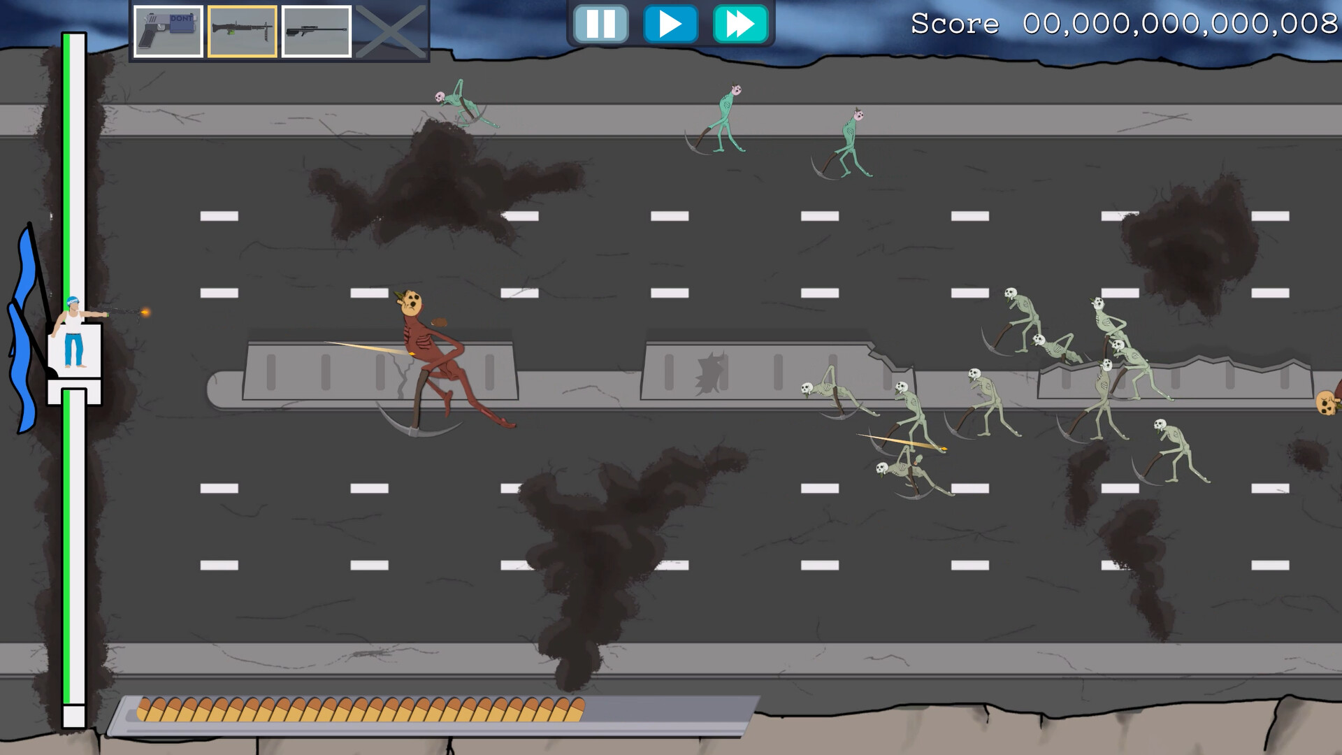
A Base Defense ShooterAt the heart of the game is the classic castle/base defense formula: enemies strut on over from one side of the screen to break your stuff on the other, and you have to shoot them down from your little podium before they can.
After each mission you get the chance to mend your defenses and upgrade your arsenal to prepare for whatever comes next.
Budget Negotiation!
With what money you might wonder? The monsters sure aren't dropping any. Looks like all of it will have to come from the DONT Organization's operating budget. So better convince your Military Account Spending Managers (MilSpAMs) that you're a stellar Captain so you can get properly equipped. Solo fighting hundreds of towering creeps is just a tad bit risky, afterall.
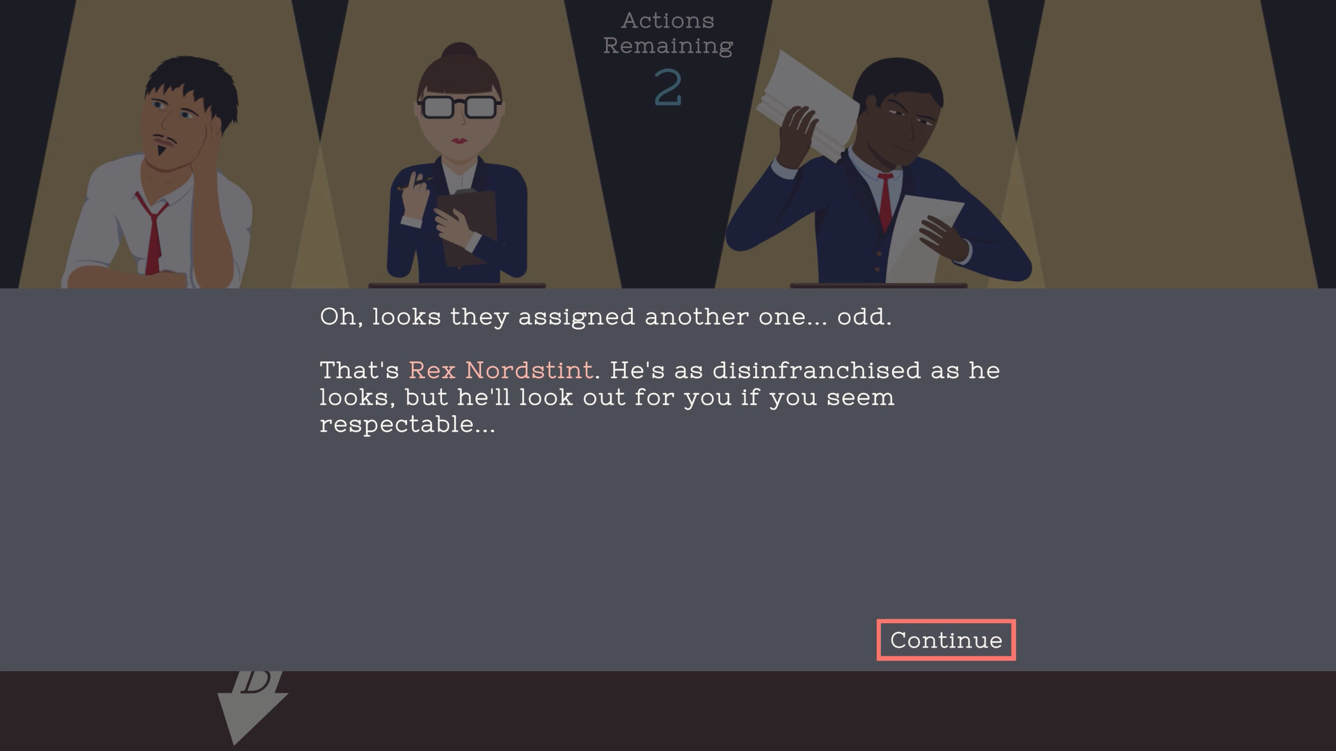
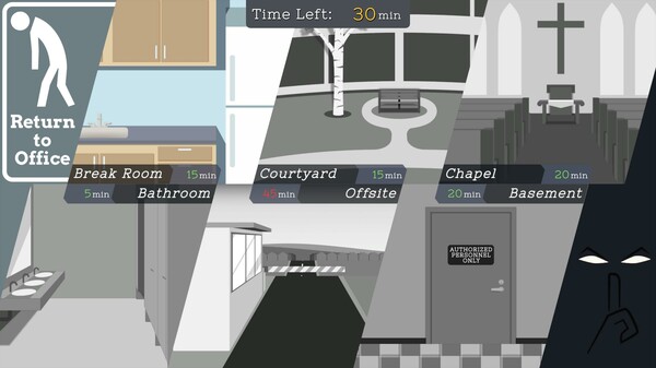
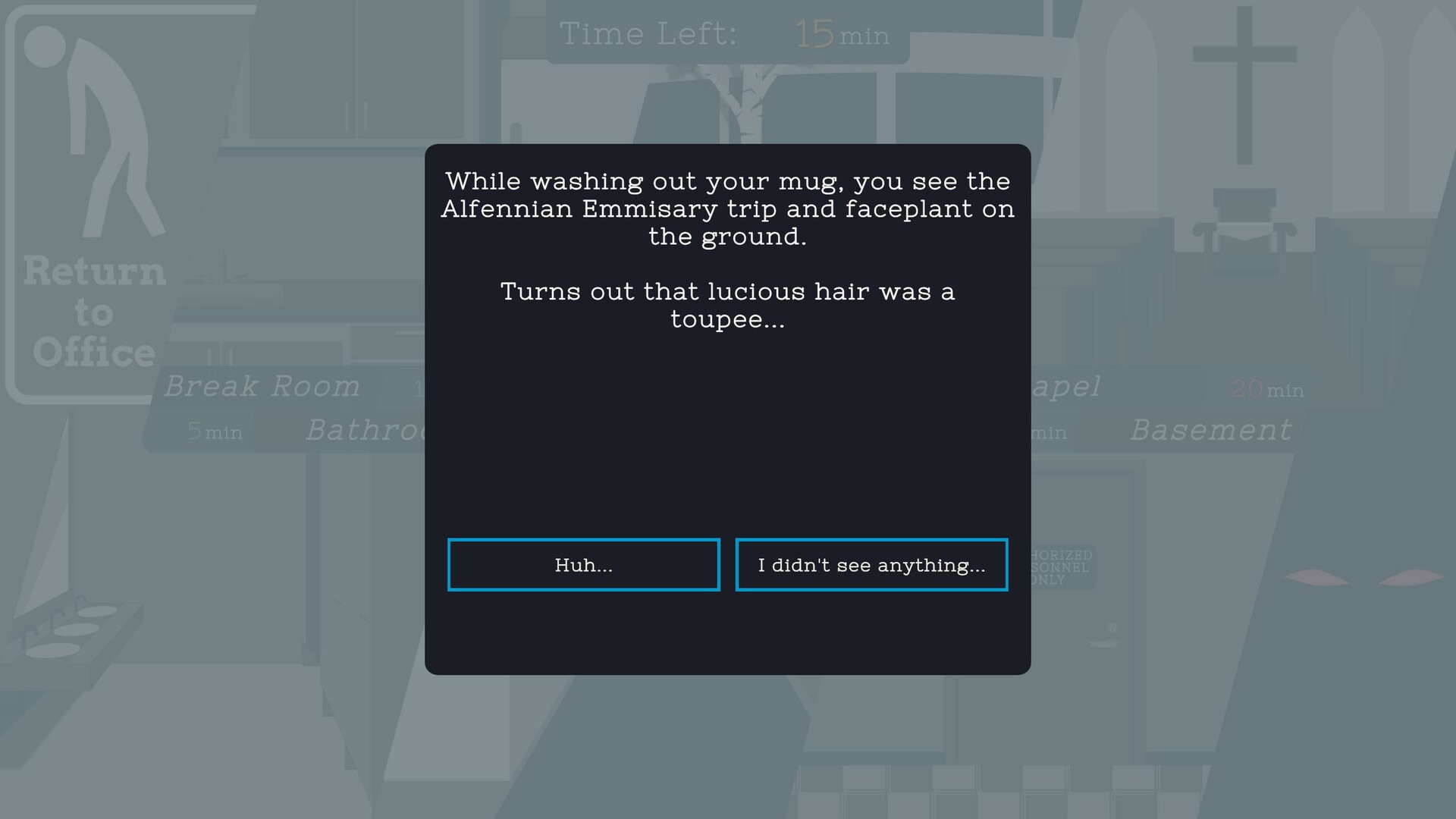
Explore the Organization
And when you're not caught up in all that, you're the perfect victim for whatever other crazy schemes your peers and the associates have cooked up! Congrats! As you explore the organization on your break time, you might make new friends, terrible enemies, find some good blackmail material, or maybe God will smile upon you and you might actually receive something useful for your real work.
The choices you make as you interact with the colorful cast of military staff, diplomats, and political figures may even change the trajectory of your playthrough—or maybe more importantly—the amount of points you'll get at the end.
🕹️ Partial Controller Support
🎮 Full Controller Support
Game testing is always fun for me seeing how people process all of the little details of the game. In a 2D platformer I worked on in college, it was eye opening to discover how many people had difficulty jumping over a box at the start because of how I implemented jumping (no air-control; WASD controls).
Now here with Defense of Nations I've discovered a fairly major oversight that should have been pretty obvious when I made it: People having been missing half the game thanks to my wording of the "Exploration" button


So that's been improved, along with some changes to bring the menu border colors in-line with the rest of the UI and the mouse navigation of the Exploration Menu should be less finicky as the "zones" for determining which element the mouse is on have been cleaned up.
As much as I like non-square UI elements, they sure are a pain to make work right with your average UI system.
Minimum Setup
- OS: Kernel version 4+
- Processor: Intel / AMD x86 Architecture at 2GhzMemory: 3 GB RAM
- Memory: 3 GB RAM
- Graphics: Intel/AMD Integrated Graphics
- Storage: 1 GB available space
Recommended Setup
- OS: SteamOS Holo
- Processor: Intel i3 or above / AMD Ryzen 3 or aboveMemory: 6 GB RAM
- Graphics: RTX 2060 / RX 6500xt
- Storage: 1 GB available space

[ 6357 ]
[ 6590 ]
[ 3177 ]
[ 2532 ]
[ 1655 ]
[ 1040 ]


[ 32822 ]


[ 867 ]
[ 45625 ]
[ 6040 ]
[ 17228 ]
[ 819 ]

Time left:
356090 days, 19 hours, 15 minutes

Time left:
356090 days, 19 hours, 15 minutes

Time left:
23 days, 3 hours, 15 minutes

Time left:
26 days, 3 hours, 15 minutes

Time left:
27 days, 3 hours, 15 minutes

Time left:
48 days, 19 hours, 14 minutes

Time left:
29 days, 3 hours, 15 minutes

Time left:
0 days, 13 hours, 15 minutes
Time left:
1 days, 21 hours, 15 minutes
Time left:
2 days, 21 hours, 15 minutes
Time left:
7 days, 21 hours, 15 minutes
Time left:
9 days, 21 hours, 15 minutes
Time left:
13 days, 21 hours, 15 minutes
Time left:
14 days, 21 hours, 15 minutes
Time left:
14 days, 21 hours, 15 minutes
Time left:
16 days, 21 hours, 15 minutes

Time left:
0 days, 8 hours, 16 minutes

Time left:
2 days, 8 hours, 16 minutes
Time left:
5 days, 9 hours, 26 minutes

Time left:
14 days, 6 hours, 17 minutes


