
The Ultimate Death Clock
Have you ever wondered just how long you might live?Do you remember trying out those old web-based death clock calculators that were boring, had few options and spit out an arbitrary answer? Have you ever wondered what a much more comprehensive one might be capable of?
Well now you can play what is truly The Ultimate Death Clock, a debut from single-developer studio, Apoptosis Games!
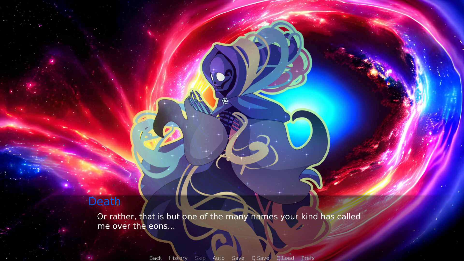
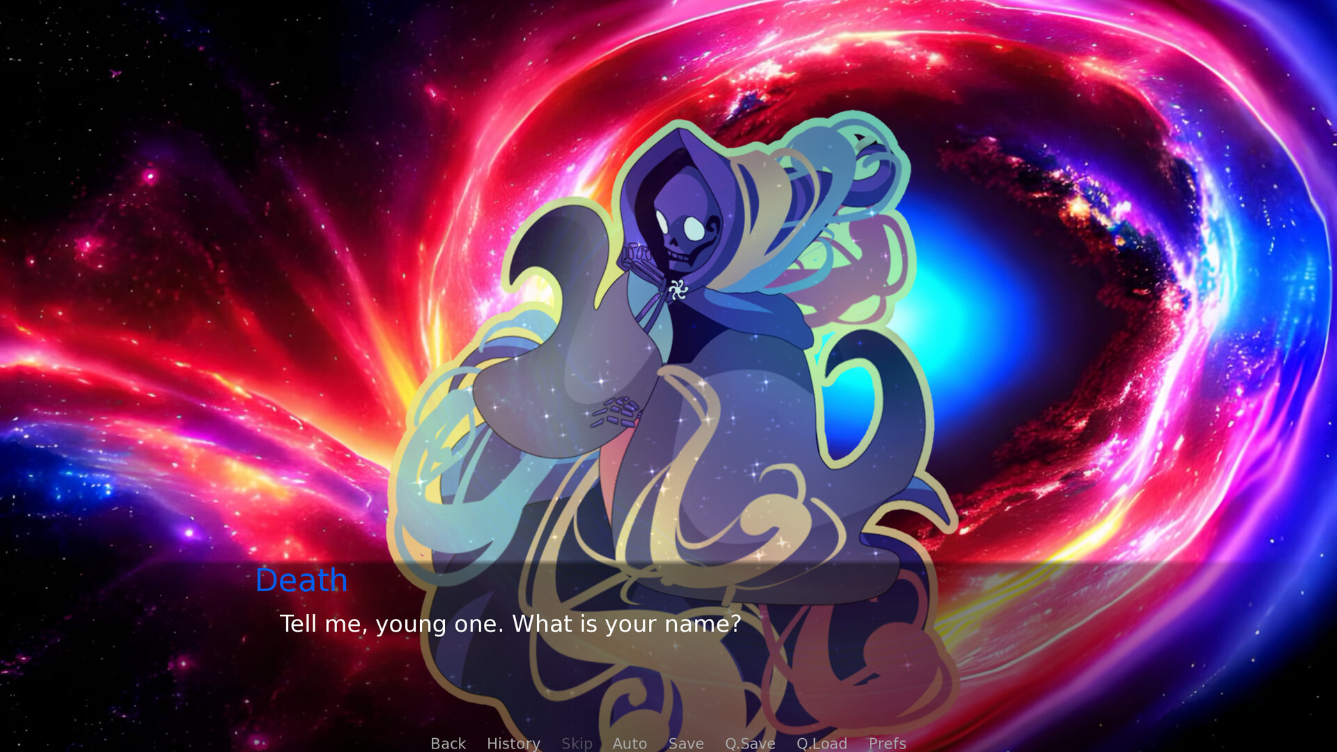
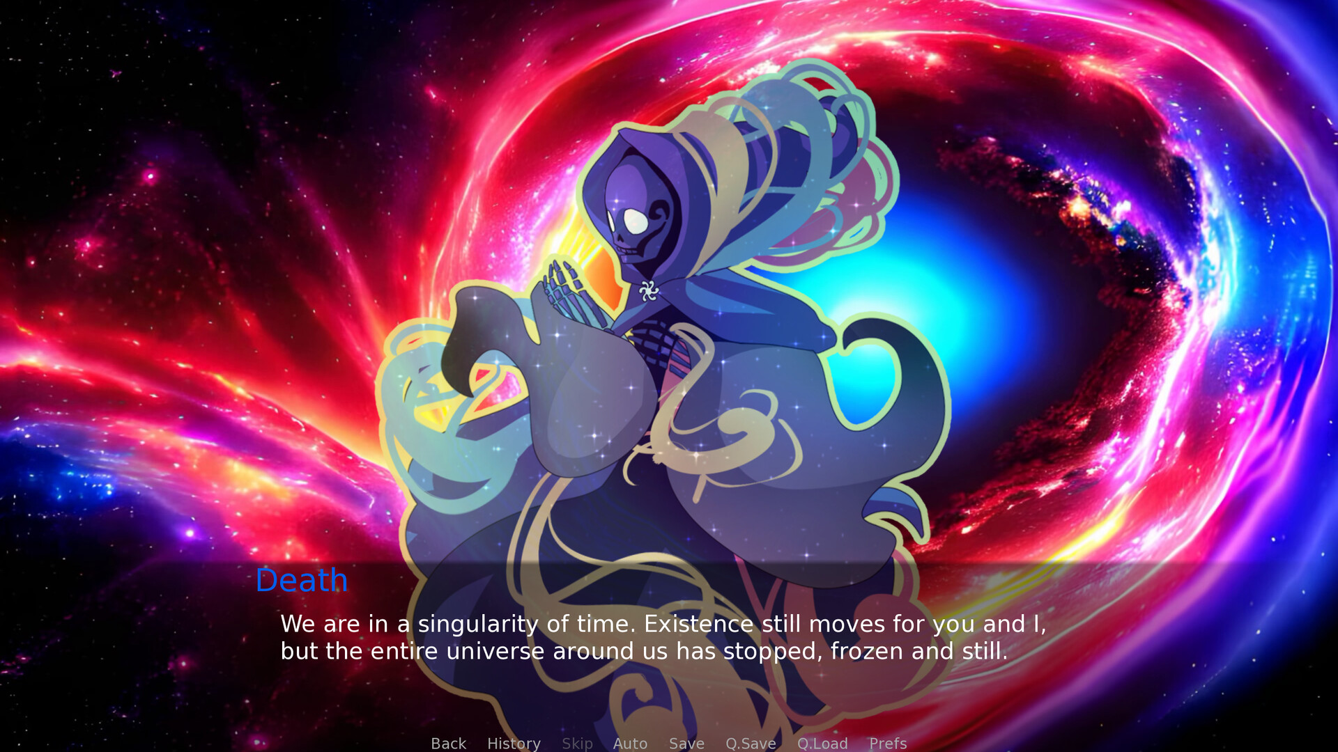
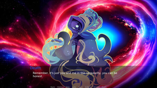
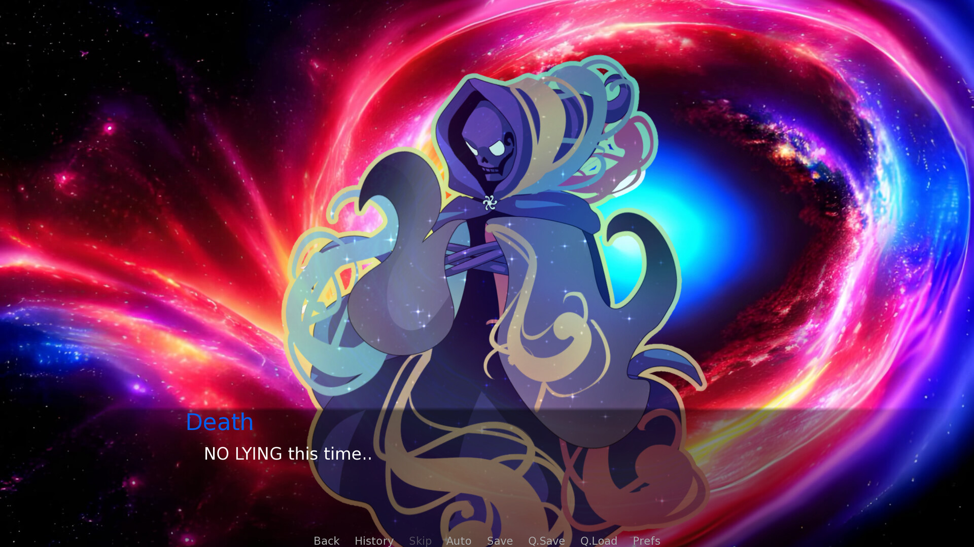
You have ended up in a singularity with none other than Death itself. Through a deep conversation, some self-reflection and LOTS of questions ranging from your history all the way down to your deepest feelings and secrets, Death just may be able to tell you when your time is up...
Features:
- -A short, but satisfying experience (approx. 25-40 mins)
- -A very unique experience for a very modest price
- -Soothing music and psychedelic visuals
- -Your choices truly do matter in this game
🕹️ Partial Controller Support
🎮 Full Controller Support
As TUDC gets closer to release, I felt the need to review the art style of the title images and determined it did not fit the theme of the game, so as many of you may have noticed, the art around the store page looks quite different.
I daresay, it looks much better. With the initial design and style of The Ultimate Death Clock, I originally created the strikingly red title screen thinking, at least from the beginning of development, the game would take a much darker tone.
As development went on, however, things took a bit more of a celestial turn in terms of style. The more the design went this route, the more it seemed to fit so much better with the deeply personal tone of the game. As such, the original title screen did not fit so well with what the game ended up becoming.
I can assure everyone, this change was a [u]vast[/u] improvement, and we are now only just over a week away from general release!
We're almost there!
Minimum Setup
- OS: Ubuntu 16.04 or newer
- Processor: 2.0GHz Intel 64-bitMemory: 2 GB RAM
- Memory: 2 GB RAM
- Graphics: OpenGL 3.0 compatible
- Storage: 250 MB available space

[ 6372 ]
[ 5870 ]
[ 1265 ]
[ 1943 ]
[ 986 ]

Time left:
356100 days, 6 hours, 48 minutes

Time left:
356100 days, 6 hours, 48 minutes

Time left:
4 days, 14 hours, 48 minutes

Time left:
32 days, 14 hours, 48 minutes

Time left:
35 days, 14 hours, 48 minutes

Time left:
36 days, 14 hours, 48 minutes

Time left:
10 days, 0 hours, 48 minutes
Time left:
5 days, 8 hours, 48 minutes
Time left:
11 days, 8 hours, 48 minutes
Time left:
12 days, 8 hours, 48 minutes
Time left:
17 days, 8 hours, 48 minutes
Time left:
19 days, 8 hours, 48 minutes
Time left:
23 days, 8 hours, 48 minutes
Time left:
2 days, 22 hours, 3 minutes

Time left:
7 days, 14 hours, 49 minutes

Time left:
9 days, 13 hours, 49 minutes

Time left:
14 days, 20 hours, 59 minutes


