The Wastes is back.
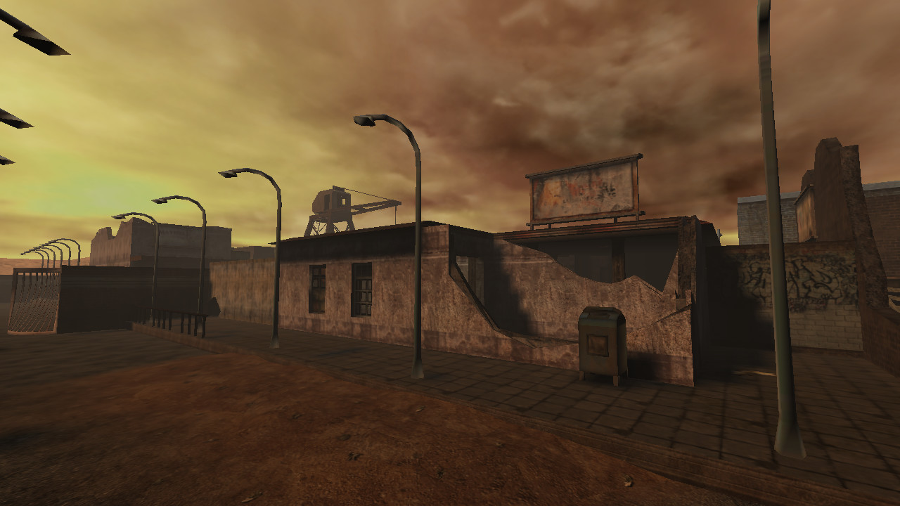
Started as a loveletter towards everyone's favourite wastelands as a mod for the GoldSrc engine, The Wastes returns as a completely new game using id Tech 3 Technology! It's been a long time coming, and it's time for the wasteland to get some life breathed back into it.It’s a game built upon the love for classic video games and movies. Imagine configuring and playing a game just like you did over 15 years ago.
Game-play
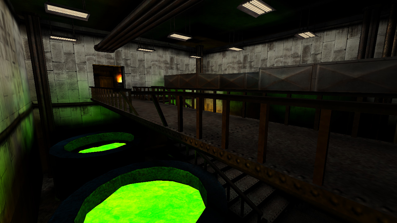
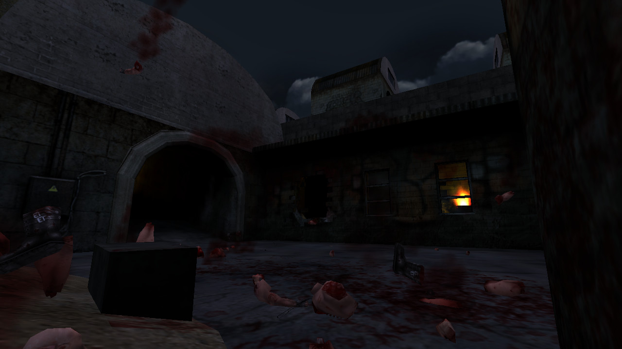
Experience a fast-paced multiplayer frag-fest, with buffs that affect the performance of each individual player, game-play mutators, and many different game-modes, including:- Anarchy: A pure free-for-all. Choose your load-out and jump right in. No restrictions, no questions asked!
- Team Chaos: Wipe the opposing team out in this round-based game-mode. Destroy what's left of them.
- Capture The Flag: The classic attack & defend mode that's a must for every serious multiplayer game.
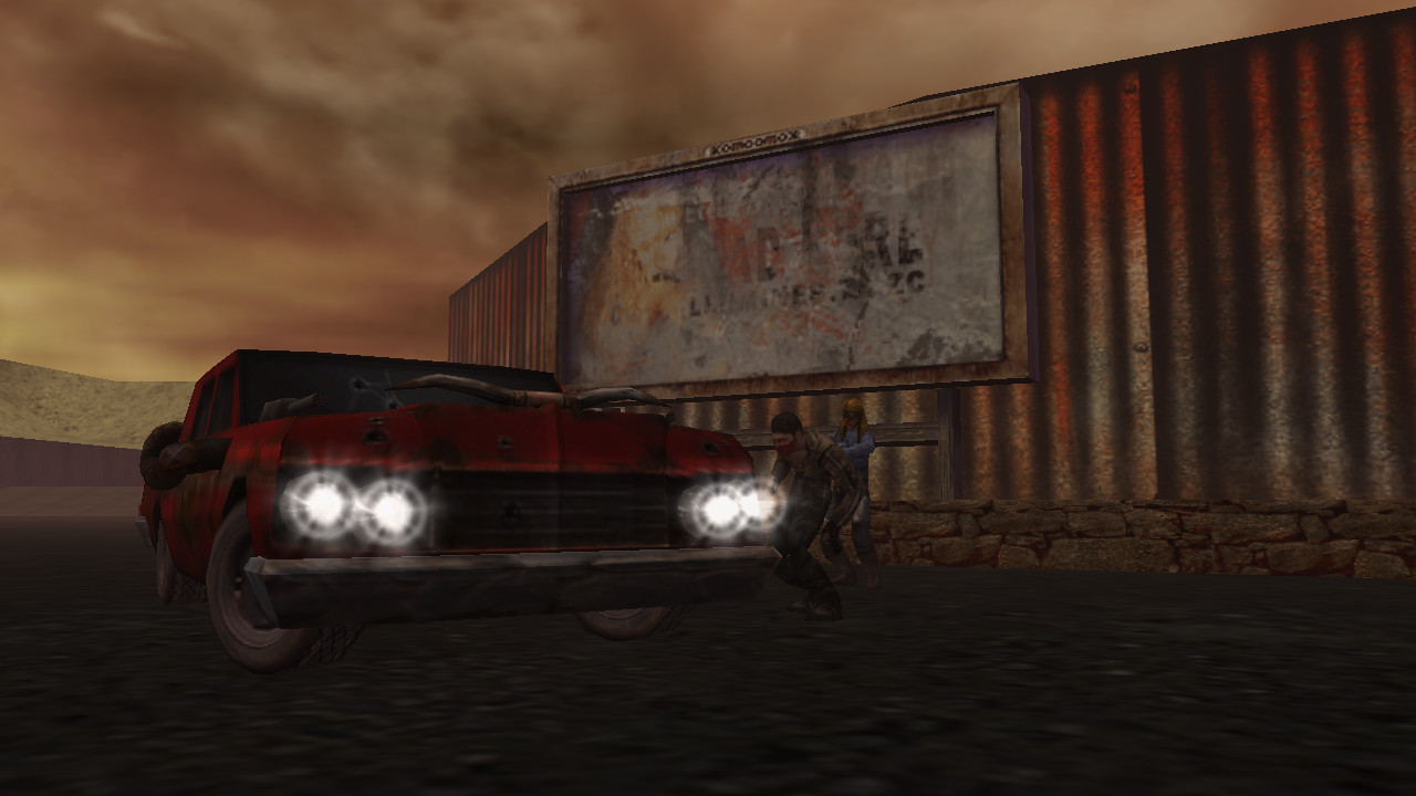
- Vehicular Carnage: Jump right into the seat of your own custom vehicle and experience a derby with hood-mounted guns.
- Destruction: Infiltrate the enemy base and destroy all their of their "precious" belongings. You might even find some treasure in there, who knows.
Weapons
The game features over 40 different weapons. Ranging from exotic melee weapons (like Throwing Knives and Sledgehammers) to high caliber handguns, firearm prototypes, as well as classic weapons – all waiting to be used. While people can also create load-outs to shape their play-style, you will find special weapons scattered all over the multiplayer levels along with ammunition and other items that will help you survive. You can also have mixed-akimbo configurations for the handguns.Vehicles
Transportation is the key to surviving in the long run. Featuring an array of unique vehicles – ranging from V8s to trucks and even dune buggies. All of them being armed and dangerous.Characters
Meet a cast of colorful characters: Mena the mechanic that keeps the Vagrants' engines running, Ezekial the Ronin Nomad with a filthy love of fire, Seal Bob (formerly Gustavo) the dishonorably discharged USMC Raider, Reese the gun-slinging Regulator, Red the Killshot disco-man that may or may not be the long lost brother of Vincent, Maddigan the dirty cop that lived through the fallout of society, and much more.Abilities
Customize your play-style with a system that affects the player-physics, controls and weapon behavior to maximize your strengths as a player.Customization
Select from a variety of Heads-Up-Displays, model skins, spray logos and fully custom car-colors (only in specific game-modes). Tweak the game-experience to your liking, right out of the box.Powered by id Tech 3 Engine technology
Create your own levels and content easily with well-documented and community-maintained tools.Hello everyone!
To give you a feel of the game, I'd like to guide you through our interface. We loved the original look and feel of the mod version, however it was rather limited by engine and interface restrictions in GoldSrc modding at the time (for the main menus at least).
And afterall, we aren't simply porting a mod, we're making a true game in the spirit of 3D accelerated shooters of the early 2000s!

Pictured above: The original mod menu.
We loved the idea of the screen-interface that the mod tried to implement a lot. Sadly GoldSrc didn't really allow you to modify the layout of elements back then. So we went to the drawing board and tried to create something with a familar look but a refined feel that'd beat the original design of not just the mod, but the game it was made for.

Pictured above: Game version, with a hint of skeuomorphism.
If you're going to put in a screen, we figured it needed some buttons as well. Those buttons on the left provide an easy way for you to go through the main menu categories. Inside those categories you'll find sub-menus which will be remembered for when you switch between categories - giving fast access to all essential options. That's something the original menu didn't do, because you'd have press "Back" many, many times in order to go from graphics options to let's say, creating an Internet game.


 Click the above thumbnails to enlarge...
The spawnmenu was quite messy. The GoldSrc VGUI menus are a great framework, but the mod implementation lacked personality that the mod needed. Supporting multiple resolutions properly also required fiddling to get the layouts just right, so in the end compromises were made. We went back and looked at some of the ideas the team had and came up with a much more unified design with a less drab interface.

Combining main interface and message of the day into one.
We also made it so that the current layout is very clearly visible.

Here you can also see what displaying weapon information looks like . We're still refining that one to give more helpful information about the Primary/Secondary/Tertiary weapon functions. So stay tuned.

The mod sported a very big heads-up-display at times. While we liked the look, we did want to minimize the default configuration a little bit to be not as overwhelming.

Pictured above: Same place, over 15 years later.
The heads-up display of course, is not just that single design. No way.


We offer players the ability to customise the look and feel as much as possible, while not overcomplicating things too much. We had the idea of creating one design for every faction in the game's lore... so we're giving you, the player, free rule to choose whatever design you want. You can choose the interface colors as well. With more options to be added.

Going into a vehicle expands the interface to its full size. With all the gauges, bells and whistles attached.

We love the idea of making the game moddable without having to tinker around the internals too much. We'll be shipping with a simple plug-and-play system to installing and choosing skins for the player hands and eventually weapon designs as well. We've got a lot of content you'll be able to pick and choose so that you can make the game your own. We hope all of you will create amazing skins and content using the system in place.
This was a quick overview about the look and feel of the interface. There are of course lots of minor elements we couldn't cover (we also don't want to spoil any surprises!).
Oh and by the way, if you'd like to communicate with us and see what we're up to - you're invited to join the official Vera Visions Discord server! We're online most of the time and occasionally post exclusive pictures (and sometimes videos) there. So spread the word and get hyped!

https://discord.gg/ENfjwsT
Hello everyone!
To give you a feel of the game, I'd like to guide you through our interface. We loved the original look and feel of the mod version, however it was rather limited by engine and interface restrictions in GoldSrc modding at the time (for the main menus at least).
And afterall, we aren't simply porting a mod, we're making a true game in the spirit of 3D accelerated shooters of the early 2000s!

Pictured above: The original mod menu.
We loved the idea of the screen-interface that the mod tried to implement a lot. Sadly GoldSrc didn't really allow you to modify the layout of elements back then. So we went to the drawing board and tried to create something with a familar look but a refined feel that'd beat the original design of not just the mod, but the game it was made for.

Pictured above: Game version, with a hint of skeuomorphism.
If you're going to put in a screen, we figured it needed some buttons as well. Those buttons on the left provide an easy way for you to go through the main menu categories. Inside those categories you'll find sub-menus which will be remembered for when you switch between categories - giving fast access to all essential options. That's something the original menu didn't do, because you'd have press "Back" many, many times in order to go from graphics options to let's say, creating an Internet game.


 Click the above thumbnails to enlarge...
The spawnmenu was quite messy. The GoldSrc VGUI menus are a great framework, but the mod implementation lacked personality that the mod needed. Supporting multiple resolutions properly also required fiddling to get the layouts just right, so in the end compromises were made. We went back and looked at some of the ideas the team had and came up with a much more unified design with a less drab interface.

Combining main interface and message of the day into one.
We also made it so that the current layout is very clearly visible.

Here you can also see what displaying weapon information looks like . We're still refining that one to give more helpful information about the Primary/Secondary/Tertiary weapon functions. So stay tuned.

The mod sported a very big heads-up-display at times. While we liked the look, we did want to minimize the default configuration a little bit to be not as overwhelming.

Pictured above: Same place, over 15 years later.
The heads-up display of course, is not just that single design. No way.


We offer players the ability to customise the look and feel as much as possible, while not overcomplicating things too much. We had the idea of creating one design for every faction in the game's lore... so we're giving you, the player, free rule to choose whatever design you want. You can choose the interface colors as well. With more options to be added.

Going into a vehicle expands the interface to its full size. With all the gauges, bells and whistles attached.

We love the idea of making the game moddable without having to tinker around the internals too much. We'll be shipping with a simple plug-and-play system to installing and choosing skins for the player hands and eventually weapon designs as well. We've got a lot of content you'll be able to pick and choose so that you can make the game your own. We hope all of you will create amazing skins and content using the system in place.
This was a quick overview about the look and feel of the interface. There are of course lots of minor elements we couldn't cover (we also don't want to spoil any surprises!).
Oh and by the way, if you'd like to communicate with us and see what we're up to - you're invited to join the official Vera Visions IRC server! We're online most of the time and occasionally post exclusive pictures (and sometimes videos) there. So spread the word and get hyped!

Join The Wastes' IRC:
Server: [noparse]irc.frag-net.com:6667[/noparse]
Channel: #wastesSteam Discussions
Edited:
We now use IRC exclusively, sorry for anyone affected by this change. Thanks for your participation and we hope to see you in our IRC channel!
Minimum Setup
- OS: Linux Kernel 2.4 or higher
- Processor: 600 Mhz Pentium III or equivalentMemory: 256 MB RAM
- Memory: 256 MB RAM
- Graphics: OpenGL 1.4 level Graphics Card
- Storage: 600 MB available space
Recommended Setup
- OS: Linux Kernel 2.4 or higher
- Processor: 1.2 GhzMemory: 512 MB RAM
- Graphics: OpenGL 2.1 level Graphics Card
- Storage: 600 MB available space
[ 6425 ]
[ 3784 ]
[ 2906 ]

