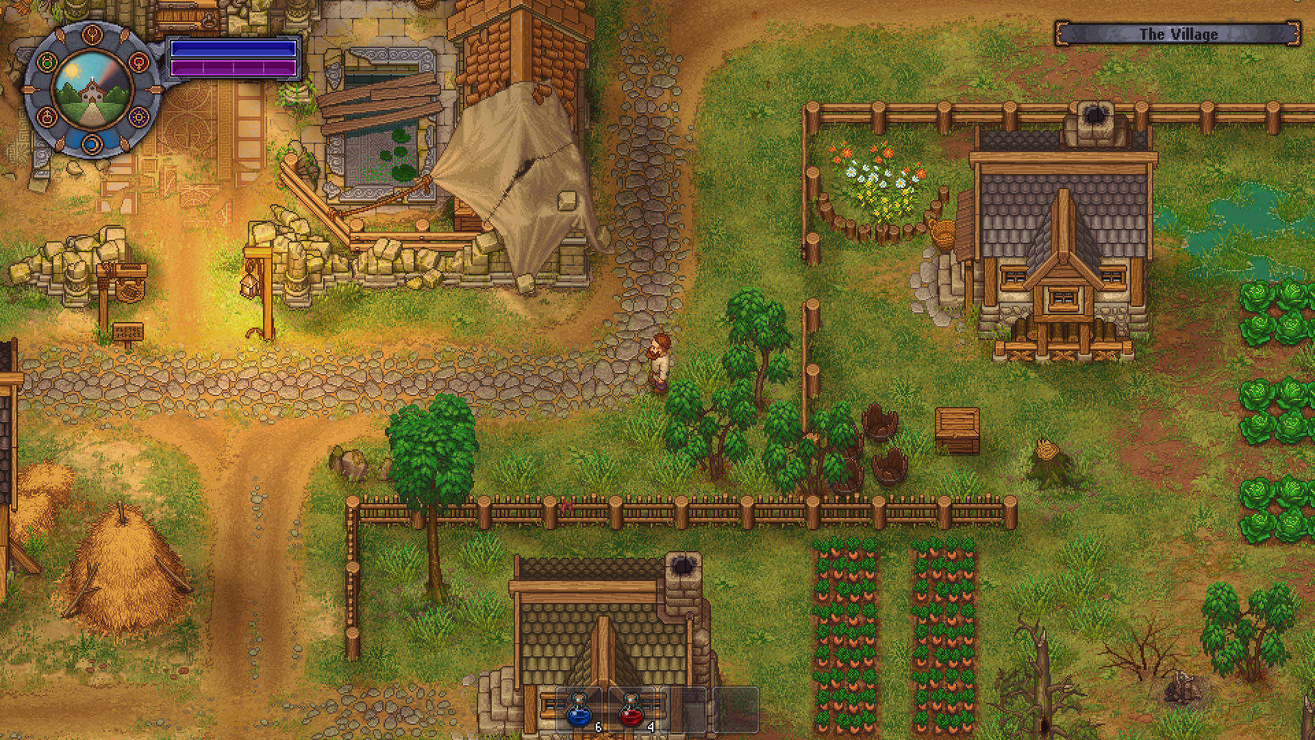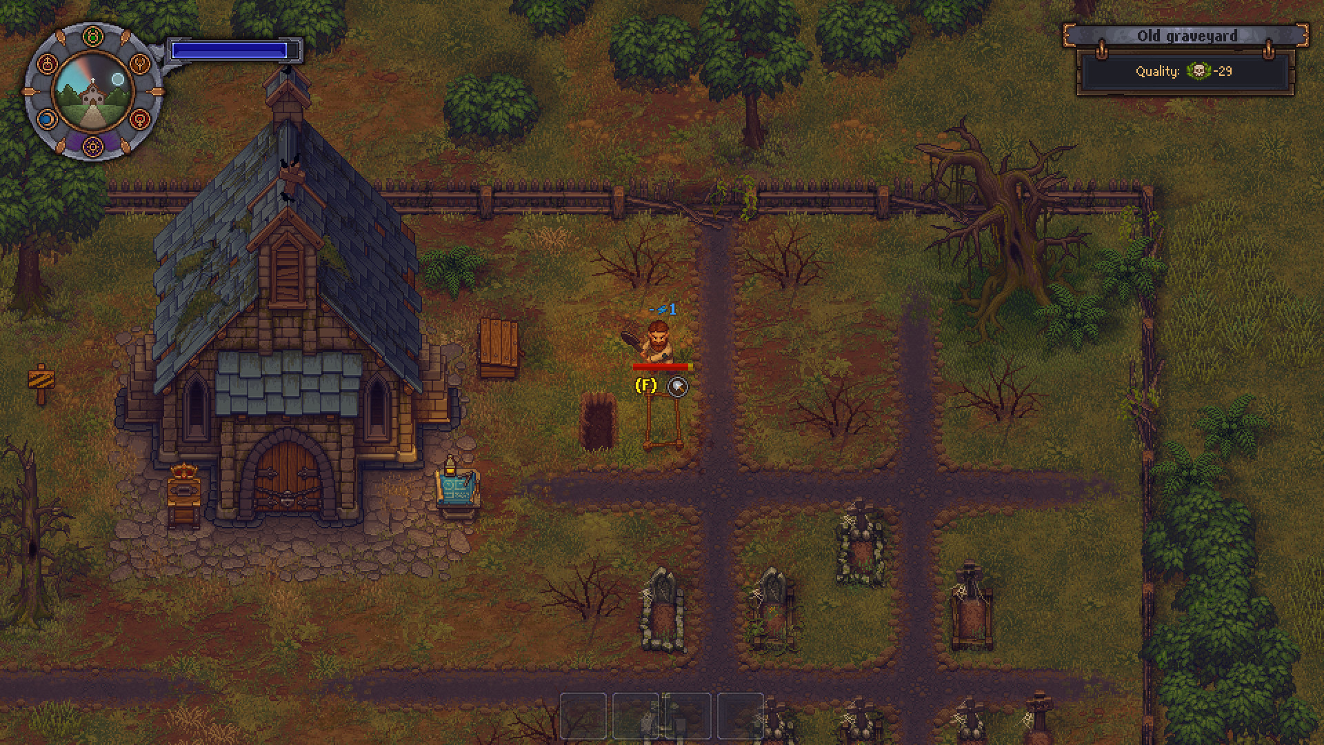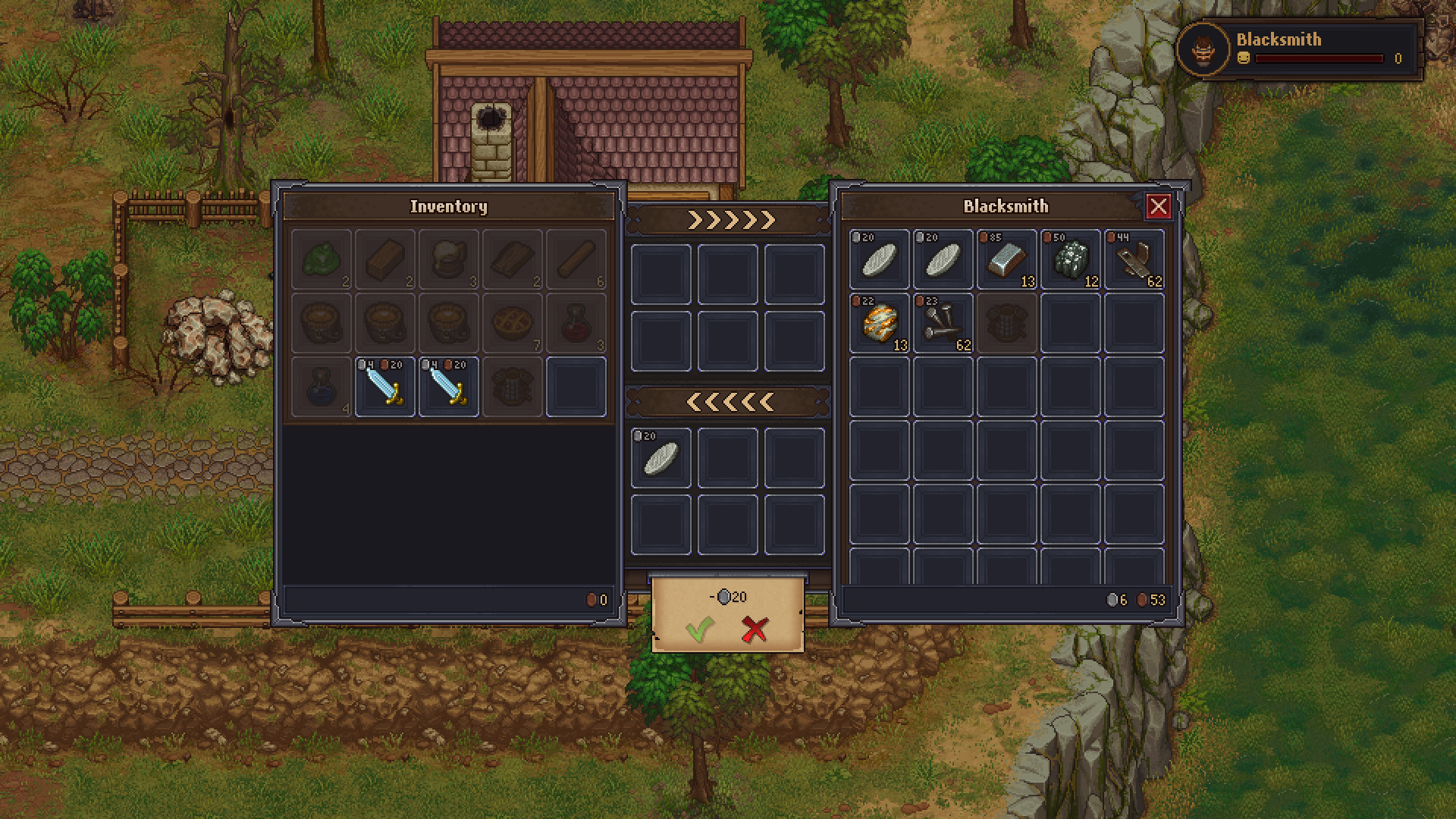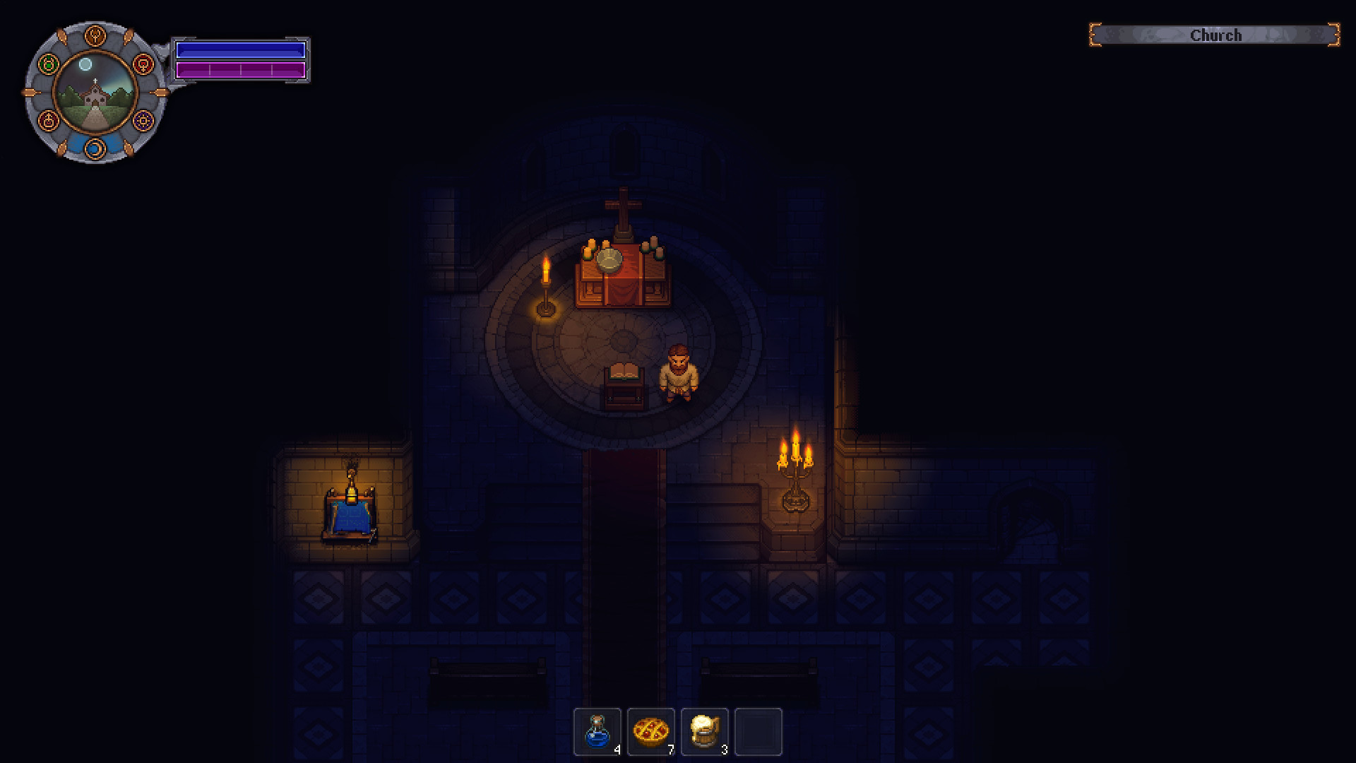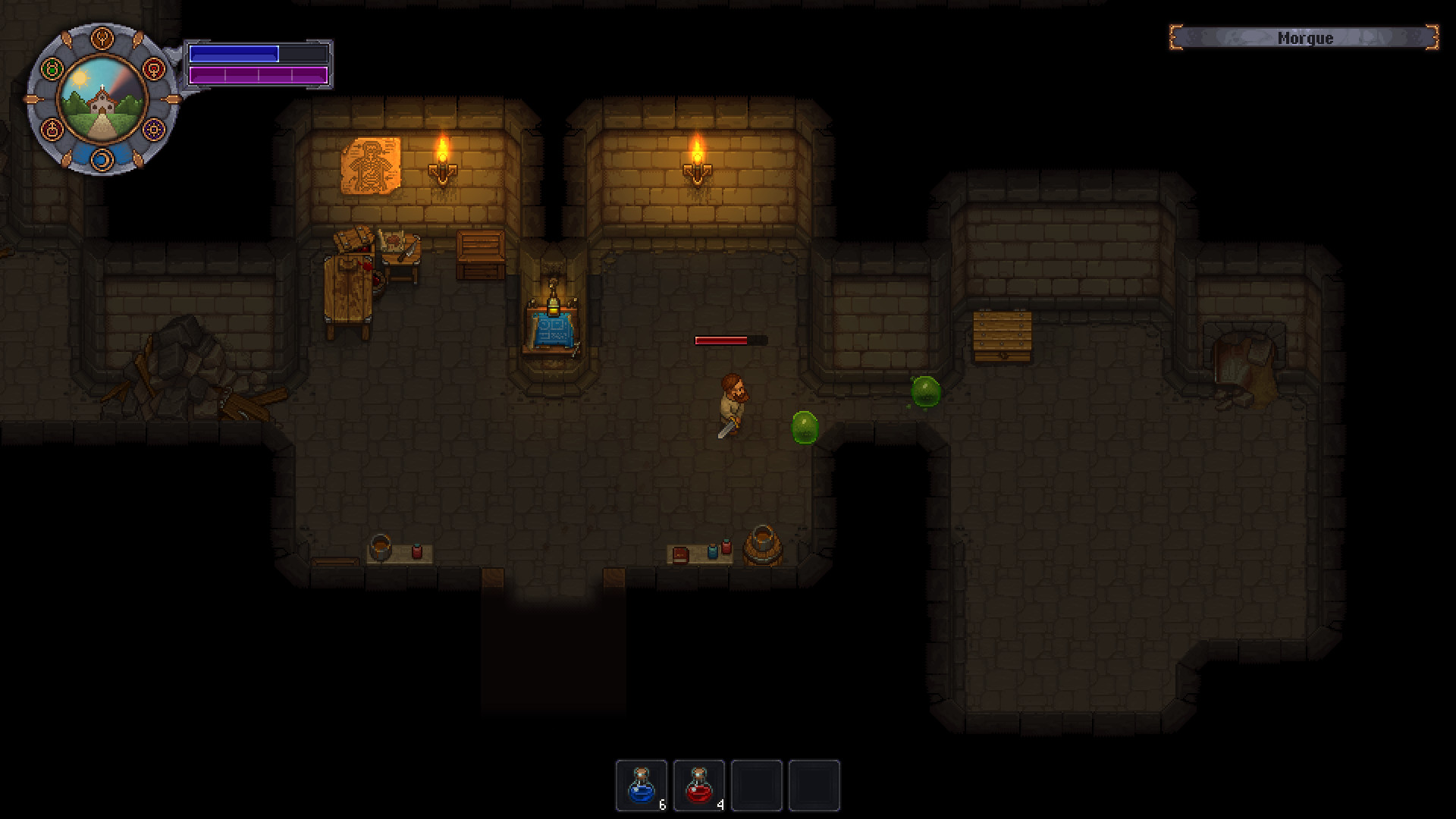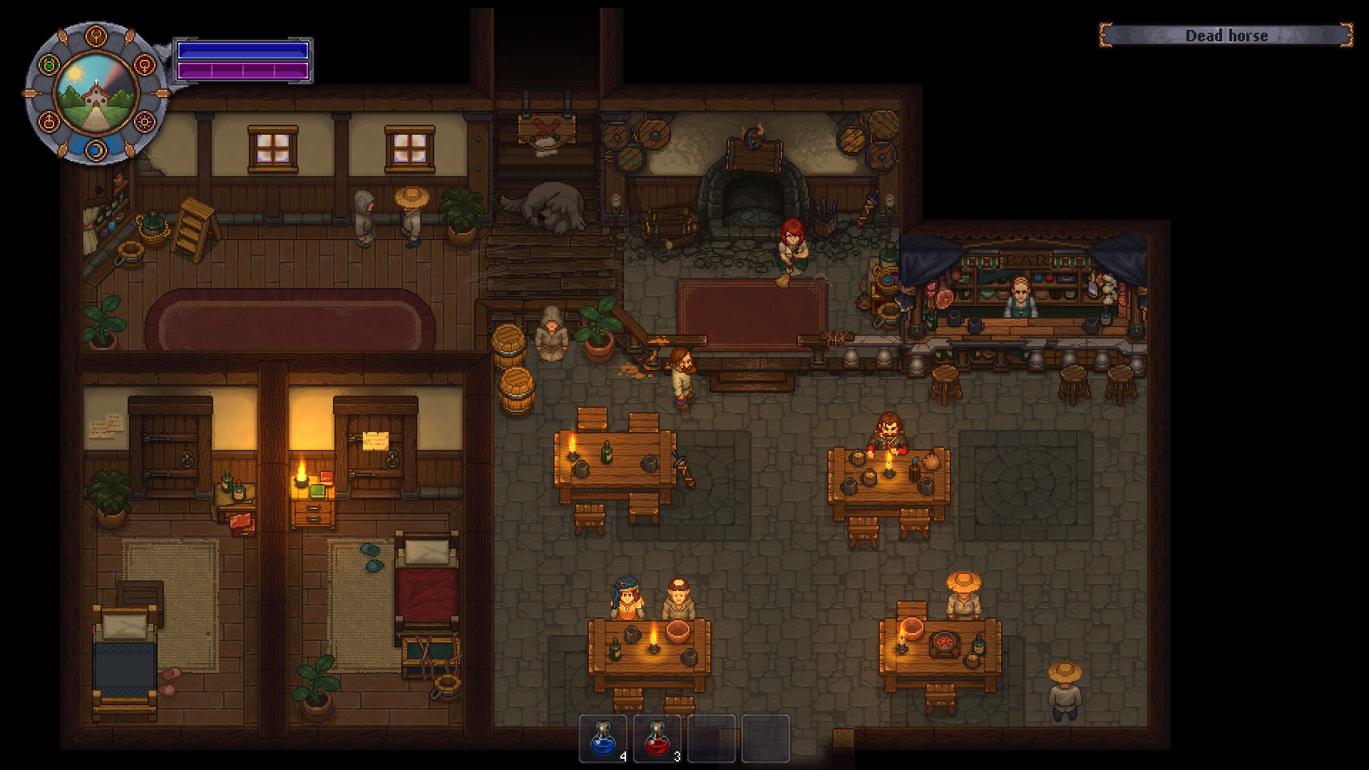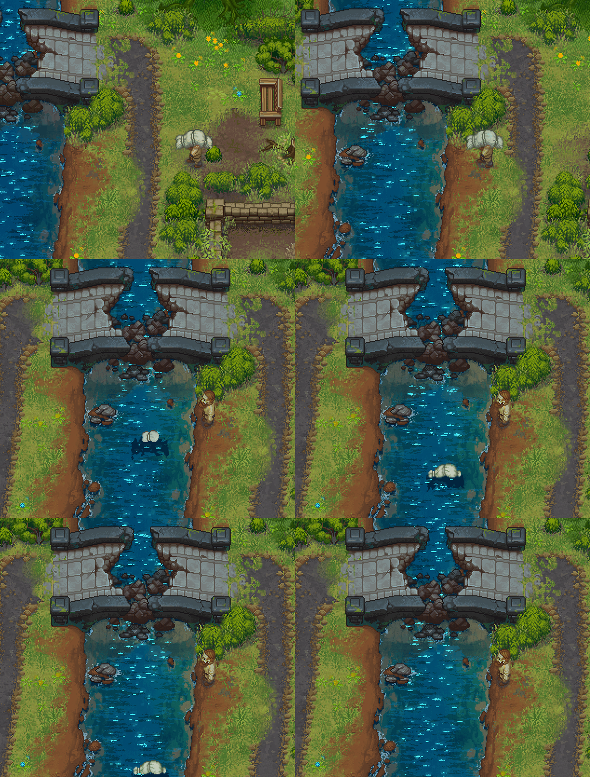
- Face ethical dilemmas. Do you really want to spend money on that proper burger meat for the witch-burning festival, when you have so many resources lying around?
- Gather valuable materials and craft new items. Expand your Graveyard into a thriving business. Help yourself -- gather the valuable resources scattered across the surrounding areas, and explore what this land has to offer.
- Quests and corpses. These dead bodies don't need all those organs, do they? Why not grind them up and sell them to the local butcher? Or you can go on proper quests, you roleplayer.
- Explore mysterious dungeons. No medieval game would be complete without those! Take a trip into the unknown, and find discover new alchemy ingredients -- which may or may not poison a whole bunch of nearby villagers.

Hello! Im a lead programmer of the game Graveyard Keeper. I'd like to share with you some techniques and tricks that we used to make our game look as you see it from the GIF above.
We are very passionate about graphics in our games. Thats why we put so much time and effort into different effects and other stuff that makes our pixel art as attractive as possible. Maybe you will find here something helpful for your work.
First I want to say some words about big parts that compose the visual part of our game:
- Dynamic ambient light is just change of illumination depending on the time of the day.
- LUT color-correction is responsible for the change of color shades depending (again) on the time of the day (or world zone).
- Dynamic light sources torches, ovens, lamps.
- Normal maps make objects look like they have a real volume, especially when light sources move.
- The math of light 3D distribution a light source centered on the screen should illuminate a higher object properly and should not illuminate an object below (turned to the camera with its dark side).
- Shadows are made with sprites, they turn and react to light source positions.
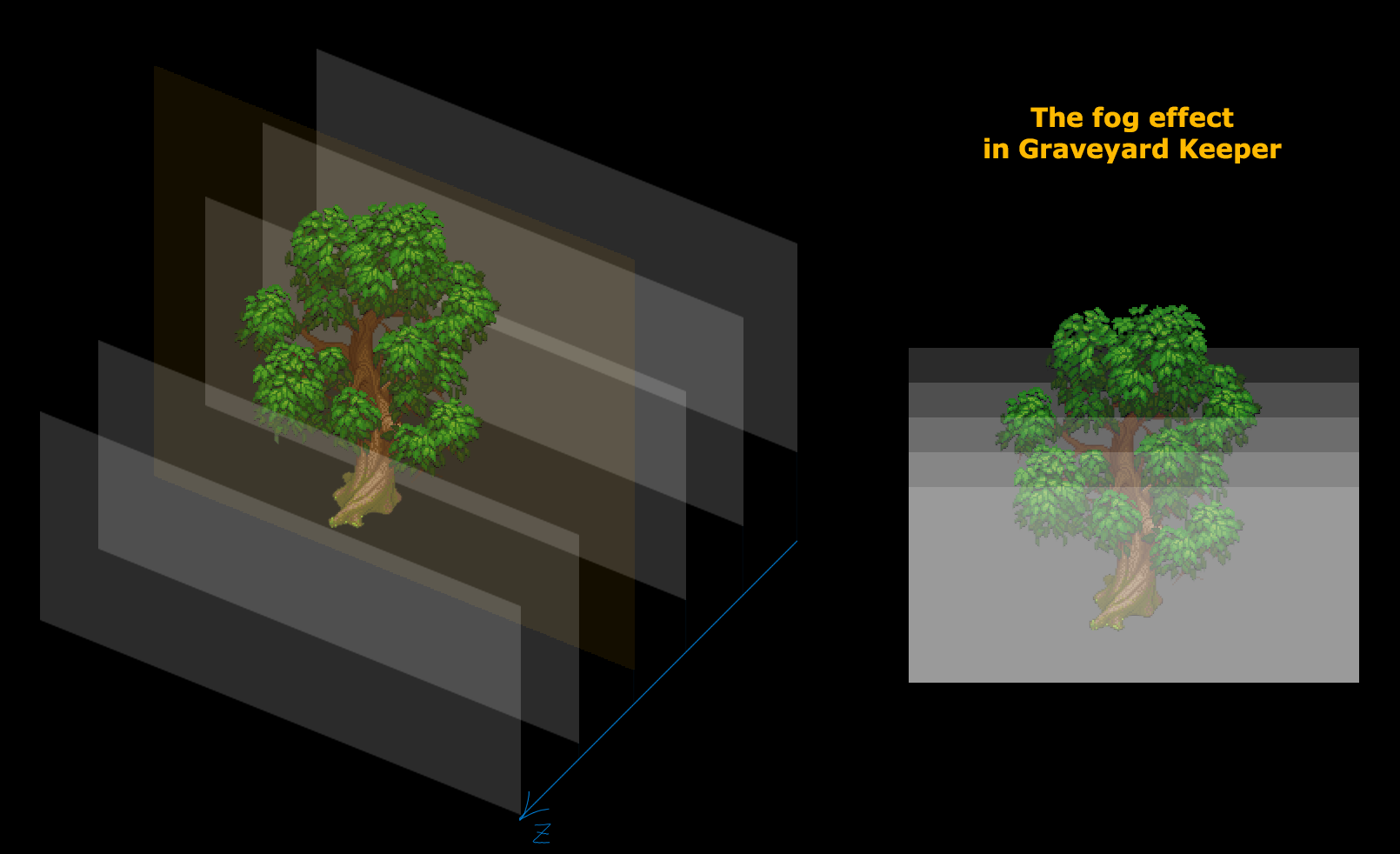
- Object altitude simulation for the fog to be displayed correctly.
- Other stuff: rain, wind, animations (including shader animation of leaves and grass) and so on.
Lets talk about those in more details now.
Dynamic ambient light
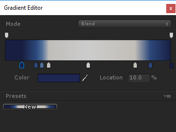
Nothing special here. Darker at night, lighter in the daytime. The lights color set with a gradient. By nightfall a light source not only becomes darker but gets blue tint.
It looks like this:
LUT color correction
LUT (Look-up table) is a table of color change. Roughly speaking its a three-dimensional RGB array where each element (a) corresponds to a color with its coordinates as RGB values; (b) contains the color value that the color associated with the element should be changed to. So if there is a red point at coordinates (1, 1, 1), it means that all the white color from the picture will be replaced with red. But if there is white color at the same coordinates (R=1, G=1, B=1), the change doesnt happen. So LUT by default has coordinates associated with a particular color. I mean that point with coordinates (0.4, 0.5, 0.8) is associated with color (R=0.4, G=0.5, B=0.8).
It should also be pointed here that for convenience that 3D texture is represented as two-dimensional. Thats how for example default LUT (that doesnt change color) looks:

Easy to make. Easy to use. Works really fast.
It is very easy to set up -- you give an artist a picture from your game and say: Make it look like its evening. Then you apply all color layers plus the default LUT. Congratulations! You get an Evening LUT.
Our artist was actually very passionate about it. He created 10 different LUTs for different time of day (night, twilight, evening and so on) Thats how the final set of LUTs looks:
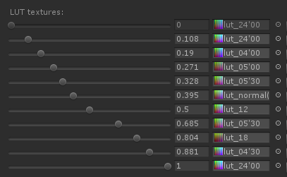
As a result one location may look different at different time of day:
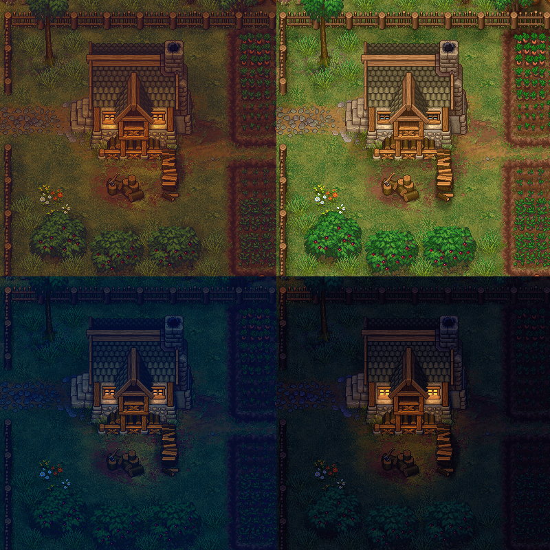
The picture also shows how the intensity of the light sprites changes depending on the time of day.
Dynamic light sources and normal maps
We use regular light sources, the default Unity ones. Also, every sprite has its own normal map. This helps to feel the volume.
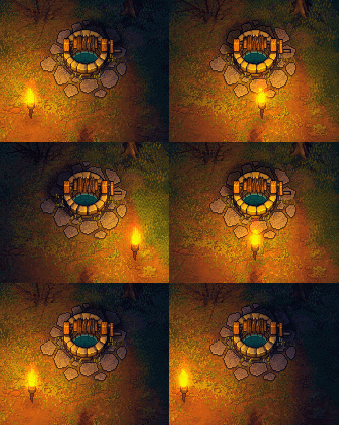
These normals are pretty easy to draw. An artist roughly paints light on 4 sides with a brush:
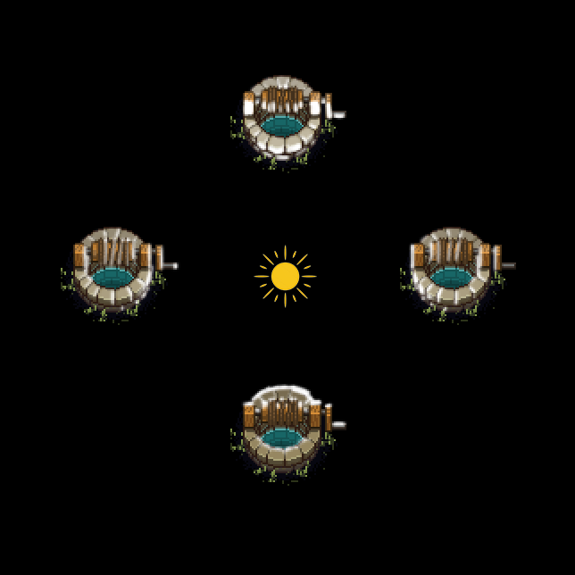
And then we merge them with a script in a normal map:
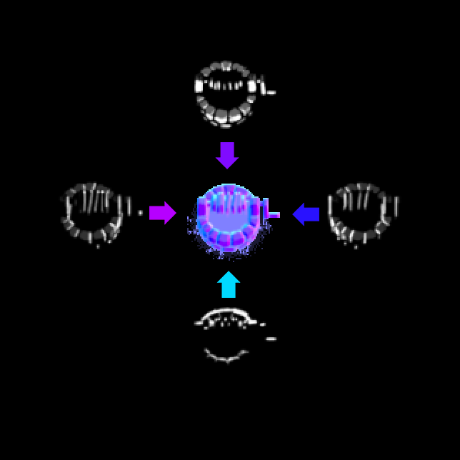
If you are looking for a shader (or software) that can do that, pay attention to Sprite Lamp.
3D light simulation
This is where things start to be a bit more complicated. You cant just light the sprites. Its very important whether a sprite is behind a light source or in front of it.
Take a look at this picture.
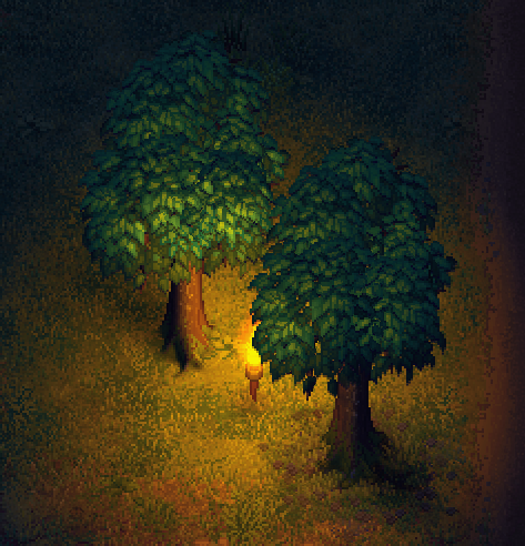
These two trees are at the same distance from the light source but the back one is illuminated while the front one is not (because the camera faces its dark side).
I solved this problem very easily. There is a shader that calculates the distance between a light source and a sprite on the vertical axis. If its positive (the light source is in front of the sprite), we illuminate the sprite like we always do, but if its negative (the sprite is blocking the light source), then the intensity of lighting is fading depending on the distance at a very quick rate. There is a rate, not just not to illuminate. So if the light source behind the sprite is moving, the sprite is blackening gradually, not at once. Yet its still very fast.
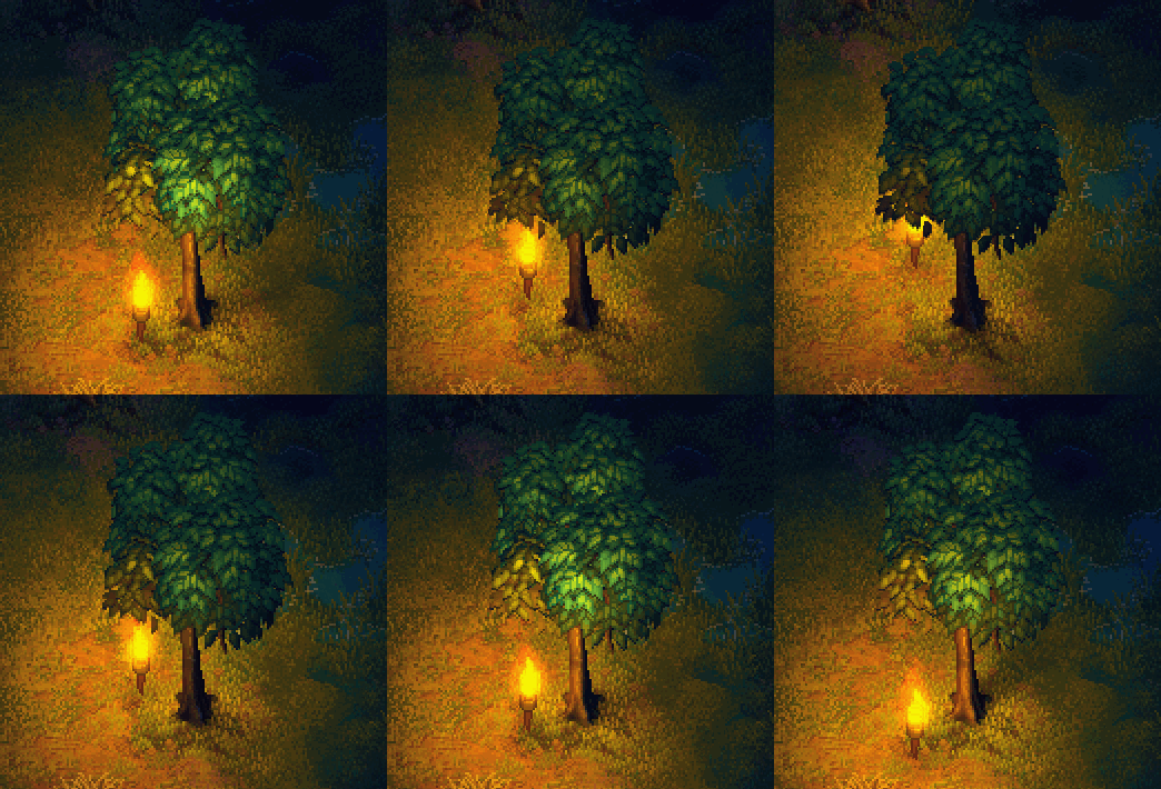
Shadows
Shadows are made with sprites rotating around a point. I tried to add a skew there, but it turned out to be unnecessary.
Every object may have a maximum of 4 shadows. The shade from the sun and the additional three from dynamic light sources. So the image below shows this concept:
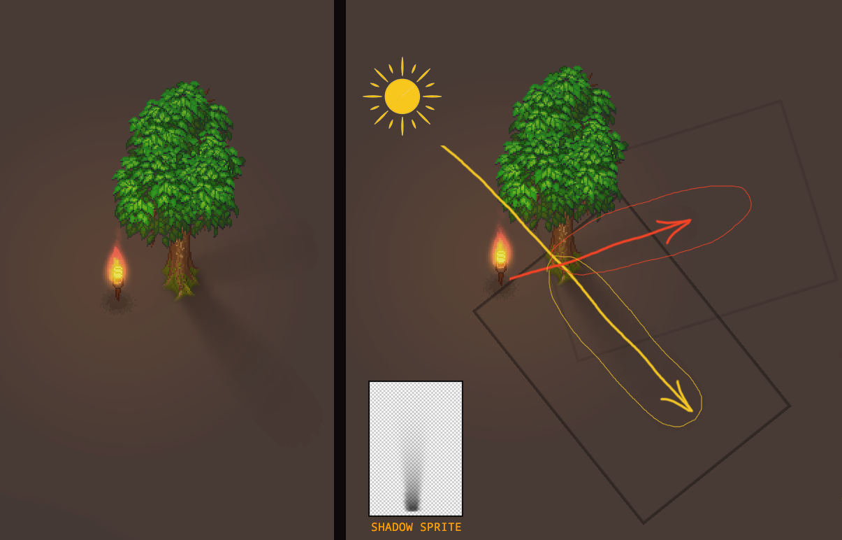
The problem how to find the closest 3 light sources and to calculate the distance and an angle was solved with a script running in the Update() loop.
Yes, its not the quickest way considering how much math is involved. If I programmed it today, I would use that modern Unity Jobs System. But when I did it there was no such thing so I had to optimize regular scripts we had.
The most important thing here is that I did the sprite rotation not modifying the transform but inside a vertex shader. So the rotation isnt involved here. You just put a parameter to a sprite (I used the color channel for that, all the shadows are black anyway), while the shader is responsible for sprite rotations. It turns out to be quicker -- you dont have to use Unity geometry.
There is a minus to this approach. The shadows are to be adjusted (and sometimes drawn) separately for each object. Yet actually, we used about ten different more or less universal sprites (thin, thick, oval etc.)
The next disadvantage is that its difficult to make a shadow for an object that is stretched along one axis. For instance, look at the fence shadow:
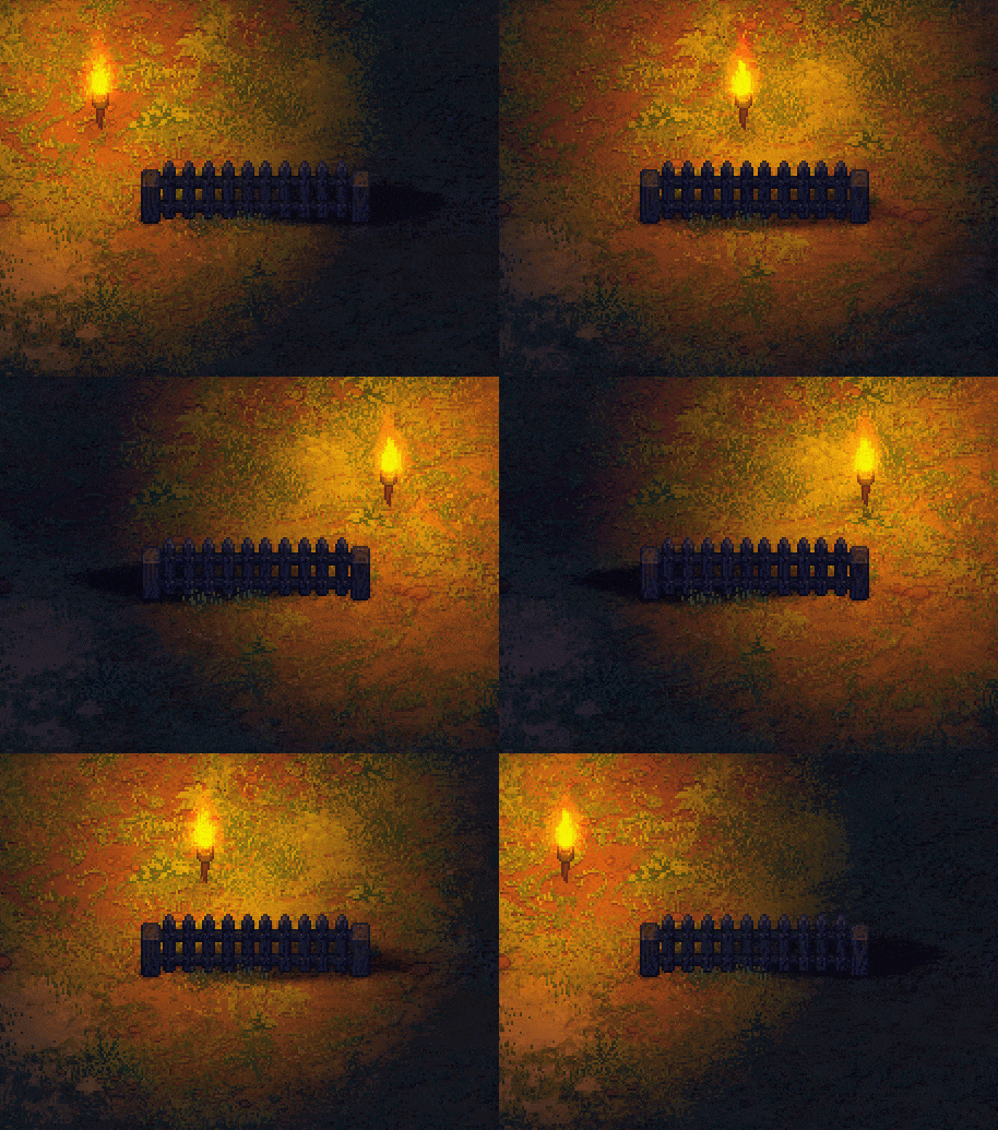
Not ideal. Thats how it looks if you make a fence sprite translucent:
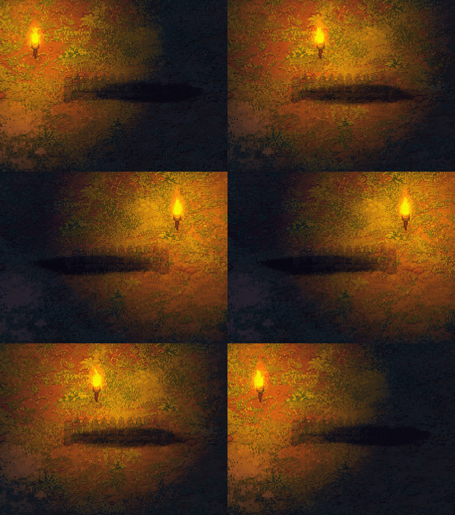
It should be noted here, by the way, that the sprite is highly distorted vertically (the shadow sprite original looks like a circle). Thats why its rotation looks like not just a simple rotation but also like a distortion.
The fog and the altitude simulation
There is also fog in the game. It looks like this (the regular version above and and an extreme 100% fog to demonstrate the effect).
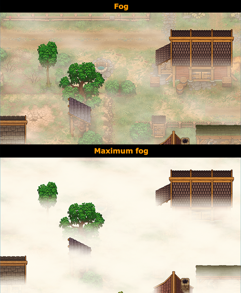
As you see, the tops of houses and trees are seen from the fog. In fact, this effect is really easy to make. The fog consists of a great deal of horizontal clouds spread across all the picture. As a result the upper part of all the sprites is covered with a fewer amount of fog sprites:
The wind
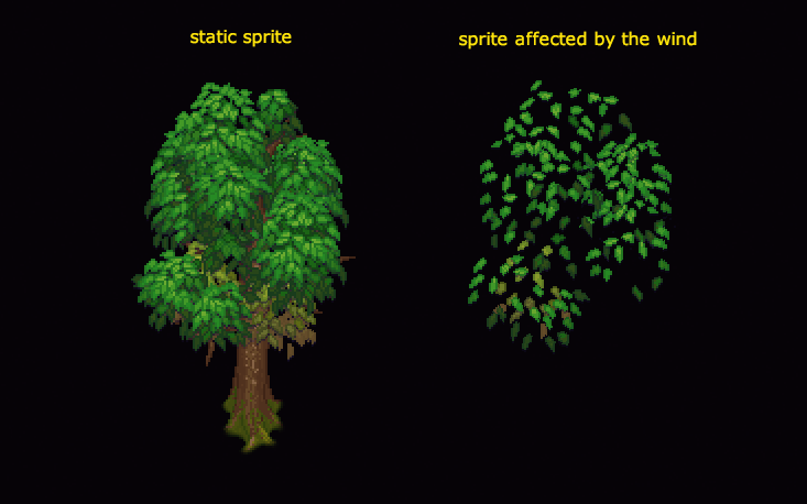
The wind in a pixel art game is a completely different story. There are not many options here. To animate manually (its not possible considering how much art we have) or to make a deforming shader, but then youll have to deal with some ugly distortions. You can also dont do any animation, but then the picture will look static and lifeless.
We chose the deforming shader. It looks like that:
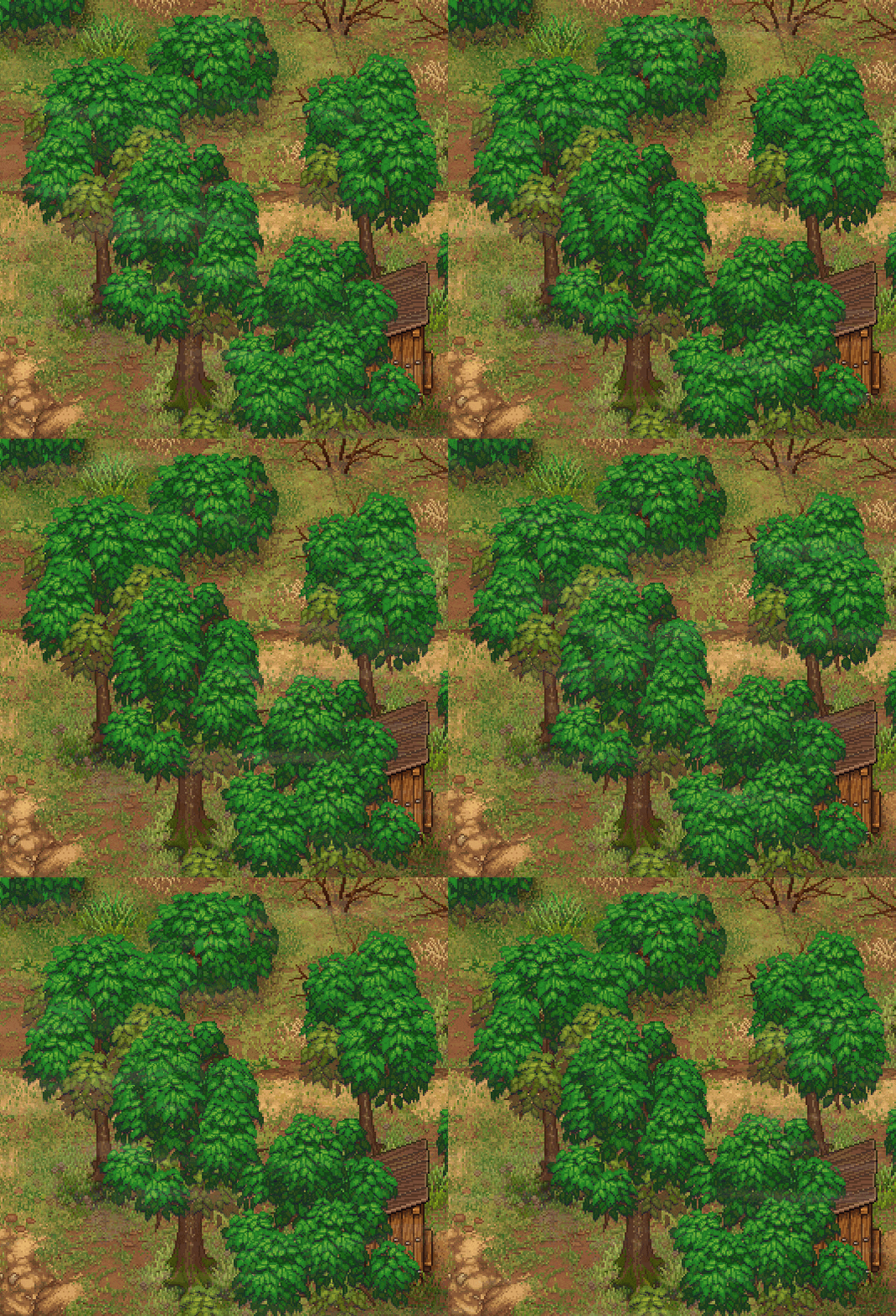
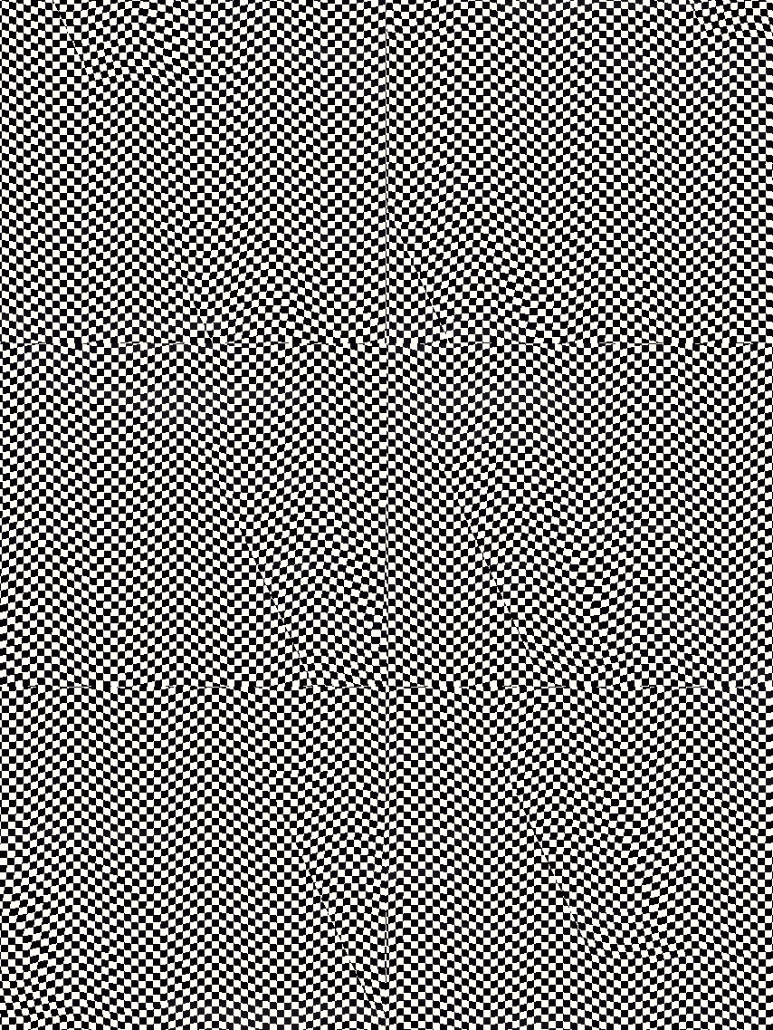
Its pretty obvious whats happening here if we apply the shader to the chequered texture:
It should also be pointed here that we do not animate the whole crown of a tree but some particular leaves:
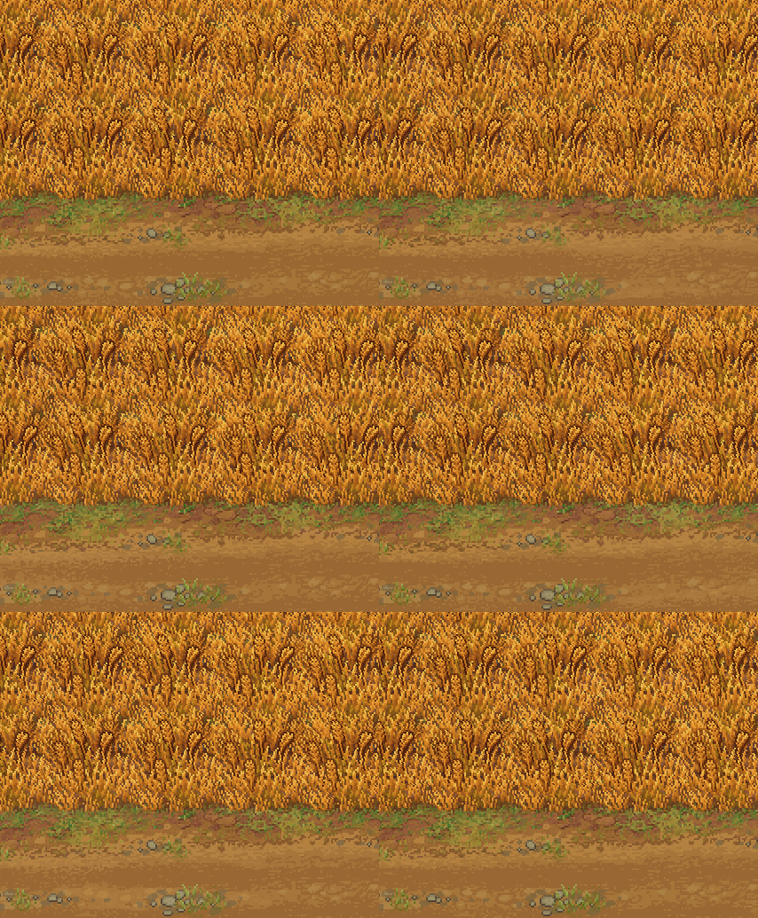
There are also an animation of a wheat field shake and things are pretty simple here too. The vertex shader changes the shape of the x-coordinates taking y-coordinate into account. The highest point will be shaken the most intensely. The intention here is that the top should move while the root shouldnt. Plus the phase of shaking varies according to the x/y coordinates to make different sprites move separately.
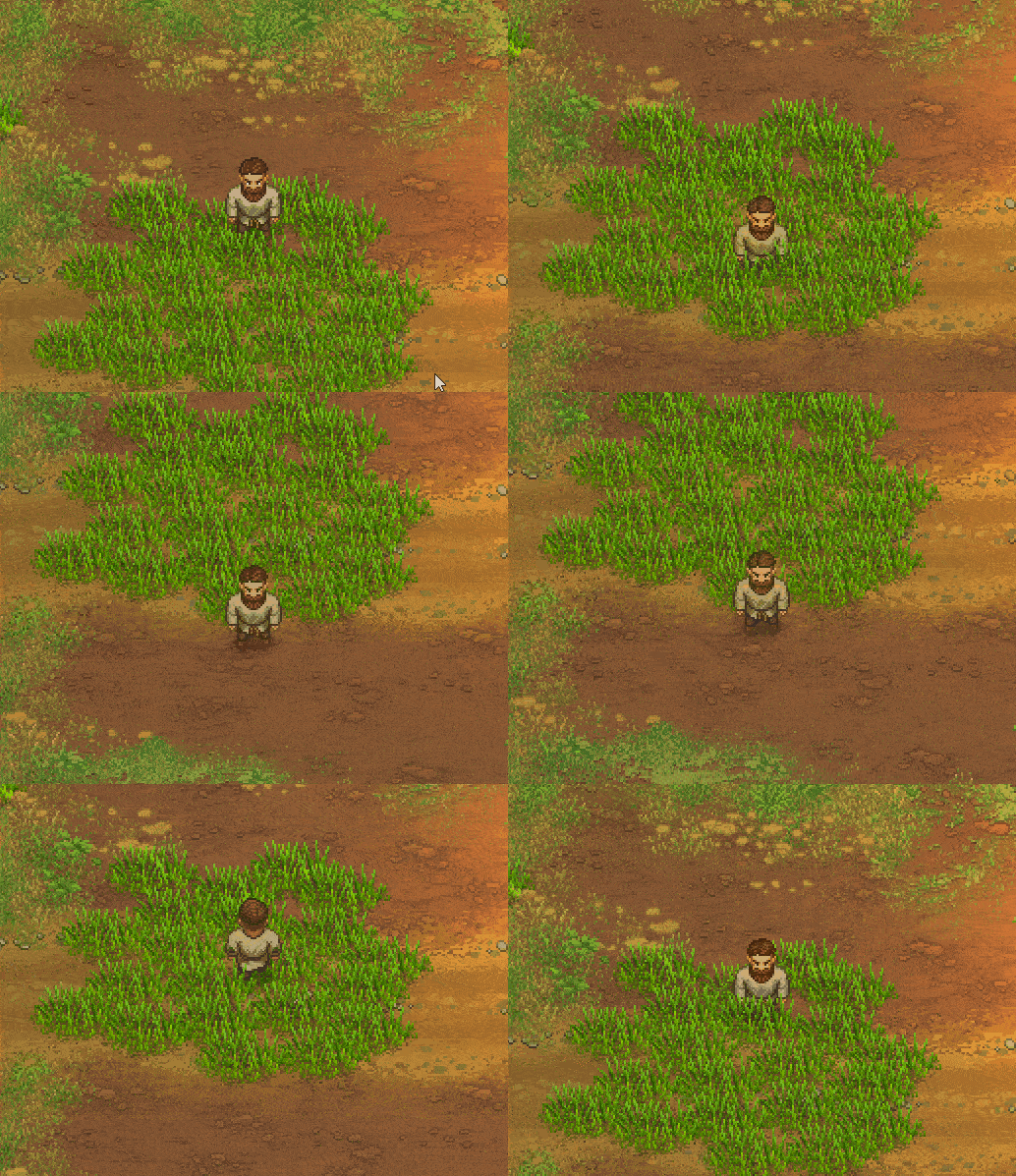
This shader is also used to create a swinging effect when a player goes through wheat or grass.
I think thats all for now. I havent spoken about scene construction and about its geometry, because there is a lot to speak about in a new entry. Beyond that Ive spoken about all the main solutions that we applied developing our game.
Minimum Setup
- OS: Ubuntu 18.04. CentOS 7
- Processor: Intel core i5. 1.5 GHz and upMemory: 4 GB RAM
- Memory: 4 GB RAM
- Graphics: 1 Gb dedicated video card. shader model 3.0+
- Storage: 1 GB available space
[ 6414 ]
[ 5910 ]
[ 1967 ]
[ 2356 ]
[ 713 ]
[ 1040 ]
[ 32814 ]
[ 859 ]

