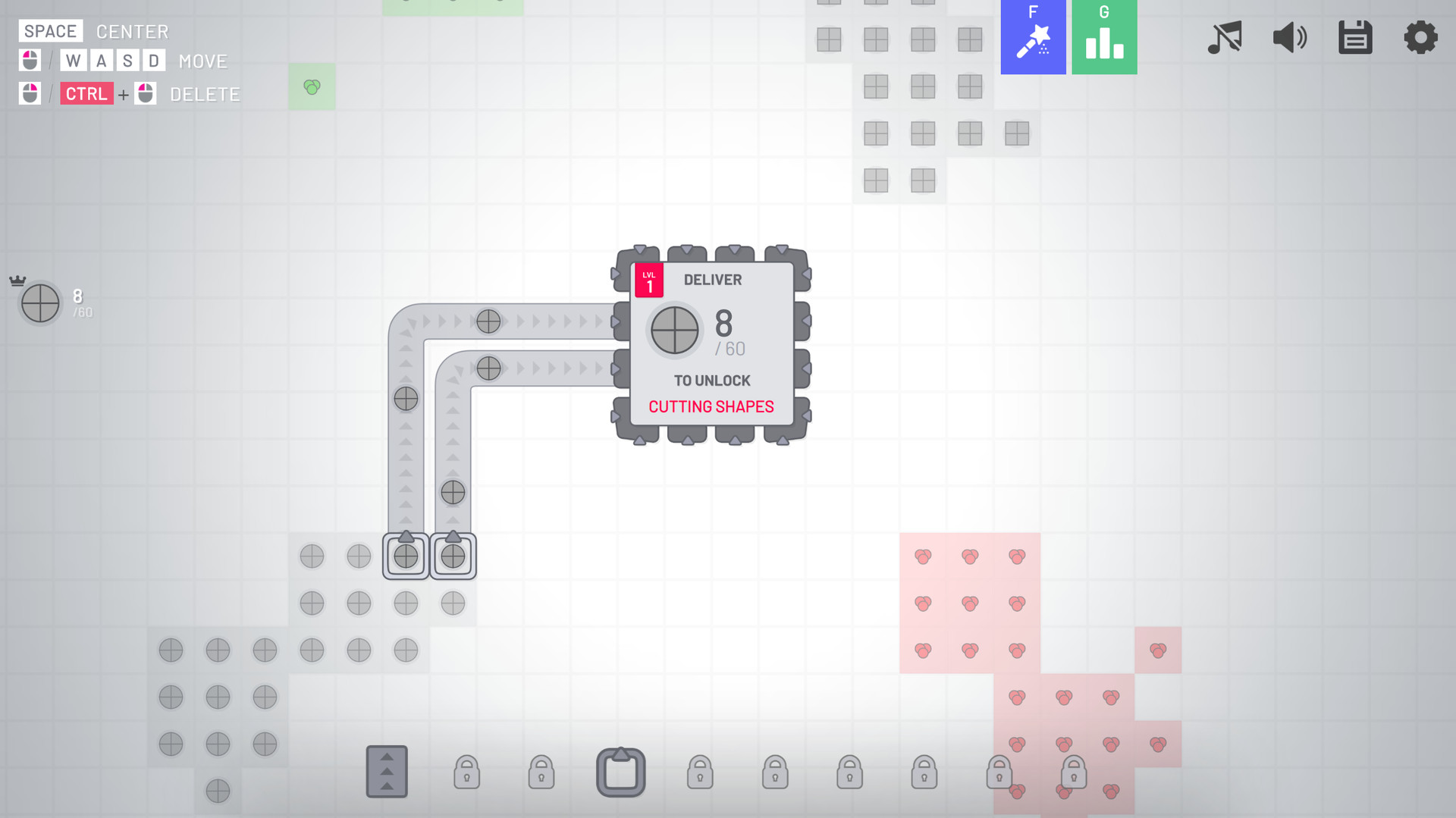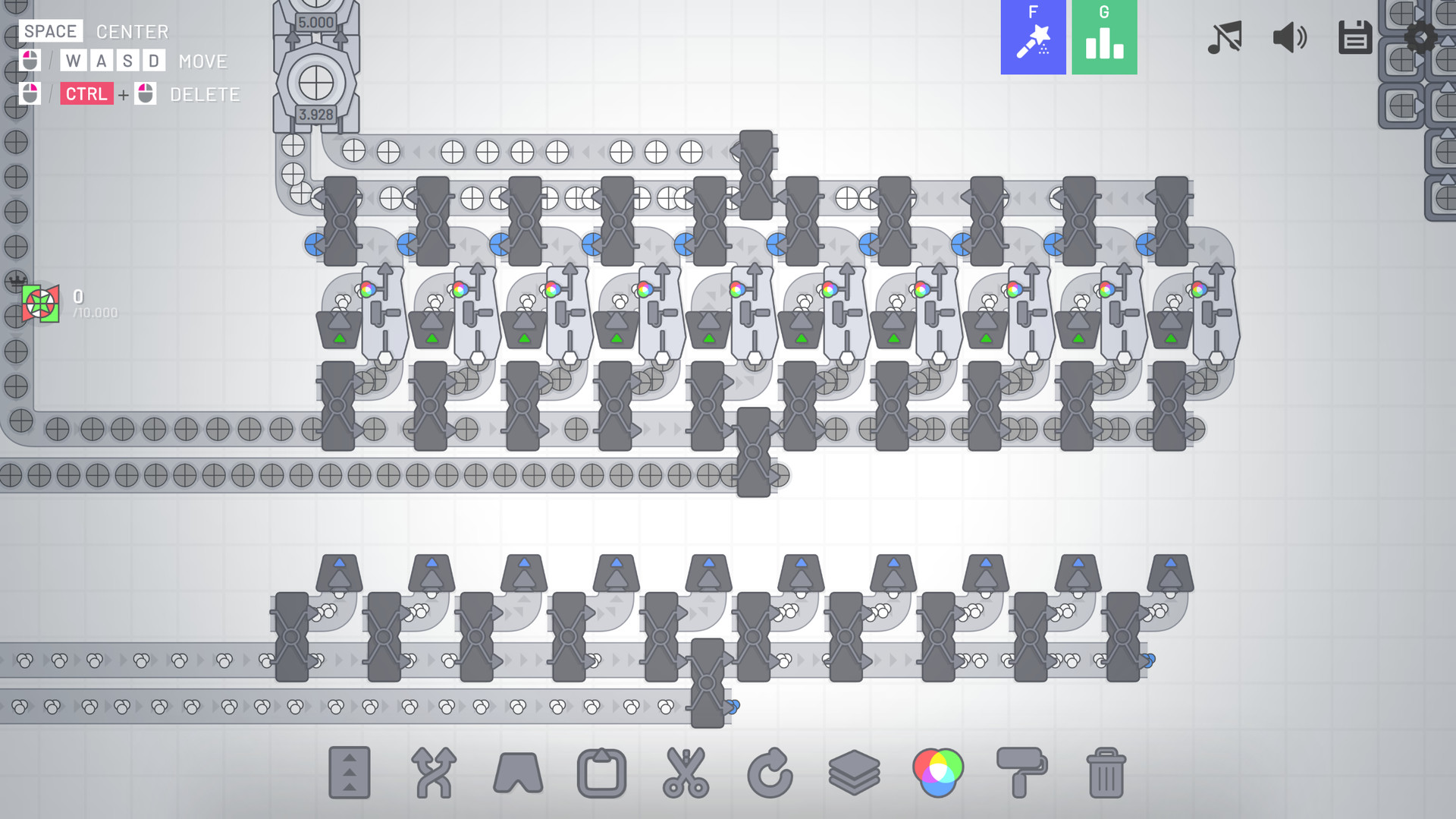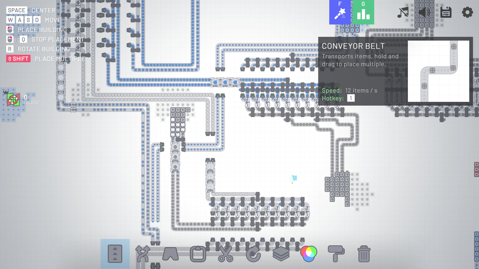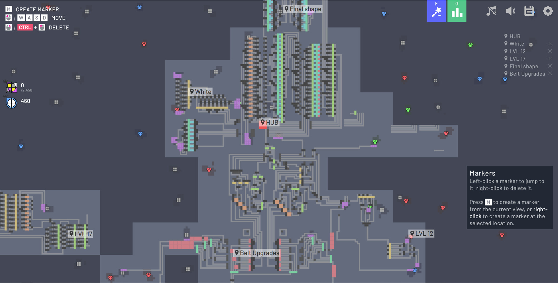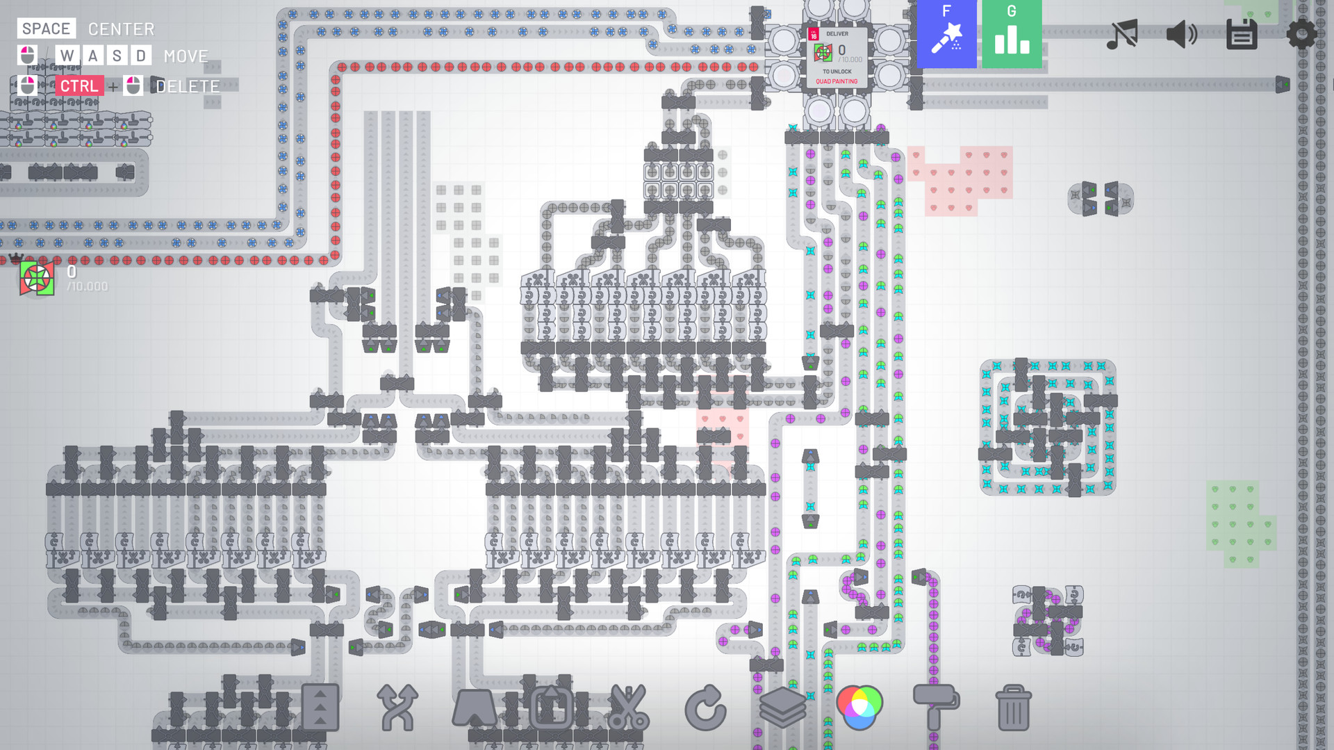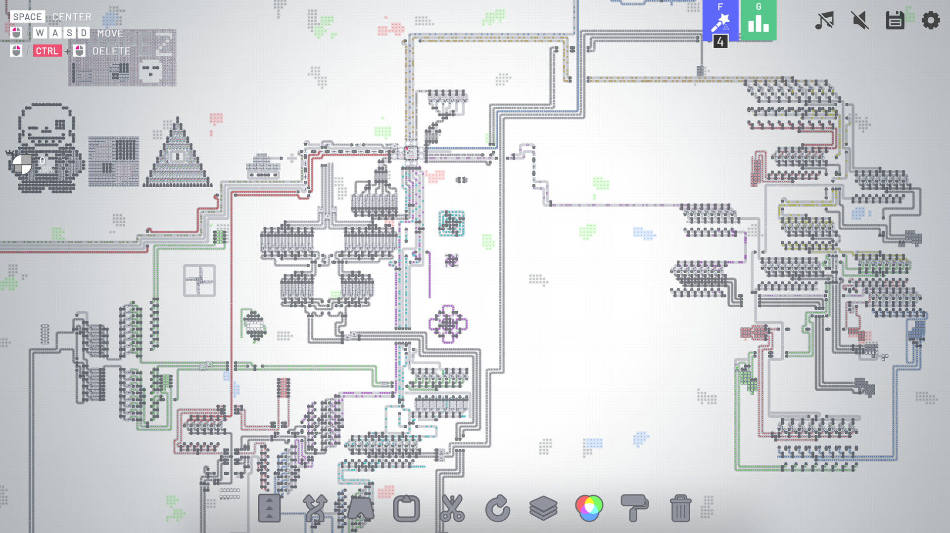
shapez.io is a game about building factories to automate the creation and combination of shapes. Deliver the requested, increasingly complex shapes to progress within the game and unlock upgrades to speed up your factory.
Since the demand raises you will have to scale up your factory to fit the needs - Don't forget about resources though, you will have to expand in the infinite map!
Since shapes can get boring soon you need to mix colors and paint your shapes with it - Combine red, green and blue color resources to produce different colors and paint shapes with it to satisfy the demand.
This game features 18 levels (Which should keep you busy for hours already!) but I'm constantly adding new content - There is a lot planned!
Standalone Advantages
- Waypoints
- Unlimited Savegames
- Dark Mode
- More settings
- Allow me to further develop shapez.io ❤️
- More features in the future!
This game is open source - Anybody can contribute! Besides of that, I listen a lot to the community! I try to read all suggestions and take as much feedback into account as possible.
- Story mode where buildings cost shapes
- More levels & buildings (standalone exclusive)
- Different maps, and maybe map obstacles
- Configurable map creation (Edit number and size of patches, seed, and more)
- More types of shapes
- More performance improvements (Although the game already runs pretty good!)
- Color blind mode
- And much more!
Hello everyone!
One of the biggest differences between Shapez 1 and Shapez 2 is, of course, the visual upgrade. The transition from 2D to 3D is an enormous task, and we spare no effort to guarantee we will ace this step forward. For this devlog, we asked Nils, our 3D artist at tobspr Games to take you through the process of how we settled on the design philosophy of Shapez 2 and what we have to keep in mind whenever we design something.
Before we get started, please make sure you have Shapez 2 wishlisted! We have some exciting times ahead of us, and it would be a shame if you were to miss out on future updates! :)
https://store.steampowered.com/app/2162800/shapez_2/
News
Alpha 12
Last week saw the release of Alpha 12, a huge update that focuses on improving the onboarding experience of Shapez 2. We are currently working on polishing this experience to a near-final state, barring any feedback we may receive from you. Want to try it out for yourself? Consider joining our Patreon !
[hr][/hr]
Nils here!
Even though Shapez 1 was a pretty complex game, it wasnt what we would call a looker. The graphics were simple and readable, but not exactly aesthetically pleasing. Its programmer art, as our lead artist would say! This is fine for those who value function over vanity, but it makes it difficult to attract new players who arent experienced factory builders already. If you take a look at a game like Satisfactory, a game thats both complex and beautiful, it appeals to all kinds of players. It has the visuals to be interesting to players who are new to the genre and the gameplay to teach them the ropes, while also being complex enough to keep veterans engaged.
This is something we feel Shapez 1 lacked. While the low-stakes gameplay was very friendly to new players, the visuals made it more of a game for people interested in IT and programming. So, for Shapez 2, Tobias envisioned a sequel that takes all the gameplay strengths of its predecessor, but takes the jump to 3D and makes it look good while keeping the game accessible.
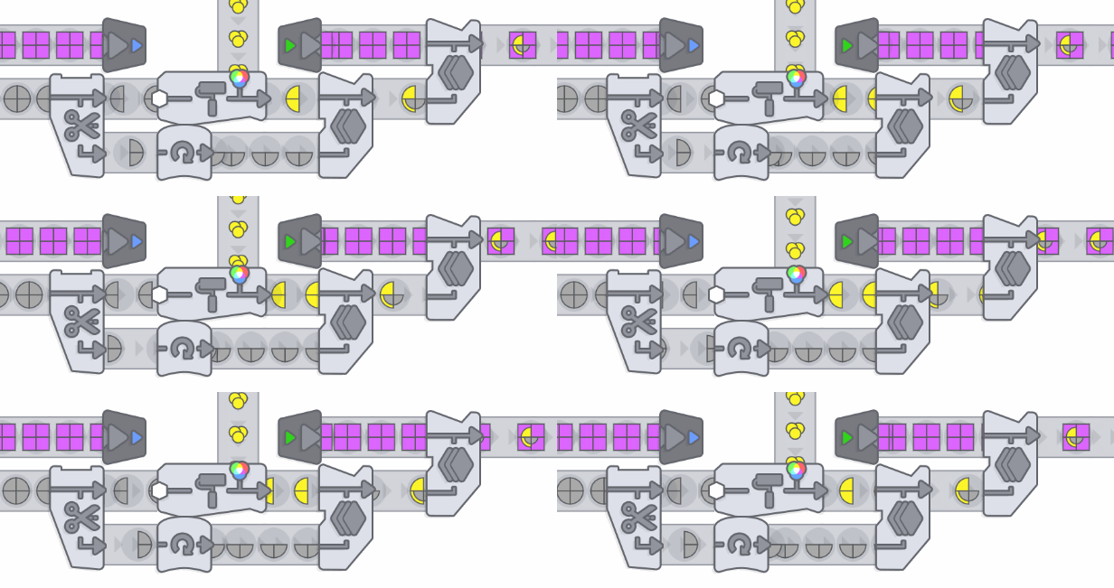
One other change we deemed important is the complete removal of black box buildings. If you look at the buildings in Satisfactory, Factorio or Dyson Sphere Program, the resources you feed into a machine disappear into nothingness. A couple seconds later, a product pops out, and you have no clue which steps happened in between. We think the segmented nature of the shapes allows for a non-black box approach where you can see exactly what a machine does by simply looking at it doing its thing. We are not smelting iron, copper and Arachnian stalagmites to create the inverse Galerian crop circle or whatever. We cut squares into smaller squares, circles into slices, paint and then stack them. We can animate every step in the journey a shape takes, from extraction to delivery.
There are some exceptions to this rule, however. Some processes would be too difficult to animate and take more time than its ultimately worth. An example would be the packing of a thousands shapes into a small crate it makes sense from a gameplay perspective, but would visually not work well.
Getting started
We started off with a very basic aesthetic, inspired in some ways by Mini Motorways. Limited geometry, a desaturated color palette and no fancy effects. No metallic objects, reflections or bevels. We made a few concepts for the general theme of the game and worked together with the community to settle on the space theme Shapez 2 now sports. With the theme set in place, we could now start detailing with shading, reflections and metallic objects.
The visual language for the buildings repeating patterns, colors and design choices developed over time. Back when I joined tobspr Games, all I had to work with were some very basic visuals Tobias made. Essentially, it was my job to make them look good! I proposed a few early design ideas, created animations and defined design rules that we still adhere to today. Some of these early ideas are still present in the current version of the game, like the animation for the lifts.


Pinpointing our vision
The direction we wanted to work towards could be described as a marriage between the realism (physicality) of factories and the abstraction of space. Good examples of this are the belts and belt corners. Instead of being a simple 90 degree curve with a stretched texture, or a hard UV seam like many other games do their belts, we made something akin to how a real belt functions. These belts have a texture looping around rollers, cartoonified a bit by hiding certain complexer parts of the mechanism. This way, the belts get the vibe of a real factory, with enough abstractness to allow for greater creative freedom. More examples will follow later on!
In general, were aiming for a highly polished look with tons of detail, many of which may never be seen by a lot of you. The buildings would hold up in a (non-existent) first person mode, even if we didnt design them with that goal in mind. With the use of LODs, a consistent design language and a lot of iterating, we ended up with the world we imagined. It captures the spirit of Shapez 1, while looking a lot more appealing (to most), as well as being more readable and easier to understand.


With this design philosophy in mind, lets dive into some specific examples!
Designing buildings for Shapez 2
The building blocks that make up the core of Shapez 2 stayed largely the same as in Shapez 1. Quite literally actually, as the game is still logically separated in square blocks of one. Since the functionality of a lot of buildings is directly taken from Shapez 1, we only had to come up with ways to visualize their inner workings. This turned out to be quite the challenge, however. With the technical and artistic constraints we were working with, it became very difficult to come up with the designs.
A lot of the technical constraints are set to make sure the game keeps running smoothly. We had to limit animations and forgo most of Unitys basic systems in order to support large factories. We cannot use baked animations, for example. If youd like to read more about the performance constraints, be sure to check out devlog 011 !
Four pillars of design
Readability, building uniqueness, building uniformity and coolness. These are the four design pillars we try to adhere to. However, within these four pillars, we can already find two conflicts: readability versus coolness and uniqueness versus uniformity. Lets go over both these conflicts!
Readability versus coolness
In a nutshell, readability is the ability for the player to easily differentiate between buildings and understand what a building does from a distance, in our case about 30 meters away. For this reason, buildings shouldnt have too much visual noise and animations should be simple, e.g. not have too many moving parts. Coolness is all about how fun and interesting the game looks.

Of course, it would be fun if we could give every building big lasers, launchers and complex animations, but this comes at the cost of readability. The more flair a building gets, the more detailed it gets and the less readable it becomes. If we make every building a big light show, youd have no clue whats going on after youve placed a couple down.

Uniqueness versus uniformity
This conflict links directly to readability. You need buildings to look and feel unique to make them stand out and make their function clear. However, the game should look coherent and every building should share one visual design language.

Every building should follow these four pillars of design. They should look cool, yet readable. To be readable, they should look unique, yet similar enough to fall in line with the other buildings.
Design pipeline
Each and every building has to go through a long string of departments and stages before its finalized form makes it into the game. Their journey is as followed:
[olist]
[/olist]
Of course, this is a very simplified look at the entire process. It makes sure we dont miss any crucial oversights, like animation clipping between adjacent buildings or concepts not adhering to the aforementioned design pillars.
Logistic versus processing buildings
We differentiate between logistic and processing buildings. Belts, mergers, splitters and lifts are logistic buildings; they move shapes around. Buildings like cutters, stackers, painters and swappers are processing buildings; they make changes to the actual shapes, producing different shapes.
The function of a building will also determine their design language. Logistic buildings have lightweight, open designs that clearly display what theyre transporting. They have unique designs per build layer to differentiate them, and have one central orange element that does something, like the pusher element in a splitter. Processing buildings should stand out and really look like buildings. They have very boxy designs and have thick, orange borders, yet should retain a unique look to differentiate them. With these differences, players should easily be able to tell the difference between the two types of buildings, even from far away.

Design limitations and rules
With all this in mind, we face a handful of limitations when it comes to designing buildings, the design pillars aside.
[olist]
[/olist]

One issue were still actively working on are the supports for multi-layer buildings. As you can place buildings below these belts, the belt supports can conflict with the building below. Not having any supports looks weird, but theyre technically not relevant for gameplay.
Casus 1: The (full) cutter
Anyone familiar with Shapez 1 will probably recognise the cutter:

This building works well in the Shapez 1 style, but it doesnt translate well to Shapez 2. Tobias created a basic model for the cutter, which gave me a rough idea on how it should work in 3D as an open design. However, the visuals needed a complete rework.
This presented quite the challenge, since in Shapez 2 the building operations are not dependent on camera rotation, but tied to the world as it were. This is necessary, as blueprints wouldnt work if the buildings would change the axis they work on. If the cutting angle would be baked into the building itself, said angle would change if the rotation of the blueprint would change. This also means youd get a different output every time you rotate a blueprint.
You can see the solution below. The blue half circle indicates which part of the shape is manipulated. The same principles extend to the Swapper as well.

Casus 2: Lifts
To introduce a completely new problem to developing this game, we decided to add layers. You have to be able to move a shape from one layer to the layer above or below. Lets go through all the boxes it has the mark off, shall we?
Lifts should

Thats quite a lot of requirements to work with, but were very happy with how it turned out. The current design is almost a year old by now, yet its still one of my personal favorites.
Not to mention you can make stuff like this:

Its in the details
As we mentioned before, we went for a very polished, yet stylized look. Almost every building currently has one or two little details that you can discover if you zoom in close enough. Lets have a little peek:

The belts were made to emulate the look of real conveyor belts, including a bit of suspension that holds everything in place. We made sure the UVs and textures arent stretched and decided on handling the change of direction of belts in a way where they feed into each other instead of warping.

Or take a look at the painter, which is admittedly still very much a work in progress as far as shaders are concerned and will get another overhaul later. We wanted the painter to adapt to the height of the shapes coming in. So, we added a hinge and allowed the roller to move up and down as shapes of different heights are fed into the machine.

[hr][/hr]
We hope this devlog showed you a complete picture of our design process for Shapez 2. Of course, we also hope you enjoyed it :)
If you have any questions, be sure to join the Discord server .
 https://store.steampowered.com/app/2162800/shapez_2/
See you again in two weeks!
~ Nils & the Shapez 2 team
Join the community:
Twitter / X YouTube TikTok Discord Reddit Patreon[ 6416 ]
[ 7155 ]
[ 3628 ]
[ 4850 ]

