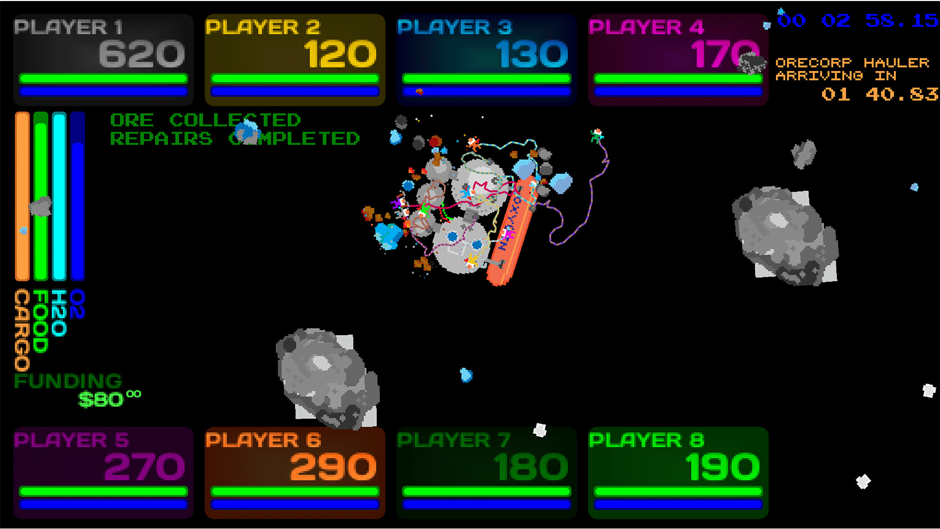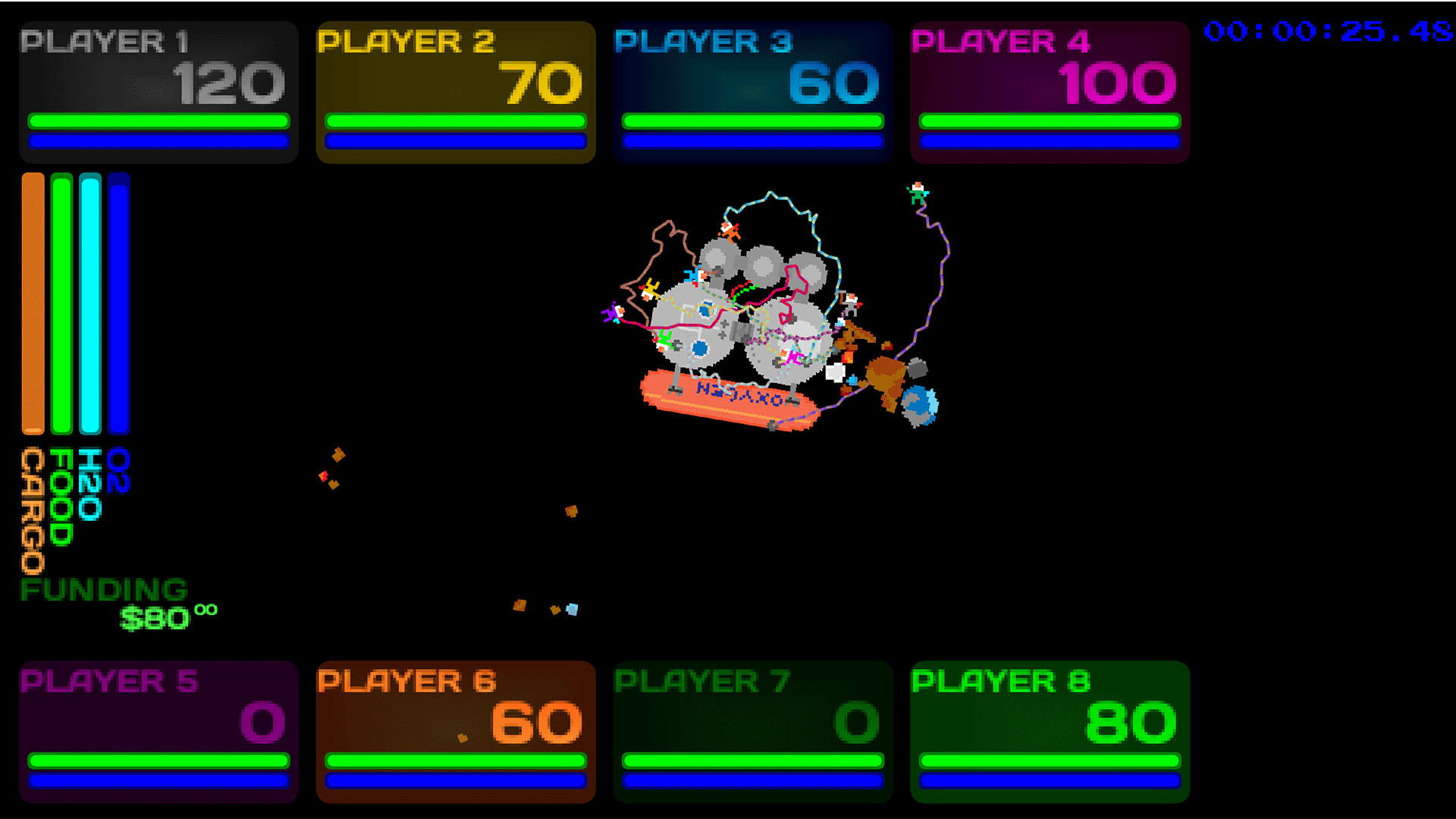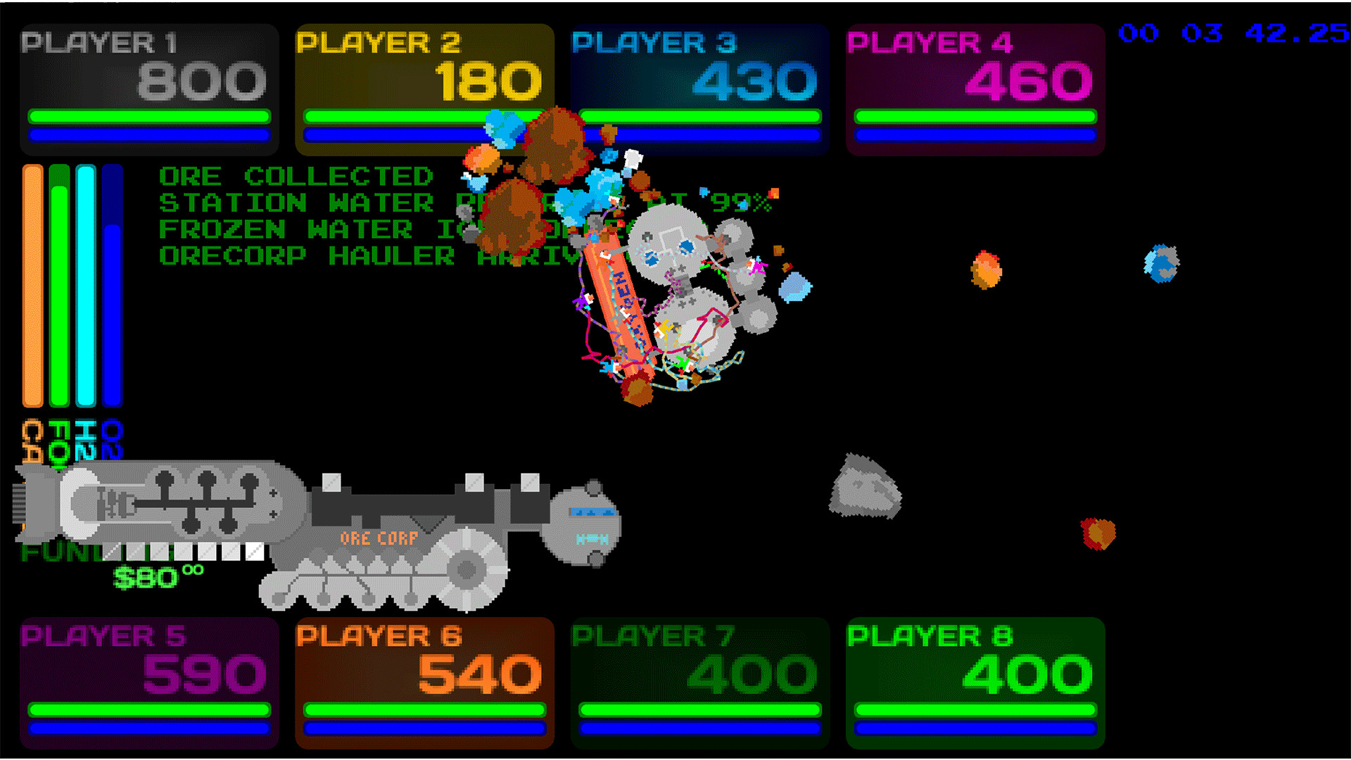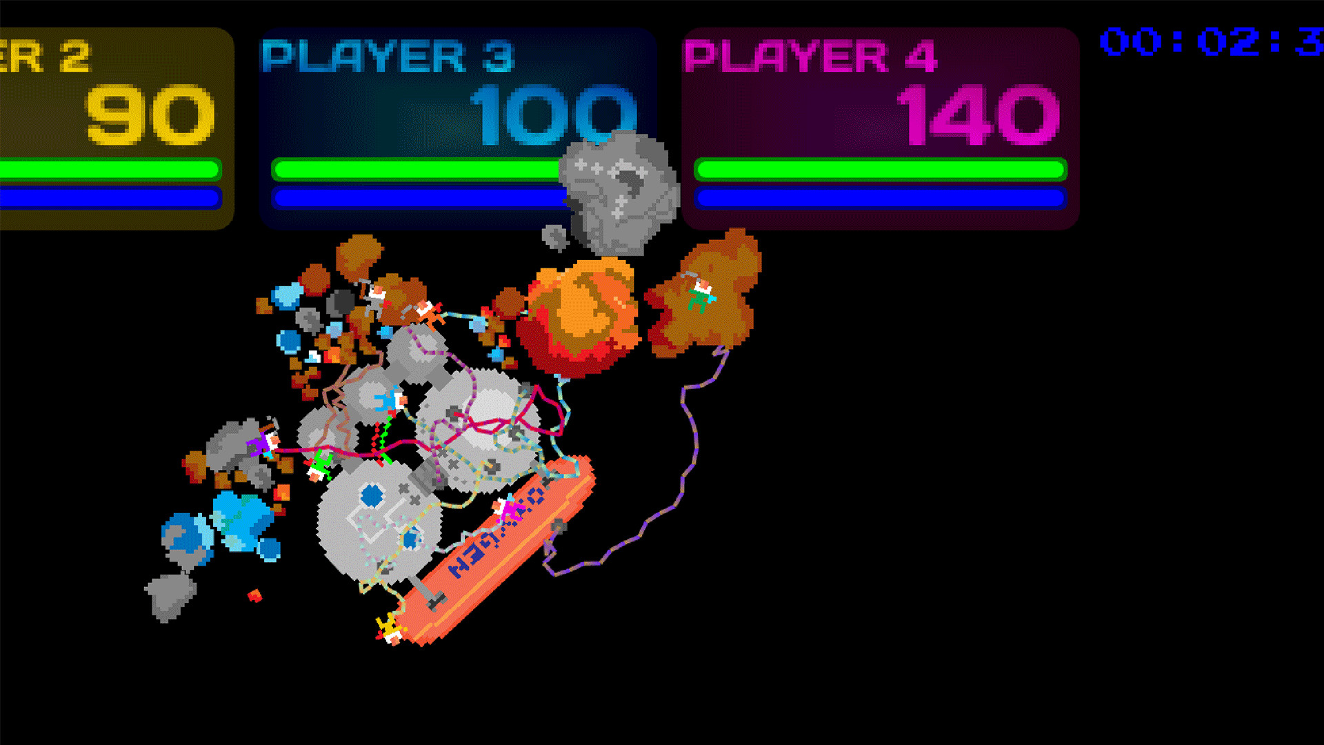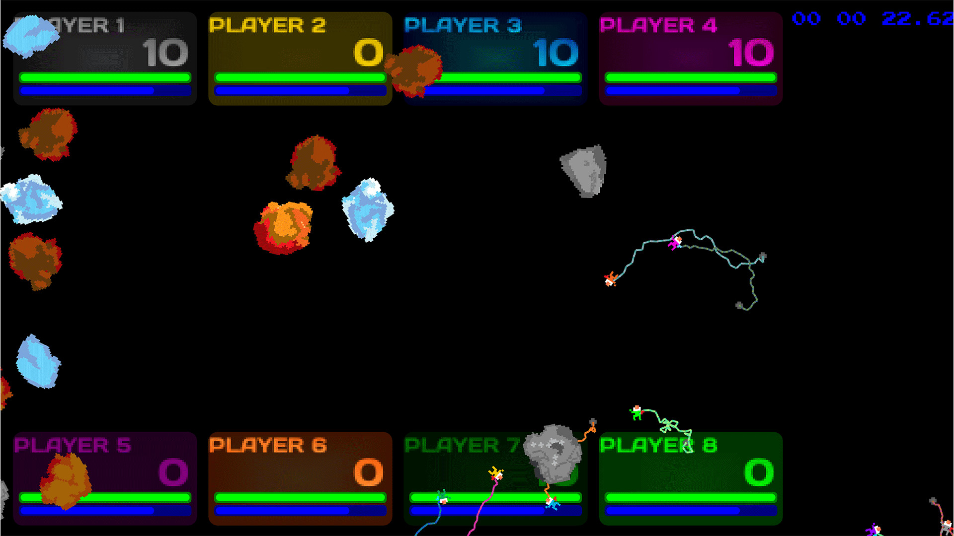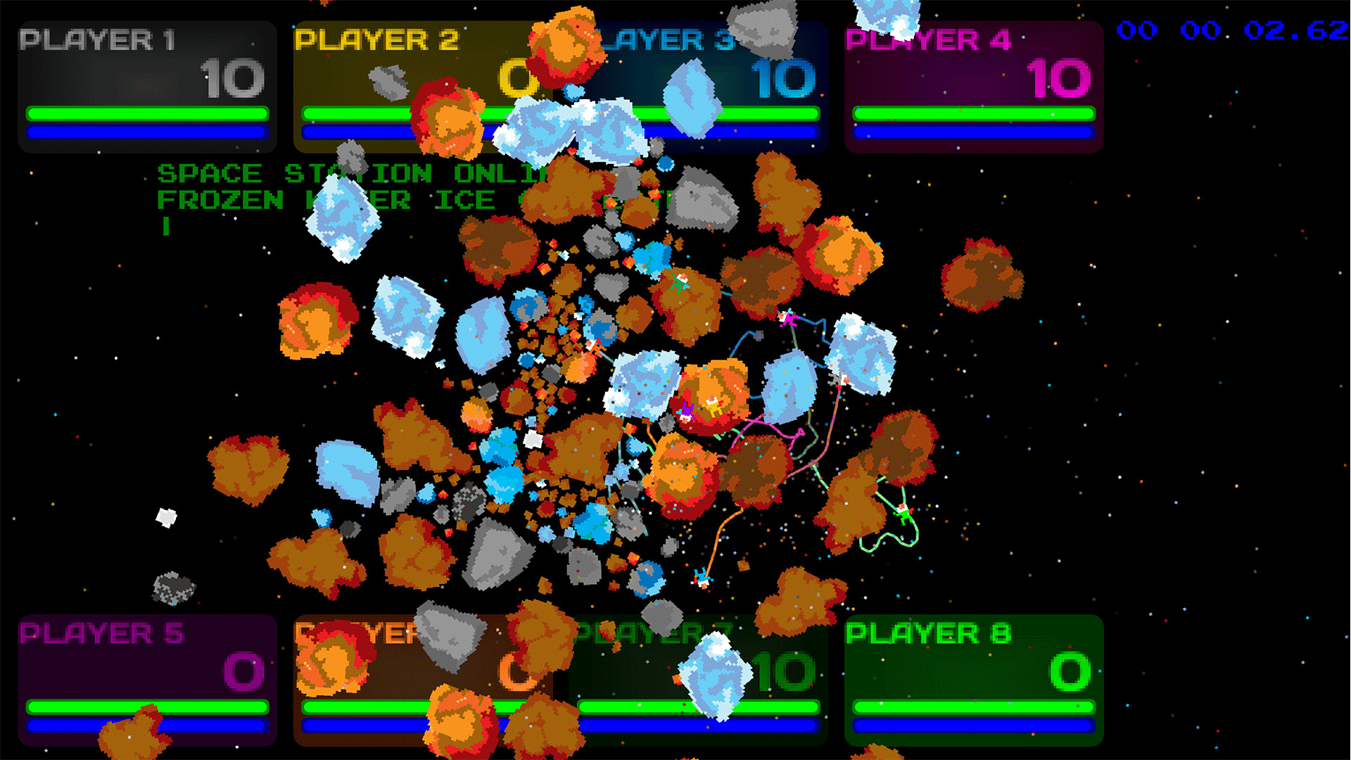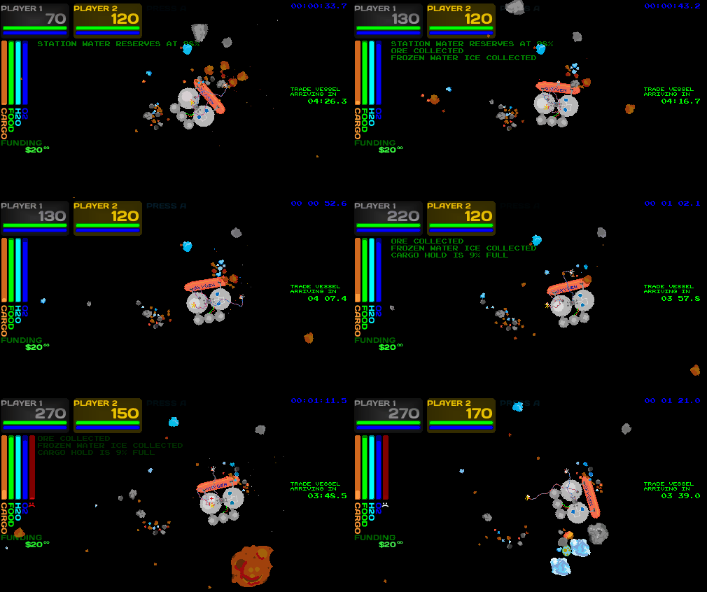
- 1 to 8 players simultaneous Co-op
- Repair, mine, shoot, collect!
- Fight off enemies like aliens and space pirates!
- Trade with interstellar merchants
- High score name entry
- Fun, casual and fun to play with friends!
- Lo-fi instant classic!
TL;DR Adding a help screen

After @SpaceGameJunkie decided to upchuck his morning brew all over this game in a 12 minute hangry review video (described by one of the game's die hard fans as the work of a "bellend") we added a help screen available by pressing F1, ESCAPE or Backspace, along with the "Menu", "Fuji", "Back" or "Start" buttons on many common controllers including modern Windows-compatible X-box controllers.

There have been a number of friendlier reviews of our game, check these out:
* https://www.youtube.com/watch?v=IvzdxTc1Hdc (BHG Media Group)
* https://www.youtube.com/watch?v=SeRPsHO6Vnk (Mockduck Plays)
* https://www.youtube.com/watch?v=TO5oRZFSYHg (Coffee and a Game by RetroRob)
* https://www.youtube.com/watch?v=sBvNXcrKZf0 (Bacon Ice Cream Productions)
In response to this review, as the developer, I'd like to say a couple of things:
1. @SGJ only scratched the surface of the game, missing many of the jokes and features. He actually did intuitively figure out 100% of the controls within the first few minutes, but did not explore or discover anything and complained about every minute detail, not giving the game a chance. I politely asked him to give it another chance after providing him with the guide, but his Discord community tarred and feathered me and Brian himself chastised me for not complaining to him in a DM or something to that effect. Not sure what I would be hiding in a DM, and while I guess that is some sort of "rule" of his community, I wasn't aware that I needed to. It's all very sad, to be honest. Sad that he was rude in the first place, and even sadder that groupthink destroyed our relationship. I've been a fan of SGJ since before episode 100, and when I mentioned this, he didn't seem to care about that at all. Go figure.
2. While the game offers single-player, it is more fun in a group with an open mind. I've had compliments from parents who love that they can play it with their younger kids, and that everyone has fun. That's extremely satisfying to hear and was a goal of the game design in the first place.
3. SGJ only hurts the indie community when he provides little or no constructive criticism. While honesty is appreciated, his attitude in the video is definitely a turnoff. We're sad to see this from a reviewer who used to help indies and has featured us on his podcast before. To quote Dave Chappelle: "This one guy laugh just a little too long..."
Design Notes
Adding a "Pause Screen" to the game was a big decision for me as the designer. I originally noted a desire from players for a Pause screen shortly after the game was originally launched in 2021. I wanted this game to be hard, and yet have "space" in the game for talking, relaxing and resting between moments of action, since the game is basically non-stop once you start playing.
I specifically did not want to add a "Pause" screen because the game was originally designed to be "rogue in space", even though the game has gotten easier with some of the iterations, it is still a hopeless cause as you will probably not be able to keep your station alive beyond two hours. However, I do understand a desire to review a manual as an onboarding feature for new players. So, for this reason, the "help screen" takes the place of the "pause screen" but prominently informs you that the game is NOT paused, though you can read the controls and take note of the advice in the help screen while the game continues on in the background.
Since then, a few changes were made that allow the players to re-enter the game as long as the station is not destroyed, even if all of the players have died (originally, this meant the game would end abruptly). When it does so, it resets the game clock, allowing players to start from the lowest level of complexity/difficulty, but with whatever money or space station upgrades they collected before dying.
I personally have issues using video game controllers for a long period of time. I carefully designed the way the controls work (generally through holding a direction, or through an "impulse") so that you don't have to "grip" the controller, which is a tendency, to cause musculoskeletal strain on the hands. Even if they seem "foreign", it's because so many designers rely on multiple fingers of each hand doing multiple things.
Think about games like Zero Horizon, which require you to press a button with your thumb, hold a trigger or shoulder, all while moving a stick, spastically fighting and fleeing, and possibly also press down clicking a stick, or the DPAD, all at the same time. This causes a lot of muscle fatigue and can lead to pain after playing video games -- sometimes referred to as "video game hand" -- and I don't think any of that is actually necessary.
Minimum Setup
- OS: Ubuntu 16.04 LTS. x64 only
- Processor: Intel Pentium 2.9 Ghz or equivalent. x64 onlyMemory: 2 GB RAM
- Memory: 2 GB RAM
- Graphics: OpenGL 4-compliant on-board graphics
- Storage: 22 MB available space
Recommended Setup
- OS: Ubuntu 16.04 LTS. x64 only
- Processor: Intel Pentium 2.9 Ghz or equivalent. x64 onlyMemory: 4 GB RAM
- Graphics: OpenGL 4-compliant on-board graphicsNetwork: Broadband Internet connection
- Storage: 22 MB available space
[ 6425 ]
[ 3784 ]
[ 2906 ]

