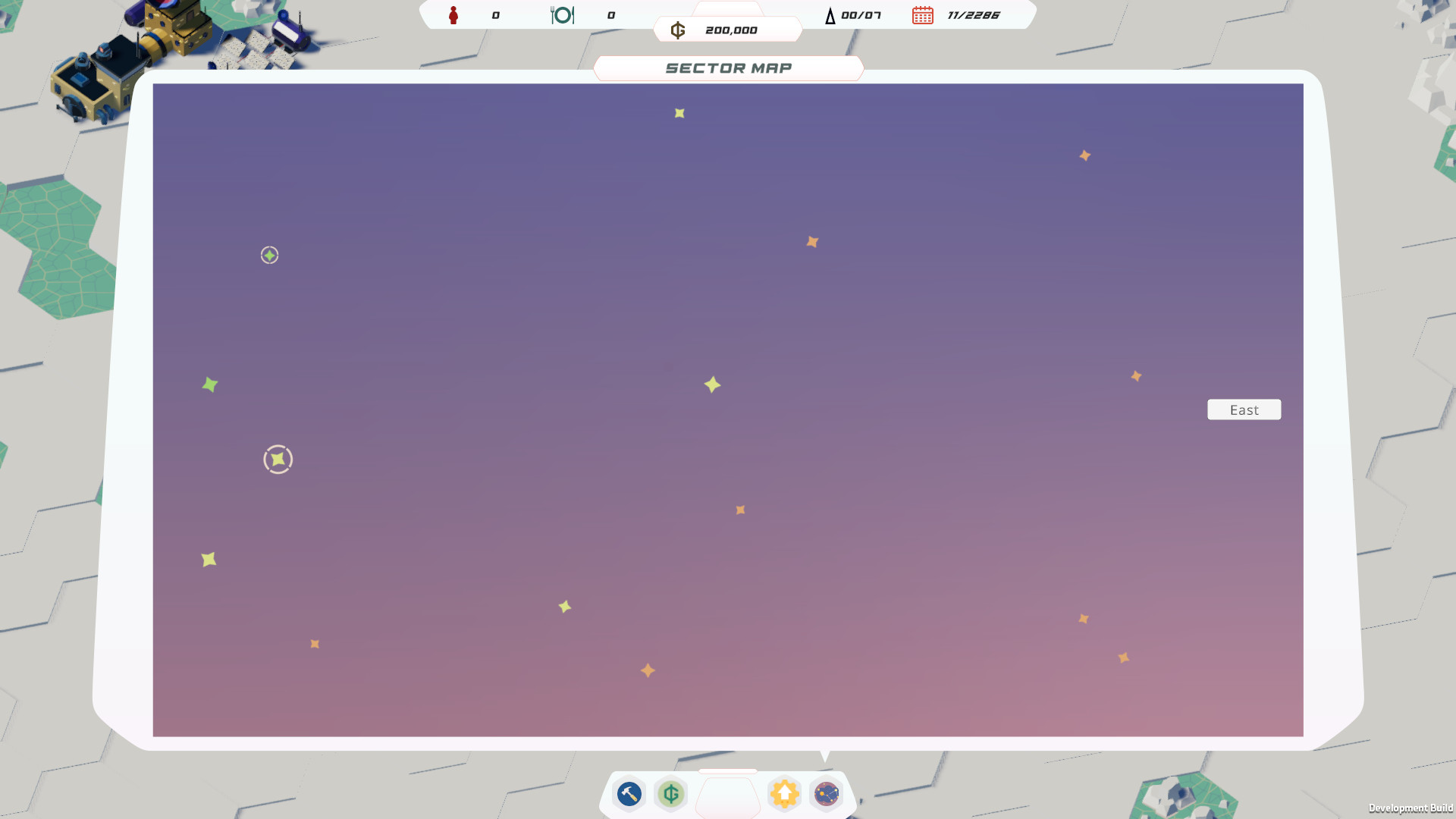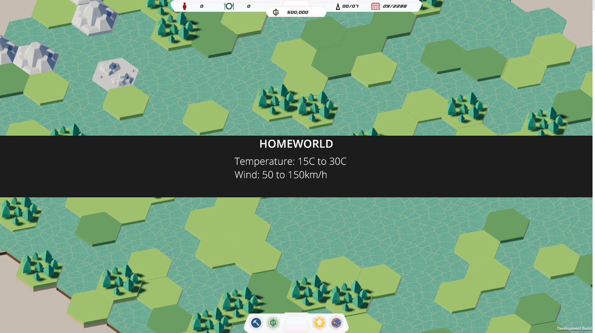
You lead the search funded by the ALAN Corporation who wants to use the opportunity to spread its arms across the galaxy.
Trade and spread
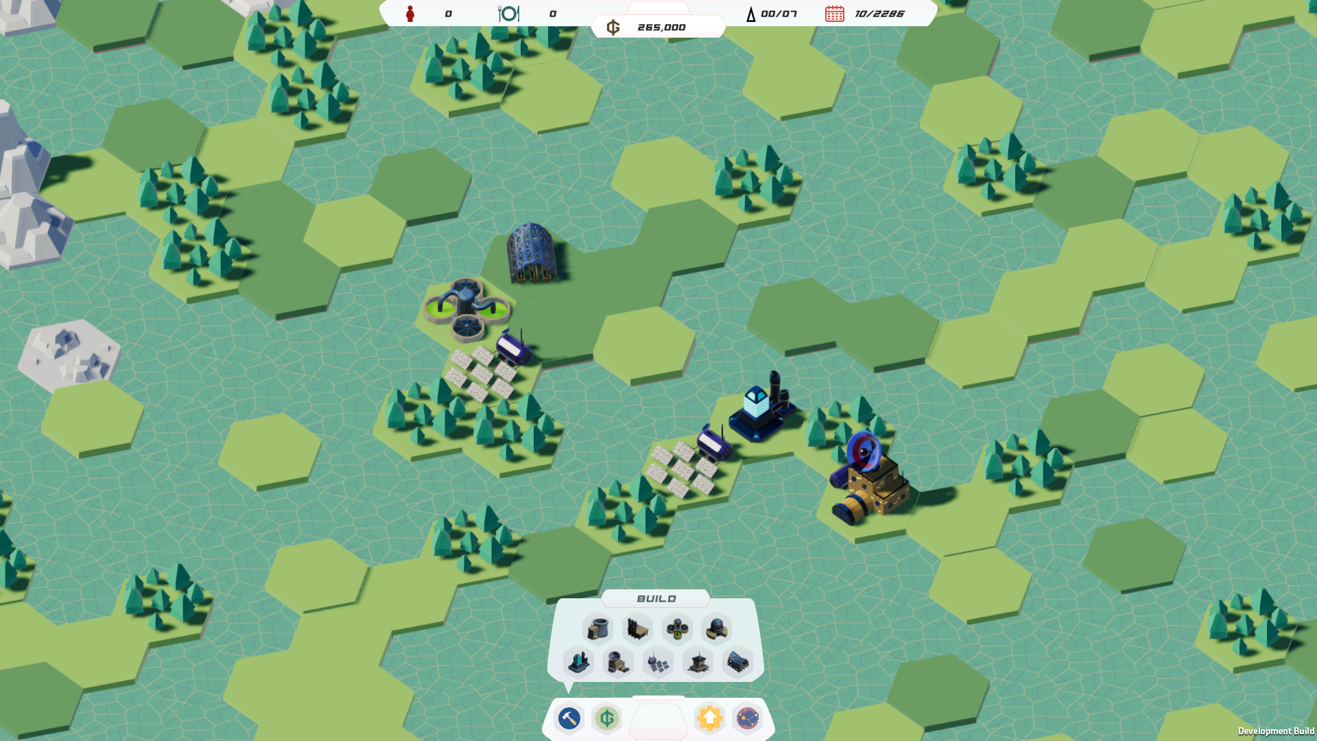
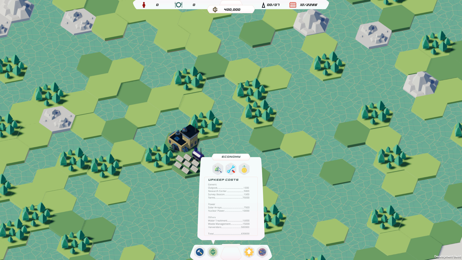
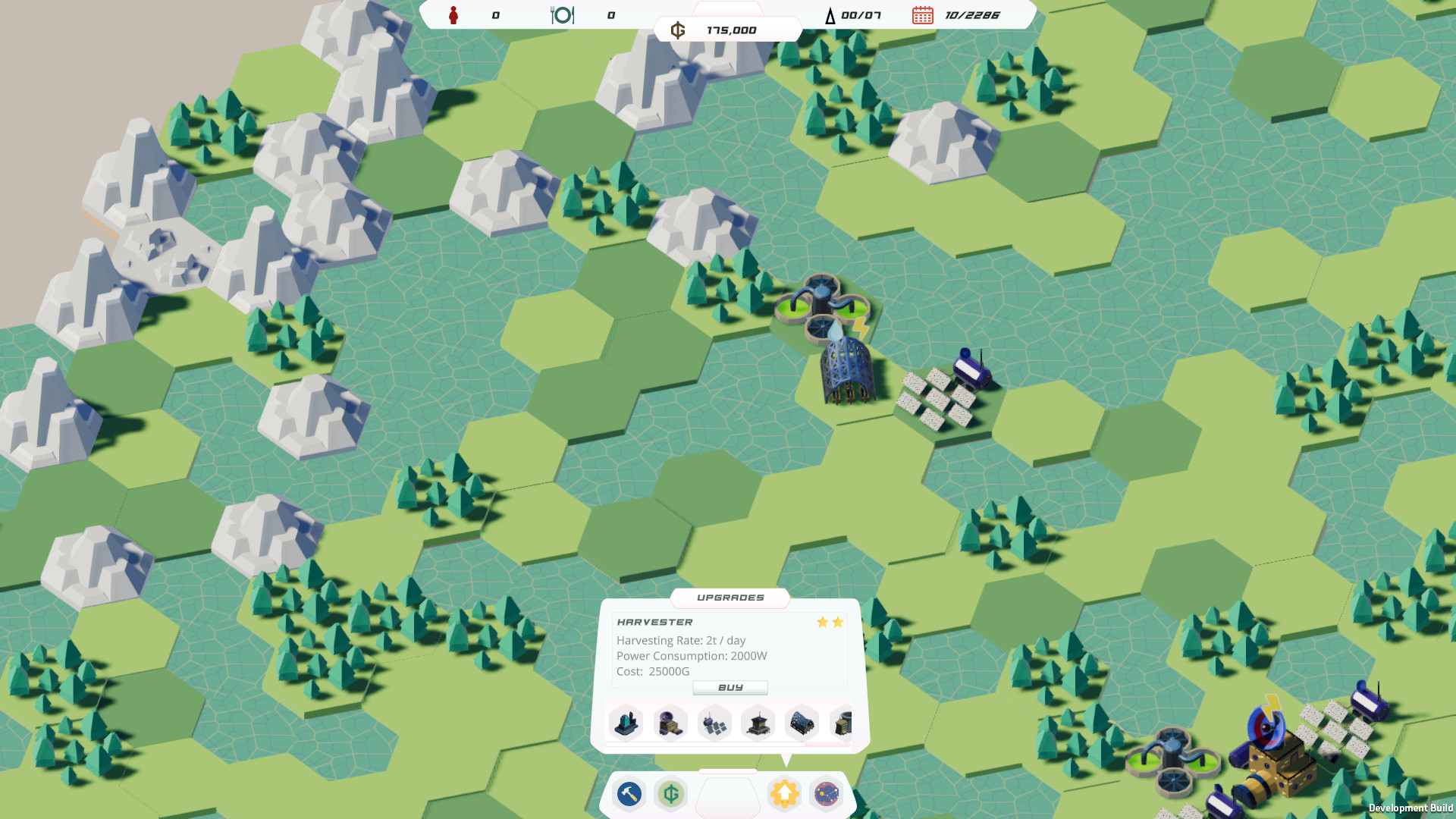
Set up a trade network to harvest the resources of the galaxy and finance your way forward. Maintain a positive cash flow and cover your upkeep costs so your progress doesn’t stall.Manage your autonomous harvesting fleet and take care of their power needs on planet surfaces, build trading outposts throughout the galaxy, and upgrade your buildings for better efficiency and faster harvesting.
Fire and forget
Get instant satisfaction! All your actions depend only on the cash and power you have available – no waiting for builders or bots here. Plan your route using notes and tags on planets.Find your way
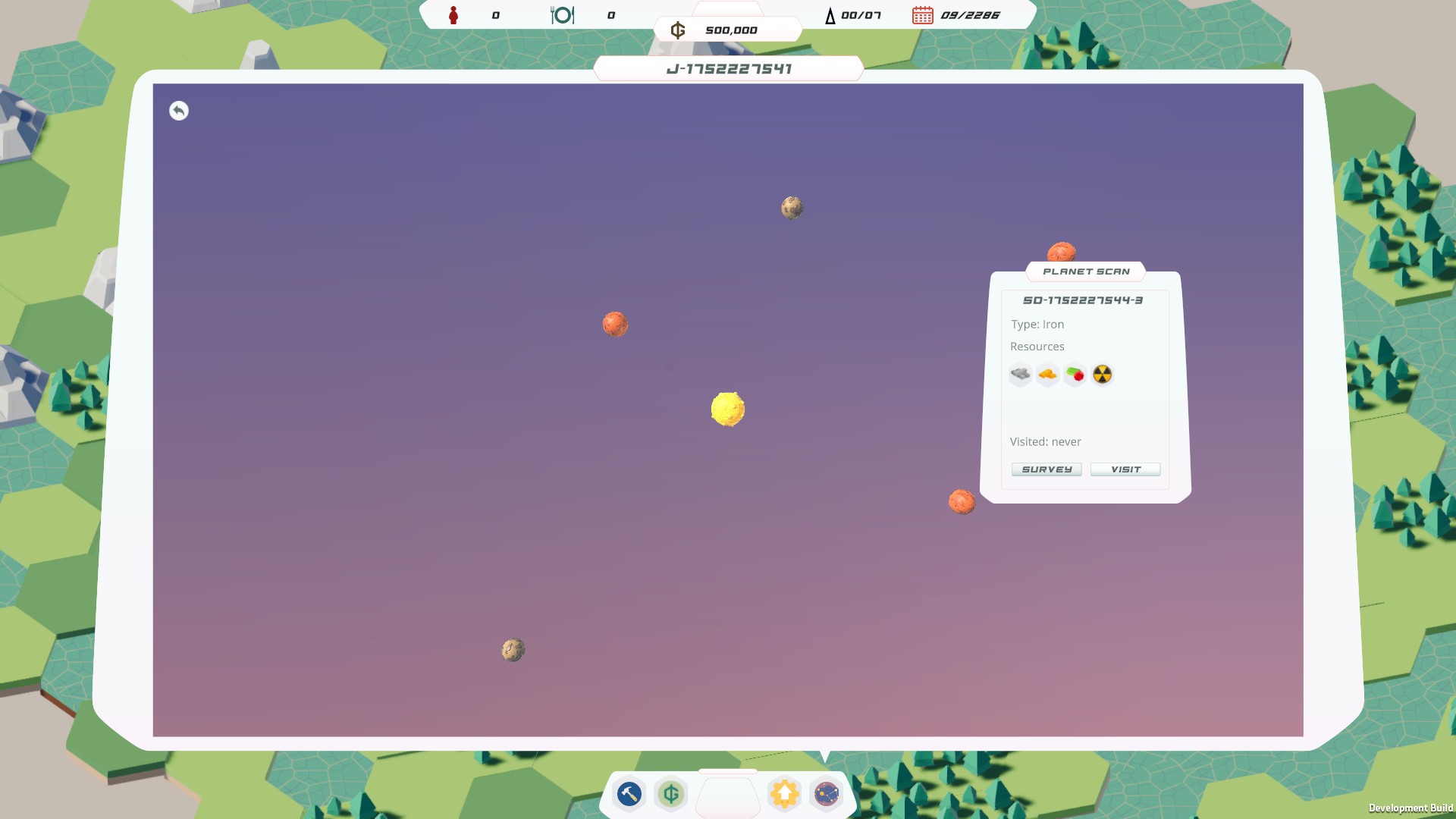
Play a campaign mode that will have you tracking a mysterious signal through the galaxy. Or keep it fresh in run mode where the procedural generation offers a different galaxy to explore and conquer each time. Keep track of your overall stats across runs, customize the size and amount of resources, and share galaxies with your friends and the community to compare scores and strategies.Fixed an issue where icons would not render correctly on some hardware.
- Fixed an issue where certain textures would render as white squares on MacOS.
- Fixed an issue that allowed buildings to be constructed without paying cost in certain conditions.
Signals is now available for MacOS.
If you encounter any issues please head to the steam forums or our Discord server!
Hi everyone!
We have just released patch 1.1.0 which contains the newly added Challenge mode.
The challenge mode is a fixed map (unknown to the player) where you aim for the highest score on the leaderboard.
The score is calculated with a combination of factors which includes money accumulated, time to completion and exploration bonus!
We hope you'll enjoy it and see you on the leaderboard!
MKDB Studio
- Water treatment plant now has an indicator on top of it with amount of water left.
- Solar array now has an indicator on top with available power.
- Minor UI fixes and icon updates.
- Fixed an issue where the ambient sound slider would not affect the volume until the ambient track was complete.
- Fixed an issue where entering destroy or deforest mode would not clear building attached to cursor.
- Sector map can now be closed with escape.
- Added weekly challenge
- Fixed an issue where a tutorial task in chapter 1 would sometime not appear leaving some players confused as to what the next steps are.
- Fixed an issue where a seed had a 0.64% chance of starting the player on a different planet in the same system in Run Mode.
- You no longer have to press building shortcut keys multiple times to place the same building.
- When un-pausing the game the time speed will now return to what it was before instead of 1.
- Fixed an issue where Chapter 3 Back to Menu button would sometimes not work.
- Fixed an issue where certain keyboard keys could not be used in the Settings>Input section.
- Fixed an issue that allowed invalid characters in the Target Framerate setting box.
- Fixed an issue where the score tracking in run mode was not always granting the Perfectionist achievement.
- Fixed an issue where autosave could sometime overwrite a manually saved game.
- Fixed and issue where the hide auto-save checkbox in the Load menu did not always worked.
- Saves are now order by most recent first in the load screen.
- The save file name is now indicated on the save entry in the load screen.
- Added an indicator in the bottom left corner of the screen when the game is auto-saving. That generally happens after travelling to a new planet.
- Fixed an issue where the "Show help" settings would not always work.
- Relocated the help menu to the middle top of the screen.
- Added shortcuts to help sections next to relevant tasks.
- Added status icon on top of the signal device that indicates which resource is currently missing.
- Tweaked the tasks in Chapter 1 to help better understand the aim of the game
- Reworded the tasks in Chapter 6 to reduce confusion.
- Fixed an issue where reload of Chapter 4 or 6 from a save would cause the Maltium Detector to no longer be available.
Small patch to fix an issue where some user would get a freeze or crash due to game files not initializing correctly.
To celebrate the launch of Signals, Kat, the second half of MKDB Studio will be playing the run mode for a few hours!
Be sure to tune in
Hi everyone,
After a busy few months we are now close to release which will be on November 16th at 3PM British Time. (Countdown to event: https://www.timeanddate.com/countdown/generic?iso=20211116T150000&p0=136)
What to expect?
The game will be available on both Windows and Linux. The download should be between 500Mb and 1Gb.
For issues, bug reports, feature requests or questions, please head to the Steam forums or our Discord ! Keep in mind this is a small team of 2 with only one developer, so please be patient, we aim to patch the game every couple of days if not more often for critical issues.
What next?
We expect to add a Weekly Challenge mode to the game in the first couple weeks where a fixed seed will be generated and players can rank on a leaderboard for the best score. More info on this soon!
We are working on adding controller support to the game as well, which requires some minor UI tweaks here and there.
We are working to make our scenario editor available to allow you to create your custom campaigns and share them in the Steam workshop. There is no precise timeline on this yet, but it is being actively worked on and it is something we strongly want to enable.
We'll soon publish a quick manual to the game files which contains all base data that controls building costs and resource economy values, allowing you to experiment with them.
We hope you'll enjoy playing Signals!
Regards,
Michel & Kathryn - MKDB Studio
Hello again, Kathryn here, the other 20% of MKDB Studio.
So, colour (I'm British, I spell colour with a u) is not something I understood much of before this project. Despite having studied art and design and holding a degree in the subject, colour theory really wasn't covered much in my education. Luckily there are some really good resources for understanding colour theory around the internet and I wasn't afraid to use them when coming up with the colour palette for Signals.
It all started with Teal
We had one colour in mind for this project and that was this vibrant teal that the two of us felt was a good starting point.

It worked well with both white and black and gave us the modern spacey vibes we felt would suit the game.
It was from here that I had to research more about colour theory in order to expand the colour palette. Youtube has some excellent videos on the subject and I utilised the method laid out in this video :

I didnt follow it perfectly but it certainly opened up our options. However it was missing a complimentary colour to the teal, so the simplest way I found to remedy that was to invert the palette in Photoshop.

We needed the complimentary colour for calls to action within the game so it would stand out without clashing.
With all these colours at our disposal, I pulled it down to 3 colours and a dark grey.

I used these as the main colours in the UI design, until one morning, Michel stopped all work done to date and did a complete 180 degree turn on the look and feel of the game.
Fortunately because our base colour palettes were large enough, pivoting to a new colour palette was simple. The new game look and feel required more pastel tones and moving from a base tone of black to a base tone of white. So I utilised the same colours but taken from the paler strip at the top and bottom of the respective palettes.
The New Colour Palette

So we ended up with a much softer palette and it looks nothing like what you would expect from a space game, however it works. I will go into more detail of the shift in design next time when I talk about my process designing the UI for Signals.
Until next time have a good week!
Welcome to this week's Dev log, Im the other half of MKDB Studio, the wife, Kathryn.
Ive worked with Michel on several logo projects prior to this, he is easy to work with and broadly knows what he wants.
At first I found it a challenge to get my head around the Signals logo as all we had was an idea for a space game and 2001: A Space Odyssey as inspiration. So I just got sketching. Getting out the uninspired/bad ideas was a must for unblocking me and it allowed Michel to give me quick feedback.

This first image was working through those initial uninspired ideas. Lets just ignore the fact that I was calling it Signal in those first sketches.
He had initially wanted a curved horizon line integrated into the logo, however that looked more corporate than space gamey.
We liked the idea of the G symbolizing the galaxy and Michel envisioned the triangle A representing the in-game signals. Hes rather fond of all things Lovecraft so the triangle A gave nod to portals that lead to strange and awful dimensions (like in the movie The Void). That was a keeper.
We settled somewhere here:

Development Stage
I felt the G needed to be a Golden Mean spiral (although altered); much like the actual movement of galaxies and made a simple grid to align the letters.


And then needed to fix those S's.

The S and G are the only curves in an otherwise angular word. I played around with simple shapes and found two 3/4 circles sat nicely on the grid. Michel loved this but wanted the weight to be heavier as it makes the logo more readable at smaller sizes which matters a lot on storefronts like Steam.

As you can see the G suddenly looked out of place. It wasn't readable with the extra weight but the rest of the letters were spot on. So it was back to the drawing board for that G.
Finalizing the Design

Fortunately the answer was simple; merge two circles with a line. The result was a G that married with the existing letters. Michel was happy with it and so was I.
We used this design in our capsules when submitting the Steam page and everything looked fine, right? Wrong.

Having looked at the logo for so long I couldn't see that the letters were not vertically aligned. I missed the sneaky misalignment for a few weeks until I went back to review it before the Steam page went live. It always helps to step away from your work for a while so that glaring edits can be easily seen.

So that's it! I'm super happy with the logo type and really enjoyed the design process, I feel like we nailed the space theme without being clich. Next time you hear from me I'll be doing a quick dev log on how we chose the colours for the game. The ball is back in Michel's court next week where he'll talk about learning and working with Unity...
Have a great weekend!
Hello everyone,
This week for devlog #2 we'll be talking about how Signals came to be, early ideas, prototypes, terrible sketches and other artifacts.
In the beginning there was 2001
The original idea came about in late-February 2021, lightning struck while watching one of my favourite movies, 2001: A Space Odyssey.
"Ever wanted to be HAL9000?", the game would set the player in the role of an AI system onboard a ship sent on a mission with a crew. On this mission your aim would have been to deliver a payload and your crew in as good a state as possible.
With that in mind a week or so was spent on information gathering: NASA website, ESA, research papers, ... The question was: what does it take to keep people alive in space, a whole lot is what.
The output was a rough sketch of what modules a ship would be made of, their needs and output.

A quick prototype was built using Monogame as a simple command line interface to route power and resources to modules in a ship.
After a few days working on it however, it became clear that it would be hard for me to get a game out of this, someone else probably could but no fire was lit in me so that was the end of that version.
Into the stars
Two things kept tickling my curiosity however, having a ship and crew traversing the galaxy, and managing resources to further the push in the galaxy.

Armed with a deck of cards, some D20 (actually life counters from Magic: The Gathering), and a white board we spent an afternoon iterating over the idea until we settled on a version we had some fun with.
In this version the ship took a backseat and the crew became the center of the game. Each mission across interstellar space would see events happen that would test the crew, potentially incapacitating them or killing them which could mean the ship would be lost. Money to upgrade the ship could be generated by "settling" in star systems.
As an aside, paper prototyping is something I highly recommend, it's fun and a cheap way to test things out. A regular deck of cards, some dice, pen, paper and onwards you go.
I ported the paper prototype in Unity, which resulted in a small game that looked like this:

We played with it some, tweaked values, and explored an event system that would be the spice of the gameplay loop. On the design side we started exploring UI concept to frame this game:
While we really liked some of the aspects of this prototype we felt it lacked direction and wanted to be something we weren't quite sure how to execute.
At that point we took a few weeks break from the idea. Also Path of Exile's new league was starting so that was my life gone for a bit.
Starflight you say?
This Path of Exile interlude was not wasted as the long grinding sessions were a perfect opportunity to consume tons of content: GDC talks, podcasts, audiobooks and movies. The intent was to try to spark something.
That's when I stumbled up an old Amiga game: Starflight[1] . Instantly I saw some overlap with our last prototype, except it was better.
A copy of the game, and its sequel, was acquired on GOG[2] and we spent a few days exploring these two games.
Ideas were bubbling to the surface yet again, we dedicated hours to talk design and possibilities which ended with a concept that saw Starflight re-imagined as a roguelike (shades of Everspace[3] as well).
The first concrete version and plan was put together at that point:

I would spend most of April and a chunk of May working on an alpha-build of this concept.
We allocated a week to play that build with a friend joining in the testing phase[4] .
The feedback was positive but there were some issues that bothered me. I didn't like the way the game flowed in general, too much jumping from screen to screen. In hindsight that was probably a side effect of taking inspiration from an Amiga game.
The other issue was that I still felt the game lacked identity, it didn't know what it wanted to be. The roguelike aspect was alright but the stakes during runs were lacking, so the loop felt a bit flat. One aspect took very well however: roaming the planet's surfaces in search of resources to harvest.
Signals
We were now 2 months into what we wanted to be a 6 months development cycle. With the issues highlighted we needed to make a decision: expand the timeline or pivot again. We opted for the latter, mostly because our aim is to learn and keeping to our deadline was the best way we would learn how to get a game out there.
The objective was to keep it simple so we could deliver. We took the one part about playtesting that connected well with everyone who tried it: harvesting surfaces for resources, and made that the centerpiece of the game.
For lore framing we took a page from 2001: A Space Odyssey and added "monolith" -Signals- to research as the main reason why the player is sent throughout the galaxy.
The game became a casual city-builder where the player spends most of its time on planet surfaces building harvesting farms and the infrastructure required to research the signals. A lot of the building blocks from the previous phase were kept, with a focus on making the experience of harvesting resources the center of the player's interaction with the game, while making the galaxy traversing a secondary aspect.
In future devlogs we'll touch more on some of the things we talked about here, why Unity (and not Monogame, or something else), UI design for the game, and next week Kathryn will take the helm and talk about the Signals logo and how she went about designing it with my awful sketch as a source.
Have a lovely weekend, stay safe and see you next week!
Hello everyone!
We at MKDB Studio, that is my wife and I, are pleased to announce our first game: Signals. It is to be released late September for PC on Steam & itch.io and has been in development since early this year.
Here is a short teaser:
What is Signals?
Signals is space exploration builder set in a procedurally generated galaxy. Traverse hundreds of planets, collect resources, upgrade your buildings in the quest to follow the signals as an AI in charge of the expansion.
You lead the search funded by the A.L.A.N.* Corporation who wants to use the opportunity to spread its arms across the galaxy. Set up a network of outposts and finance your way forward. Maintain a positive cash flow and cover your upkeep costs so your progress doesnt stall.
Manage your harvesters and take care of their power needs on planet surfaces, build outposts throughout the galaxy, and upgrade your buildings for better efficiency and faster harvesting of resources.
Open Production
Having relied on lot of information and knowledge shared by members of the industry like Weather Factory (Cultist Simulator)[2] , or Grey Alien Games[3] and many more, we felt it was natural to share as well.
Our aim is to be as transparent as possible; from how the game came to be, to reviewing how we planned it, the financial aspect and once released we'll take a look to see whether the game was successful or not.
Alongside the weekly devlogs, which will cover these topics, we will also be on Twitch[4] every now and then where we will be doing live work on the game and diving sessions in the codebase (so you can judge hard).
Who are we?
MKDB Studio is an 80/20 venture that involves a husband and wife team and is based in the UK. I, Michel, have a background in software engineering and management where I have been a professional for 15 years outside the gaming industry, while Kathryn has an art and design background.
MKDB Studio and Signals is my full time venture where I oversee the business side, finance, planning, game design, programming, some 3D work and terrible sketching. Kathryn has been helping part-time with the UI, design work, game design and rubber ducking[5] .
We are committed to doing multiple projects to give us a real view of what it takes to make games and be successful at it. I am under no illusion that it'll be easy, but so far one thing is certain, happiness is at an all time high.
Next week we will cover the prototyping & ideation phase and how we got to Signals with some footage, screenshots, and documents from the "early" days.
Thanks for tuning in!
MKDB Studio
*A.L.A.N : Artificial Life & Advanced Networks
Minimum Setup
- Memory: 4 GB RAM
- Graphics: GeForce 7xx series or equivalent
- Storage: 1 GB available space
Recommended Setup
- Graphics: GeForce 7xx series or equivalent
- Storage: 1 GB available space
[ 6228 ]
[ 5939 ]
[ 2477 ]
[ 4756 ]

